Jin-gu-yuan Mixed-use Complex
Kunshan, China
PUBLIC SPACE, HIGH DENSITY, AND AN EMERGING CIVIL SOCIETY
THE PROBLEMS
The 19th-century Chinese cities did not have much consciously planned public space, especially the nodal types such as square and park. People simply used the streets, or whatever left by the traffic flow. The urban renewals brought by the Economic Reform since 1978 have changed Chinese cities completely. However, the renewals have focused on improving the cities’ economic infrastructure. The “non-productive” public space, especially the part serving average residents, has not received proportional attention. So as the first problem, Chinese cities today need more public space quantitatively. But the limited public space already supplied by the urban renewals has also exhibited three quality issues.
To begin with, much of the resources used on the public space has been lavished on a few “window-dressing” projects to show off the governments’ accomplishment. These huge squares and green areas tend to be far away from where residents concentrate and inaccessible to the masses most of whom don’t own cars. The users also often feel alienated by the large areas of lawn or sun-baked hard surface. Secondly, the few new public spaces serving the average residents, such as those in commercial streets and neighborhoods, have been impacted by a kind of privatization. Overlooked by the laissez-faire government, these profitless projects tend to be barebones, with no or few benches, shading and other amenities, and shunned by the opaque facades of nearby buildings. They have been often commercialized or even encroached by neighboring private developments. In particular, the gated community has become the dominating form of residential development, killing the street life ever since. Thirdly, the gentrification of public space has taken many free or inexpensive functions and services away from the new public spaces. For example, pedestrians and street peddlers have been treated as second-class citizens. (For a full analysis see my article “Brave New City: Three Problems in Chinese Urban Public Space since the 1980s" in Journal of Urban Design, No. 2, 2011.)
If the problems could be excused by the poor economy at the beginning of the Reform, it is no longer the case. Meanwhile, more people are living in the cities now. 51.3% Chinese are urban residents in 2011, compared with 17.92% in 1978. As a result, China has 117 cities with more than 1 million people in 2007, a rapid rise from 21 such cities in 1985. The urban population has also become increasingly middle class. All these demand a timely improvement of the urban environment, including the provision of more and better public space.
But there is one more reason. China has entered such a historical moment that the public, government officials and professional analysts have agreed that a fundamental reform in its political and social structure cannot be delayed because its successful economic development can no longer work with the other aspects of the society. It is time to accelerate the process of political democratization and of increasing civil liberties. To get more people into the process, the civil society in Chinese cities, already prospers over the internet, must be further developed into the physical world. What is more appropriate than creating adequate public spaces for the purpose, as Henri Lefebvre argued before? Even though we should be cautioned against architectural determinism, one cannot deny that environmental form does have a role in quickening or retarding the progress. It is urgent now for Chinese urban planners and designers to create incubators for an emerging civil society.
How is this to be done? This article will use the Jin-gu-yuan Mixed-use Complex in Kunshan, China, designed by this author, to illustrate a new set of design principles.
THE PROJECT
Located west of Shanghai, the historical city Kunshan has been rapidly transformed into a major manufacturing center in the Yangtze River delta. With an area of 118 square kilometers and a population of 180,000, the central city is undergoing major urban renewals. The 1.38-hectare project site sits in one of the renewal zones, between a newly completed 5.6-hectare Jin-gu-yuan gated residential development to its north and the Loujiang River to its south. The low-rise houses occupying the other areas surrounding the site will be all replaced by high-density developments, similar to the high-rise Jin-gu-yuan that has 155 apartments per hectare.
Considering a major commercial street exists north of the Jin-gu-yuan, the developer (a part of the municipal government) called for a 6,220-square-meter floor area of neighborhood shopping, dining and community service facilities, including a kindergarten. Public space is required but its amount not specified. Early schemes by others reflected the conventional design approach, they showed a long row of one to two-story building, with the narrow strip of leftover space between the building and the river as “public space”. Dictated by Chinese building codes that require the kindergarten to sit in its own parcel, the facility was placed on the ground at the west end of the row in these schemes.
THE DESIGN THEORIES
The problems in public space stated earlier can be partially attributed to the conventional design approach that blindly imitates the urban form of European and US cities and ignores the unique conditions of Chinese cities. These conditions include the larger size of a city, the limited existing public space (especially the shortage of the nodal types), the hotter and longer summer, the poorer majority of the urbanities, and the need to preserve arable land. But the biggest oversight may be on the higher population density of Chinese cities. For example, in each square kilometer of the central city, Beijing and Shanghai have 7,387 and 16,828 residents respectively in 2012, far exceeding those of the most crowded Western cities. High density brings in a host of other issues such as more intensive use of the public space and higher building density. Therefore it demands design strategies qualitatively different from the current imported ones. The first five of the eight concepts used in the project primarily respond to the high density, which were proposed in Public Places in Asia Pacific Cities (2001) edited by this author, while the rest has more to do with the economic and cultural peculiarities of Chinese urbanities.
1. Numerous Small Nodes
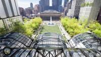
Many small public spaces are better than a few huge “window-dressing” projects in a dense city. The former model will create a public-space network accessible to most residents within a 500-meter walking or bicycling distance. Being able to use all kinds of vacant lots, it will also cause less relocation. The nodal type will create a more static setting that supports social gathering better. In fact, the traditional Chinese city had many courtyards in public buildings to supplement the streets as public space. In this project, the footprint of the building in the conventional design is shrunk and divided into five portions, creating five gardens between the buildings. Measured from 42X34 meters to 21X15 meters, these nodal spaces with clear boundaries will act as a more serious invitation to social groups than merely expanding the sidewalk.
2. Vertical Zoning
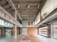
To carve out more public space in a dense city, spaces have to be piled up, and one has to abandon the traditional “horizontal” zoning that dictates a singular use for each parcel, either among different functions or between open space and a building site. As long as fire and other hazards are prevented from spreading across floors, building codes should allow vertical zoning. Some of the building functions in this project are juxtaposed vertically. For example, all rooms used by the children in the kindergarten, along with the outdoor play areas, are now moved to the upper level, only the functions used mainly by adults remain in the north part of the first floor. The entire kindergarten has the image of a hilltop village. An exterior stair, designed as a mountain path, provides a secondary entrance. The new layout not only makes the kindergarten more secured (a big issue in China), but also affords the children a better view of the river which would have been blocked by a wall in the conventional scheme. Meanwhile, the concept allows the southern portion of the first floor to be used as a covered walkway and shops, which will continue the waterfront public corridor along the Loujiang River. Because a variance was not issued, the developer had to give the entire Building A to the kindergarten, but the experiment shows that the concept can be realized physically.
3. Multi-layered Street
Since the curbside shops attract more people, the conventional approach has created miles after miles of commercial streets in Chinese cities. They do not only tire us physically but also make the urban environment less legible, especially in an extended metropolitan area. Research showed that a commercial street longer than 600 meters did not attract more customers. So why don’t we shorten the commercial section of a street by creating sidewalks on the second floor? To heed William Whyte’s warning that a public space works only when it is close to pedestrian flows, the proposed sidewalk must be no more than one floor above the ground and frequently connected to the ground by public stairs. Moreover, the pedestrians on the ground should be able to see the shop fronts along the upper-level sidewalk. The concept was realized as a small-scale experiment in Buildings E and B-D of this project.
4. Paved Garden
The essence of an urban park in a high-density city is not a piece of transplanted “nature”, merely to be viewed upon, but a public room with greeneries. In designing a public green area, the conventional approach favors the model of English landscape garden characterized by the large lawns, lakes and forests. It does not support the intensive human activities observed in many Chinese parks. Therefore, most part of a public green area should be paved, with as many overhead or vertical planes of plants as possible. Of course, a limited area of lawn may be designed to create a void center for a sense of relief and to allow for occasional use of a large group. Finally, associations with nature should be created but with a more symbolized approach rather than a literal one. All these ideas are used in the design of the five gardens in this project. The largely paved gardens will accommodate many residents’ activities which may not be possible in their small apartments. Meanwhile, the numerous trellises and tree pits give shades and a sense of nature to the gardens. Near each of the two gates of the Jin-gu-yuan housing, a small lawn opens a visual channel toward the river. In festivals, it can be transform into a stage or playground.
5. Hard Edges
In many Western cities, sense of territory is created by space, such as the front lawn of a home, and by non-physical means, such as customs. These “soft” edges do not work in high-density Chinese cities which posse neither extra space nor a similar culture (Chinese in a queue tend to have their bodies touch each other). In a conventionally designed park, the lawns and unprotected flower beds are quickly worn out. Therefore, we should use more physical, particularly vertical (i.e., space-efficient) boundaries. In this project, a wall, a colonnade and tall bushes divide the gardens from the northern street. Inside the gardens, conversation groups are separated by dense plants of eye-level height. The two lawns described earlier are completely rimmed by railings which can be opened for occasional use of the turf by large groups.
6. Low-cost Activities
By imitating the West, the planners often assumed gentrified functions for public spaces, such as symphony concert and artists’ village, which are unfrequented by the majority of Chinese urbanities. 60.8% (the largest group) of Shanghai residents in 2012 listed simple green spaces as the most visited public facility. As Ray Oldenburg argued, a good public space should be free or inexpensive. It was observed that low-cost recreations attracted people most in Shanghai parks. In addition to exercises that are loved by everyone, the older generation prefers playing chess/cards and talking. The middle-aged enjoy social dancing and singing. And the younger generation loves the sports. In this project, the five gardens have plenty of benches, many are arranged in a centripetal form, to provide settings for quiet social activities. There are small “plazas” for self-expressions. We also transformed the roofs of Buildings B-D into one volley ball and two badminton courts, satisfying the teenagers’ needs often overlooked by planners.
7. Spaces for Open-ended Uses
All the five buildings in this project are adjacent to a covered walkway at least three meters wide. Some sections of the walkway are further expanded. The generous dimension aims at providing more than a traffic corridor. Since only the public knows all the ways to use public space, the best design may be to provide many minimally furbished but free spaces, so people can invent their own uses, such as an English-speaking corner, bird display, and an outdoor cafe. Adding a roof will open up most versatile possibilities with a small cost increase. In particular, the street market proves to be an efficient tool to help low-income residents to make a living. With a good management, the peddlers also enrich a public space. While this project may be too small, it is still hoped that a few peddlers could be accommodated in the covered walkway.
8. Buildings Paired with Open Spaces
One of the characteristics of Chinese traditional space is coupling an indoor space with some outdoors spaces to serve each building function. In contrast to the Central Park model, today’s Chinese still prefer a more refined mixture of indoor comfort with nature. We tried several ways to adapt the idea to this project. The juxtaposition of buildings with gardens is one, which makes it easier to provide food and drink to people in the gardens, another Oldenburg’s hallmark for a good public space. Moreover, the kindergarten in Building A has a roof deck next to each classroom and a roof garden shared by all classes, and the second-floor shops in Building E all open into their own roof decks overlooking the Loujiang River.
Except for Garden 5, the construction is near completion now. We will see if the design works after the Complex opens and the plants grow. Urban design should never be reduced to fancy graphic compositions. Human behaviors should serve as the main foundation of the design concepts. It is not even merely a design issue. If the southern gates of the nearby housing estate are not opened as planned, few people will use the public facility. If the shops in the Complex do not include some inexpensive convenience stores, people in the gardens will interact less with the nearby buildings. If the management fails to regulate the peddlers smartly, street market will never occur or will become a nuisance. It takes a civil society to make a civil place, but I believe that Chinese urbanities are learning to claim the ownership of public space, a relatively new phenomenon in the long history of China.
Publication
Urban Design (UK, Summer/2013), Architectural Journal (China, 10/2013),
archdaily.com

- Architects
- Pu Miao
- Location
- Zhenchuan West Road (between Baimajing Road and West Cangji River), Kunshan, China
- Year
- 2013
- Client
- Kunshan City Construction Investment and Development Co. Ltd.
- Team
- Pu Miao
- Structure
- Shanghai Yuangui Structural Design Inc.
- Plumbing, HVAC, and electrical engineering
- Hanjia Design Group


