Martine Sitbon Designer Shop
Seoul, South Korea
The renovation is for a shop for French fashion designer Martine Sitbon. The building we renovated was originally a large house. Located on a sloping hill about 7 meters above the access road, it has changed programs and been redesigned three times in the past five years; an example of the program having nothing to do with a building typology. Form doesn’t follow function.
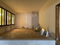
The half buried commercial space at the base of the house was originally the garage and storage areas enclosed by retaining/foundation walls. The space was really a combination of the original garage and left over by-product space left from the construction above creating spaces that varied in height from 1.75M to 6 Meters. We chose to exploit this variety and emphasize the volumetric characteristics by wrapping the entire interior volume in a continuous surface that bends around corners, floors and ceiling. This emphasizes the void space (volume) over the individual surfaces that define it.
On the exterior, there are two rows of 12.5m wide 3.6m tall glass skins stacked on top of each other creating a 7.2m tall glass wall along the access road. The bottom row of clear glass is a giant display window- and the entire shop is the display. The top row of glass screens the views of the existing 1970’s (faux) French mansard villa.
The street is defined by a retaining wall next to the shop. The façade continues this wall plane. Discrete yet differentiated by being fragile glass next to heavy masonry and stone.
The two rows of glass respond to the shifting day and night conditions. During the day, when the shop is open, the transparent bottom row of glass becomes the primary focus while the top row reflects the sky, keeping its presence discreet.
As night falls and the activities move from shopping to pleasure seeking, the two-way mirror glass wall on top slowly stops reflecting the surroundings and reveals the strong materiality of polyester paint roughly painted on the backside of the two way mirror. Slowly, the upper surface responds to the shift in ambience and activity; the smooth, flat, reflective skin becomes a deep, glowing, crumpled, golden surface.
Clothes are displayed using objects in the space. The objects imply a liquid state of suspension within the store, like looking into an aquarium; they appear to float or be shaped by surface tension within the space. The shapes and materials of the objects also reveal different qualities of the space.
The hanging linear object floats behind the façade to accentuate the length of the space and the symmetry between floor and ceiling conditions. It presents the idea of weightlessness and floating. It is clad in synthetic hair, a stark contrast to the smooth reflective surfaces that predominate. It is like a fishing lure in the water.
The shiny, low, black display object reveals the height and width of the space and the force of gravity; like a black drop of mercury shaped by surface tension and it’s own weight.
The verticality of the moveable hanging racks exaggerates the tightness of the space. The warped surface of the front side implies a liquid shaped by surface tension, like a soap film bowing in to accommodate the hanging clothes. The mirrored backside of these displays as well as the glass shelf and dressing room mirror provide a sharp edged counterpoint to the smooth rounded surfaces in the space. The sales counter at the entry is made of soft, squishy silicone. It engages with clients directly as they are paying or talking with the sales assistants. Its softness calls into question the material of the walls, floor and ceiling, which looks the same but is hard.
Project completed in the summer of 2002 after a four-five month design and construction process. It is approximately 100 square meters in area. Ceiling heights vary from 1.75M to 6 Meters.


