Twelve-Roomed School of Beauty
Weihai, China
A Twelve-Roomed School of Beauty: Moderate Architectural Intervention with Skillful Usage of Mountain Rocks
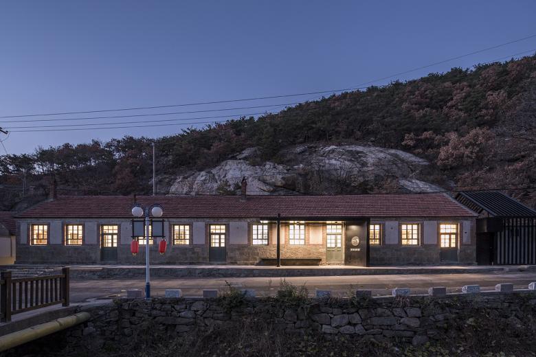
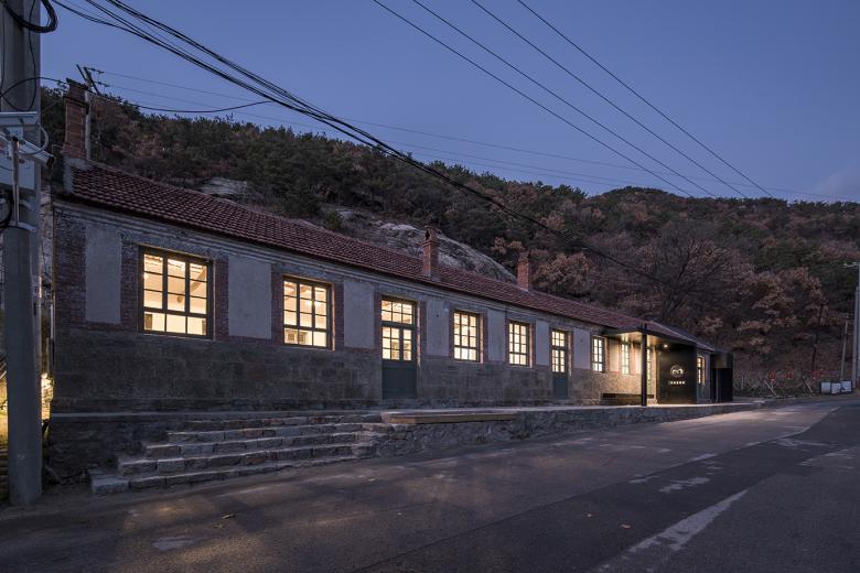
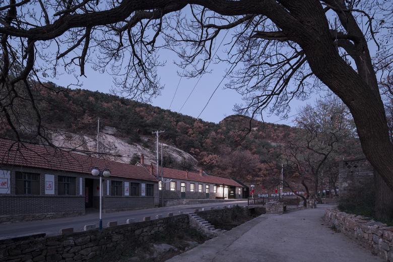
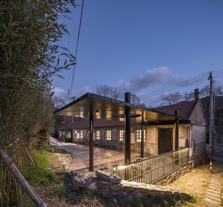
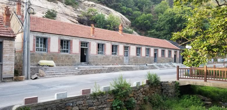
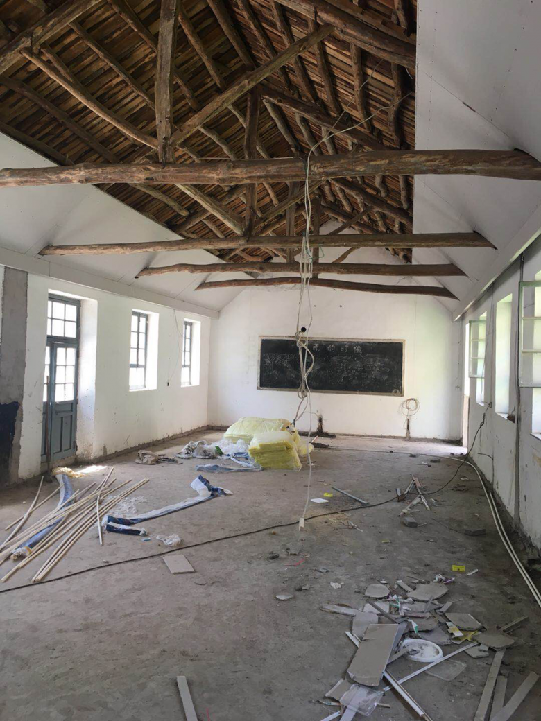
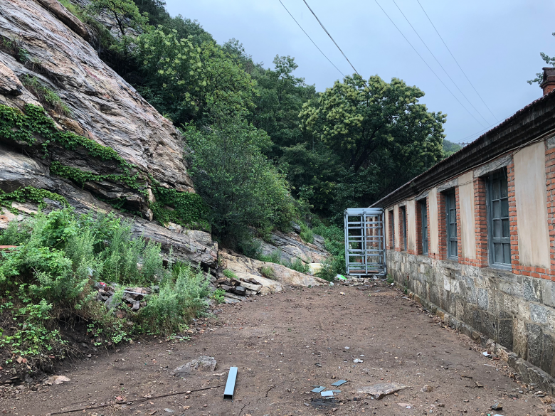
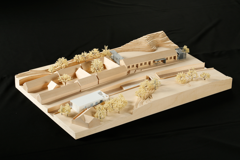
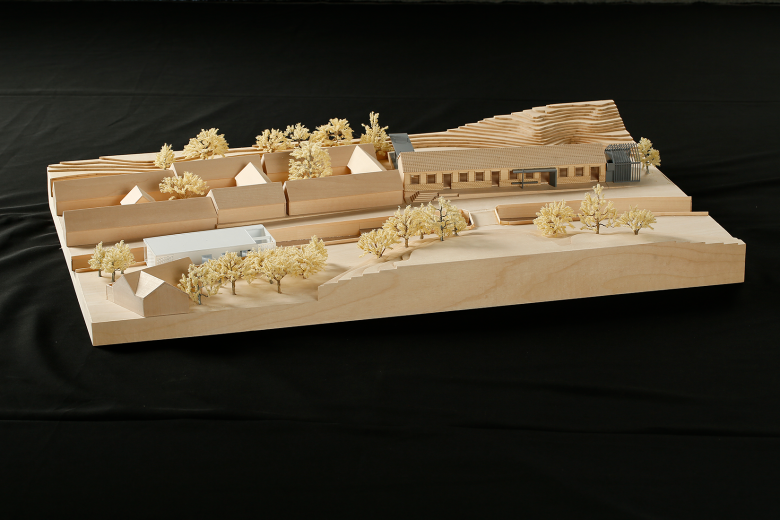
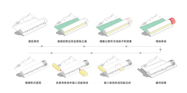
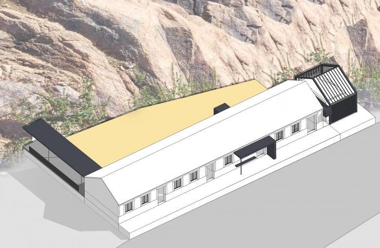
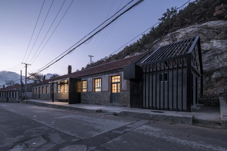
The Twelve-Roomed School of Beauty is an important part of Wangjiatuan Village overall regeneration project and one of the carriers of the theme of "Six Arts"(six most significant traditional Chinese arts compulsory for a Confucian scholar). It is a reconstruction project of an old building. The original building was a typical form of China’s Jiaodong residential building, with tile roofs and rubble outer walls, which was used as a rural primary school’s classrooms, but already idle before the reconstruction. Because of its twelve rooms, it’s called "Twelve-Roomed House" by local people. The original building was divided into three independent parts, each respectively with six, three and three rooms. These twelve rooms are arranged in a row along the street, forming the main street facade of the area and defining the main features of the village. The back of the building is adjacent to a cliff, and a triangular open space is formed between the building and the cliff. The shape of the cliff and the rock is steep and natural, with artistic conception of Chinese traditional aesthetics. On the east side of the building is the public toilet added in recent years, which has poor image and low utilization rate.
Because of its distinctive regional characteristics, well preserved condition, and good constructive quality, the design team hopes to appropriately transform the building on the basis of retaining the original architectural style, so that it can adapt to the new usage function, and with the temperament of the times. Based on the old, and blend the new into the old --- the coexistence of the new and the old is the design theme of the project.
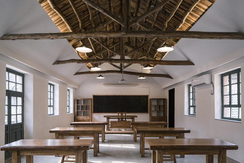
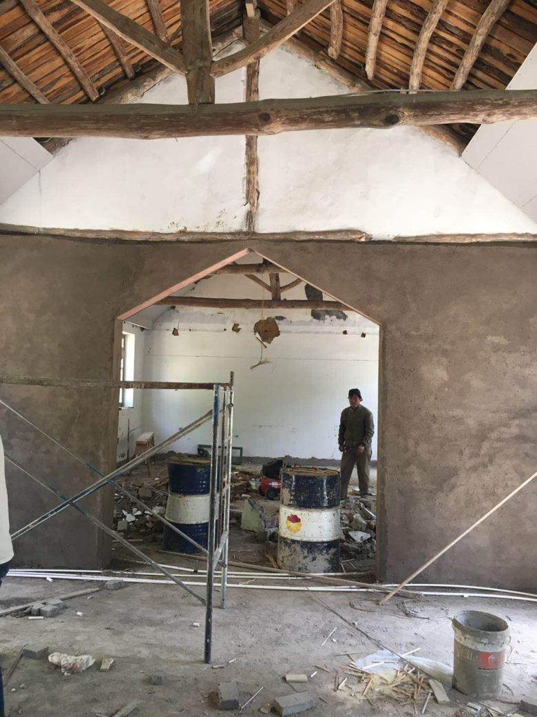
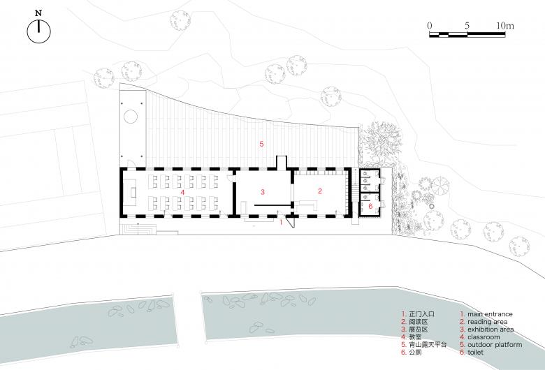
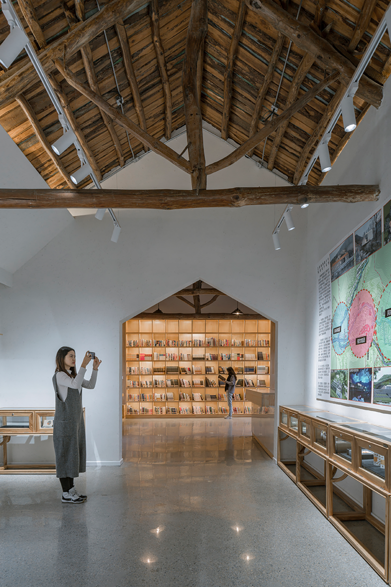
In terms of function, the new building will be used as a rural school of beauty. The originally isolated three spaces are opened and connected into a whole space which is divided into three parts: classroom, exhibition area and reading area. Among them, the classroom area is relatively private and separated from the exhibition and reading area by doors. The exhibition area and reading area are public areas of the new building, open, transparent and hierarchical, showing a welcome attitude to the public, while at the same time trying to retain the heavy residential characteristics of the original building.
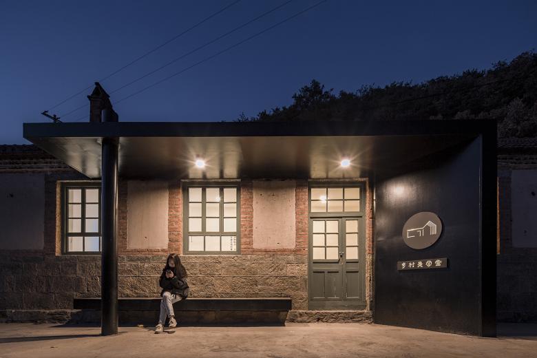
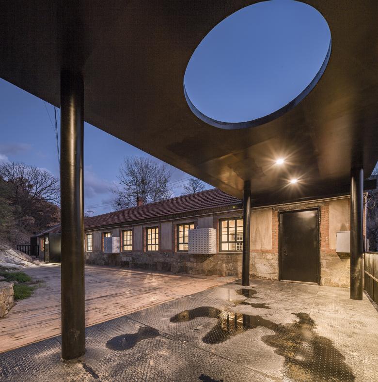
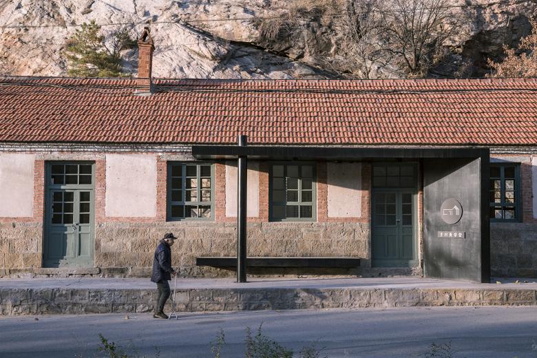
The streamline of the building has been teased according to the function. The main entrance, redesigned and defined, is arranged in the exhibition area. The designer uses black steel plates to build a semi open door. On the one hand, it gives the entrance of the building a landmark. On the other hand, the contrast between the old and the new further indicates two independent construction eras.
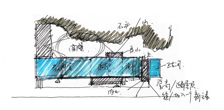
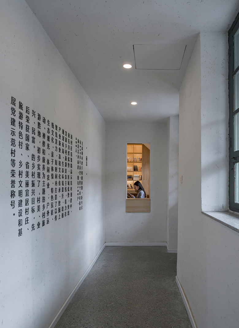
The exhibition area is not large with a relatively simple space. The processing mode of "white box" is more conducive to the layout and display of future exhibits. The "shadow wall" at the entrance not only appropriately combines the vision, but also provides support for the preface and exhibition wall. An opening is opened in the north exterior wall of the exhibition hall, which forms the opposite view between the original closed interior space and the rocks on the back of the building. As for materials, black steel plates are also used, which echoe the entrance on the south side, suggesting the penetration of new elements and the designer's intention to lead people to the rocks behind the building.
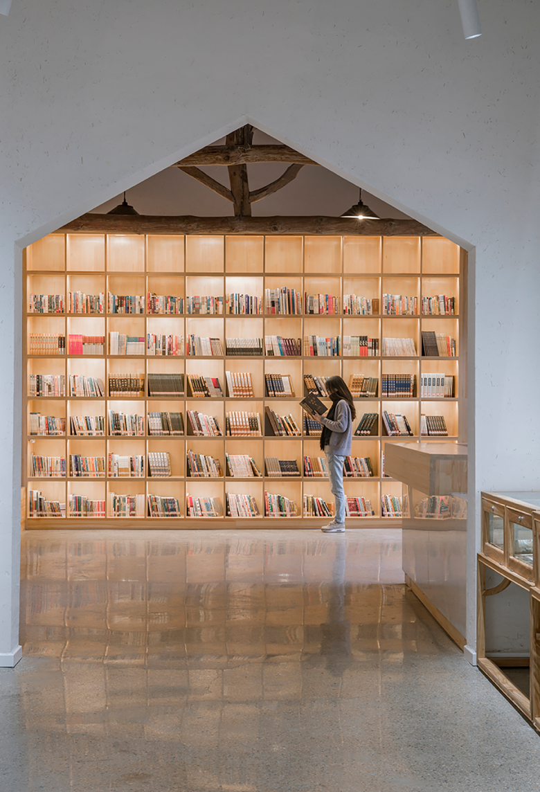
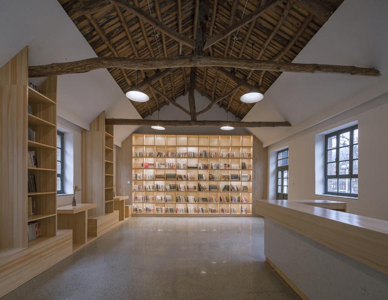
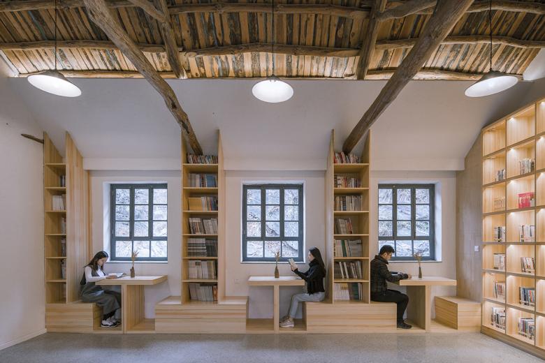
On one side of the exhibition area is the reading area, which is separated from the two areas by the mute entrance (entrance without door) in the profile of the double slope roof building. The reading area is equipped with bookshelves and exhibition tables, which are used to place books and cultural and creative products related to the area and Chinese culture. Combined with the original windows, the bookshelves and seats are designed together with the north wall, forming a matching relationship among people, building and objects. The roof of the original building is retained and partially exposed. Combined with the new indoor finish materials, the new-old contrast and light-dark contrasts are formed.
The external environment of the building is also an important part of the transformation. On the side facing the street, the irregular land between the building and the street is regulated, and a platform higher than the road surface is formed by using the elevation, on which the users can sit, rest, watch and talk on the platform, without being disturbed by the traffic.
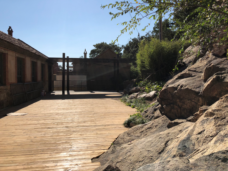
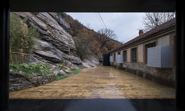
The outer space on the back side of the building has been a great discovery of this design project. Originally, it was a forgotten corner where villagers raised chickens. During the survey, the designer found that the rocks behind the building are of great aesthetic value, and the "gap" between the rocks and the old building forms a kind of natural "introspection" space, which conforms to the artistic conception of Chinese traditional self-cultivation. So the design cleverly uses the "back body" to level the ground slightly and lay anti-corrosion wood, while the mountain rocks completely untouched but displayed here as the opposite view for the "wall-facing meditation". A semi open pavilion perpendicular to the original building is placed on the west side of the back area as the boundary of the area and provides a relatively comfortable space for subsequent use.
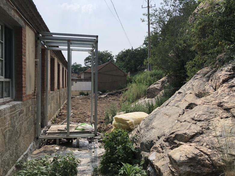
The public toilet on the east side of the original building has been one of the problems that must be solved in the design. It can't be demolished, yet is quite unsightly. What can be done? In the final design, square grids are used skillfully to cover the public toilet. The scale and form of the grid construction come from the profile of "Twelve-Roomed House" nearby, so the low and simple public toilet becomes the continuation of the school of beauty. The treatment of the black grids not only continues the scale of the main building nearby, but also the transformation method of the whole project. The gap between the toilet and the school is utilized where a stairway for one person only is placed. A small viewing platform with a slight protruding facade is connected with it, which provides a place for the public to climb, overlook and observe the roof of the original building at a close distance. The roof of the toilet is also used as a roof platform for temporary stop and rest, connected with the stairway and the viewing platform together, forming some kind of small external interest of the building.
Project Name: Twelve-Roomed School of Beauty
Location: Wangjiatuan Village, Zhangcun Town, Huancui District, Weihai City, Shandong Province, China
Client: Zhangcun Township Government, Huancui District, Weihai City, Shandong Province
Principal architect: He Wei
Design team: Chen long, Zhang Jiaojie, Sang Wanchen, Li Qiang, Wu Lijun
On site representative: Liu Weidong
Soft decoration consultant: Bai Bing
Construction area: 850sqm (incl. courtyard)
Design time: Dec. 2017 to April 2018
Construction time: 2018
Partner: Beijing Huaju Architectural Planning and Design Institute Co., Ltd
Photography: Jin Weiqi

- Architects
- 3andwich Design / He Wei Studio
- Location
- Wangjiatuan Village, Weihai, China
- Year
- 2018
- Client
- Zhangcun Township Government
- Team
- He Wei, Chen long, Zhang Jiaojie, Sang Wanchen, Li Qiang, Wu Lijun
- Cooperation
- Beijing Huaju Architectural Planning and Design Institute Co., Ltd
