The District Court in Alingsås
Alingsås , Sweden
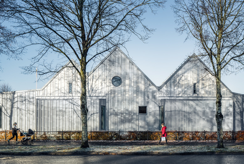
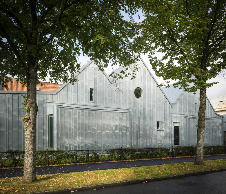
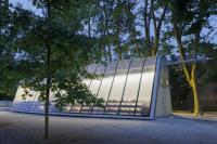
We have designed an extension to the Alingsås District Court from 1899, clad entirely in zinc. The jury for the PLÅT prize considered that it was so spectacular and unique that they gave us the award. What do you zinc?
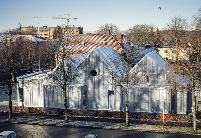
The District Court in Alingsås is a typical brick building from 1899, designed by architect Adrian Crispin Pettersson. It is placed a few of blocks from the town centre in a district lined with large villas and a school from the early twentieth century. In the second half of the 1950s a wing in brick was added. Just over half a century later it was time for the next extension, designed by Tengbom. A new epic date was added to Alingsås District Court’s history when we were awarded the PLÅT prize for 2016 for this extension in zinc. The yearly PLÅT seminar is a major event devoted to metal sheeting and architecture.
We became involved in the process a little way into the process when there already was a proposal on the table for a brick extension by architect Börje Falemo. The District Court was interested, however, in seeing alternative facade solutions and we were given the opportunity to present a design based on the proposed floor plan. Inspired by the surrounding buildings with their steep roofs, we presented a building with a saddle roof and curved bay windows. The plan was efficiently designed with thin walls on a small plot so is was a natural choice to bring down the zinc sheeting from the roof and use it as a thin raincoat on the outside.
“It was a shape that gave us both flat and steep roofs and we needed a material that could handle this, which led us to zinc as the roofing material. The old building is a solid thick-walled construction but the extension has thinner curtain walls. In this case, zinc sheeting worked well as exterior cladding. We could wrap up the building in a single material and it was obvious what was new and what was old,” says architect Fritz Olausson.
The result, a monolith in zinc, cannot be ignored. The sheeting accentuates the building’s shape and shows its own annual ring at the same time as it ages with dignity—much like a grey and wise judge.
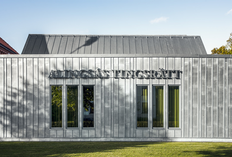
“Zinc is a fine old classic material which was used extensively as roofing during the last century. We simply brought in down onto the facade and it fits beautifully with the granite foundation wall which is a common denominator for both buildings,” says architect Magnus Almung.
Even if the shape can be thought expressive, the building is restrained in volume so as not to crowd the old building.
“The design represents our time, perhaps primarily thinking of the expressive volume. Monolithic buildings are typical these days with the same material for walls and roof. You can even see buildings without eaves. In the same way saddle roofs have come back into fashion in the past few years, something we didn’t see much of previously. The difference is perhaps that this building is constructed using craft techniques that are the same as at the beginning of the twentieth century. All the sheets are put up with great care and precision,” continues Olausson.
A living facade
The roof is clad with standing seam sheeting while the facades are covered with sheets of different widths placed in a set “random pattern” from base to ridge. Variation provides a living facade and by working with four different widths we could work round the predetermined window locations which were dictated by the internal functions. The entrance doors are also clad in zinc and fall into the pattern.
“Over time the facade will age as beautifully as the adjacent brick buildings when runnels and patination make their mark on the sheeting,” says Almung.
The grey zinc sheeting was chosen with care, not least for its robust and confidence-inspiring aesthetic. The Alingsås District Court stressed the importance of a dignified environment. The Court often makes sensitive and serious decisions—the surroundings must therefore both respect as well as inspire confidence in visitors.
“A good client is key to a successful result. The requirements of the Swedish National Courts Administration and the District Court were decisive for the building’s appearance,” says Olausson.
Metaphors and problem solving
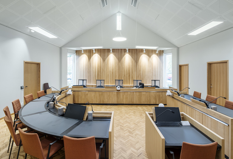
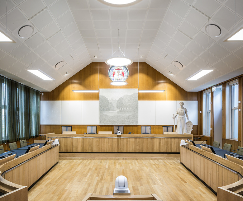
Raising the roof is not just a metaphor for being pleased, but was a real challenge that needed to be solved. High ceilings were not originally in the plans, but made it possible to locate two new courtrooms with a ceiling height resembling that of the large courtroom in the original building. Ceiling height in the courtrooms was a hobbyhorse on which we were not willing to compromise. There was some discussion of lowering the ceilings to improve the acoustics and recording possibilities in the rooms. But instead it was a nut for the skilled acousticians to crack together with the sound and light engineers. Otherwise there would have been a battle between the building’s exterior and interior—a situation we dearly wanted to avoid.
Designed-in stories
Another aspect which the presiding judge liked was a building that told stories. Tengbom has also designed the interior and Carl Olofsson saw an opportunity to incorporate the courthouse’s history in the interior. There was an existing decision that the courtroom doors should be of walnut with elements of oak. Olofsson’s solution was a striped pattern with references to the five key years for the building. At the bottom of the doors is a code with lines that form the year. Tengbom has a frame contract with the Swedish National Courts Administration and designs interiors for courts throughout Sweden. The interiors in Alingsås District Court are designed by Karin von Geijer.
“We started in both the original and new buildings when we designed the courtroom furniture. The rooms are characterised by wood-panelled walls and floors. We wanted to get a feeling that the tables were growing out of the wooden floor. It was like a jigsaw getting the tables right bearing in mind the mass of technical equipment such as cameras and recording equipment that they contain. The interiors need to be beautiful and dignified since life-changing events will take place here. The rooms must be perceived as neutral as much by the public as by the parties and witnesses,” she says.
The generous ceiling height made even higher demands on the technical installation, which influenced the furniture. The courtrooms have a lovely sense of space which must be reinforced, not supressed, by the furniture required. One solution to this, among others, is office chairs with semi-transparent backs which make the back wall behind the Court’s bench visible. The wooden frontals of the furniture have references to the facades in brick and zinc. Another unusual detail in the context of courtrooms is that they have direct daylight. If hearings are in camera then curtains can be drawn across the windows.
Now and then
The jury for the PLÅT prize stressed among other things that Alingsås District Court is “a building that arouses feelings (…) The designers have been insistent in their choice of material which shows a very good understanding for materials. A familiarity which has provided the finest details as well as space for great craftsmanship. Alingsås residents should confidently follow each annual ring on this solid building.”
The courthouse started to be used in November last year and will be officially inaugurated in September 2016. Currently renovation of the older parts is in progress and construction of a further extension in zinc to the older building’s large courtroom.
