Office of New Silk Road E-Commerce Company
Xi'an, China
New Silk Road Office — A space where colour palette coordinates with form
In the modern home, colour harmonies which are definitely architectural and yet suited to the natural taste and needs.
--
Besides a well-known architect, Le Corbusier is also a chromatist. He emphasized many times that colors played an important role in space. Based on his masterpiece Architectural Polychromy, he summarized two colour collections in 1931 and 1959, with 63 colors arranged in different spatial moods. In the article “Purism” he co-authored with Amédée Ozenfant in 1920, he mentioned that shades could be arranged hierarchically and defined the first range of colors as “la grande gamme”, which consists of hues such as ochre, red, brown, white, black, blue, etc. and of course their derivatives. According to Le Corbusier, those shades are stable, powerful and capable of holding the canvas because they can be mixed harmoniously; those are essential colours that can be utilized in all great eras; and those are the ones necessary to express the sense of volume in painting.
Workspace in the new era is a symbol of humanized renewal, which brings pleasant aesthetic experiences and provides an energetic venue that inspires employees. Le Corbusier's artistic theories are often applied to working space design nowadays. The project is a corporate office situated on the 33rd floor of Maike Center, Xi’an High-tech Industries Zone, China. Through adopting a brand-new design approach, the chief designer Dang Ming turned the workplace into an artwork, and injected modernism and humanism into the space to create a unique ambience.
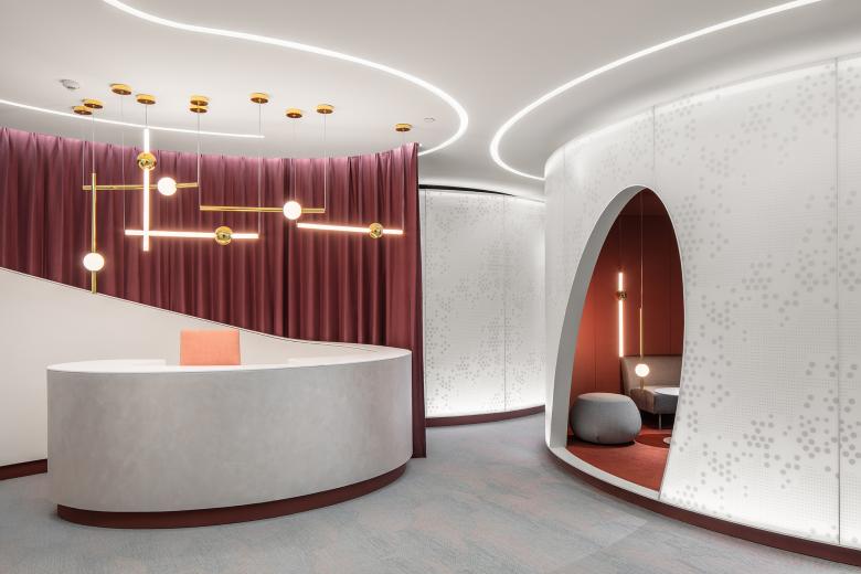
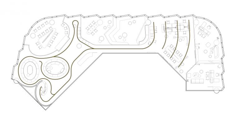
The architectural space is static, but users’ visual and emotional experiences vary from scene to scene. The reception area presents the first impression, with curved lines producing a futuristic feeling. Symbolizing the infinity of creative thinking, the vibrant curves make the space more playful and enrich the expression of spatial moods.
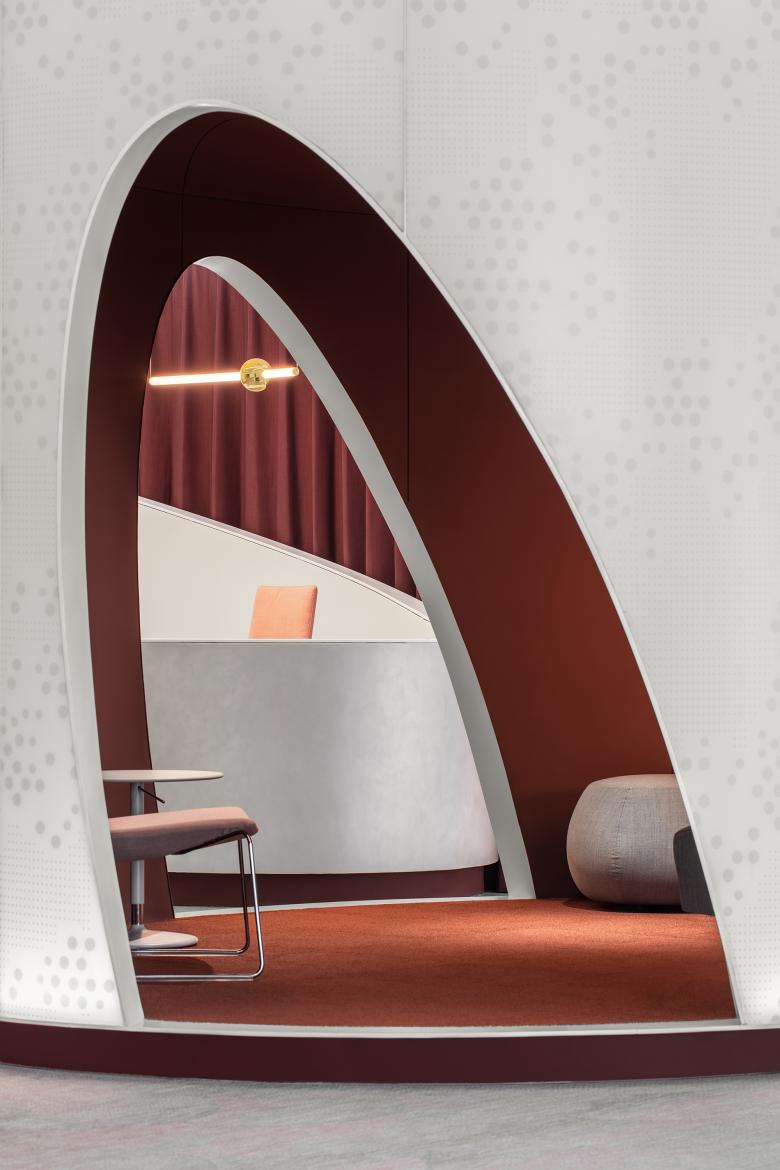
The spiral reception desk is combined with the crimson curtain, together generating dramatic visual affects while also concealing the equipment room behind.
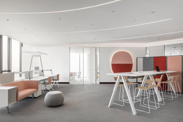
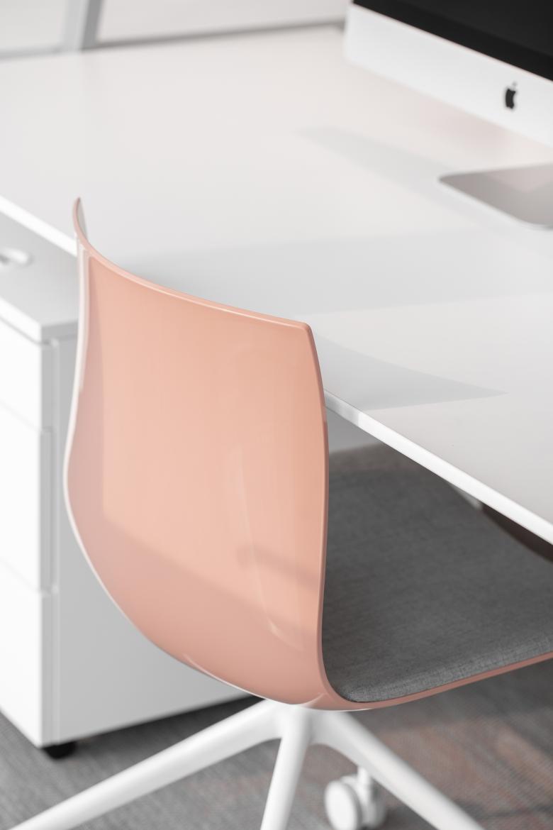
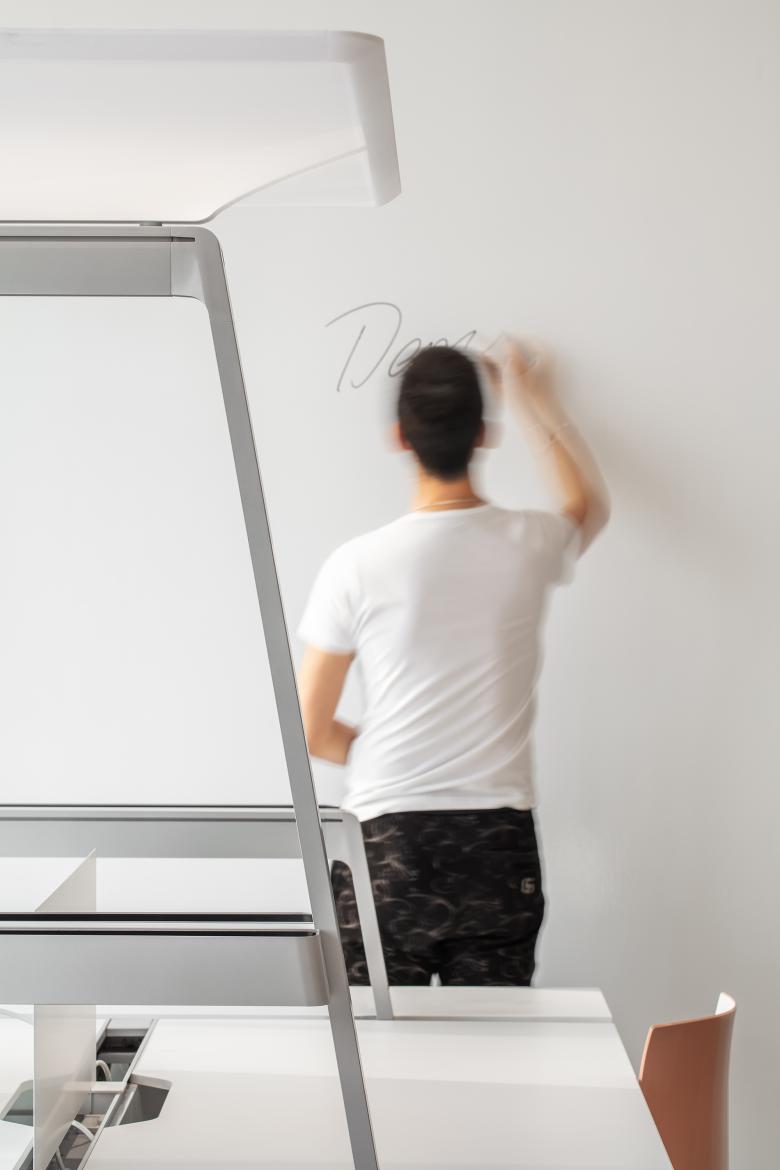
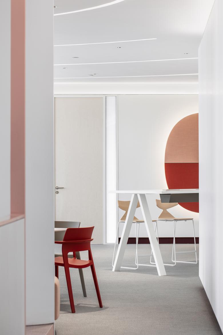
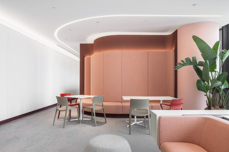
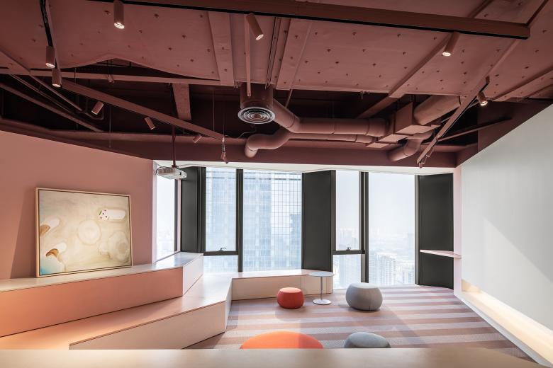
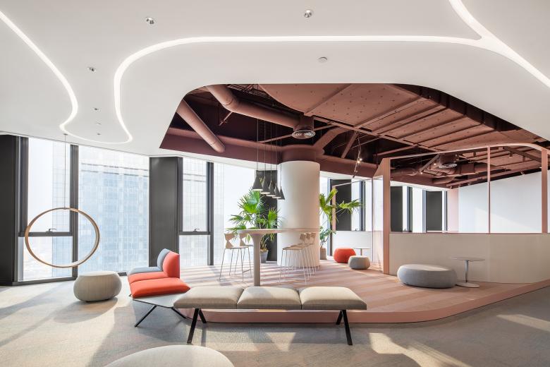
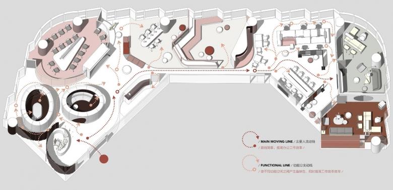
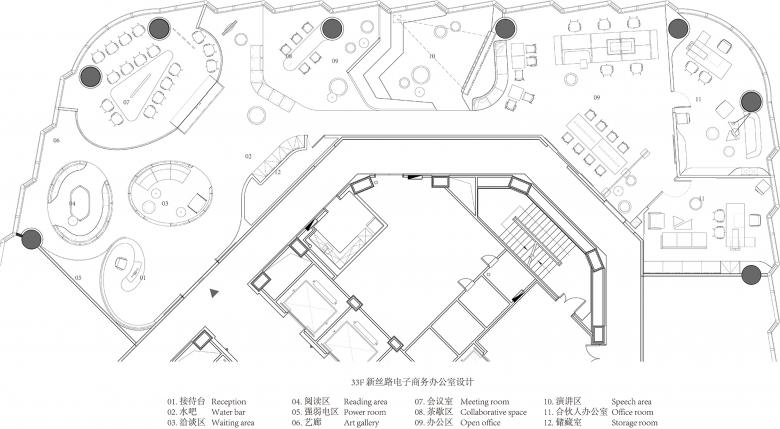
Different from traditional companies, the client is an electronic business firm, which requires greater flexibility with few fixed work stations. Considering this, the design team didn’t adopt conventional cubicles, but instead created several independent functional areas, which can constitute a large holistic gathering space when combined together. At the same time, the team utilized red, white and pink tones to form a multi-layered workspace based on the color theory of Le Corbusier.
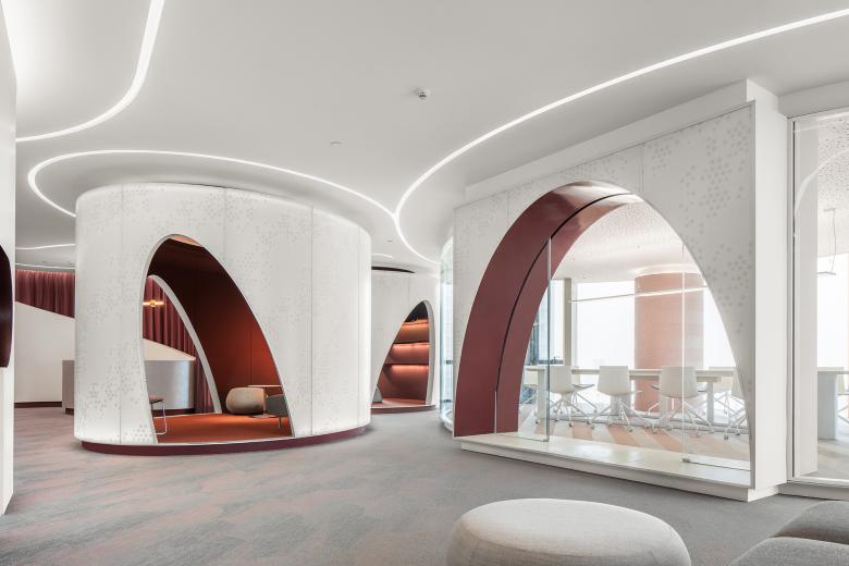
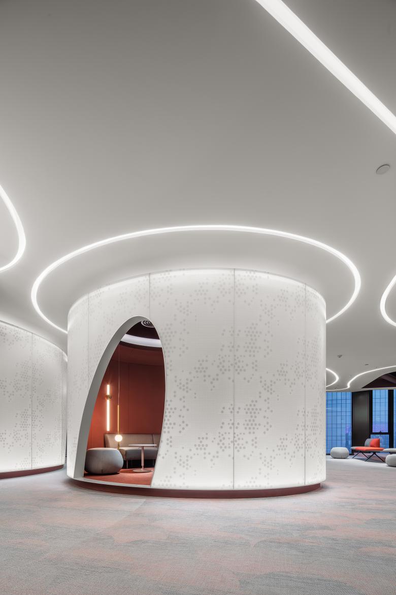
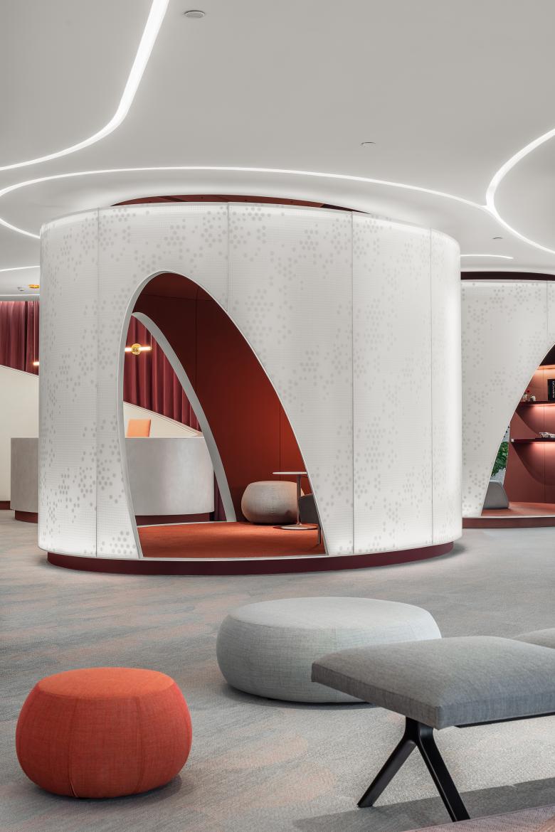
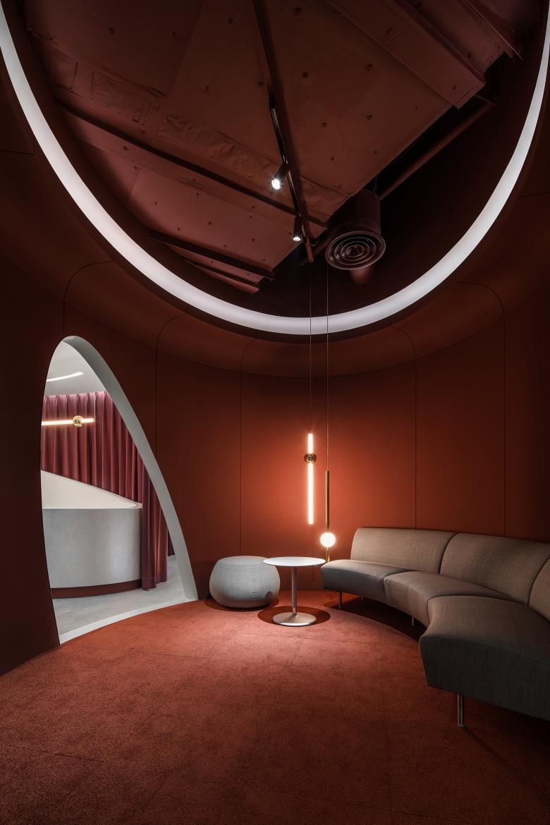
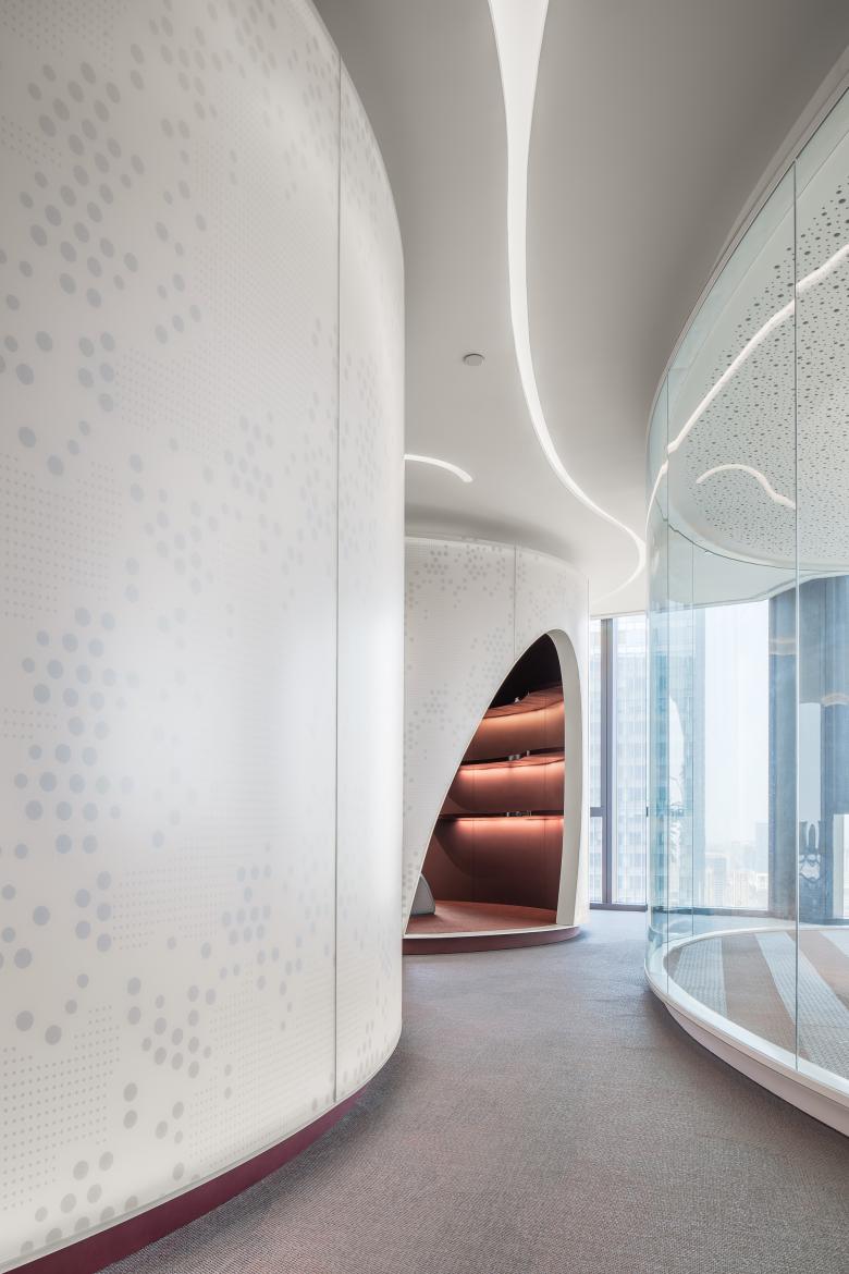
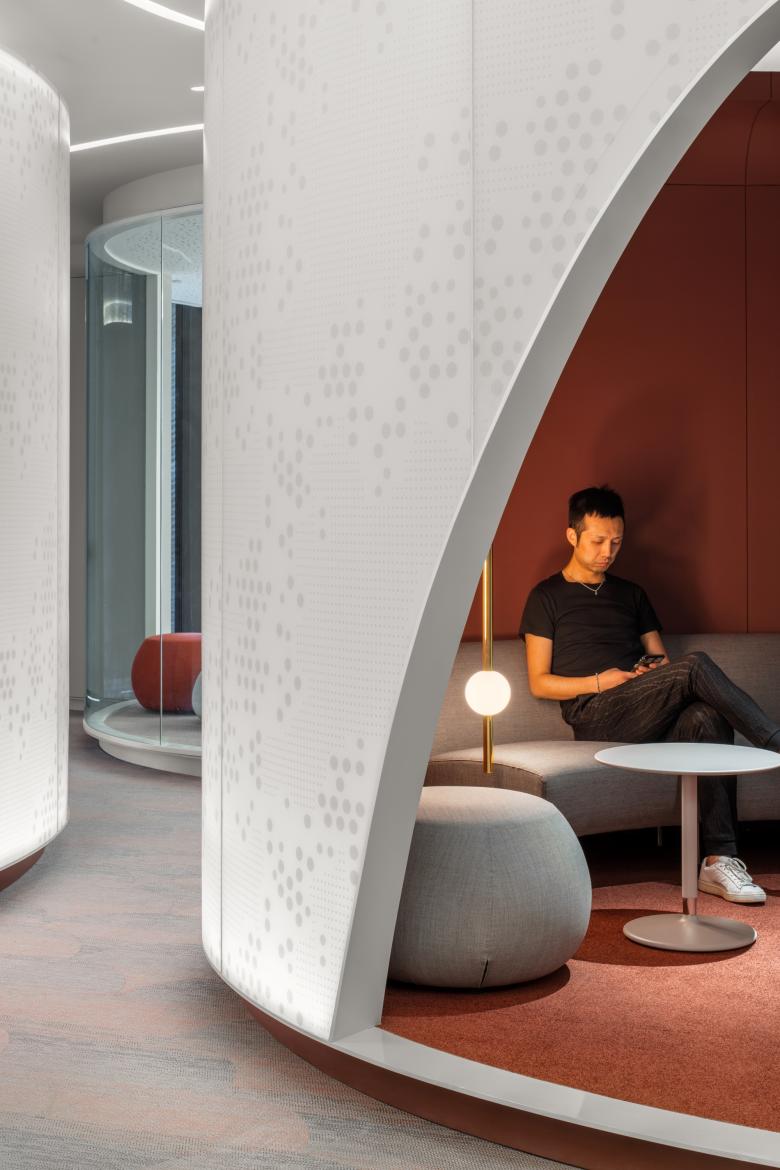
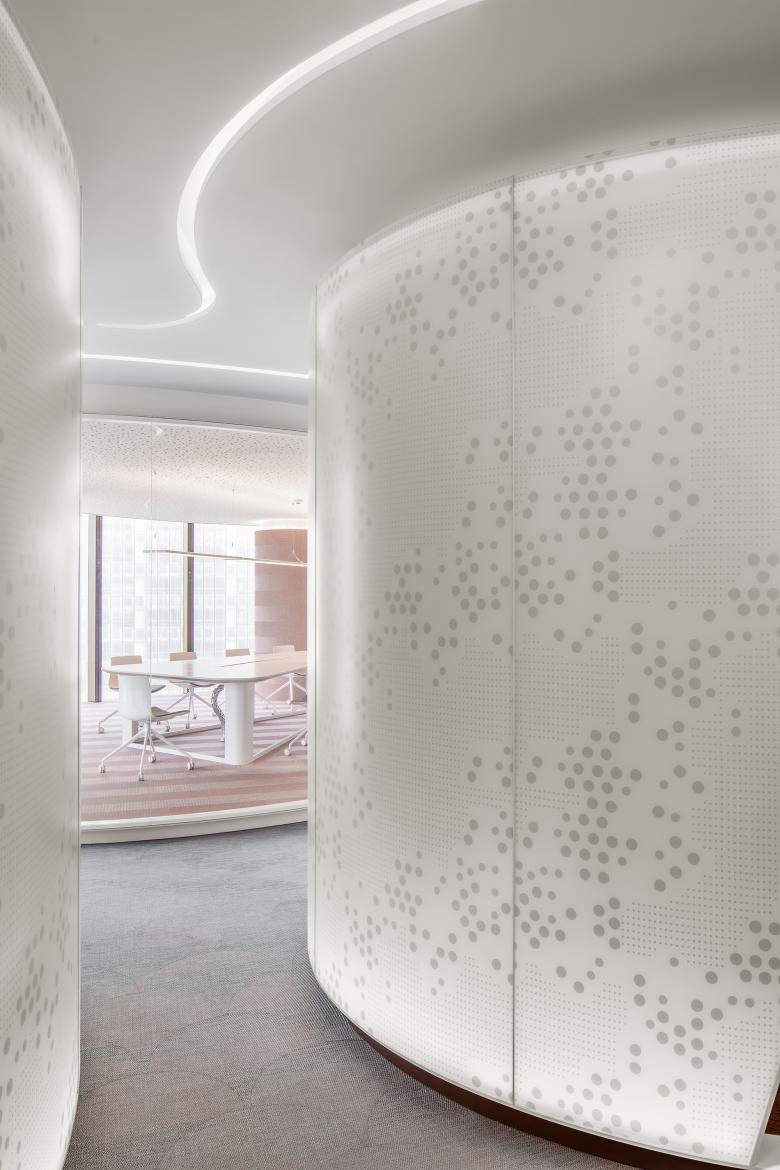
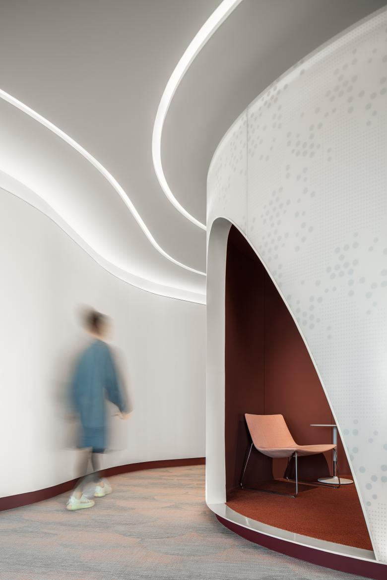
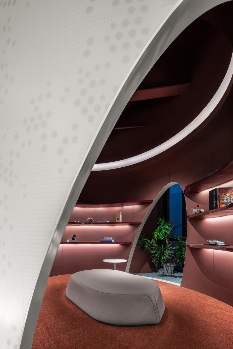
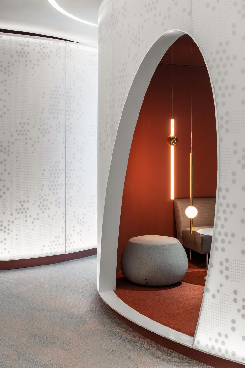
Inside the reception foyer, there are two eye-catching cylindrical structures, which respectively function as waiting area and reading area. Featuring white exteriors and red interior finishes, the volumes take on a futuristic and stylish form. The designers hope to calm people in these two semi-enclosed tranquil spaces before they walk into the office area.
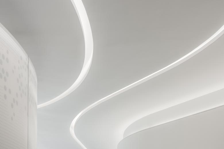
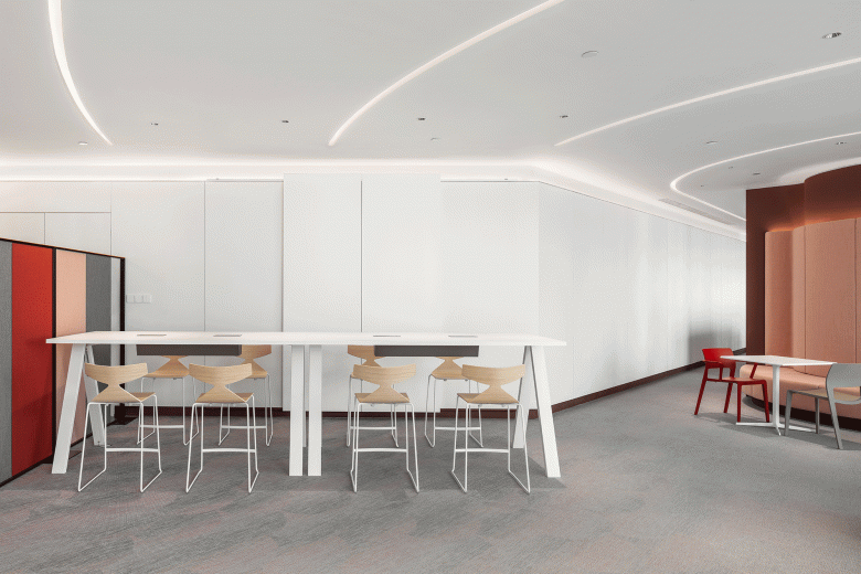
Embedded ceiling lights flexibly run throughout the space in accordance with the circulation and spatial structures. Characterized by folding and sweeping forms, the lights weaken the straight lines and rectangular structures of the space, and realize natural transition between different areas.
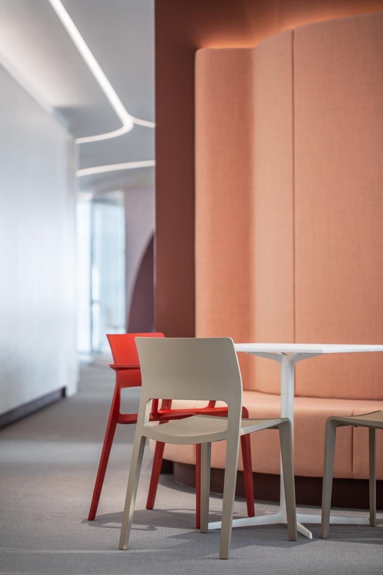
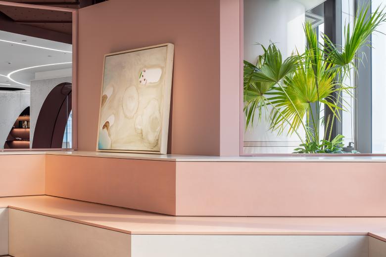
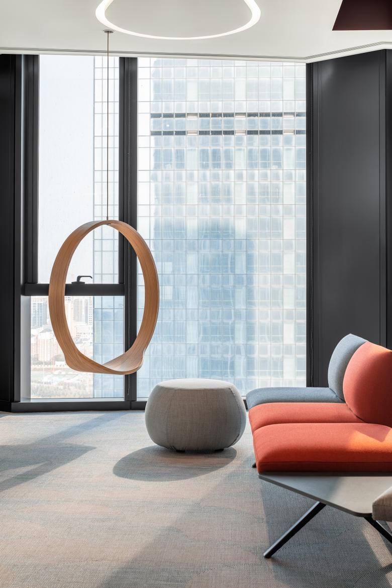
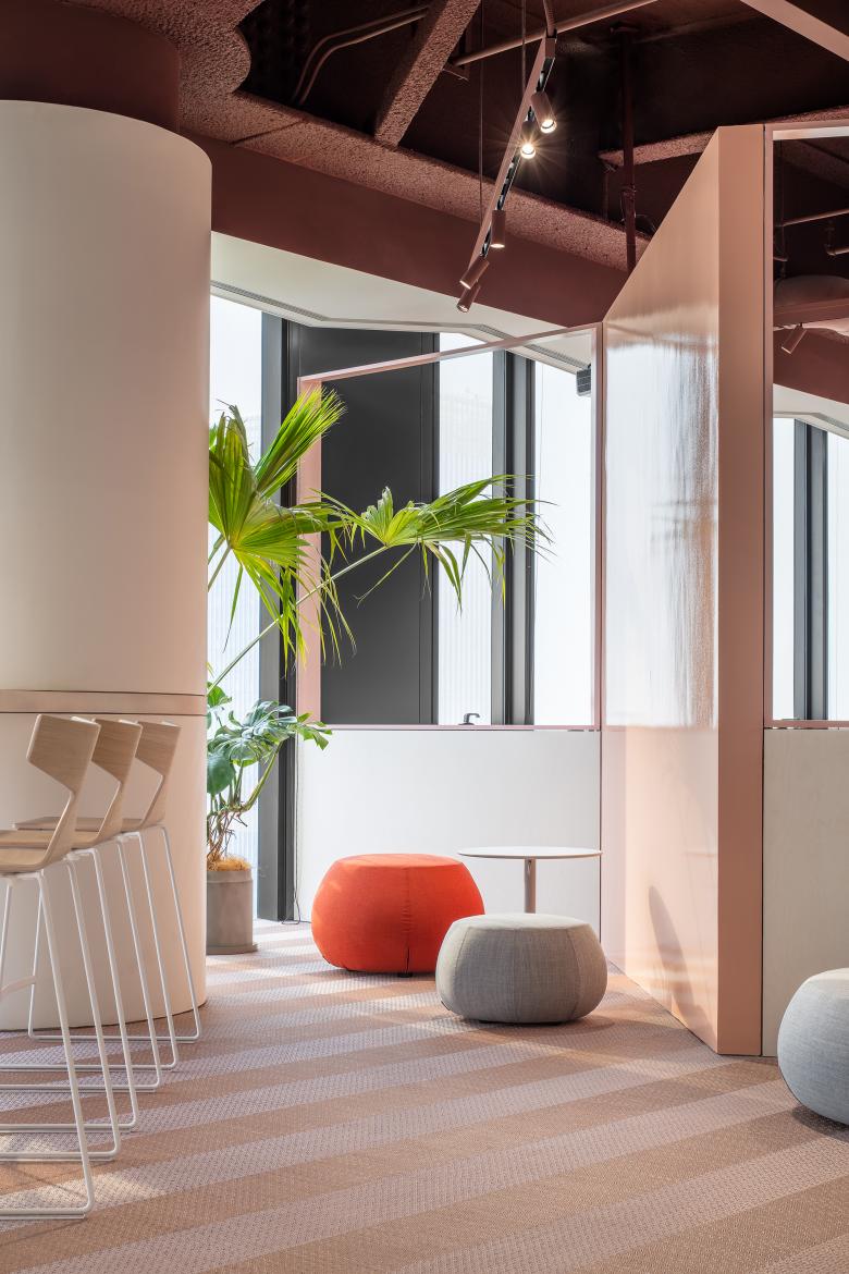
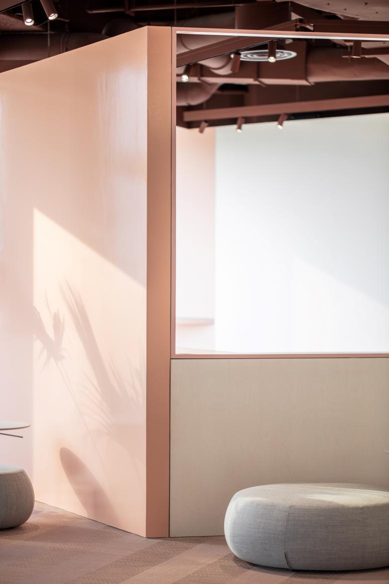
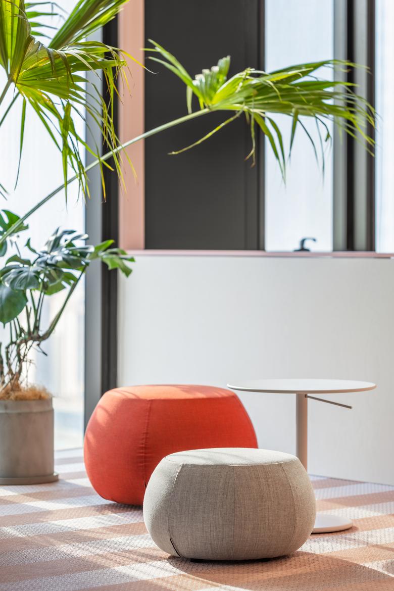
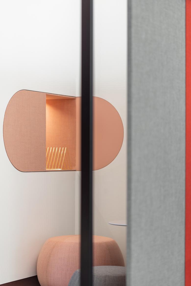
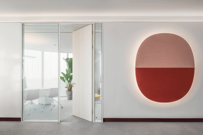
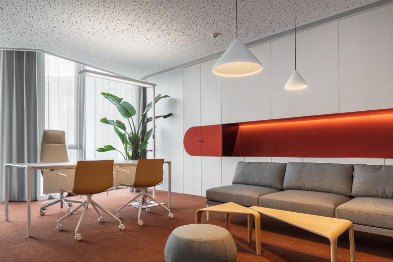
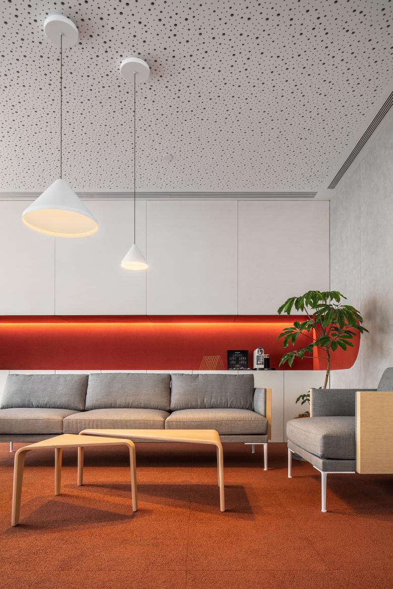
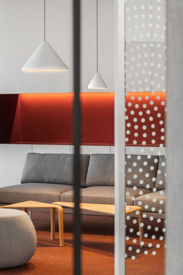
Color palette plays a prominent role in the design, functioning as the clue that indicates the transition of different areas. White is the prominent tone, which dominates different volumes in different scenes; dynamic red hue enlivens the spaces and creates dramatic visual effects; and the rest hues such as pink are used to coordinate the ambience. The combination of different colors contributes to shape the overall spatial form.
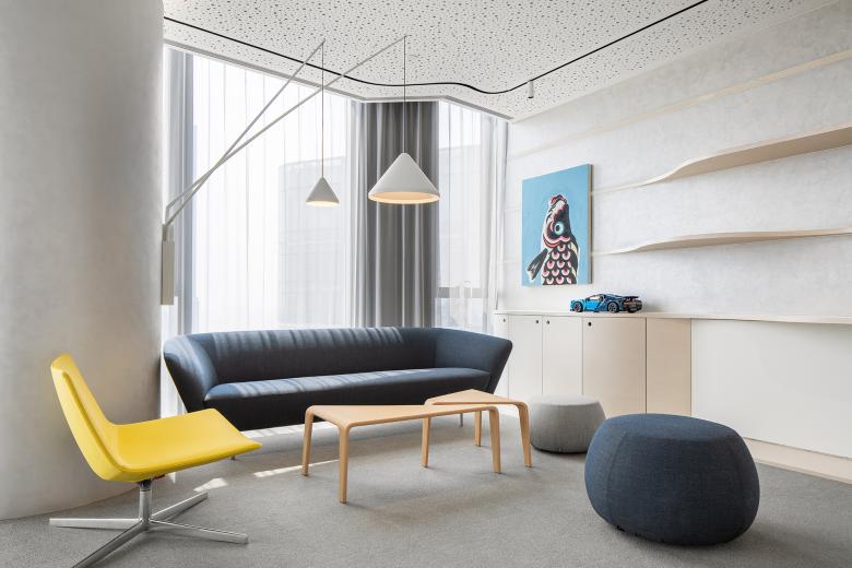
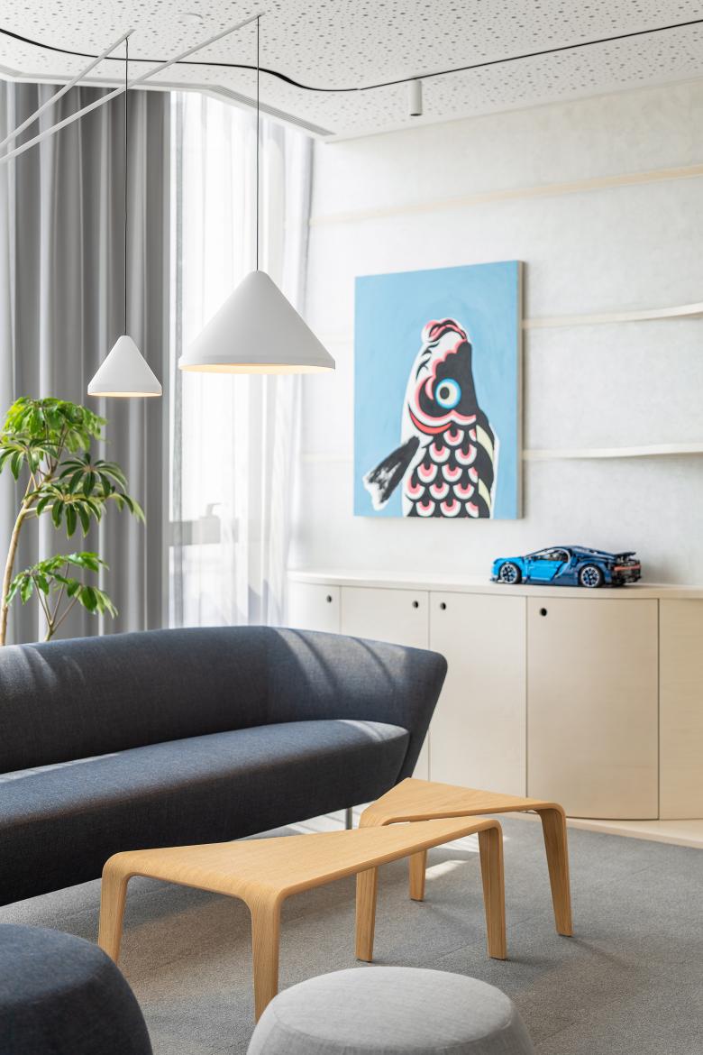
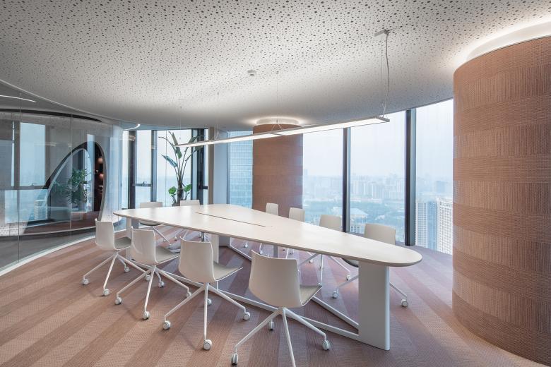
The office rooms of the founding partners are set at the innermost area. The external wall adornments utilize sound-absorbing materials, which are conducive to ensuring a tranquil working environment in the rooms. The simplistic furnishings and furniture as well as green plants make the interior comfortable and tasteful.
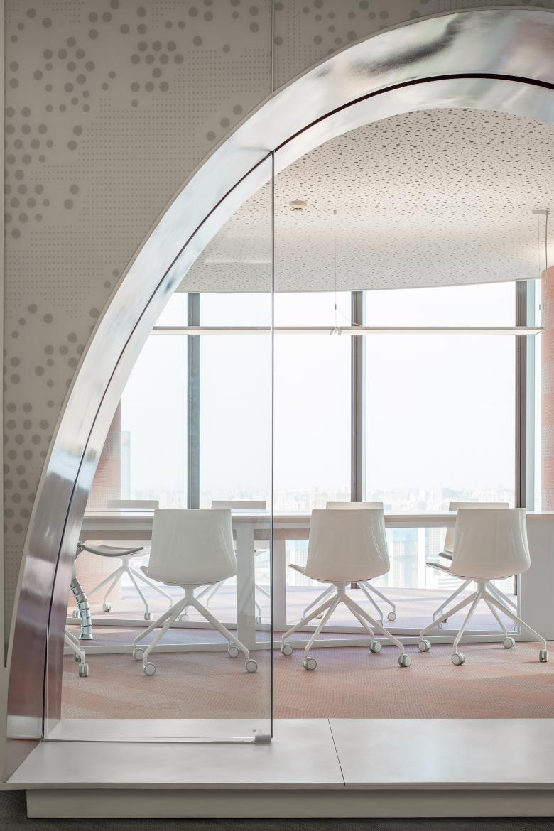
The ceilings in the office rooms and meeting room feature white perforated aluminum panels, which create a flexible spatial ambience and generate soft and lightweight visual effects together with the lighting.
This is an open, free and artistic workspace, which enables the employees to find appropriate working environment at anytime. As companies are becoming more diversified, it requires personalized and high-end offices. A workspace design that can provide quality socializing environment and hardware and software services will become a future trend.
- Architects
- Hong Designworks
- Location
- Xi'an, China
- Year
- 2019
- Design firm
- HONG Designworks
- Chief designer
- Dang Ming
- Design team
- Wang Qing, Yan Zhen, Wang Haichuan Detailed design: Xie Xu, Ao Qinge
- Construction firm
- SDCIC Construction Group Co., Ltd.
- Start time
- August 2018
- Completion time
- April 2019
- Area
- 650 m2
- Main material suppliers
- Bolon, Milliken, Kvadrat, JEB, novacolor
- Furniture & lighting fixtures
- Arper, Steelcase, LaCividina, Lee Broom, Waldmann, Vibia
