Yanjiao Campus Library of Central Academy of Fine Arts
Beijing, China

Reconstruction of Yanjiao Campus Library of Central Academy of Fine Arts
Space production stimulates knowledge and art production Reconstruction of Yanjiao Campus Library of Central Academy of Fine Arts
Background and problem: the contradiction between old space and new use demand
The project is located in the Yanjiao campus of Central Academy of Fine Arts, Sanhe City, Langfang City, Hebei Province, China. Yanjiao campus covers an area of 136667sqm. The old teaching building where the library is located is reconstructed on the basis of an uncompleted building, so the pattern and space are limited by the original building, which is not ideal.
The library, formerly known as the Library of the Affiliated Middle School of the Central Academy of Fine Arts, was founded in 1953. In 2006, as the Affiliated Middle School of the Central Academy of Fine Arts settled in Yanjiao, it became a campus library. In recent years, with the School of City Design settled in Yanjiao campus and the number of students and teachers increasing, the problems of the library accumulated all the year round have gradually emerged, which can be summarized as follows:
1.On the first floor of the teaching building, the library, the art gallery and the laboratory of the School of City Design intertwine with each other, resulting in the use spaces of the three units being discontinuous and streamlines crossing and interfered with each other.
2.The main entrance of the library is very hidden. One has to walk through a long corridor with poor lighting to find the entrance at the end, which is also quite narrow.
3.The spaces of the library are scattered, which are located on the first and the second floor of the teaching building, not directly connected. After taking books from the circulation library, readers have to go through the external corridor or outdoor space to reach the reading room on the second floor.
4.The reading room in the southeast corner of the second floor of the library has a height difference due to the influence of the lower space, yet without reasonable organization in the original room, resulting in a waste of space.
5. The interior of each space is in urgent need of repair and purchase of new furniture because of disrepair for a long time, as well as damaged floors and ceilings, old furniture and insufficient lighting.
In short, after many years of service, the library has become more and more old-fashioned, and has been unable to meet the expectations and positioning of the school and students for a modern library in the new era. A systematic and comprehensive transformation is imperative.
Task and design concept: Four-in-One with "collection, exhibition, reading and enjoyment"
In the autumn of 2018, under the personal command of the school leaders, the renovation and design of Yanjiao Library officially began. The school hoped to upgrade the library of Yanjiao campus to meet the needs of the new library within the limited budget. As a teacher of the Central Academy, the architect accepted the task of designing a new library for his alma mater. This is both a responsibility and an honor.
After on-site investigation, the architect put forward the idea of planning and transforming the library and the adjacent art gallery together, that is, the library and the exhibition hall should be considered as a whole, and jointly serve as the base of knowledge and art production for the future of the academy, also with the four-in-one concept of "collection, exhibition, reading and enjoyment". The so-called "collection" means here mainly books collecting. As a base of knowledge production, books are knowledge and the basis of all extended functions. Therefore, the new library must provide the best conditions for the collection of books. "Exhibition" means both presenting and exhibiting. Whether it is the library's books or the exhibition hall, the new space should have enough openness and tolerance to carry different forms of display and exhibition. “Reading” means books reading, one of the most basic functional requirements of the library. The design hopes to provide teachers and students with more spacious and comfortable reading space and more diversified reading experience. "Enjoyment" means both enjoying and sharing. In the view of the architect, the new library should be a space that readers are willing to enter. It should not be rigid, where readers can even read books lying down. At the same time, the library should be open and public. It can not only be linked with the exhibition hall to hold related extended reading events next to the exhibitions, but also be used as a special classroom, seminar room or lecture hall.
Layout and streamline: reorganizing the boundary and shaping the new entrance of the library
The reconstruction design of the library started from adjusting the layout and combing the streamline. Firstly, the architect moved out the laboratory of the School of City Design (originally belonging to the exhibition hall of the art museum) which was inserted between the library and the exhibition hall of the art museum on the first floor, returned part of the free space to the art museum to continue to be used as the exhibition hall, and assigned the other part to the library to transform it into a circulation reading room. The new circulation reading room is directly connected with the original circulation library, which solves the awkward separated situation of the library from the reading room before the transformation. Then the offices of the library and the exhibition hall of the art museum are merged to form a joint office mode. The layout of the functional rooms on the second floor remains unchanged. So do the functions of the two reading rooms on the south side. And the computer room on the north side is canceled and changed into a material reading room jointly built by the School of City Design and the library.
The original entrance of the library was hidden in the depth of the corridor, which was difficult to find and not conducive to the attributes of the library as a public space. The architect rearranged a new, direct entrance to the library. The new entrance is located in the southwest corner of the teaching building where the library is, adjacent to the west secondary entrance of the gallery. It used to be a semi outdoor corridor where sundries were piled up. The architect had the sundries cleared away, and the corridor remained semi outdoor. However, expressive new materials and colors were introduced to create a new entrance image of the library.
The appearance of the new entrance is simple and bright. The door head and the new approach wall are made of white perforated plate, forming a geometric block combination with the old building; The inner wall of the entrance uses orange aluminum gusset plate, and the floor connected with it uses epoxy resin of the same color. In addition, the ground extends outward, forming a welcome gesture similar to the "red carpet". The hazy white perforated board, together with the bright orange, not only connects with the gray and white facades of the original building, but also forms a strong symbolic image.
The trees in the original outdoor field are carefully reserved, forming the relationship between the figure and the background with the newly added architectural elements. In fine weather, the shadows of the trees will fall on the orange ground and the facade of the white perforated board, forming a mottled pattern, which echoes with the tree silhouette on the perforated board. The architect hopes that the new entrance with strong visual symbols can bring clear imaginability and communication power to the library.
Hall: a new space core and a new hub linking libraries, art galleries, exhibition halls and other teaching spaces
Connected with the new entrance, the hall is the hub linking the library on the first floor, the exhibition hall of the art museum, the reading room on the second floor and other teaching spaces. It is also the main public place in this area in the future.
The hall is transformed from the unused space of the original building. There was an evacuation staircase, with 8 structural columns, which has a great impact on the space and visual experience. As the staircase and columns must be retained, the architect divided the hall into two parts: the front hall and the back hall, hiding the evacuation staircase and structural columns between the partition walls.
After the transformation, the front hall is a trapezoidal high space. The circulation library is to its north side, the gallery exhibition hall to its south, and the main facade of the front hall (the partition wall between the front hall and the rear Hall) to its east. The passageway of the new entrance of the library is connected with the front hall from the west. In the future, the front hall will be the main space for the opening ceremonies of exhibitions, and there can also be many public events. The architect tries to make the walls of space as pure as possible, so as to keep the space intact, which provides the greatest possibility for subsequent use. The color tones of the whole space are mainly white and gray, and only orange of corridor can be seen at the west entrance. The walls on the second floors of the east, south and west side have windows, which not only ensure the lighting of the space behind the windows, but also keep the moderate eye contact and penetration between the spaces.
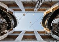
The roof is the most active place in the whole space, and the architect uses the Voronoi diagram algorithm to generate the shape of high grillings. The high grillings adopt white acrylic material, which can shield the roof structures of the roof under the premise of sufficient sunshine. In addition to its own visual richness, Voronoi diagram high grillings also add "variables" to the hall space due to the changeable light and shadow effect formed by sunlight refraction and reflection. At different times of the day, sunlight and shadows are scattered into the hall space in an "unpredictable" way, which affects the atmosphere of the space and makes people's feeling of the space constantly change and keep fresh.
The back hall is a little smaller than the front hall, which is also a trapezoidal space. In use, the back hall is of more rest and auxiliary functions. Several groups of leisure sofas are placed in the back hall space, and the low space next to the staircase of the original building is used to set the bag storage place. The treatment of the walls and roof of the back hall is the same as that of the front hall, while the only difference is the facade used to hide the staircase. Instead of completely closing the staircase, the architect uses perforated plates to form a narrative interface. By means of graphic design, a tree pattern is presented, which implies the meaning of education: "cultivating people for a hundred years like cultivating trees".
Reading room: make full use of the space property of the original building to create abundant and relaxing reading experience.
The reading room of the library is the place where readers stay for the longest time. So, the architect hopes that the reformed reading room will show an open and relaxing atmosphere on the premise of meeting the basic functions.
The transformation started from the ceiling and the ground. The ceiling uses a dark gray metal mesh to hide the messy structure of the original building, as well as the newly added air conditioning, lamps and pipelines. The dark gray also echoes with the metal components of the original bookshelves of the library. According to the requirements of horizontal illumination, the new white LED lamps are embedded in the metal mesh in matrix mode, and the outer surface is flush with the metal mesh. The terrazzo floor is simple and easy to use, which can also meet the requirements of large load of library buildings. After upgrading the basic functions, the architect uses different ways to transform different spaces. One of the most characteristic is: the circulation reading room and the outer courtyard on the first floor, and the terrace reading room on the second floor.
The new circulation reading room is a regular rectangular space. There is an L-shaped inner courtyard on the west and south sides of it, where a lot of bamboos are planted. Sheltered from the wind, bamboos grow luxuriantly and remain evergreen all the year round, making a very artistic place in the teaching building. The architect maximizes the transparency of the south facade of the reading room by using the mode of whole floor glass with glass ribs to ensure sufficient sunlight into the room while the courtyard landscape is introduced into the room at the same time. The wall on the south side of the courtyard is the north wall of the exhibition hall of the art museum. The original wall has uneven windows, which is not conducive to the display of art works, but also makes the background of the bamboo landscape slightly messy. The architect had the windows on the wall blocked and the facade painted white. This kind of treatment creates a good figure-ground relation of the bamboo forest: from the circulation reading room, readers can see that green bamboo, white wall and gray shadow together build a picture with literati flavor.
The biggest problem of the former terrace reading room on the second floor is that there was a height difference of more than 1 meter between the north and south sides of the room, and the roof also presents a fold that was lower in the north and higher in the south. The reason for this phenomenon is that the downstairs space was the exhibition hall, the upstairs space was the lecture hall, and the floor slabs were both elevated on the structure. In addition, due to structural reasons, the higher part of the south side of the room could not bear excessive load, so it had been vacant for a long time.
The architect believed that the height difference in the space could provide a fulcrum for the diversified reading experience. After communication with the user, a cascading terrace was finally created. The height difference and size of each elevation of the terrace are rich and varied, forming all kinds of "micro platform". The surface of the steps is made of wood, with soft cushion and backrest, which provides students with different reading possibilities. The reading room can also be used as a terrace classroom, and the stairs become seats smoothly. In addition to the stairs, the reading room also provides readers with conventional reading tables, chairs and sofas, so as to ensure different use needs.
Conclusion: space production stimulates the production of knowledge and art
The whole transformation does not pursue luxury. Most of the actions come from the answers to the original questions of the building and the responses to the essential functions. But at the same time, the architect also hopes that this transformation can bring some new atmosphere to the library of Yanjiao Campus, that is, the so-called "with the help of space production, to stimulate the production of knowledge and art"
After the reconstruction, the library has been reopened in May 2020, where academic salons and seminars have been held. The role of knowledge and art production has been initially revealed.
Project name: Reconstruction of Yanjiao Campus Library of Central Academy of Fine Arts
Location: Sanhe City, Langfang City, Hebei Province
Owner: Yanjiao Campus Library of China Central Academy of Fine Arts
Lead architect: He Wei
Design team: Chen Long, Hua Xiaoying, Li Wanting, Shen Xingyi(intern), Ji Ran(intern)
Construction drawing design: China Academy of Building Research
General director of detailed design: Sun Yan
Architecture: Li Li
Interior architecture: Ma Guohui
Structure: Guo Shen
Heating and ventilation: Chen Yimei
Electrical engineering: Ning Ke
Construction: Jiangsu Jinxiang Construction Engineering Co., Ltd.
General construction area: 2900sqm
Design time: 2018-2019
Completion time: April, 2021
Photography: Jin Weiqi


- Architects
- 3andwich Design / He Wei Studio
- Location
- Beijing, China
- Year
- 2021


