TBA / Thomas Balaban Architecte
Holy Cross House
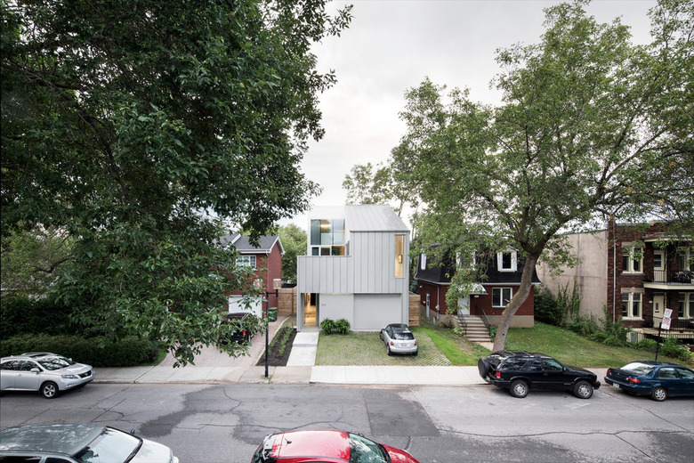
Located in the city's up and coming Southwest neighborhood this 300-sm detached house hides a rich spatial complexity behind its tough working class façade.
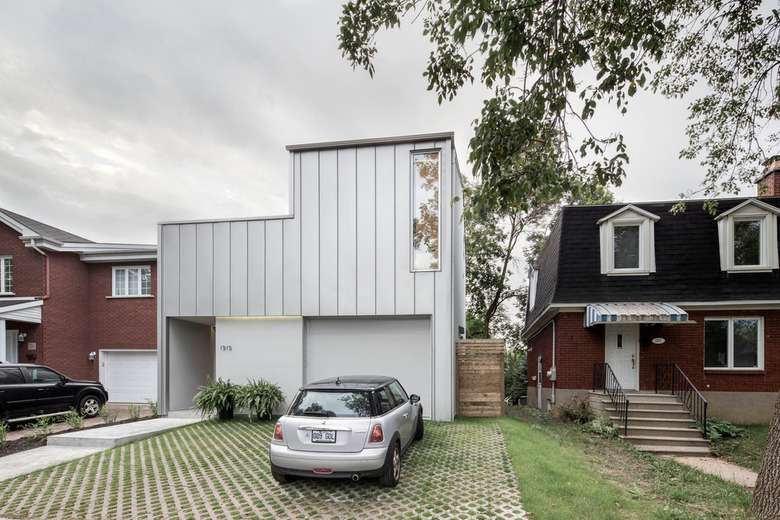
Turning to the neighborhood’s post-war veteran’s home as its formal point of departure, the architects set out to make a house that simultaneously fits in and stands out from its heterogeneous context without resorting to mimicry and without sacrificing the contemporary nature of the project.
The principal challenge lay in bringing light to the living spaces given the tight nature of the lot and the availability of direct sunlight limited to its center. By flipping the traditional vertical hierarchy found in most two-story homes and by carving out a series of spaces from the house's volume, the project was able to address the need for exposure to direct light and concerns about maintaining privacy. By bringing the living spaces upstairs, the house maximizes direct sunlight where it is needed most. By carving out of the house’s volume, the light available at the center of the lot is drawn down into the heart of the house and additional private outdoor spaces are provided for each room.
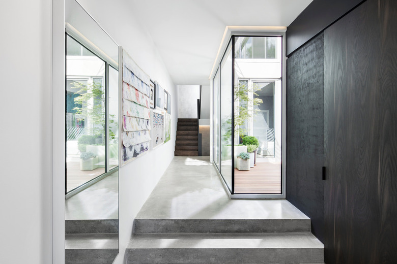
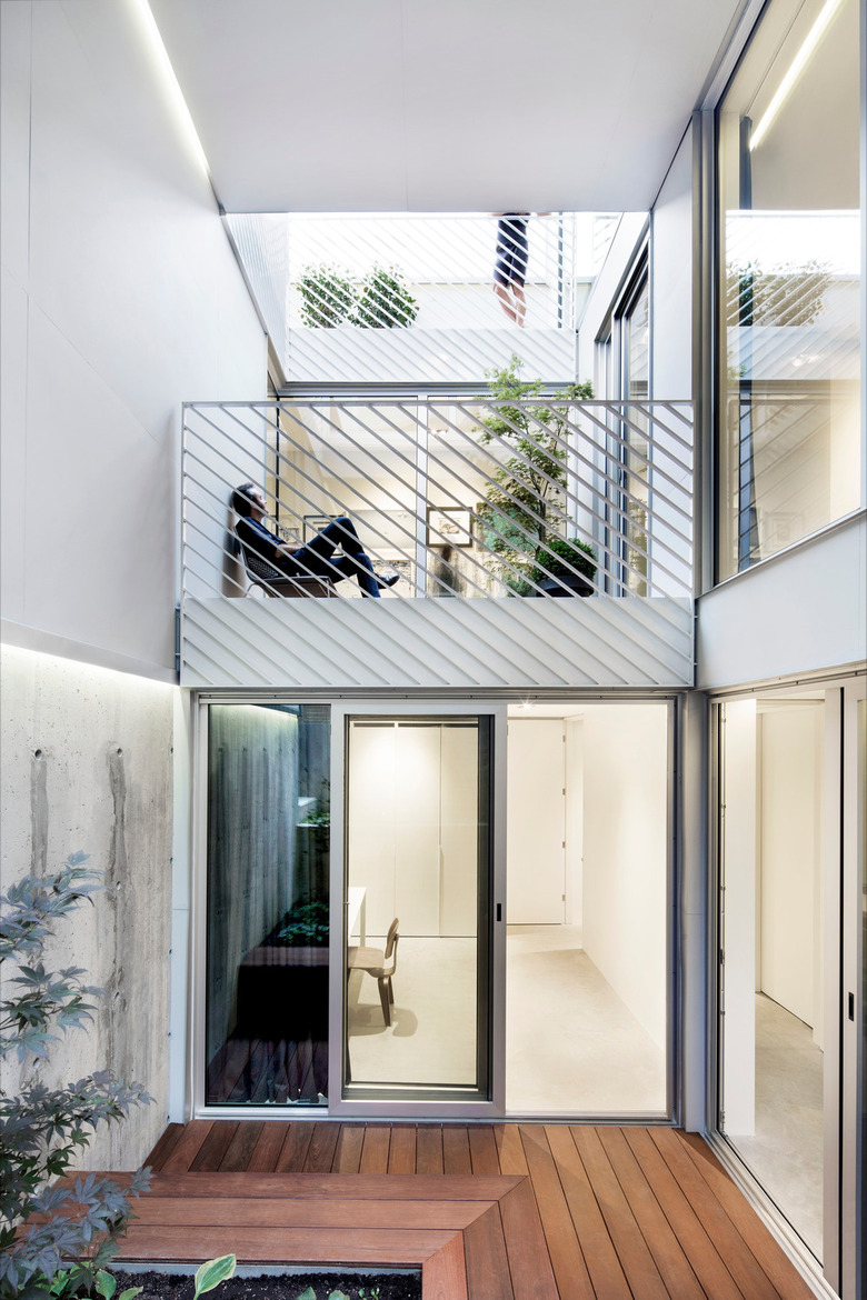
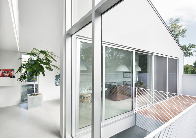
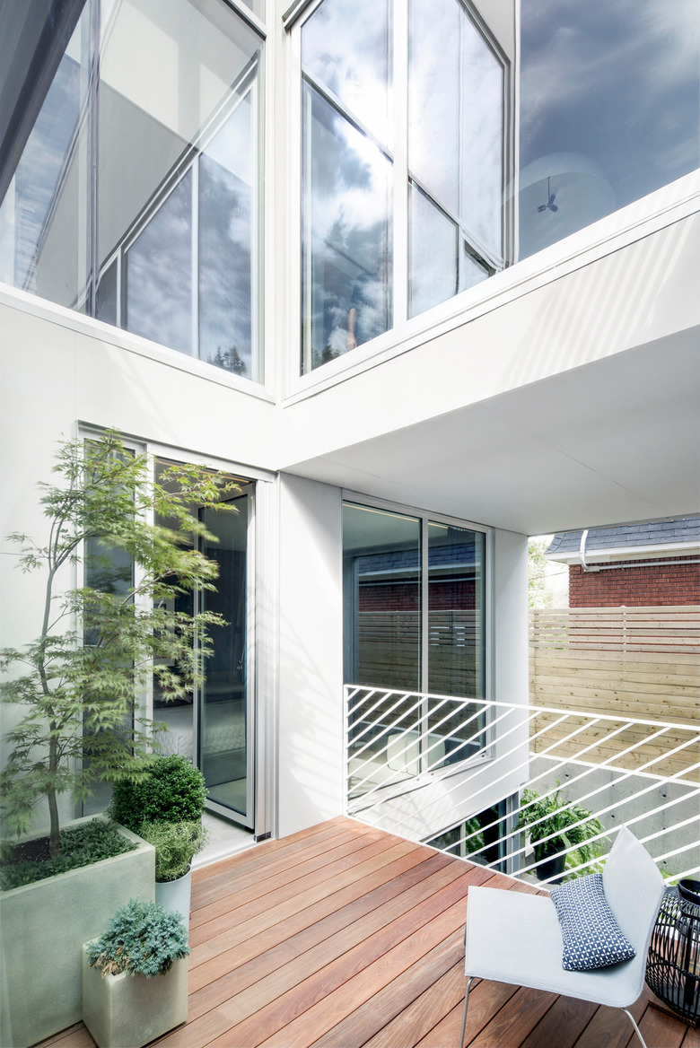
One of the most striking features of the house is the staggered central outdoor courtyard, created to funnel light all the way down to the house’s lowest level. All the rooms have access to this central space. Full height windows at different levels provide a theatrical quality to the courtyard space and foster for the homeowners an awareness of each other’s movement throughout the house.
The courtyard’s design also prioritizes the use of passive solar energy. The spatial transparency and open central courtyard allow for a deep penetration of natural light and for efficient natural ventilation and movement of air in the protected microclimate. In parallel to the courtyard, the stacked staircases combined with a north-facing opening at the top provide a cooling chimney effect inside the house. The house maximizes south-facing glazing for direct solar gain in winter, and limits glazing on the north façade. The radiant concrete floors also serve as a small thermal mass helping to mitigate exterior temperature fluctuations.
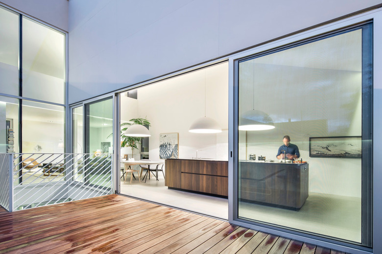
On the exterior, the house is restrained, light and monochromatic, emphasizing overall form over components and details. To unify the shape the architects sought a material in a natural color that could serve as both roofing and wall cladding – a standing seam aluminum cladding. Flat concrete panels painted to match the color of the metal cladding were used as subtle accents around doors and windows. In contrast to the cool vertical surfaces, house’s many terraces are clad in warm Ipe decking, highlighting these outdoor extensions of the living spaces.
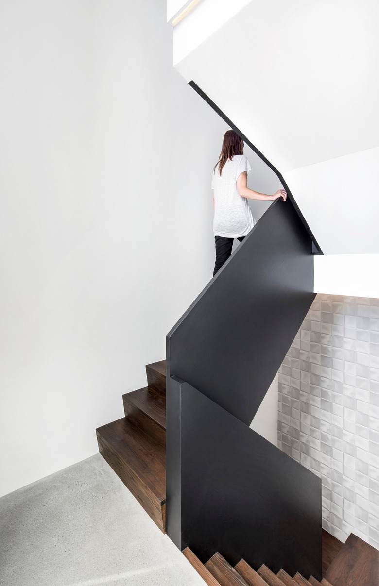
In sharp contrast to the spatial complexity created by the central courtyard, the interior is also kept uniform, strategically articulated with warm touches appearing in the millwork and central stair. Pale, mat polished concrete floors and unarticulated white walls place the focus on the homeowners’ collection of art and design objects. The kitchen is simply organized around two elements - the island and the storage wall– both constructed from the same material: heat-treated white oak. The rich chocolate color of the wood cuts itself out from the white walls and pale gray floor.
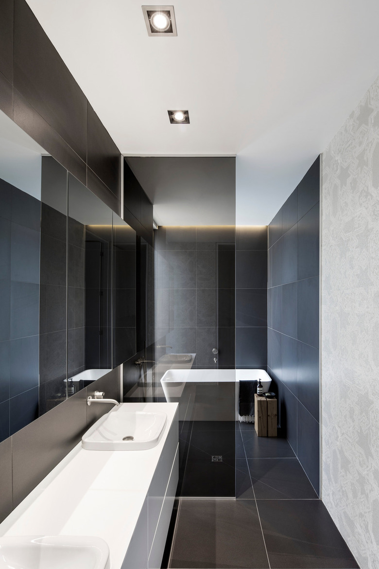
Moments of contrasting exuberance are also offered up in the darker, graphic tones of the bathrooms and in the changing vegetation visible through the windows perforating the exterior of the house. These architectural moments contribute to the house’s sense of theatricality.
Articles relacionats
-
-
Cocoon Pre-primary Extension at Bloomingdale International School
andblack design studio | 19.08.2024 -
-
