Luneurs have rapidly expanded their loyal customer base since their first baked treats delighted customers at their experimental bakery lab, Luneurs Boulanger & Glacier in early 2018. Since then, they have continued to open new stores, with a focus on quality and detail in every location.
In their spirit of innovation, they decided to launch their latest venture to create a fresh all-day brunch for a new up and coming community in Shanghai.
To launch the concept, Luneurs chose the newly completed One ITC mall for its sleek design, featuring luxury brands and a focus on female clientele.
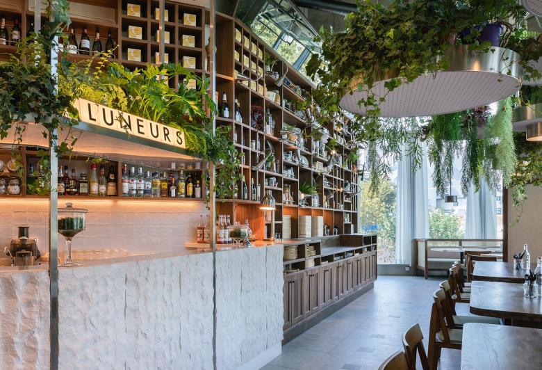
The food concept was an ample well-crafted menu, served on a colourful and unique array of small plates. Aesthetically the restaurant needed to stay true to the interior DNA of Luneurs, building on its contrasting modern and rustic aesthetic, incorporating more traditional French elements and lush planting.
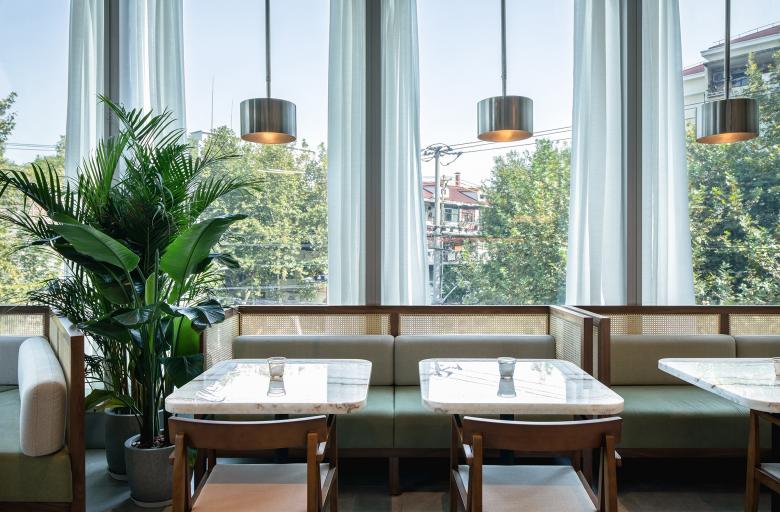
The material pallet relies heavily on natural and earthy tones. Rough cut stone slabs form monolithic counters with contrasting lightweight brushed stainless cabinetry keeping a contemporary tone. The use of timber, marble, sheer curtains, and cane provide warmth and tradition. Each expressed in a modern way, clean lines, soft fabric hues, and onyx bring a light and refined touch.
It was important to consider the experience of the user and create an atmosphere suited to all-day dining. Intimate but also impactful, a place to enjoy with friends but also to be seen. The seating arrangements were designed to create an intimate ambience for each group while also presenting them within the environment. Soft pink onyx tables create an extravagant backdrop for the food and add a touch of glamour.
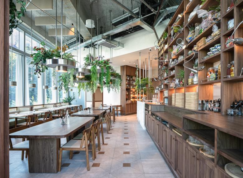
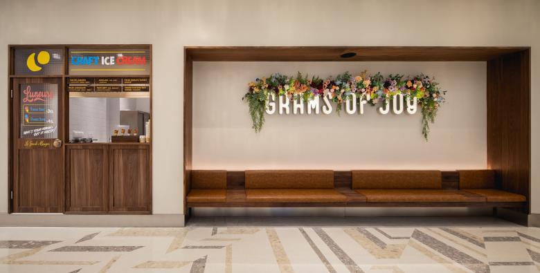
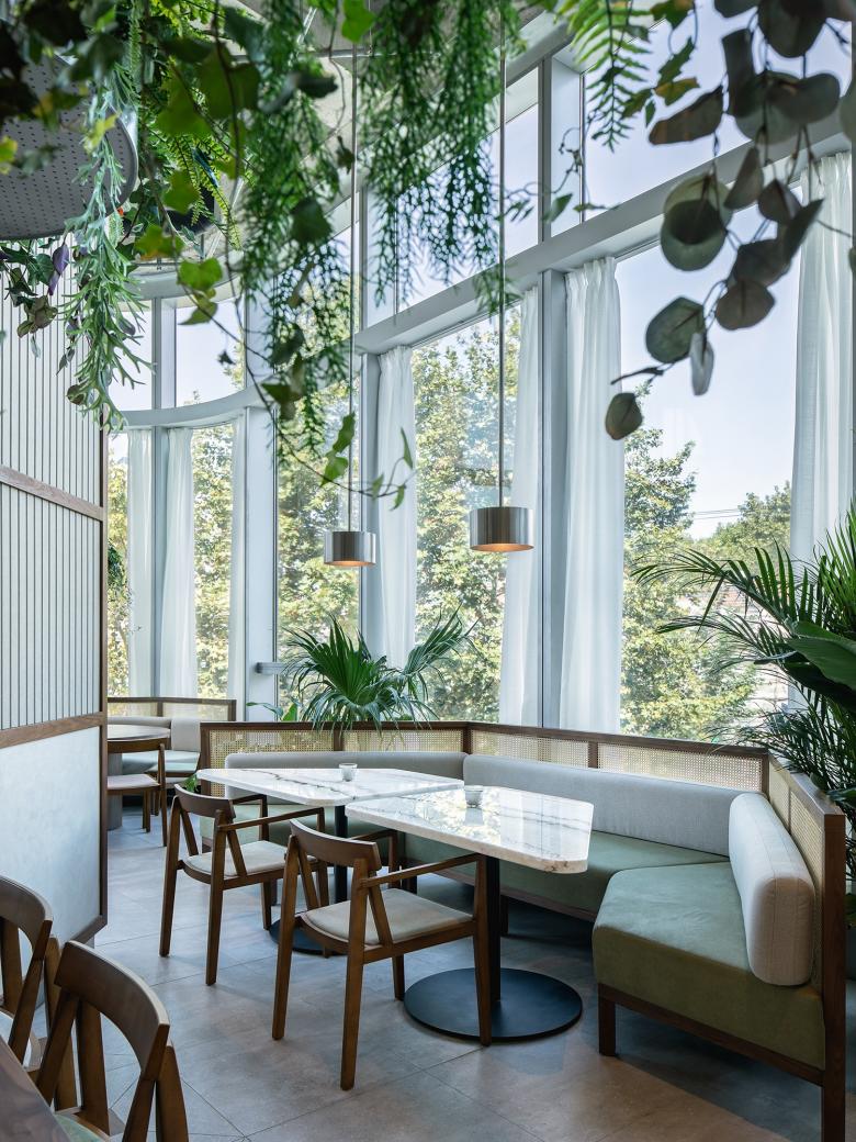
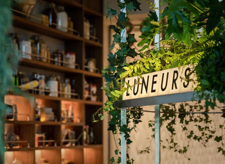
A corner site wrapped with full height windows and a high ceiling, the design looked to capitalise on the existing openness and extend the outdoor vista within the space. Walnut and cane sofas wrap the windows, enveloping you in the trees and creating intimate pockets. Opposite, floor to ceiling timber shelving curated with French food and collectables line the counter area. Before entering the main restaurant, you pass by a large seating alcove and ice cream window. The brightly hand-painted signage gives a nod towards the traditional while bringing a colour-filled and playful touch.
Function and flow were equally important to the design process and was the starting point of the layout. The cabinetry was custom-designed to fit purpose and complement the food concept. A large plate preparation counter faces out to the restaurant allowing the customer to view the energy and detail in the arrangement of the small plates and trays.
Acoustics were carefully considered and integrated into the design in consultation with Delhom Acoustics. The large central columns were wrapped with recycled panel and coconut fibre material – both sound absorbing and sustainable - and the ceilings were treated with wool fibre spray and baffles.
A key feature of the design was incorporating a lush, green, planted environment, that brought relief to the heavy walnut shelving and enhanced the floor to ceiling views of the surrounding Plane trees and neighbourhood green. A large hanging garden made from brushed stainless steel, filled with greens and autumn colour created a rich and tranquil ceiling of flora. A favourite project moment of Hannah Churchill, Founder of hcreates - “One of my personal highlights came during the installation of the furniture and the planting. The planting was one of the very last things to be added and as it was slowly installed, we saw the heart of the concept come to life.”
The overall design effect has brought something new to Shanghai in a familiar but modern way. Luneurs grand-manger has become an instant success, with its highly rated food and complimentary design, seats are in high demand.
Luneurs le garde-manger
Torna enrere a la llista de projectes- Localització
- Huashan Lu, 200040 Shanghai, China
- Any
- 2020
- Client
- Luneurs
- Photography
- Brian Chua


