US Building of the Week
Nora Eccles Harrison Museum of Art
Sparano + Mooney Architecture
26. November 2018
Photo: Jeremy Bittermann
The Nora Eccles Harrison Museum of Art (NEHMA) at Utah State University was founded in 1982 and housed in a building designed by Edward Larrabee Barnes. A recent expansion by Sparano + Mooney Architecture adds space for galleries but also reconfigures the entry sequence and creates stronger relationships with neighboring campus buildings. The architects answered a few questions about the recently completed expansion.
Location: Logan, Utah, USA
Client: Utah State University
Architect: Sparano + Mooney Architecture
Design Principal: John P. Sparano
Project Architect: Seth Striefel
Project Team: Anne Mooney, Nate King, and Jun Li, Mark James
Structural Engineer: Calder Richards Consulting Engineers
MEP/FP Engineer: Van Boerum and Frank Associates
Landscape Architect: Cache Landmark
Lighting Designer: Spectrum Engineers
Interior Designer: Sparano + Mooney Architecture
Contractor: Gramoll Construction
Museum Consultant: Walt Crimm Associates
Zinc Façade: VM Zinc
Site Area: 1 acre
Building Area: 29,000 sf total, 9,000 sf for new addition
Photo: Jeremy Bittermann
What were the circumstances of receiving the commission for this project?
To accommodate the growth of the museum collection, increase the visibility of the museum, and establish a new experience for visitors, it was determined that the museum required a renovation and expansion. In 2016 NEHMA awarded Sparano + Mooney Architecture the design commission, and the construction of the renovation and expansion was completed in September of 2018, with a budget of $5 million dollars. The commission was received through a competitive RFP (Request for Proposals) process run through the state of Utah’s Department of Facilities and Construction Management.
Photo: Jeremy Bittermann
Please provide an overview of the project.
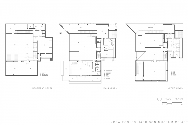
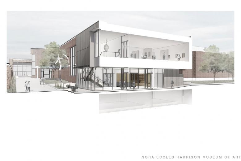
The 9,000-square-foot addition includes an entry, lobby, museum store, café, galleries, and art storage and curatorial components. The 20,000-square-foot renovation includes new office and administrative spaces, a collection study center, a lecture space, a revised collections storage layout, and upgrades to building systems and finishes.
Photo: Jeremy Bittermann
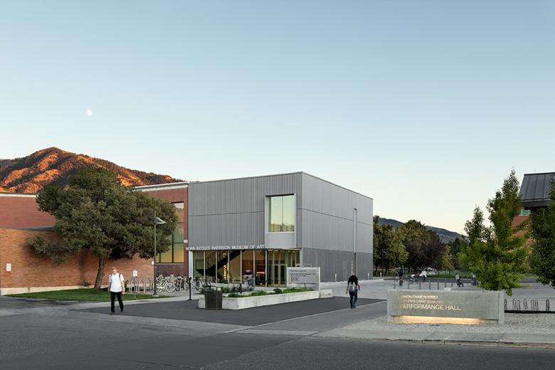
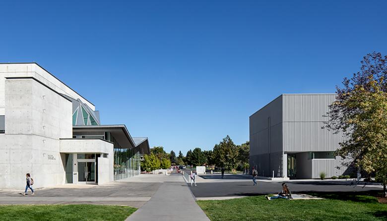
The design of the museum’s new addition is a restrained form. The architecture does not compete with nor mimic the existing museum nor the adjacent Performing Arts Center. Rather, the addition creates a new public plaza that connects the two buildings in a neutral response to a visually complex context. Amid a corridor with diverse building forms, programs, scales and materials, the architects opted for a design of quiet refinement in dialogue — not in competition — with what exists.
Photo: Jeremy Bittermann
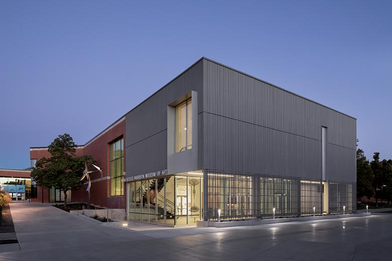
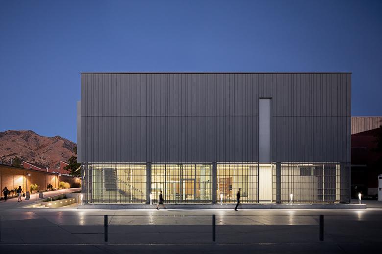
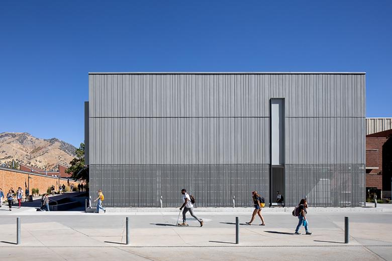
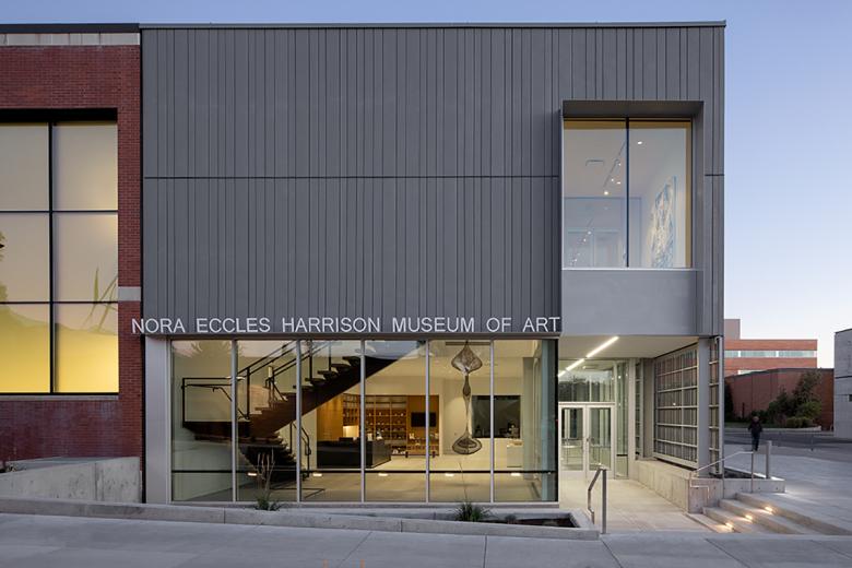
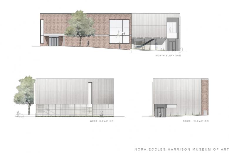
The façade design is composed of linear vertical panels of opaque and perforated zinc, referencing the materiality of the Performing Arts building but with a unique pattern and design approach. The porousness of the lower half of the façade invites glimpses into the museum by the passerby, and at night the activity and exhibitions housed within glow through this façade. By separating the perforated zinc screen from the building envelope at the entry level, the campus circulation flows directly into and through the museum. The façade creates a space of transition and entry along this perforated veil and softly defines the edge of the campus arts node. This welcoming entry sequence invites students of all disciplines to consider the role of art both within their academic discipline and the tradition of the American Land Grant College.
Photo: Jeremy Bittermann
Although a simple and restrained form, the new design increases the visibility of the museum by relocating the almost hidden entry out of the Fine Arts Center courtyard by bringing it out and externalizing it onto the west façade. This move locates the entry along one of the main pedestrian circulation routes through campus and with direct visibility from the existing parking areas.
Photo: Jeremy Bittermann
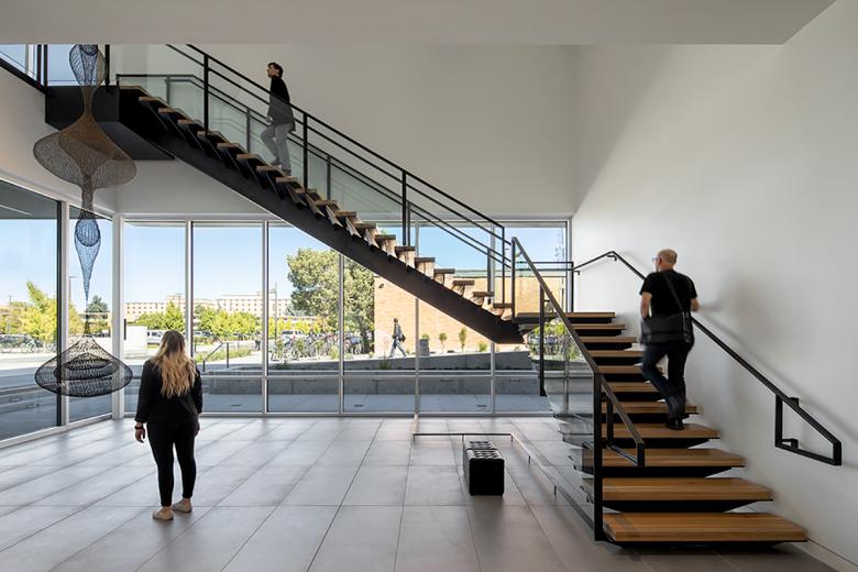
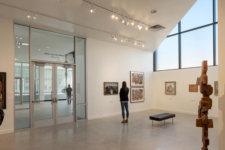
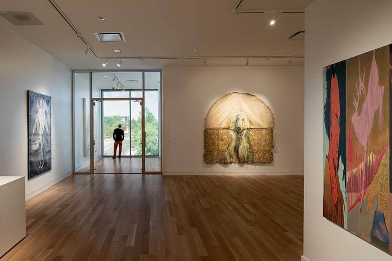
The experience of the museum upon entry has been completely transformed. The new lobby immediately provides visitors with a café, museum store, and reception desk with information on the exhibits within the museum. The entry sequence provides the first detailed view of the 21 foot-tall woven metal sculpture by Ruth Asawa, (Untitled, 1967), that the lobby and new blackened-steel open stair is configured around. Once visitors move to the galleries — where formerly the circulation terminated at each level, requiring back-tracking through the space — the new circulation pattern provides a continuous loop from gallery to gallery and from floor to floor. The transparency level of the new glazing varies based on the program. In the existing gallery area, the glazing system has an acid etched (frosted) inner layer which internalizes the focus of the space on the art, retaining the daylight but eliminating the view to the exterior, while the clear glazing at the new lobby provides a direct connection and visibility to the exterior plaza.
Photo: Jeremy Bitterman
The new gallery at the second level of the addition is designed to allow for a broad range of temperature and humidity controls, providing the ability to accommodate the standards required for borrowing world-class collection material and traveling exhibits. Supporting the gallery function, the new and reconfigured collection storage provides increased capacity to house the permanent collection and to accommodate future acquisitions, while consolidating and reorganizing the existing storage space for greater efficiency. The relocation of the administrative offices out of the basement provides staff with a collaborative working environment, access to daylight, and closer proximity to the museum director’s office and to the primary museum functions.
Photo: Jeremy Bitterman
The project has enabled the museum to have greater visibility and campus presence, enhance and transform the visitor experience, better organize its existing facilities, expand its exhibition and collection storage space, offer new amenities, and expand its education programming for both the USU community and the public at large.
Floor Plans (Drawing: Sparano + Mooney Architecture)
How does the design respond to the unique qualities of the site?
The design team determined that by locating the new lobby at the existing lower level gallery elevation, the building could be entered near the existing Performing Arts Center, increasing the visibility and presence of the building. This location also allowed for the creation of a continuous circulation loop through the entry/lobby, existing galleries, and new gallery spaces.
Elevations (Drawing: Sparano + Mooney Architecture)
Was the project influenced by any trends in energy-conservation, construction, or design?
The entire museum received a new triple-glazed curtain wall system, which resolved the museum’s moisture and condensation issues, increased the efficiency of the building enclosure, and reduced the required mechanical heating and cooling loads. Furthermore, the level of transparency of the new glazing fundamentally changes the experience of the museum. The new glazing in the gallery areas includes an acid-etched (frosted) inner layer that internalizes the focus of the space, while the clear glazing at the new lobby spaces promotes visibility from the interior and exterior.
Section Perspective (Drawing: Sparano + Mooney Architecture)
What products or materials have contributed to the success of the completed building?
The zinc façade on the expansion provides a material link to the adjacent Manon Caine Russell Kathryn Caine Wanlass Performance Hall, as well as the FAC’s Scene/ Costume shop. Zinc was selected for its long life span, limited maintenance requirements, and the visible changing of the material over time through oxidation. The perforated zinc panels at the entrance protect the lobby from the western sun in the daytime, and transform the façade by allowing full visibility of the space at night.
Email interview conducted by John Hill.
