Las Chicas, Los Chicos y Los Maniquís Restaurant
Las Chicas, Los Chicos y Los Maniquís Restaurant by El Equipo Creativo has won Best Use of Colour at the 2019 Frame Awards.
Location: Calle de Atocha, 49 —28012, Madrid, Spain
Client: HI Partners, Grup Iglesias
Interior Designer: EL EQUIPO CREATIVO
Floor Area: 280 m²
The design of the AXEL Hotel on Atocha Street in Madrid superposes a series of historic references forming a complex and explosive tandem. Firstly, the privileged location in the very midst of Madrid’s literary neighborhood. Secondly, the palatial 19th-century building in which it is located. Finally, an important role in the design choices was also played by some of Madrid’s most traditional and popular characteristics.
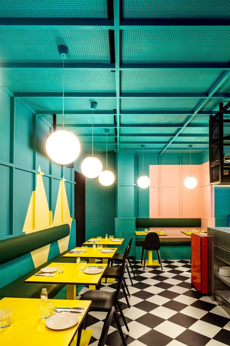
In order to achieve this atmosphere, the most important strategy in the design is the use of color, an element which accompanies us throughout all the areas of the hotel, which is applied with a different character and material nature in each zone.
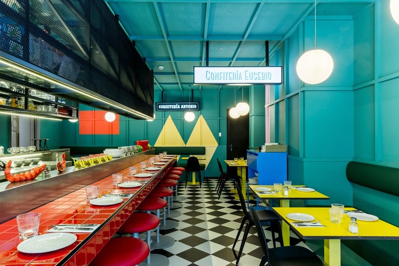
What was originally the entrance to the building for the horse-drawn carriages is today the entrance to the hotel and divides the most public part of the restaurant into two rooms. Both spaces are designed under the same concept: a carefree atmosphere with a distinctly colorful character employing large graphic elements of color with references to the “Movida Madrileña” and the visual universe created by Almodovar, the well-known Spanish movie director.
The name of the restaurant “Las Chicas, Los Chicos y Los Maniquies” was precisely the title of one of the songs which accompanied the “Movida Madrileña” and whose lyrics are still part of our popular culture today.
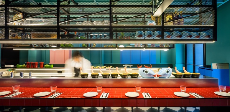
The main characters of this colorful universe are the two large red bars presiding over the two rooms. All morning they function as buffet tables for breakfast and as snack and beer bars — in the purest Madrid style — during the remainder of the day.
Another important element of the popular culture of Madrid is the classic neighborhood stores with their large window advertisements, attractive names and incredible offers. Sashes, hats and elaborate mannequins fill some of the scarce shop windows still left in this part of the city. Strange as it may seem, Atocha Street has managed to keep intact some of its more classic shops, to which our design wanted to pay sincere homage filling the space with large luminous posters with attractive commercial names.
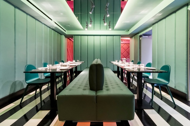
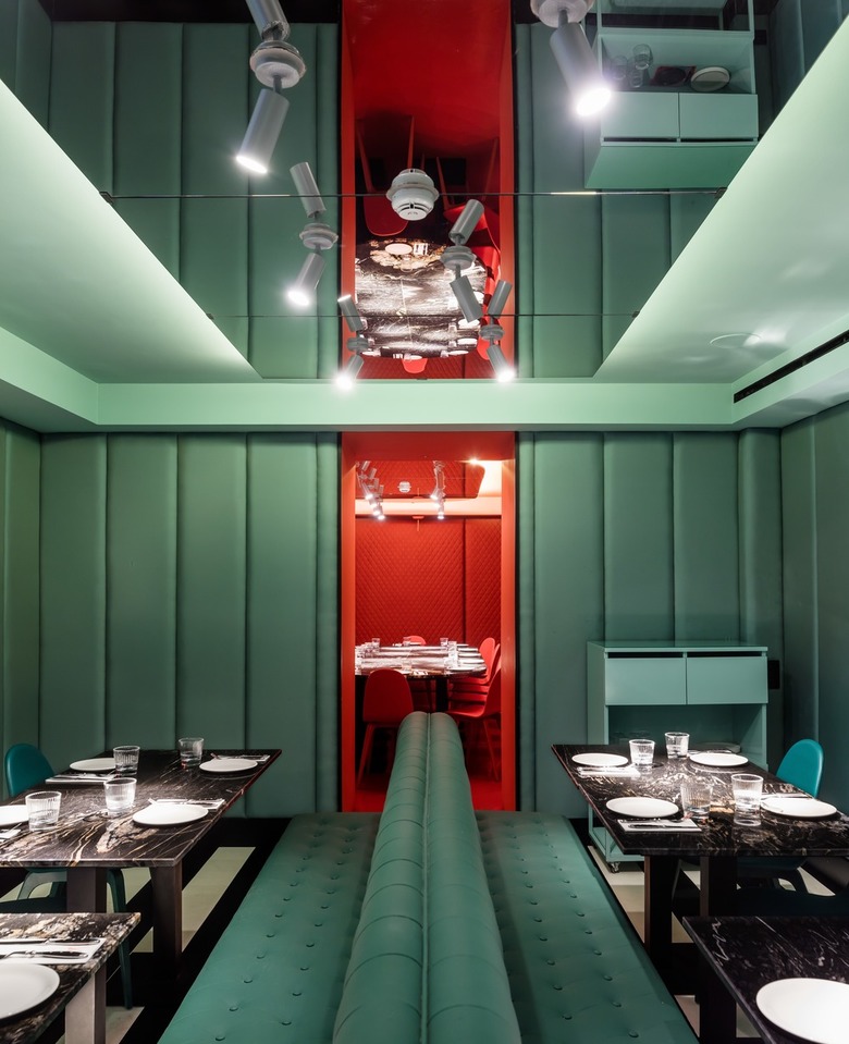
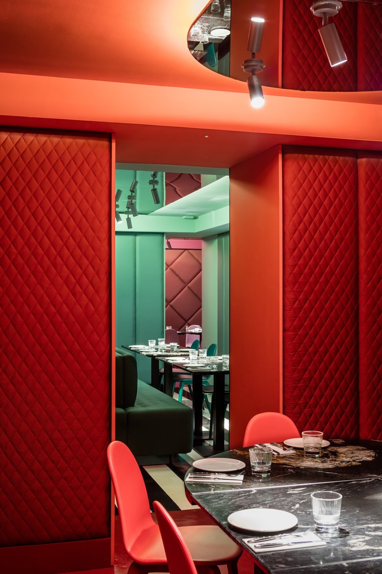
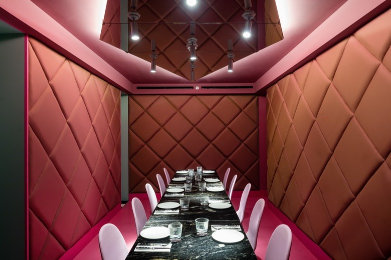
In the lower part of the hotel, the restaurant has three small interconnected dining rooms where, once again, color is the indisputable principal element. Each room achieves its own personality by use of a single color: red, greenish and pink. Their walls covered in textiles, as well as the chromatic choices, seek to reference the noble rooms of 19th-century palatial homes.
Verwandte Artikel
-
-
-
-
-
Cocoon Pre-primary Extension at Bloomingdale International School
andblack design studio | 19.08.2024
