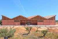
Gjuteriet
Malmö, Schweden
Located in the Varvstaden district, a new sustainable neighbourhood in Malmö, Gjuteriet is to be transformed into an innovative, open public meeting place. The historical building represents the foundation for what will become a contemporary and versatile work environment, reinterpreting the original scale and the former shipbuilding industry into a vibrant creative hub. The transformation fills Gjuteriet, a significant building with strikingly robust character, with new unexpected spatial experiences and proposes a flexible structure in the long term. The design activates the surroundings and utilizes the unique location by the shipyard’s inner basin, the quay, and the adjacent dry dock. It introduces new connections and places public activities on the ground floor, supporting the development of the emerging city life.
The point of departure was a joint vision of Varvsstaden and the City of Malmö, featuring the transformation of the Kockum’s formerly industrial grounds into a vibrant mixed urban district with strong connections to the inner city and the Malmö University. The goal is to create a rich, varied place with housing, offices, cultural facilities and amenities, providing the existing industrial architecture with a new purpose and introducing public functions. New bridges, public transport routes and investments in public spaces, squares and streets will connect the neighbourhood to the city centre and create an exciting new city life.
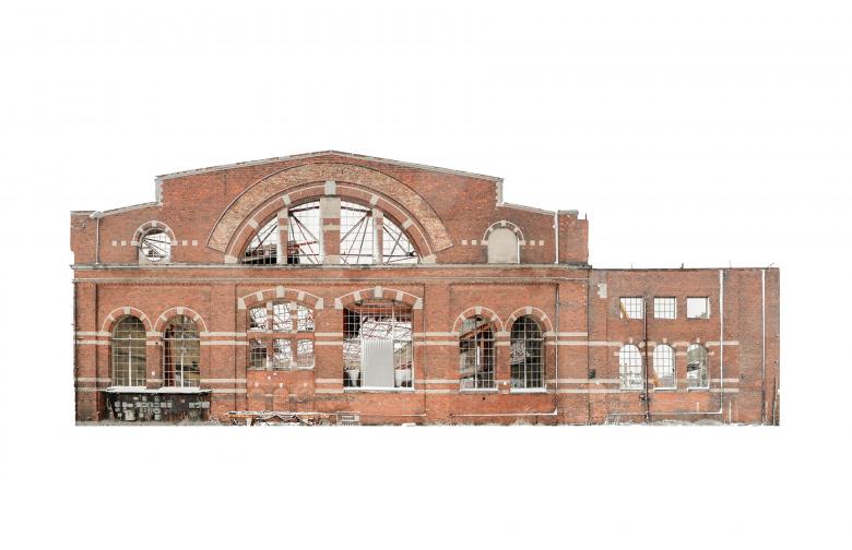
Gjuteriet is a visible, prominent building in Malmö, representing an important part in the history of shipbuilding industry and the identity of the city. The building was originally built in 1910 as a foundry producing metal castings for ship machinery and bridge parts. The frequent adaptations to everchanging needs and functions in different eras have left the building in a state of a ruin we see today. It was partly or fully extended towards the north, west and east. These extensions, buds or sprouts, have mostly been demolished yet left visible imprints in the facades.
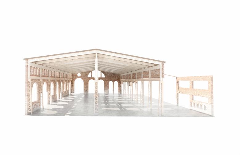
Gjuteriet, although currently in a state of a ruin exposed to elements and winds, sparks interest and imagination. Roofing felt has been torn off and roof lanterns removed. East and west facades are heavily fragmented. The approach to the transformation can be defined as a reinterpretation of an architectural heritage where various time periods coexist with how we experience the architecture today.
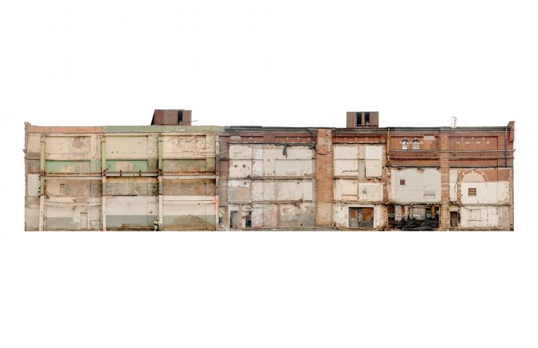
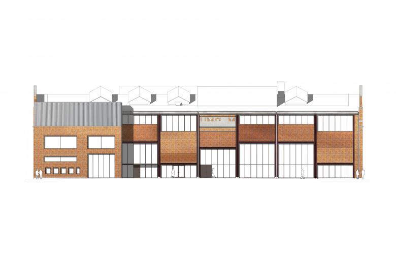
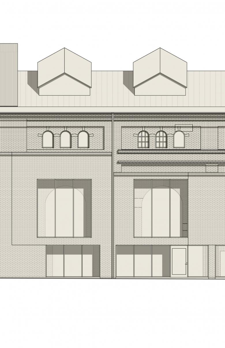
The west façade, formerly an interior wall, is a rich collage with remains of demolished building components. The intention is to preserve this expression, designing a new building envelope with a distinct tectonic solution. The original openings, bricked up in the past, are reintroduced, exposing the brick wall to the interior whilst adding an entirely new insulated façade from recycled brick reclaimed from recently demolished Kockum’s buildings on the outside. Overlaying the restored original openings on the inside with the new curtain walls on the outside creates an unconventional composition.
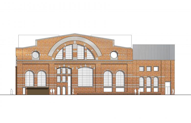
East façade reveals Gjuteriet’s interior through large longitudinal apertures indicating where a side aisle once stood. Brick remains with a fragment of original signage hanging at the top of the steel frame are taken down, dismantled, and reassembled adding recycled brick. Thermal insulation is placed on the inside and sandwiched in by another layer of recycled brick, left exposed to the interior. The original façade expression with large openings is thus preserved, using rectangular curtain walls with modular division aligned to the main loadbearing structure.
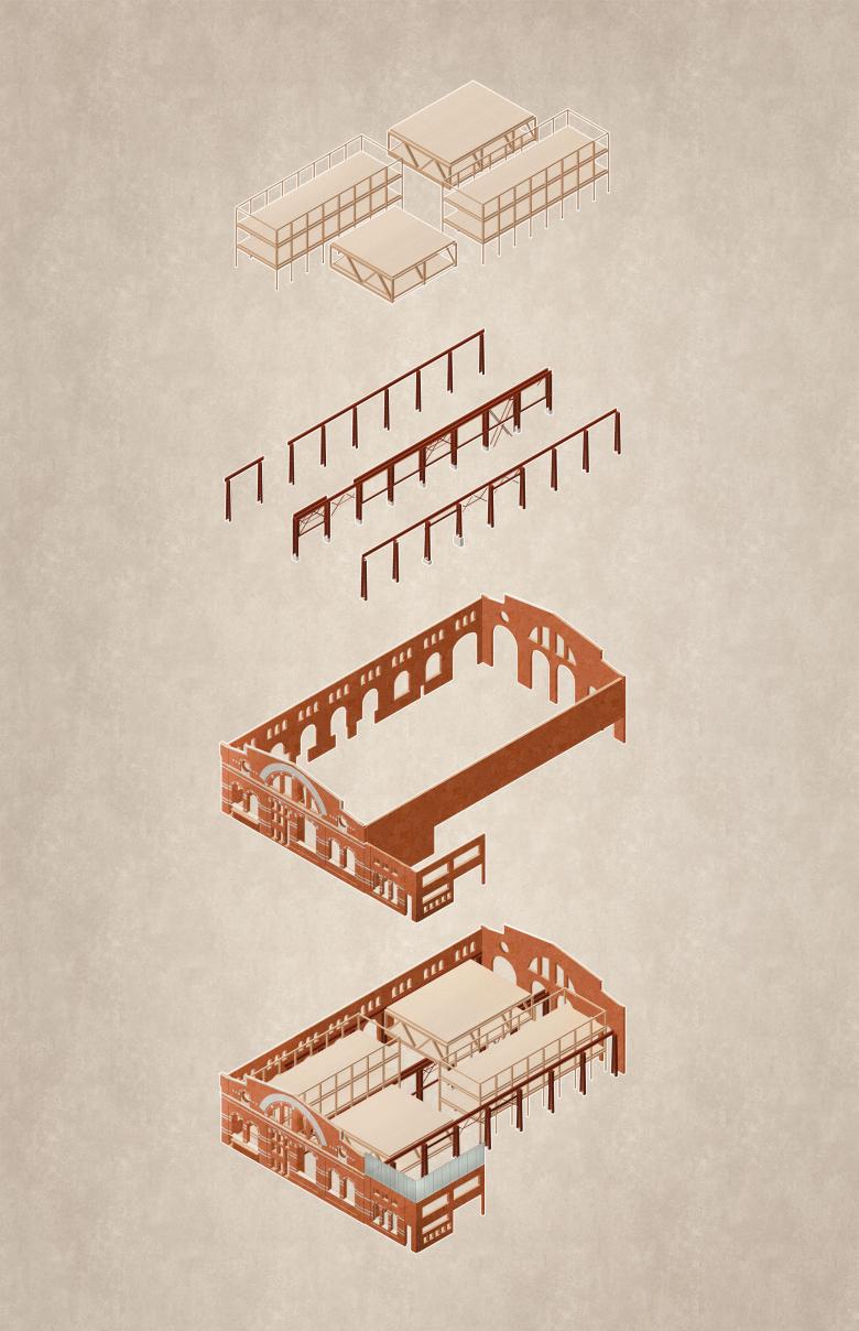
Gjuteriet’s loadbearing structure is a steel frame wrapped in longitudinal modular brick facades and crowned by intricate bell-gables with decorative red brick and white limestone patterns. The building is an example of a rational industrial architecture based on a clear organisation of the loadbearing system with light and airy functional working spaces. One of the key design tasks was to add new areas in a sensible way so that the large industrial space can still be experienced. The building’s characteristic elements are subject to a high grade of heritage protection.
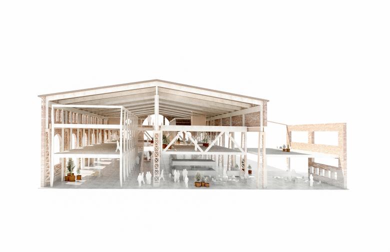
The added timber structure, detached from the walls and hung from the roof, keeps a distance to the existing structure to preserve the spatial quality of the large hall. The new elements create a variation of spaces suitable for new programmes – meetings, social interaction, creativity, exhibitions, food and beverages. The design allows daylight from the tall windows and roof lanterns to penetrate through the entire broad and deep space.
There is a clearly stated sustainability strategy for the project, in line with the Varvsstaden’s Sustainability Compass. The goal is to create a long-term, healthy work environment with three focus areas to maximize the potential of the building from a sustainability viewpoint: Material, Social and Energetic qualities. The main social objective is to create an environment stimulating knowledge exchange and creating a community both within the building as well as in the entire neighbourhood; with low thresholds and a variety of connections, both visual and physical, internally as well as externally to the immediate surroundings – the university, culture and multitude of activities.
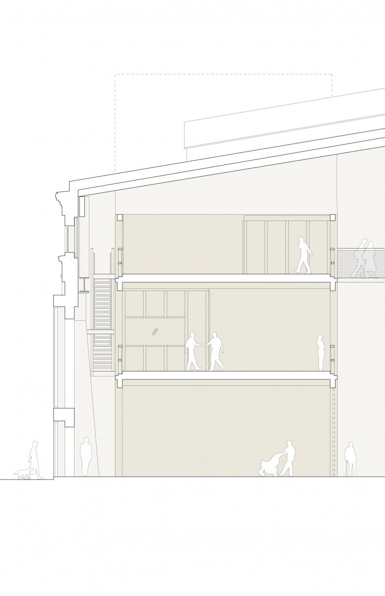
Two of the newly introduced volumes are hung from the remaining overhead crane runways to decrease the need for supporting columns and thus allowing for a free open programming on the ground floor. Main entrance, lobby, café and a restaurant are located to the south, facing the quay. The proposed programming acts as a link between the existing dry dock to the north and the new square to the west. The interior layout is rational and flexible, based on the existing loadbearing structure and allowing for four individual tenants on each floor, vertically interconnected by large longitudinal stairs in the central atrium and two side staircases with lifts.
Kjellander Sjöberg, in close collaboration with Varvsstaden and the world-renowned food brand Oatly as the main tenant, has developed a bespoke solution, grounded in the company’s values and sustainable philosophy. Oatly’s products are oat-based, renewable, offering healthy, wholesome and nutritious foods with a minimal environmental impact. Core values, identified in joint workshops to be used in the design process: open, informal, healthy, light and genuine.
The material sustainability is a main strategy aiming to minimize use of resources and climate impact by making smart material choices. Besides the preservation of building elements, new construction is mainly made of timber to minimize carbon dioxide emissions and the overall ecological footprint. Timber is also a light-weight material, which reduces the load put on the existing structure and therefore the need for a new foundation. Complementary materials make use of recycled and upcycled materials recovered from demolitions in the area: brick, chequer plates, stairs, steel profiles, perforated sheet metal and many more.
The floor layout fits approximately 300 workspaces across 4,600 sq m. Besides a café with a barista-receptionist, “the no-milk bar”, and a canteen for both the employees and public, there are meeting rooms, open lounges, conference rooms, a conservatory, studios, exhibition spaces, a test kitchen and wellness facilities. All circulation areas are designed as wide galleries encouraging informal talks and spontaneous “corridor chats”; to stop and sit down. Temporary workplaces and open meeting rooms face the central atrium whilst the more permanent places are located at the perimeter along the facades. Experiencing the building as a whole was a very important for Oatly right from the beginning. Gjuteriet should not be a series of individual floors but rather one continuous space. The unexpected spatial experiences, openness between floors, numerous staircases and shortcuts aim to connect and create a community and a sense of belonging, accommodating the many activities within the company under one roof. Choosing materials that are natural, robust, genuine and employ a lot of wood creates a link to the main subject of the business – oats.
Photo: Petra Bindel
- Architekten
- Kjellander Sjöberg
- Standort
- Malmö, Schweden
- Jahr
- 2020
- Bauherrschaft
- Varvsstaden
- Team
- Stefan Sjöberg, Johan Pitura, Hannes Haak, Sylvia Neiglick, Simon Estié, Sebastian Mardi, Per Hedefält, Michael Westerlund, Susanna Bremberg, Stefan Rydin, Karin Lindström
- Collaboration
- Sted Landskap, BK Konsult, Matter by Brix


