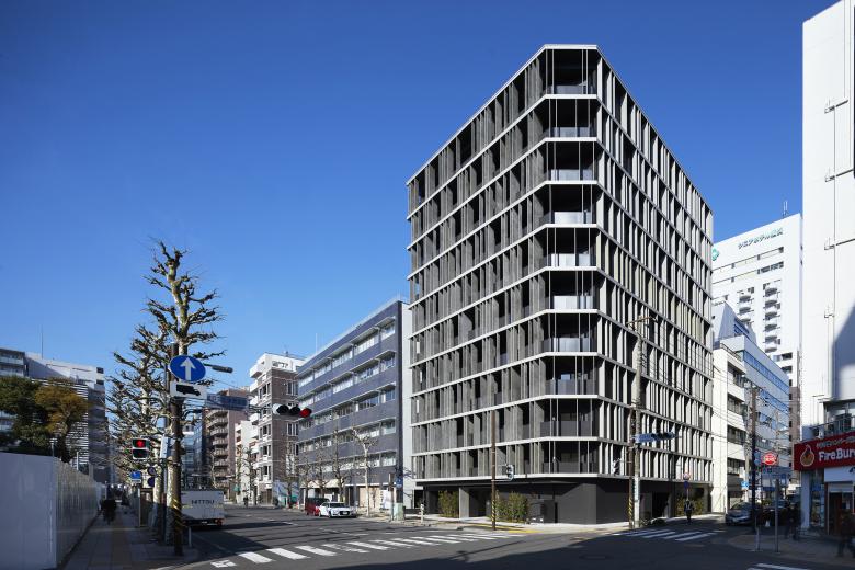
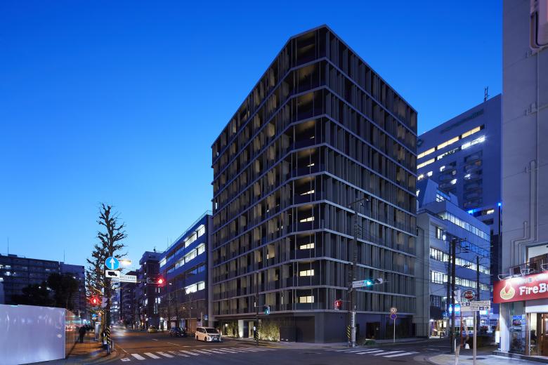
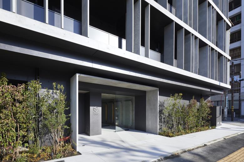
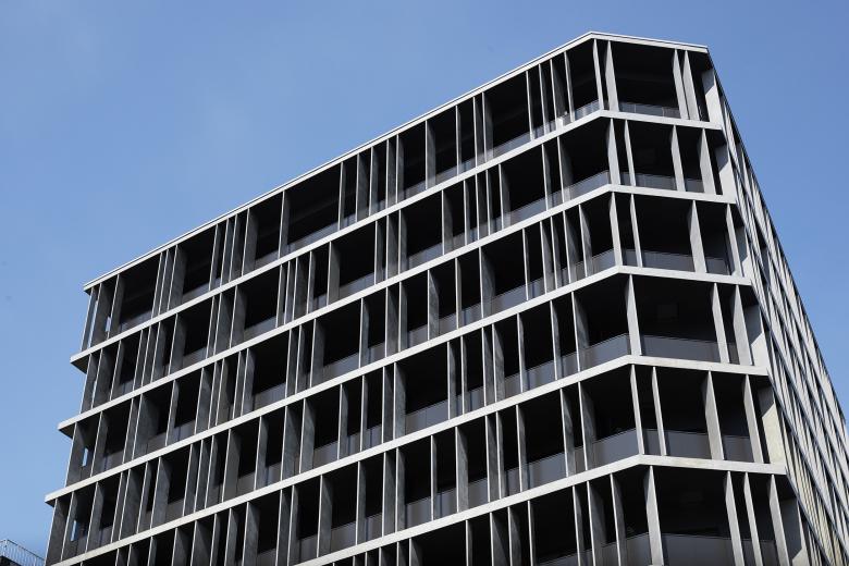
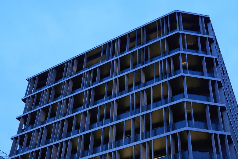
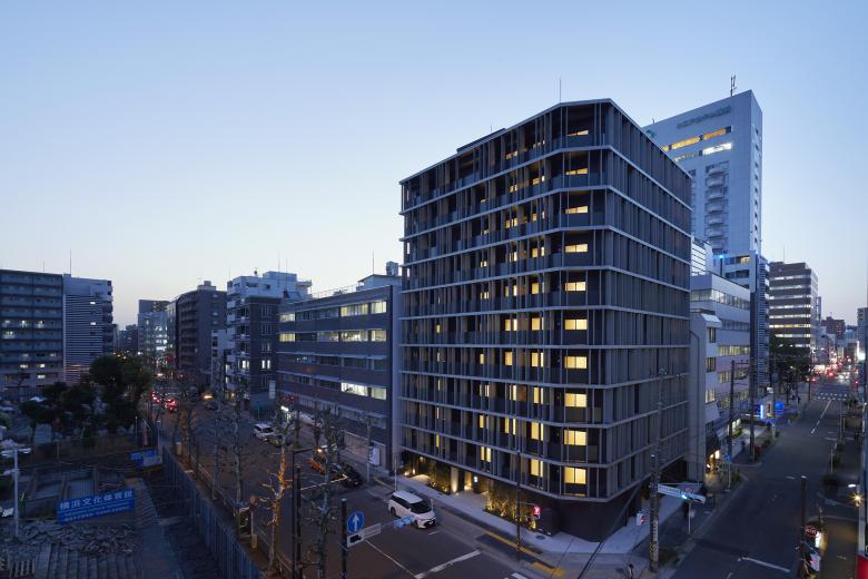
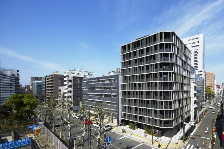
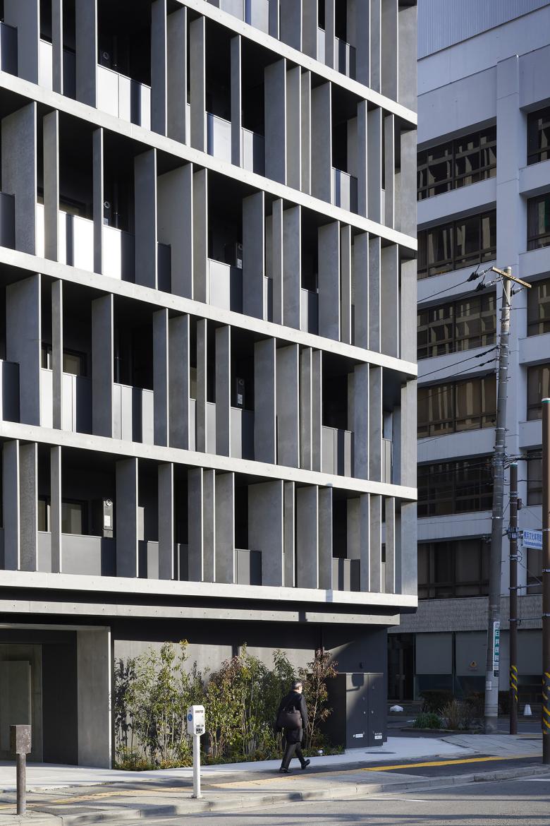
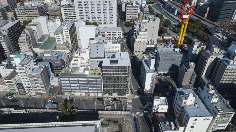
The Kannai Blade Residence - so called because its facades are intersected with thin, bladelike concrete fins - has been designed by the Japanese architectural studio Key Operation Inc. It sits on a corner site within a 5-minute walk of the well-connected Yokohama Kannai Train Station, not far from central Tokyo.
The new 11-storey housing block replaces the 4-storey post-war office building known as “Furocho 2-chome Daiichi Kyodo Building.” The original building was designed by Miyauchi Architects in a style typical of the time, built in concrete, characteristically robust and lowrise, functioning as a firebreak. During WWII, much of Yokohama City was razed to the ground leading to the government-sponsored reconstruction efforts to comply with strict fire regulations.
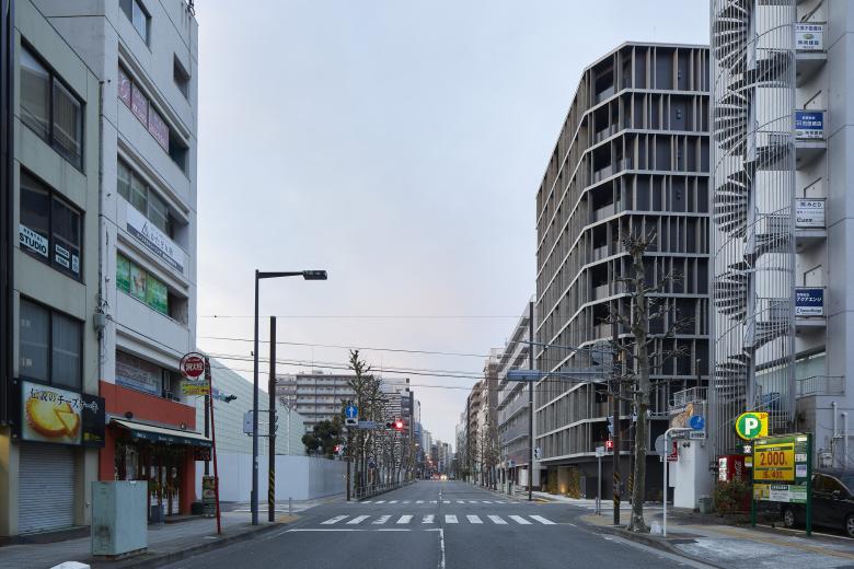
The same area is currently facing rapid changes through Private Finance Initiative, PFI, funded redevelopment. The site across the street from the Kannai Blade Residence will accommodate the new Yokohama United Arena, remodelled after the Yokohama Cultural Gymnasium (built in time for 1964 Tokyo Olympics and demolished in 2020). In the vicinity,
a new campus building for Kantou Gakuin University is nearing completion. This is being built on the site that used to accommodate Kunio Maekawa’s Cultural Educational Centre, built in 1974, now demolished after it was deemed that the structure was not compliant with today’s seismic standards.
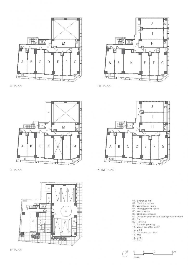
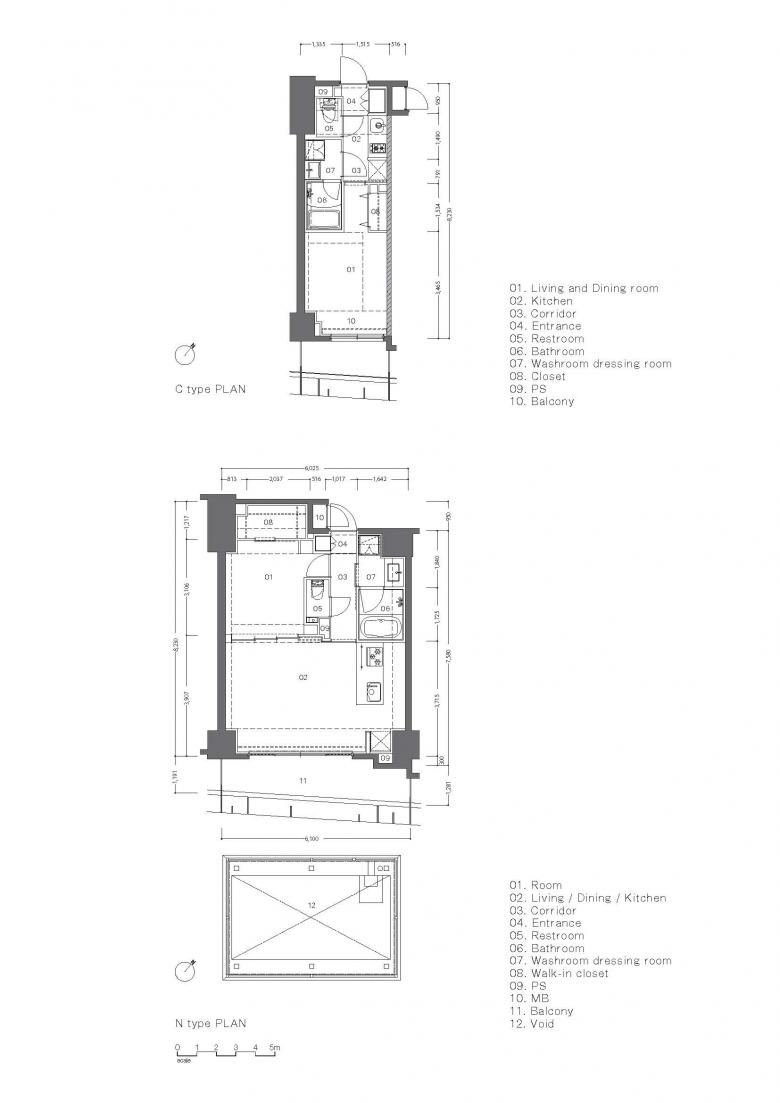
The Kannai Blade Residence consists of ninety-four privately-owned studio flats. The individual units are very small, with their floor areas ranging between 22m2 to 47m2. They are what the Japanese call ‘one-room-mansion’ suitable for single dwellers or young couples without children.
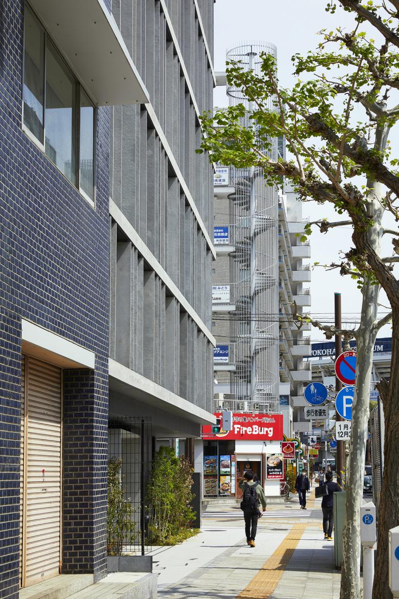
Because many of the post-war buildings still survive in this area, there is a uniformity rarely seen in other neighbourhoods of urban centres in Japan. Their low-rise, horizontal concrete structures, solid yet open and accessible, are very distinctive and can easily be spotted amongst today’s high-rise towers. The corner buildings abutting large streets (functioning as firebreaks) are usually chamfered, further emphasizing the area’s spacious feel and unusual uniformity.
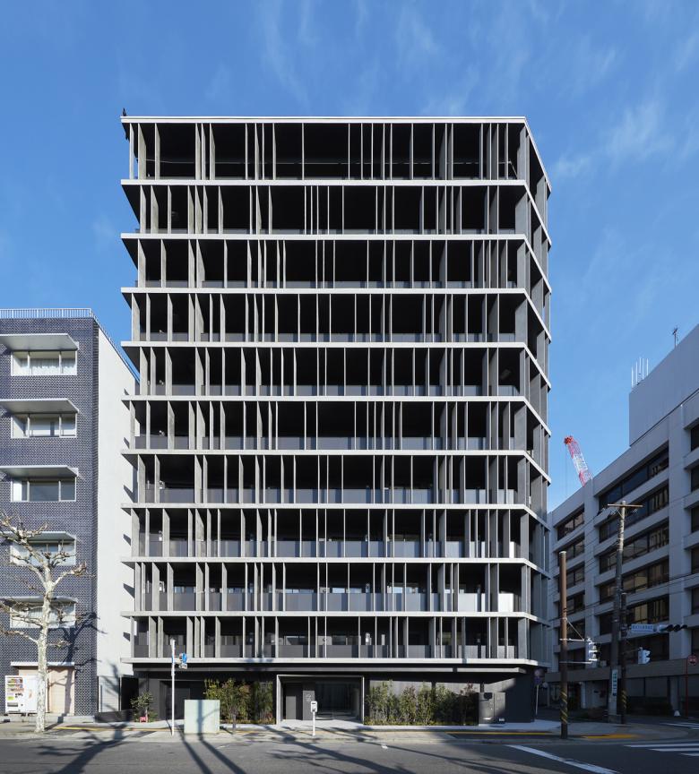
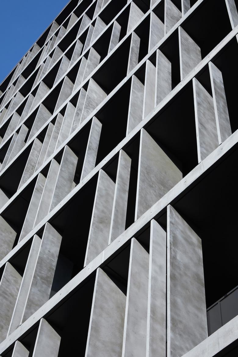
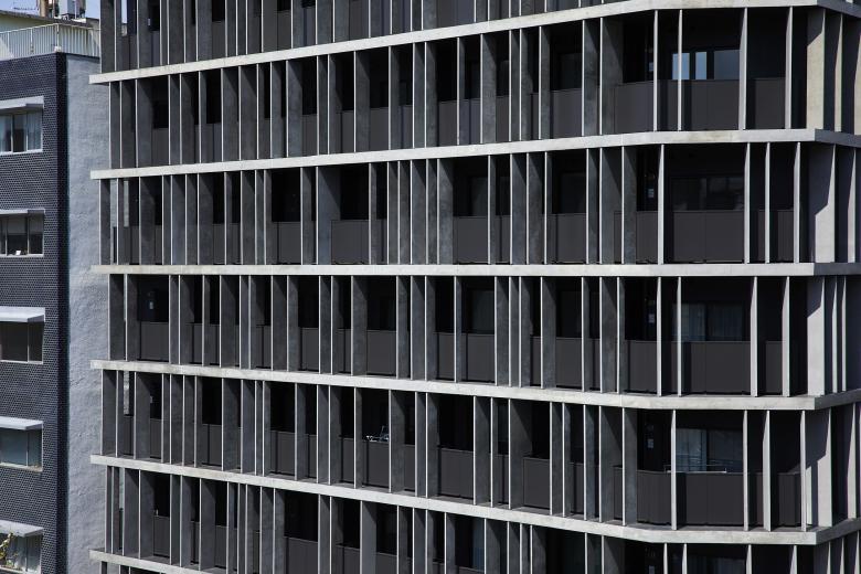
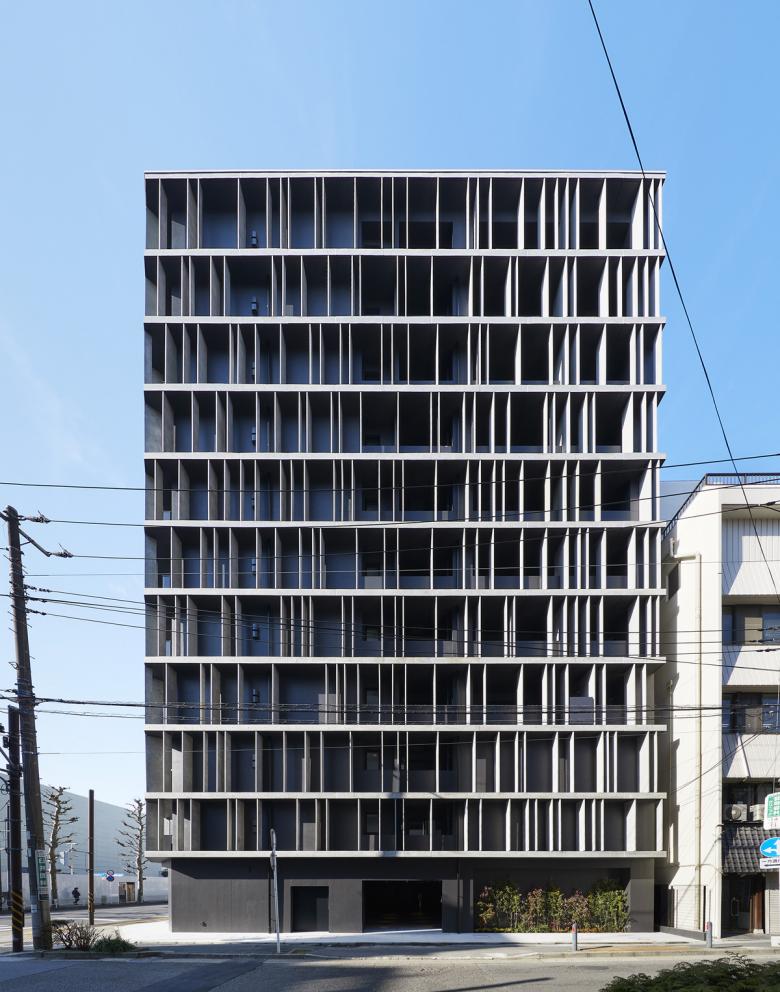
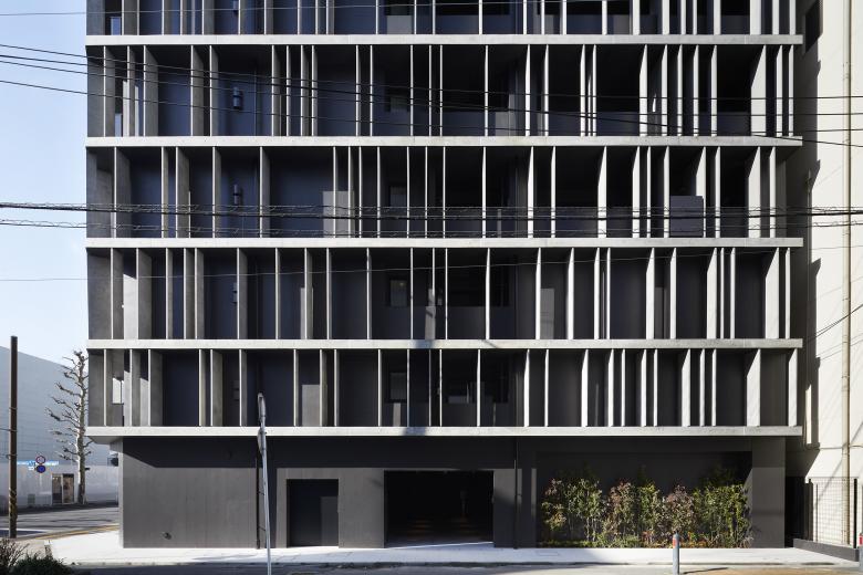
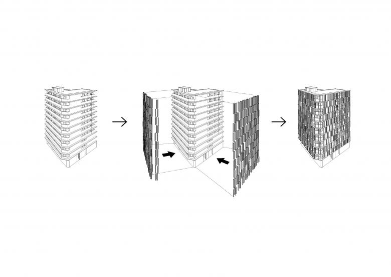
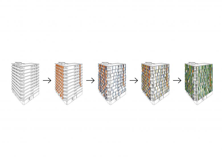
Particular attention was therefore paid to design a characterful building to match the post-war buildings surrounding it. Our strategy was to emphasize the concrete floor slabs in order to amplify and echo the area’s horizontal linearity. We also used the paper-thin concrete fins (40mm in thickness) to break the monotony and introduce playfulness.
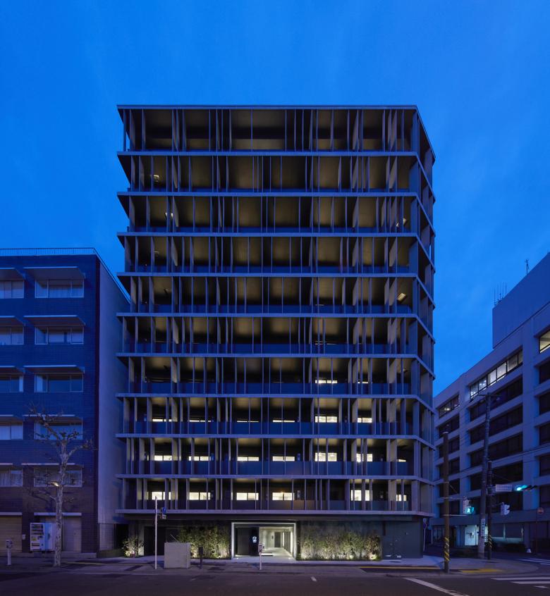
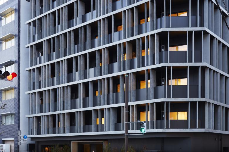
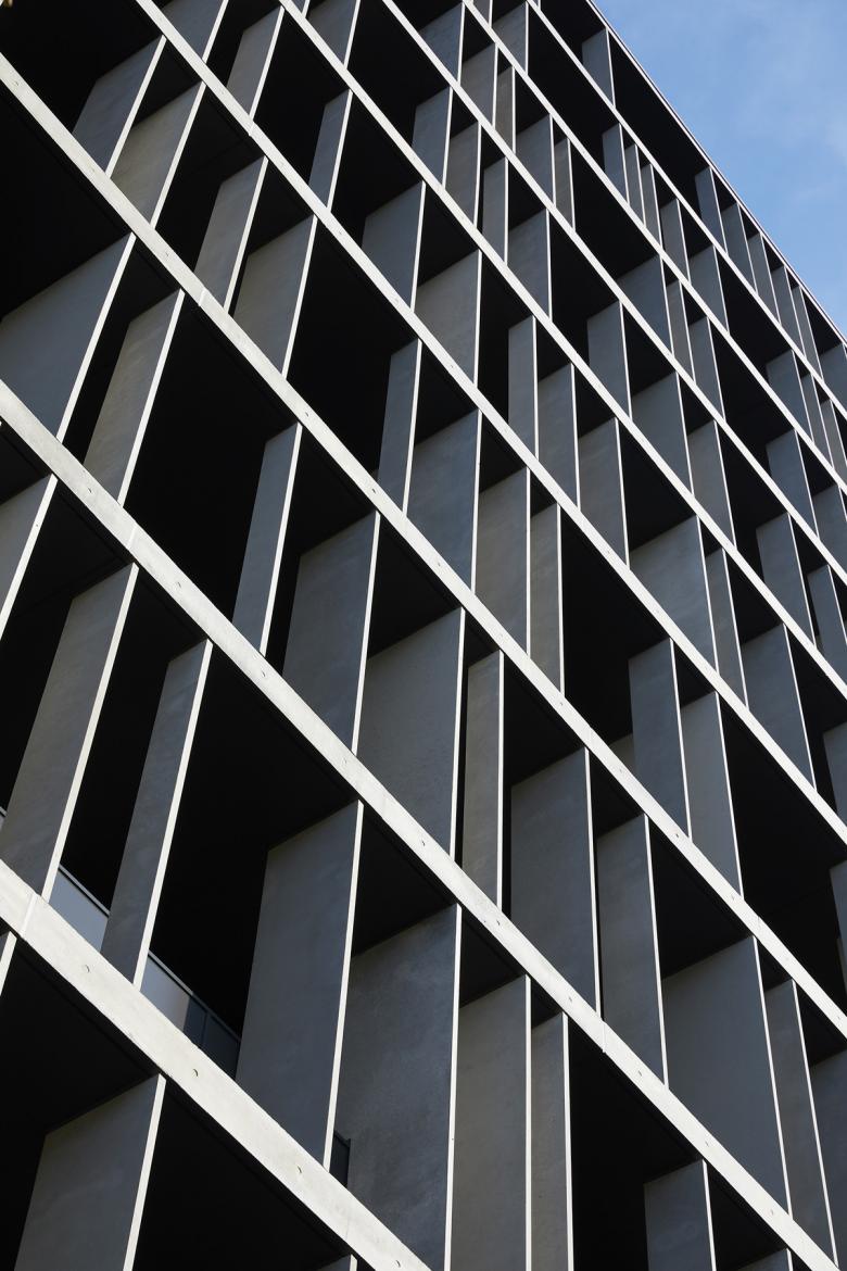
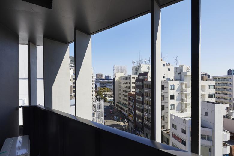
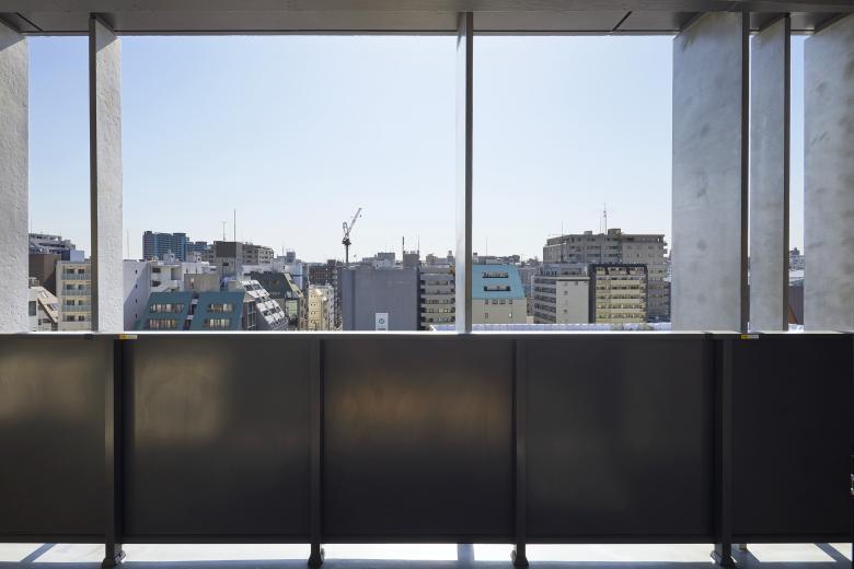
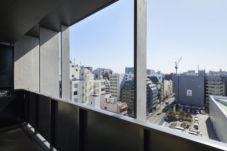
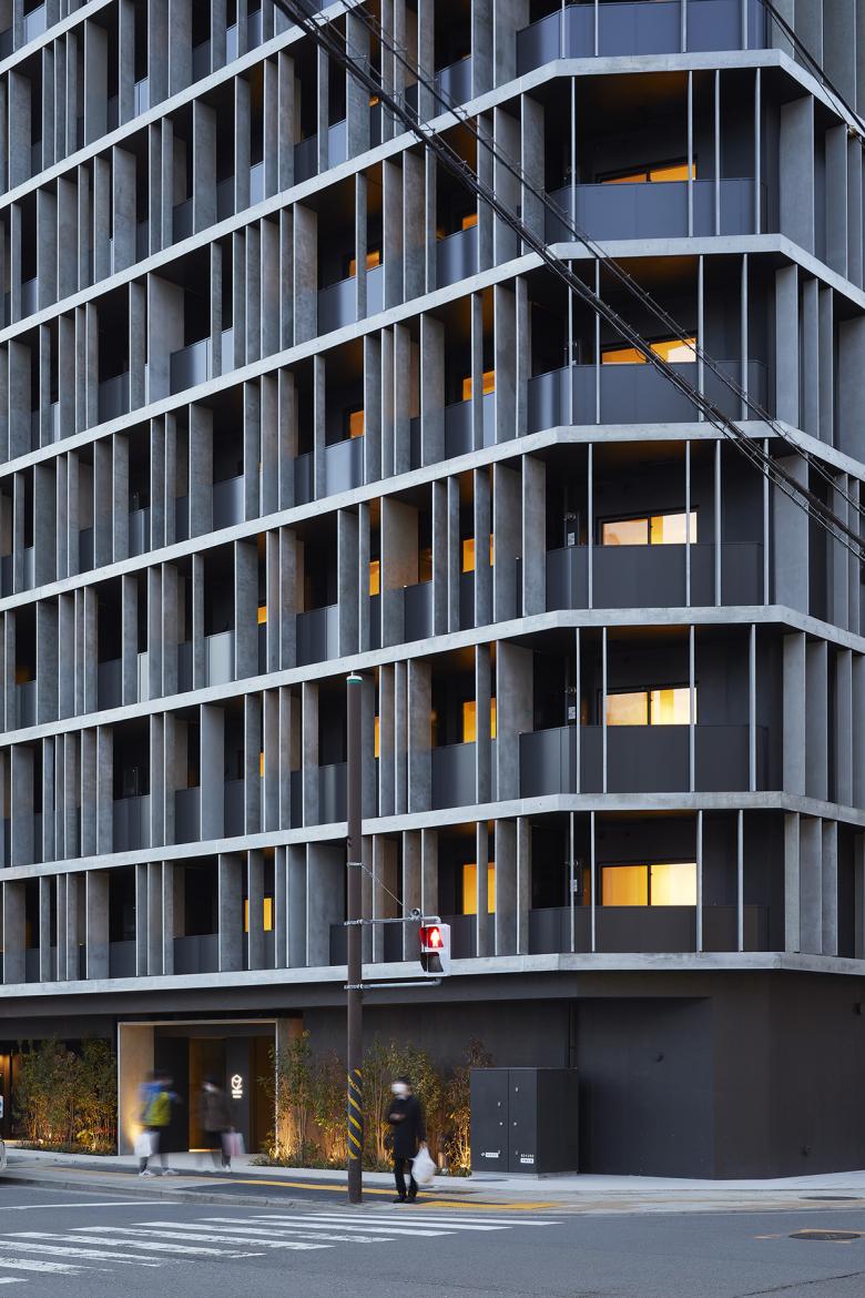
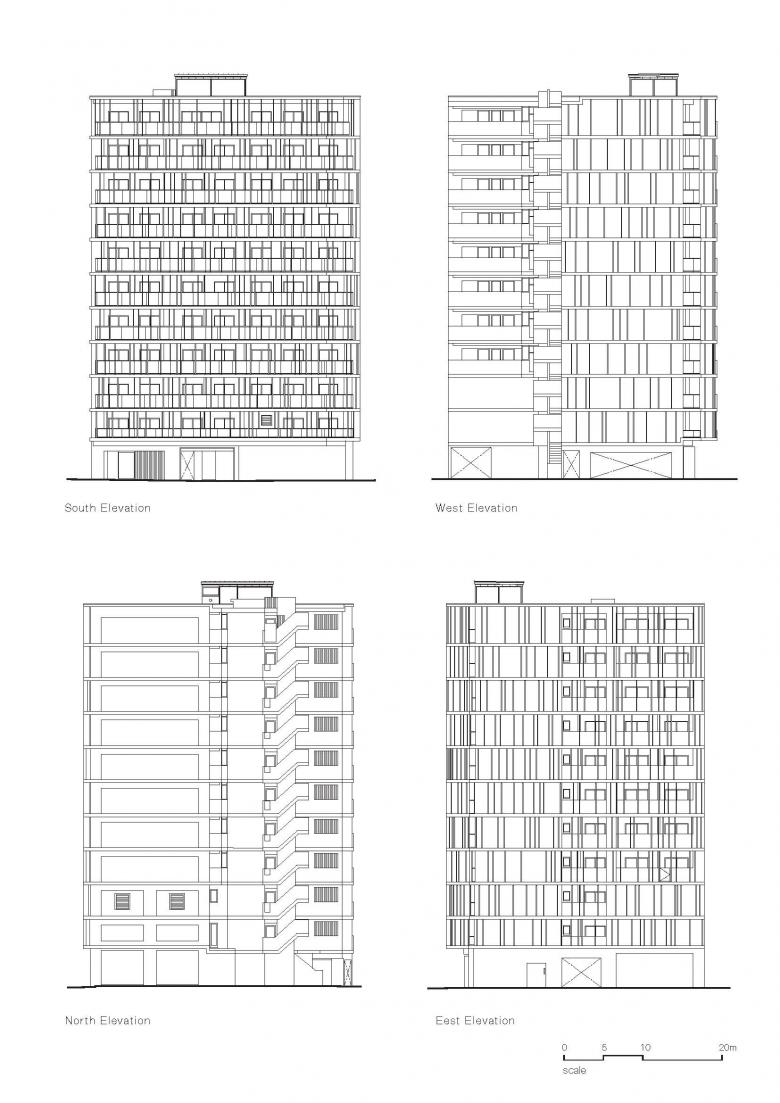
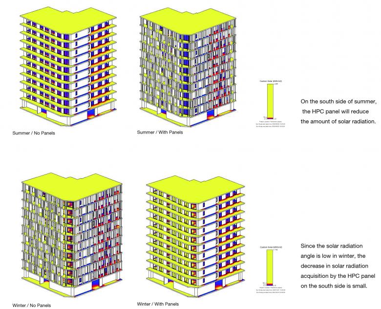
The vertical concrete panels have been added to the facade randomly, concealing the small units behind them. Panels, thin as they are, are unobtrusive, befitting the scale of the individual units. Each unit has a width of just 2.9 meters. The depth of panels vary between 200mm to 900mm, with some functioning as brise-soleil and some as dividing walls between different units, whilst others are more decorative, framing views of the city.
In Japan, balconies are almost obligatory for mansion blocks as a mean of incorporating escape ladders to avoid excessive internal staircases, allowing for more space for individual flats. This results in them looking formulaic and monotonous. The concrete fins are deliberately made not to reflect the internal structure. Thin calcium silicate boards are discreetly tucked away behind these fins. In case of emergencies, they can be pushed down easily and the residents can escape using the escape ladders installed on each floor.
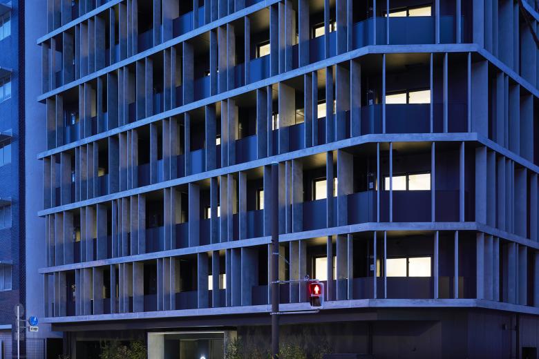
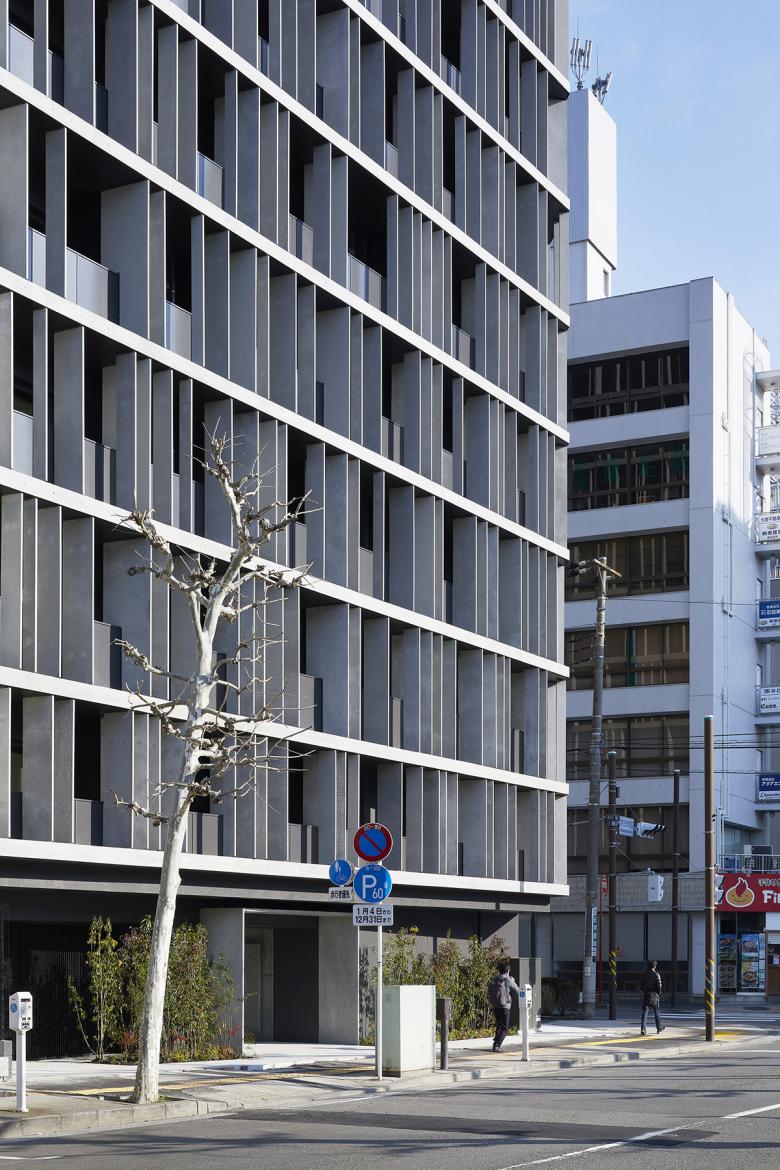
The new building is chamfered as many other corner buildings are in this area. We achieved this effect by extending the first floor slabs out of the facade then wrapping the fins around the corner of building.
The concrete fins on the facade are made with Hybrid Prestressed Concrete or HPC. They have been developed and patented by the Japanese company HPC Okinawa in 2015. The panels used in this housing block have been manufactured by Kooge Concrete company in Tottori prefecture, south of Japan.
By using enmeshed carbon cables instead of the usual steel rods to reinforce concrete and by adding polypropylene fibre to strengthen the mixture, the panels can be made as thin as 40mm, as tall as 5 meters, and incredibly still be load-bearing. Currently, however, the Japanese building regulations do not permit the use of these panels structurally.
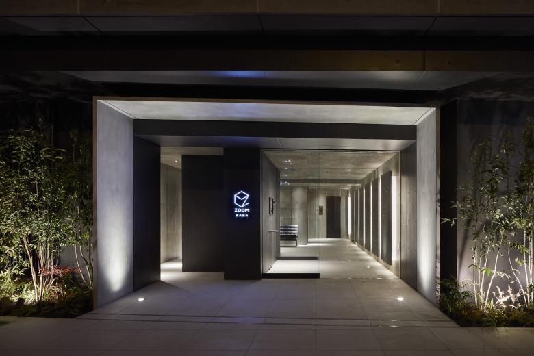
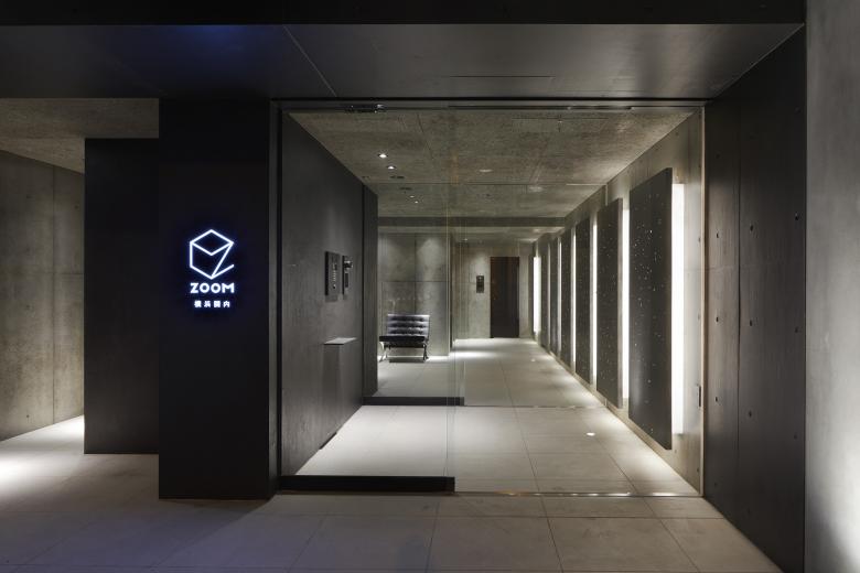
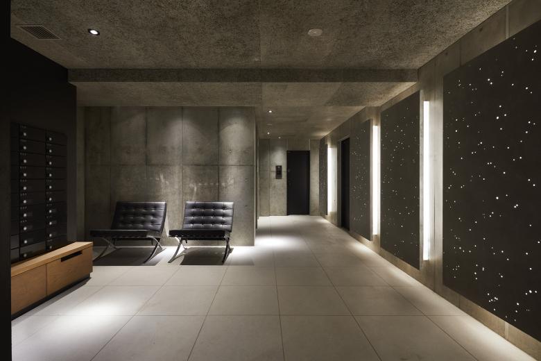
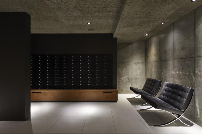
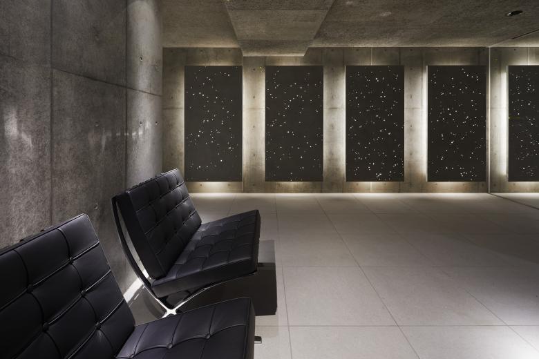
We also create special sculptural pieces using HPC panels to light up the communal entrance area inside the building. We cast circular acrylic moulds into the concrete panels and they light up like the night sky with stars. The generously-proportioned entrance area is also an added luxury not usually granted to ‘one-room mansion’ blocks in built areas such as Tokyo and Yokohama.
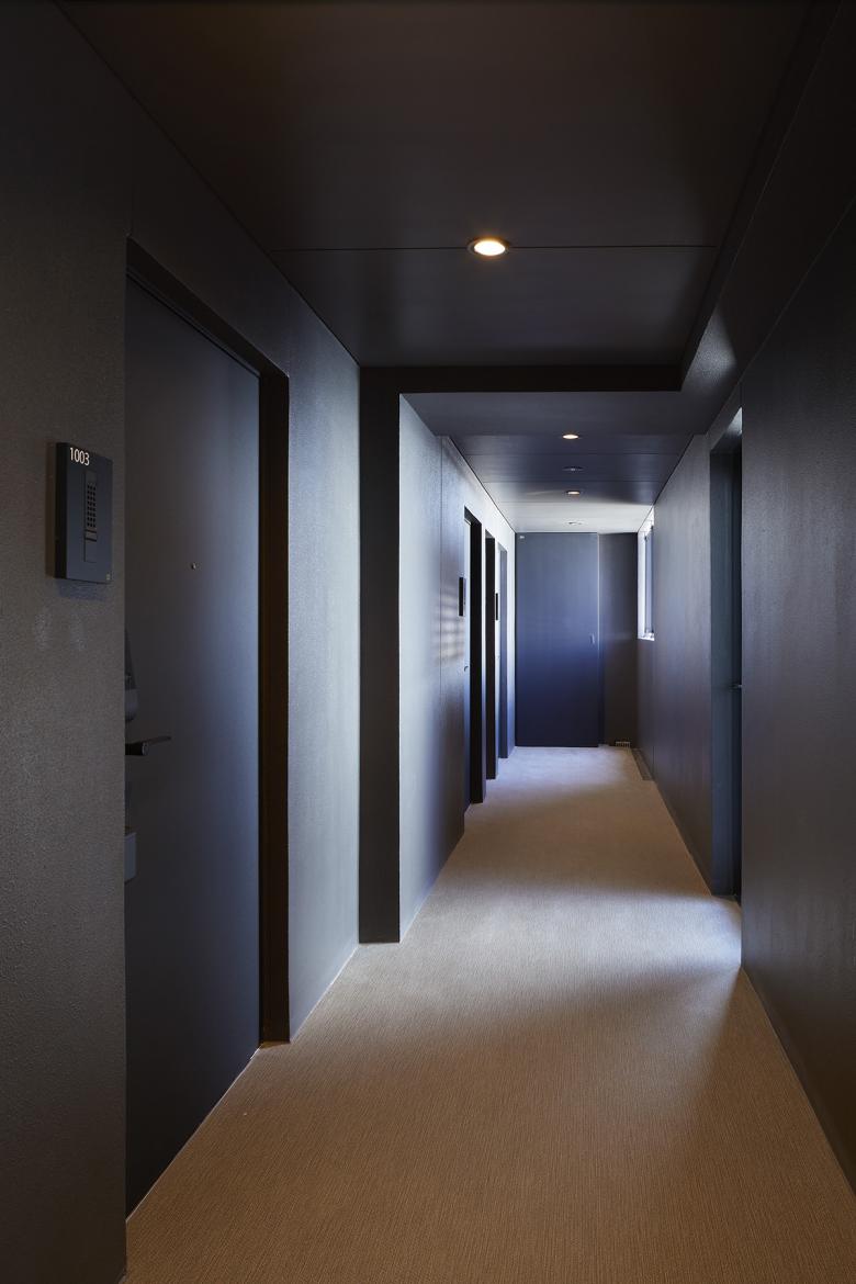
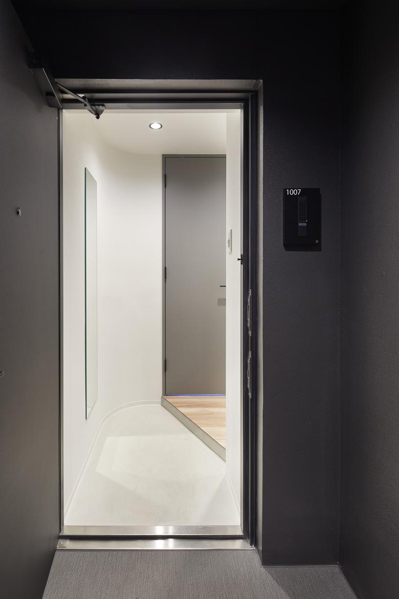
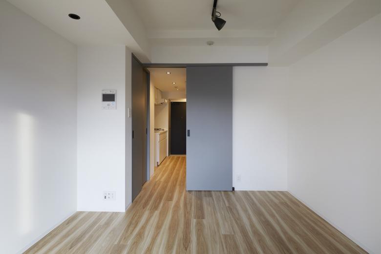
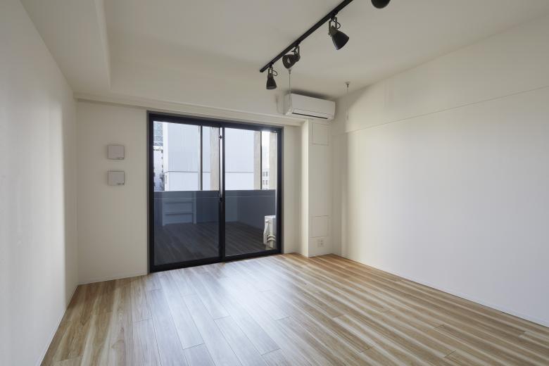
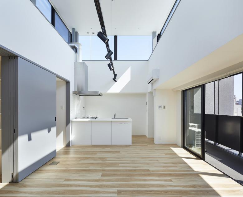
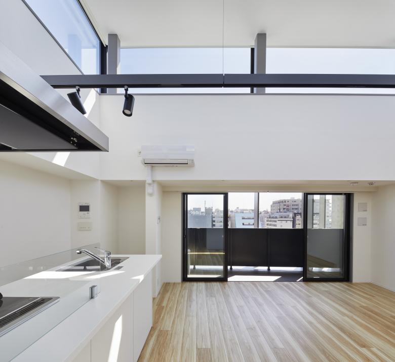
One unit on the top level of the residence is spacious with sky lights and extra bedrooms. All the flats have been decorated with a minimum palette of white, grey and black. Rooms are laid with timber flooring. Kitchen and utility spaces have been tucked away neatly along the entrance hallway and doors are made to slide over one another at corners to make more space and provide some form of privacy.
As mentioned above, the Japanese mansion blocks tend to look very similar due to the requirement of the balconies on the facade. We took extra care to make sure that the boilers and air-conditioning units placed outside on the balconies (per the norm in Japan) as discreetly tucked away as possible. Handrails, exterior walls and the balcony ceilings have been painted black. We wanted to bring out the light grey colour of concrete.
When you look at the entire building from the front elevation, these concrete fins appear as sharp as a Samurai’s sword cutting through the air. If you look at the buildings from the side, however, you can begin to appreciate the texture of the exposed concrete, which changes its appearance with the intensity of the light.
Facade designs tend to reflect the interior structures but we wanted to experiment and play against such a norm so that the new building resonated with the post-war buildings in the area. The individual flats feel more open and connected with the outside world through the thin concrete panels, retaining a sense of scale that is both human and urban.
Kannai Blade Residence
Back to Projects list- Year
- 2021
- Client
- TOHSHIN PARTNERS Co. Ltd.
- Contractor
- Fujiki Komuten Co., Ltd.
- Structural Engineer
- Delta Structural Consultants
- Service Engineer
- Comodo
- HPC Consultant
- Jin Hosoya
