Interview with Mecanoo's Francine Houben
'The world is changing; we have to update'
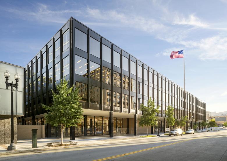
Visitors to the American-Architects platform of World-Architects last month voted Mecanoo’s renovation of Ludwig Mies van der Rohe’s Martin Luther King Jr. Memorial Library in Washington, DC as US Building of the Year, picking it from dozens of adaptive reuse and renovation projects. Following the announcement of the winner in early February, World-Architects spoke with Mecanoo founding principal Francine Houben about the MLK Library, other library renovations, and libraries in the 21st century.
John Hill (W-A): To start, can you talk about the beginning of the project. It started as an invited competition in 2013, correct?
Francine Houben (Mecanoo): Yes, it all started with a public tender, when we got shortlisted together with two other offices back in 2013. It was a very special process, in which we teamed up with architect of record [Martinez + Johnson Architecture, now OTJ Architects]. On the initial design, the DC Libraries wanted to make the “Library of the Future” — and add housing on top of it! In our final presentation, together with the other two firms, we presented our ideas to the jury in the MLKL great hall, which back then still included affordable housing on top of the building. After, we were selected as the winner.
What were your first impressions of the existing building, and what were your initial design ideas?
On this initial design we kept all the Mies structure unaltered, and for the addition we made it a composition — a beam — on top. We placed the residential entrance on the back, on what is called G Place. We got selected and we were happy to start with this process. I never thought it was a good idea to add a residential volume on this particular public building. A library — a public building — has very different ownership, maintenance, and sustainability issues than a residential building. In the end DC Libraries canceled that idea, and changed direction. I think that was a good decision on the part of the city.
Was it early in the process that they got rid of the residential component?
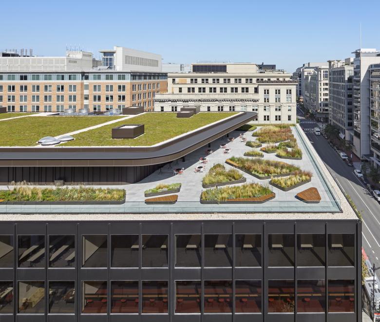
I think maybe in the first half year. I totally agreed with that because all of Washington, DC, is around ten stories high and the MLKL is actually lower. In combination with the idea to make an elevated park on top of the building, it was beneficial to be surrounded by the other buildings, providing shelter and a different level of intimacy to the space.
With Mies’s library, what were the big issues or deficiencies that you had to overcome?
The documentary A Legacy of Mies and King was made during the process of finding out how to deal with a Miesian building and how to understand Mies; also, of course, it was very important to understand Martin Luther King and what his values represent nowadays. As an architect it was important for me to balance these two aspects, but my conclusion — expressed in the documentary — was that Martin Luther King’s values are more important than the values of Mies. In a way, I think we brought them beautifully together, if you visit the building now. The design on which we started working was the building as it was delivered by Mies and his project architect. To be honest it was not a beautiful building from the inside. Have you visited this building before?
I did go before the renovation.
It was not a pleasant building. But knowing the spatial ideas of a Mies building — the horizontality and the detailing of the facade — I think we really brought that into our design. At the same time, you also have to realize that it was designed in the late Sixties, early Seventies, so it was not entirely designed as a public building; it was almost designed as an office building with a monumental lobby. It didn’t feel like it was for the public — of all ages and all backgrounds.
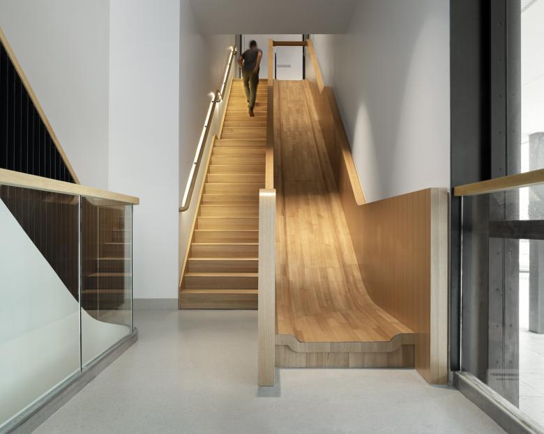
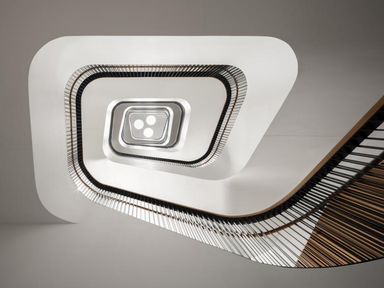
We wanted to change that, and one of the first decisions we made was to change the position of the stairs. The building has four cores, but originally the public stairs were at the rear, while the front had the back-of-house stairs. We kept the four cores with their brick enclosures. We made it Mecanoo, with a set of monumental stairs that are beautifully detailed and with a clear design movement, organic, a clear departure from Mies. We wanted to make clear what is Mecanoo and what is Mies. Still it’s a very Miesian building. I call these the social stairs, or intuitive stairs. Maybe you want to go to the children’s library, but then … “Hey! I can also see this programming in the building.” With this design feature we stimulate people to take the stairs, but if you cannot you can take the elevator — or you can slide down, from the second floor to the first floor in the children’s library, which is fun.
For me it was interesting to see what happened after COVID. Back then we were adding the final touches to one library in New York (SNFL) and the MLKL in Washington, DC. In the design process we were concerned about making walkable buildings with very generous stairs and stimulating the movement of people in which you have plenty of generous space. I always said, “I want two people going up and one down, and it should fit.” We have included this spatial feature in our design which is very pleasant for a public building, but also very COVID-proof.
Although I haven’t been to the renovated MLK Library, I’ve been quite a few times to the Mid-Manhattan Library (now Stavros Niarchos Foundation Library [SNFL]), since it’s the best library in the NYPL system to go check out books or just to browse the stacks and find books. So I see what you mean in terms of how the stairs are functioning. But I was wondering how the MLK Library works for different people, different users. Do the stairs allow people to visually see what's happening elsewhere in the library so they can discover other things there that they didn’t know about? Were you saying that?
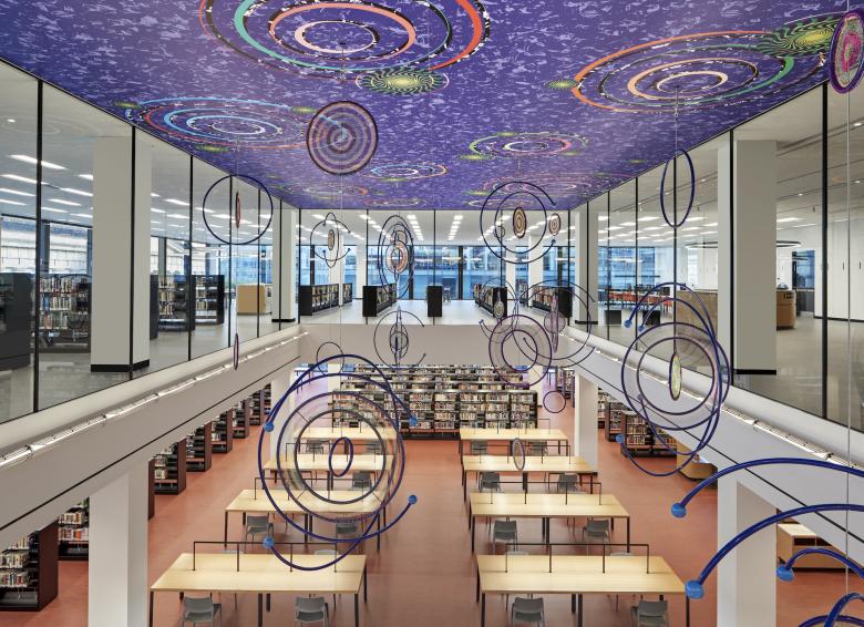
Yes, that's what I'm saying. Of course, in the case of MLKL it's a low-rise building, not a high-rise building. New York is seven floors, in the MLKL we have four or five floors, with a beautiful basement, what I call the lower ground floor. The east side, facing the National Portrait Gallery, is a more active zone, with the subway and the Metro. The west side is facing another building. We kept the east side as an active zone, with the children’s library, the grand reading room, and the café on the roof. The west side, it is more protected, so people who are visually impaired are there because they don’t want so much light. I think it’s a very nice balance. We did it with the chief librarian, the director of the library and all their staff, to put the program where it is logical and beautiful and needed.
It’s a big building — twice the size of Mid-Manhattan— and it has two levels underground. Previously there was parking and meeting rooms and the auditorium, all in the basement. We opened it up with beautiful stairs that go down to the lower ground floor. This is where we have the Fab Lab, you can do podcasts, 3d printing, dance classes; all the noisy things were put on the lower ground floor. It's also surrounded by archival books and materials and the book handling system. The floor below is occupied by parking and mechanical equipment.
So are the MLK Library and SNFL indicative of more and more libraries looking to renovate or be adaptive reuse projects rather than new buildings? Are you seeing that with your commissions?
If I look at the recent libraries we have worked on, for example the Library of Birmingham or the Tainan Public Library in Taiwan, and another one in Athens, those are all newly built. Recently we did the interiors for the LocHal Public Library in Tilburg, this project is a true collaborative design with other great architecture offices, it has been very celebrated and received numerous awards. Mecanoo is currently updating the Hague Central Library that was originally designed by Richard Meier; the interior design is outdated and not able to accommodate change. Last year we were selected to design the new Macau Central Library — a very exciting design located in the heart of the historic center of Macau.
The Hague library is just a few decades old but is old fashioned in terms of how libraries are working?
Yes, libraries are so extremely important, not just for archiving books and getting new books; much more is happening. In every city it is different. If you look at the functions that are in Washington, DC, they are different than the ones in New York, or the Hague, or Tilburg, or even Taiwan. Obviously, it is reflecting the needs of a certain area in a certain city. In New York we are working on the main research library [Stephen A. Schwarzman Building] across from the SNFL. A research library is something totally different. In the research library no books go out, unlike the collection in the circulating library, and a lot of people go there to study as well, bring their own books and tech. It's about sense of place.
As a New Yorker it's a very interesting place because there are also a lot of tourists who go to look at the Rose Reading Room and the rest of the library. One might think a research library is very stodgy, especially if it’s a hundred-plus-year-old building, but this one is very dynamic, lively because of all these different people using it. What is the status of that project and how is the design being worked on? It is very much the opposite of the earlier Norman Foster proposal; yours is more piecemeal and will maybe evolve over time…
If you compare it to the Foster plan, the idea behind was to sell the Mid-Manhattan Library, get the money and place the Mid-Manhattan into the stacks. There was a big protest, so the New York Public Library decided to keep the circulating library and keep the central library. We made a master plan with what is logical in this building and what is logical in that building — we were designing and working on both buildings at the same time, so they influenced each other. The children were in the Stephen A. Schwartzman Building, but we decided to move them to the circulating library because that's more logical. Some of the collection — for instance, the picture collection — we moved to the research library. We also had to integrate the former Science, Industry and Business Library; we brought that into SNFL.
I also wanted to integrate Bryant Park into the central library in what is under construction now, the extra entrance on 40th street for staff and researchers. It will feel like Bryant Park goes around the building. There will also be an education center for young people who are interested in research; it's a big educational goal, you want the young people to be interested in research. You want to have that flow so we made it a very easy step from SNFL across the street through to that new entrance.
So you have the Schwartzman Building designed by Carrère and Hastings in 1911 and Mies in DC in 1972. How did you approach renovating the spaces for new programming but also preserving the architecture?
It starts with researching the original architects and their ideas, to really understand them and also respect their design choices. The Mies project started two years before the New York library, and I remember going to just about all Mies buildings that were renovated. As you can see in the documentary, we discovered that the project architect [Jack Bowman] was still alive; I really wanted to talk with him about his memories. Also, I wanted to see what other architects are doing when they do adaptive reuse, as you mentioned it. I realized that on many of these projects most architects would just restore the building to its former glory. For me that is too dogmatic. The world is changing; we have to update.
We wanted to balance what was kept as original, though technically we really had to improve these buildings. You cannot just technically bring it back the way it was, especially if it was not well done. The facade of the building in DC was falling apart; if we would have brought it back the same, it would then have the same problems. It was also, intellectually, an extremely interesting project for us, and because of that we decided we needed to record it; that is why we made the documentary. I think that now a lot of people will not remember how the building used to be.
When I tried to find some information on Mies’s design in the books on him in my personal library, I only discovered one or two paragraphs on the project. The library seems to be like a footnote in histories of Mies rather than an important chapter in his career; perhaps this is timing but also, like you were saying earlier, because of the way it applied an office typology to the library…
It didn't feel like a library, to be honest. Also be aware that the building was never designed for Martin Luther King; it was a big struggle to get it named after him. Now you might think that's normal, but at that time it was not normal. It became my intention — my personal intention — that I really wanted to make the Martin Luther King Memorial Library, to celebrate him.
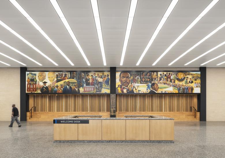
We had very interesting discussions. Of all the projects we’ve done around the world, I think it's the one where we had the most meetings. Because it's a federal project, it's a city project, and it's Martin Luther King. There was a whole DC community involved, and they were not at all interested that it was a Mies building — no interest. Martin Luther King? Yes. How to celebrate Martin Luther King was a very interesting discussion, and I hope we did well. We also kept the mural in this prominent place and made a recessed space underneath it for social gathering, I think it's more prominent and more beautiful and more welcoming than it was before.
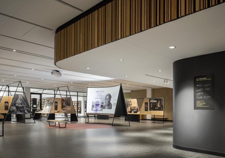
The values of Martin Luther King are timeless. It's very much about education. It's very much about getting jobs for people. It's for all people of all colors of the skin. And, of course, it's in Washington, DC. I think the discussions we had, and the ideas of the director, Richard [Reyes-Gavilan], will put King very much in the programming of the building. He may even do an artist-in-residence program, there are displays about Martin Luther King in the exhibition, and also the black history collection is in the building. For me personally, it's a very, very important project about what architecture is.
I think that’s a great statement to end on. Thank you!
