ADBA – Federal Union of German Pharmacists' Associations
Berlin, Germany
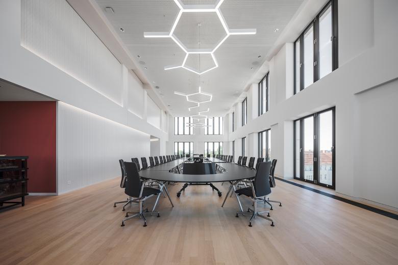
In a modern office building on the Europacity art campus in Berlin, designed by Kleihues + Kleihues Architekten, Reuter Schoger Architektur Innenarchitektur has realised the new headquarters of the Bundesvereinigung Deutscher Apothekerverbände e.V. (ABDA). Around 70% of the building space is used by ABDA itself, while the remaining space in the southern part of the building has been let. In total, ABDA has seven floors and around 7,800 square metres of state-of-the-art office space for up to 140 employees. A particular challenge for the team of interior designers led by Wencke Katharina Schoger was to express the importance and self-image of the profession in terms of design. The result is a modern working environment for networking, representation of interests and representation, for meetings, communication and co-operation as well as for concentrated office and administrative work.
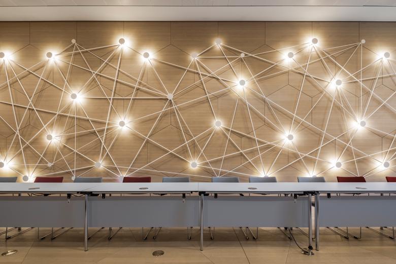
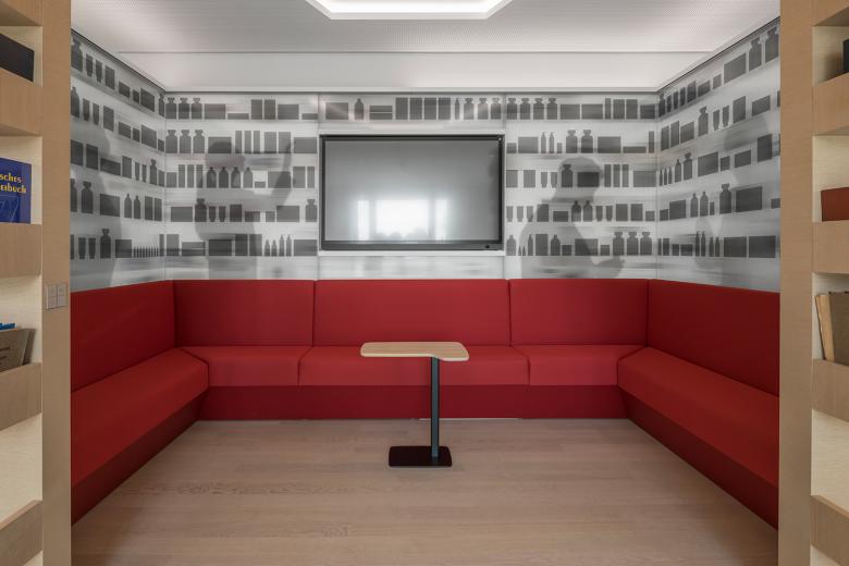
With over 100 office workstations, reception, six conference rooms, a plenary hall, library and catering facilities with a full kitchen, the site is optimally equipped to meet the requirements of modern association work. ‘The design focus is on the comprehensive, life-saving knowledge of active ingredients and interactions, the special skills and personal responsibility of pharmacists,’ explains Wencke Katharina Schoger. This knowledge is symbolically translated into room shapes, furniture and lights in the shape of molecules, light installations reminiscent of neuronal connections and seating in the shape of cells. Open work niches showcase the past, present and future of the pharmacy - a collaboration with the Schimmelpenninck design studio. In the café, the theme of food as a remedy is taken up, with medicinal plants growing integrated into the side of the stairs. The canteen with its open-plan kitchen becomes an interactive laboratory thanks to mobile glass walls.
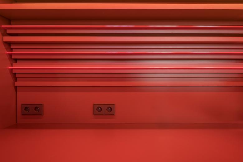
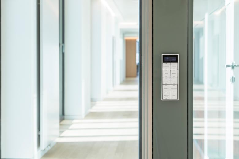
Targeted routing and functional overlaps motivate people at the new location to engage in dialogue with each other. The interior designers created stimulating spaces with a variety of zones for communication and informal exchange, for collaboration and concentration. Knowing the power of colour, the employees were able to individually choose the colour of their personal office. The well-known pharmacy red colour is an important part of the design for the public areas. It can be found again and again discreetly in furniture and fittings. For example in the LS 990 switches and sockets from JUNG in the colour 4320M le rubis - the elegant ruby red from the Les Couleurs® Le Corbusier colour palette. They blend in perfectly with the red fittings. The building also features switches and sockets from the LS 990 range in white and aluminium as well as intelligent F40 room controllers, which can be used to control the building technology easily and conveniently.
All the objects, shapes, light and colours of the interior design reflect the self-image of the organisation and the profession - subtly yet clearly. A successful interpretation of corporate interior architecture.
- Manufacturers
- JUNG
- Location
- Berlin, Germany
- Year
- 2024
- Client
- ABDA – Bundesvereinigung Deutscher Apothekerverbände e. V.
- Team
- Kleihues + Kleihues Gesellschaft von Architekten mbH, Reuter Schoger Architektur Innenarchitektur Part mbB
