Business Park Airporthotel
Berlin, Germany
On Alexander Meissner Street a new business center with hotel is developing - the first step to a future business park - accompanying the new Airport Berlin Brandenburg Willy Brandt.
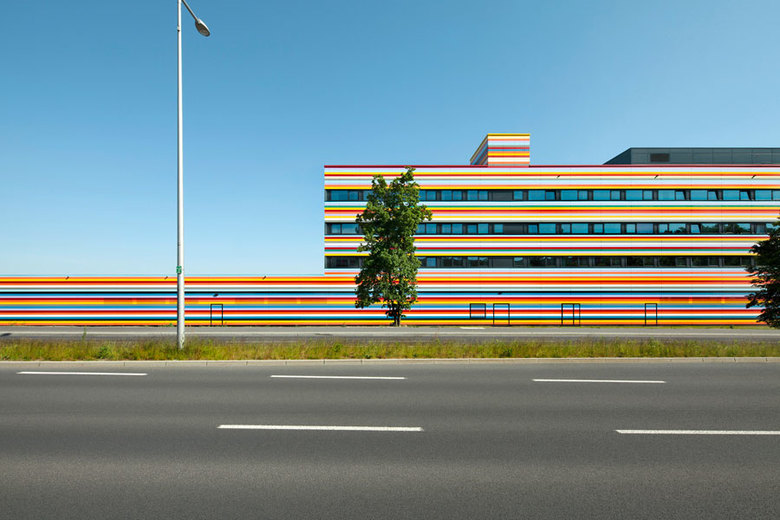
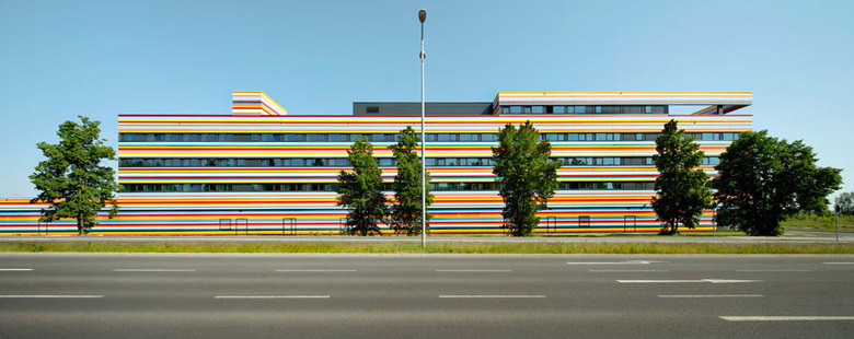
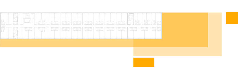
The building defines the entrance of the Airport Business Park. Users and neighbors are unknown at the start. The site is vacant. The form was created with a sustainable strategy: ecological, economical, social and cultural. Relevant variables are urban contours, compactedness (optimal A/V ratio), energy concepts, functional requirements of users, building processes, materials used, financial strategies, budget limits etc. We call that the "Sudoku" strategy (trial and error). In search of a form, basic geometries were used - cubes, plane, lines, dots. They can be organized in any order, varying in their length, width, and height (floors) and the specifics uses are defined later. The result is a coordinated systematic convolute of shapes and surfaces with one clear configuration, a house with just the required volume and surface. Such a building is created with just the necessary volumes and surfaces. The structural system made of prefabricated columns and floor slabs. Like the „Domino-House“ (Le Corbusier), all floor plans are completely flexible - the interior organization is flexible and can always be adjusted as needed. All slots are perpendicular to the facade. The thus-arranged shafts and horizontal bands of windows of the facade allow unrestricted conversion of use – for example as an office building.
Facade
The realization was preceded by nearly three-years of planning process before a building permit could be submitted. First, the client decided to invest in this plot because of its proximity to the future Capital Airport. No master plan existed then. A competition was held and the basis of the development plans. Simultaneously a search for new users was conducted. Propositions for future building were developed, adapted and rejected. Rapidly it became clear that the building was going to have to be very flexible. The uses would probably change frequently. So it seemed that with this particular planning process, we needed to adopt a flexible but also unifying strategy. To determine the final appearance, other parameters had to be considered. So first we investigated different phenomena: Markings on the sky (lines, cloud holes, vistas), global + regional, landing + departure (playing with scale), natural spatial characteristics (nature reserve, neighboring birch forest), technological innovations (dynamic development for aerospace technology).
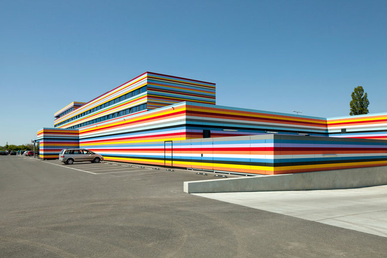
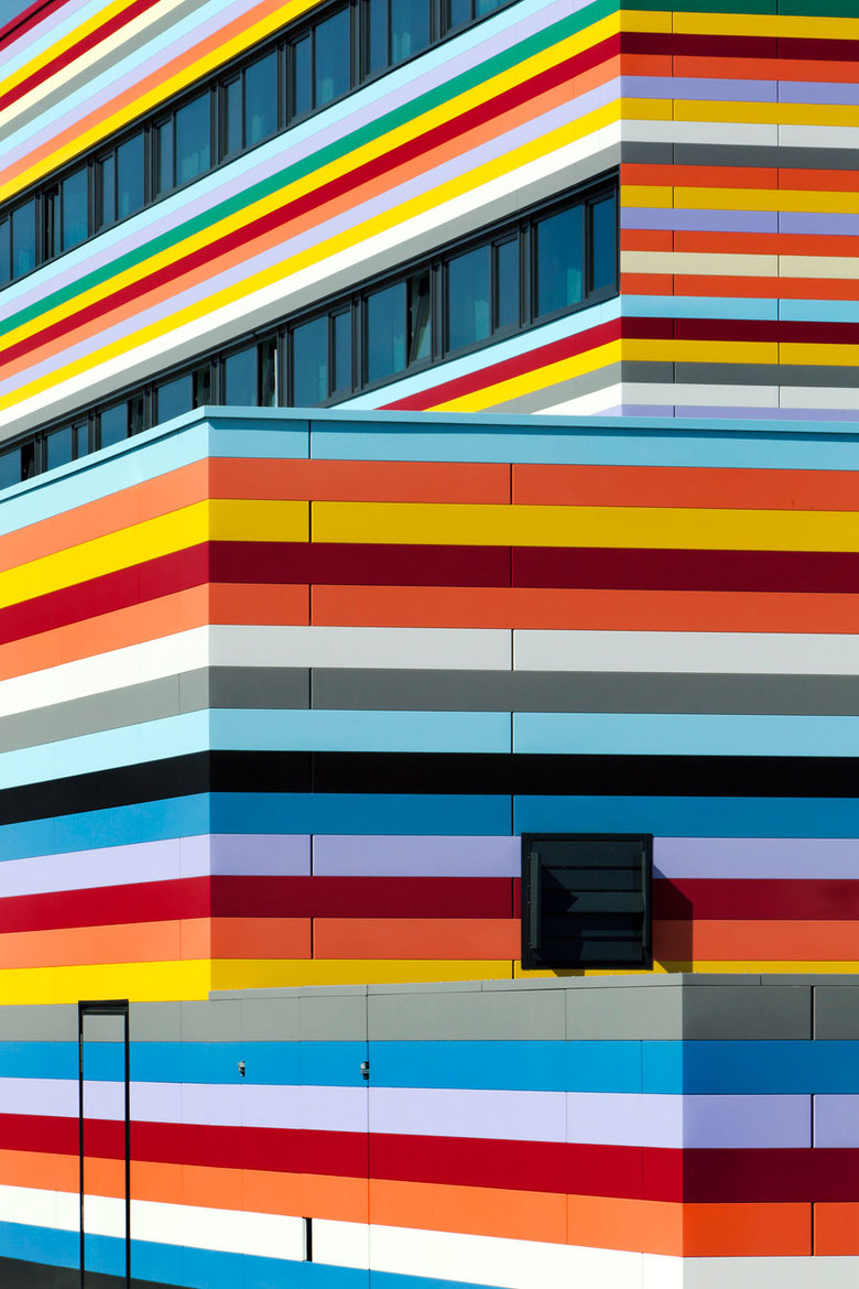
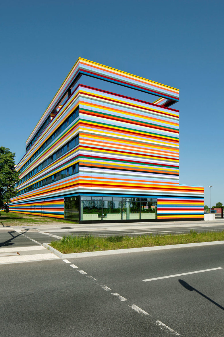
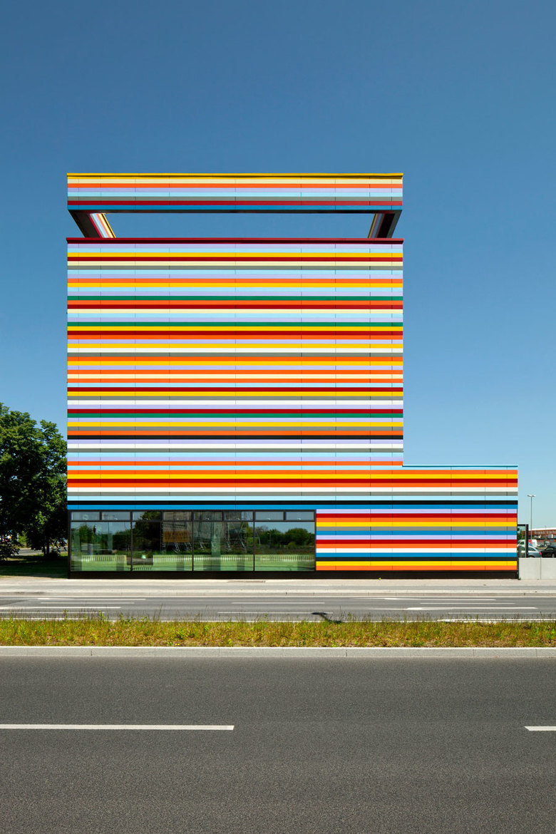
Now facade types were explored - monolithic, unitized, collage (glass + concrete) structures, colors, reflective, etc. A decision was made in favor of a horizontal disposition, which are synchronized which the bands of windows. Planning process required a flexible facade concept – it would be a way to unify the actual appearance of the building previously described as basic geometries: a jumpsuit made of steel panels with defined, summarizing color code. The system is modular and adaptable in the design + construction and the color creates unifies the whole building, it is robust, reversible and affordable.
Engineering, construction, manufacturing and maintenance costs of the facade
The chosen system is modular and therefore flexible during the planning and construction process. Steel is highly resistant to mechanical stress, and due to its properties, it is also not flammable (simplified fire protection). It offers thanks to its inertia a good protection against overheating in summer, provides a good sound insulation (hotel use) and minimizes the U-value threw mounting points thanks to large spans elements. The mounting system with hidden guide rails allows a constraint-free and simple mounting. The result is ventilated and long lasting smooth facade. Effect of temperature and tolerance on building site are reduced. The large span of facade elements and the minimal U-value (reduction of hanging points) enable a reduction of thermal bridges. The texture of the color coating ("dim") makes the façade a self-cleaning surface, it is UV-stable, non-glare and intense colors in all weather conditions. Large spans of the panels allow quicker mounting and thus lower installation costs. The minimal number of attachment points reduces the heat loss, the smooth surface makes cleaning and maintenance obsolete. The result is an economically realistic facade system and product, its costs per square meter is only slightly over composite insulation facade elements. The raw steel surface is protected with a long lasting zinc-magnesium composition. The entire facade system is 100% recyclable + permanently smooth facades.
BERLIN_AIRPORT HOTEL
2012
On Alexander Meissner Street a new business center with hotel is developing - the first step to a future business park - accompanying the new Airport Berlin Brandenburg Willy Brandt.
The building defines the entrance of the Airport Business Park. Users and neighbors are unknown at the start. The site is vacant. The form was created with a sustainable strategy: ecological, economical, social and cultural. Relevant variables are urban contours, compactedness (optimal A/V ratio), energy concepts, functional requirements of users, building processes, materials used, financial strategies, budget limits etc. We call that the "Sudoku" strategy (trial and error). In search of a form, basic geometries were used - cubes, plane, lines, dots. They can be organized in any order, varying in their length, width, and height (floors) and the specifics uses are defined later. The result is a coordinated systematic convolute of shapes and surfaces with one clear configuration, a house with just the required volume and surface. Such a building is created with just the necessary volumes and surfaces. The structural system made of prefabricated columns and floor slabs. Like the „Domino-House“ (Le Corbusier), all floor plans are completely flexible - the interior organization is flexible and can always be adjusted as needed. All slots are perpendicular to the facade. The thus-arranged shafts and horizontal bands of windows of the facade allow unrestricted conversion of use – for example as an office building.
Facade
The realization was preceded by nearly three-years of planning process before a building permit could be submitted. First, the client decided to invest in this plot because of its proximity to the future Capital Airport. No master plan existed then. A competition was held and the basis of the development plans. Simultaneously a search for new users was conducted. Propositions for future building were developed, adapted and rejected. Rapidly it became clear that the building was going to have to be very flexible. The uses would probably change frequently. So it seemed that with this particular planning process, we needed to adopt a flexible but also unifying strategy. To determine the final appearance, other parameters had to be considered. So first we investigated different phenomena: Markings on the sky (lines, cloud holes, vistas), global + regional, landing + departure (playing with scale), natural spatial characteristics (nature reserve, neighboring birch forest), technological innovations (dynamic development for aerospace technology).
Now facade types were explored - monolithic, unitized, collage (glass + concrete) structures, colors, reflective, etc. A decision was made in favor of a horizontal disposition, which are synchronized which the bands of windows. Planning process required a flexible facade concept – it would be a way to unify the actual appearance of the building previously described as basic geometries: a jumpsuit made of steel panels with defined, summarizing color code. The system is modular and adaptable in the design + construction and the color creates unifies the whole building, it is robust, reversible and affordable.
Engineering, construction, manufacturing and maintenance costs of the facade
The chosen system is modular and therefore flexible during the planning and construction process. Steel is highly resistant to mechanical stress, and due to its properties, it is also not flammable (simplified fire protection). It offers thanks to its inertia a good protection against overheating in summer, provides a good sound insulation (hotel use) and minimizes the U-value threw mounting points thanks to large spans elements. The mounting system with hidden guide rails allows a constraint-free and simple mounting. The result is ventilated and long lasting smooth facade. Effect of temperature and tolerance on building site are reduced. The large span of facade elements and the minimal U-value (reduction of hanging points) enable a reduction of thermal bridges. The texture of the color coating ("dim") makes the façade a self-cleaning surface, it is UV-stable, non-glare and intense colors in all weather conditions. Large spans of the panels allow quicker mounting and thus lower installation costs. The minimal number of attachment points reduces the heat loss, the smooth surface makes cleaning and maintenance obsolete. The result is an economically realistic facade system and product, its costs per square meter is only slightly over composite insulation facade elements. The raw steel surface is protected with a long lasting zinc-magnesium composition. The entire facade system is 100% recyclable + permanently smooth facades
Color concept
What we see is not the envelope as a facade of a house, but the "image" of a facade - an abstract composition that defies a clear organizations (building + use) and instead intrigues the passersby and invites them to create their own abstraction. The color selection offered by the manufacturer did not seem sufficient to achieve this goal. Therefore, additional colors that we derived from our coding were required. The texture of the colored coating ("dim") makes the façade a self-cleaning surface, it is UV-stable, non-glare, the colors are intense in all weather conditions, and particularly emphasizes on the level of abstraction the facade. The collaboration with Thyssen-Krupp was straightforward at all times. They were supportive and interested - even at a time when the system and the costs were not yet calculable.
Construction materials
4.000 m2 Steel Sheets (DIN 10142, Quality class Z275, two sides zinc coating ca. 275 g/m2) / standard Elements: thickness 200 mm
Steel sheet thickness: 0,75/0,88/1,0 mm Type H
Coating: SP/RSL (Visible side/Back side: Coating thickness 25 µm/10µm) Polyester Varnish
Uses
Hotel + Shops
Hotel
156 Bedrooms (15 Single, 30 for Family-, 111 Double)
Construction time
03/2011 – 03/2012
BGF ca 7.800 m²
BRI ca 30.800 m³
Particularity
„Design in Progress“
Client
ANH Hausbesitz GmbH & Co.KG, Arnsberg/ Berlin
Architect
PETERSENARCHITEKTEN
Civil engineers
SKP Ingenieure GmbH
HVACR
W33
Landscape architecture
Kamel Louafi
Interior architecture
studio Aisslinger
Photos
Jan Bitter
- Architects
- PETERSENARCHITEKTEN
- Location
- Alexander-Meissner-Straße 1, 12526 Berlin, Germany
- Year
- 2012
