Roca Barcelona Gallery
Barcelona, Spain
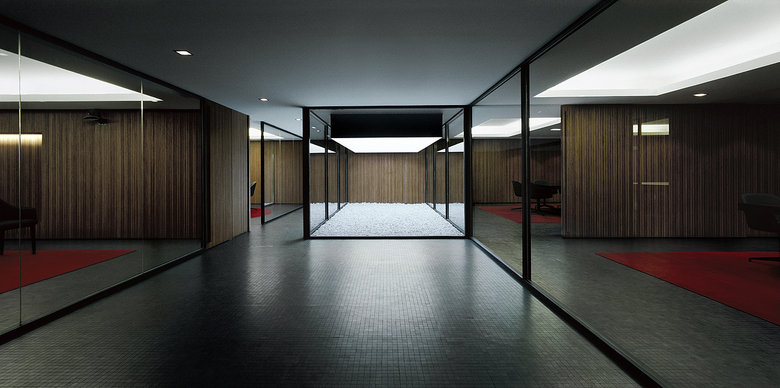
The development of this project is a study of special interest to us. Designing a project for a client like Roca is a big challenge, but a bigger challenge is creating a successful design. A whole range of possibilities is open to us by working with a company that is continually evolving with concerns about a current image that meets contemporary demands. We are aware that proposing a headquarters/social center/showroom for a business, brand, institution, etc. is more than creating just a building, it is representing and projecting an image through architecture, and therefore the building should express a corporate image in the collective memory.
Another challenge is creating a flagship project for a company like Roca in Barcelona which entails making a project for a large company in a big city – not just a big city, but as we see it, an epicenter of events, a global city in which there are many different types of looks and ideas which makes it a strategic city for the development of the best companies.
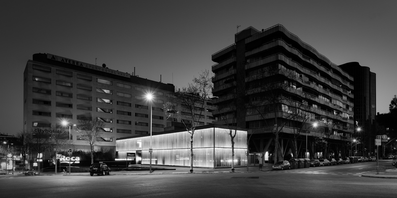
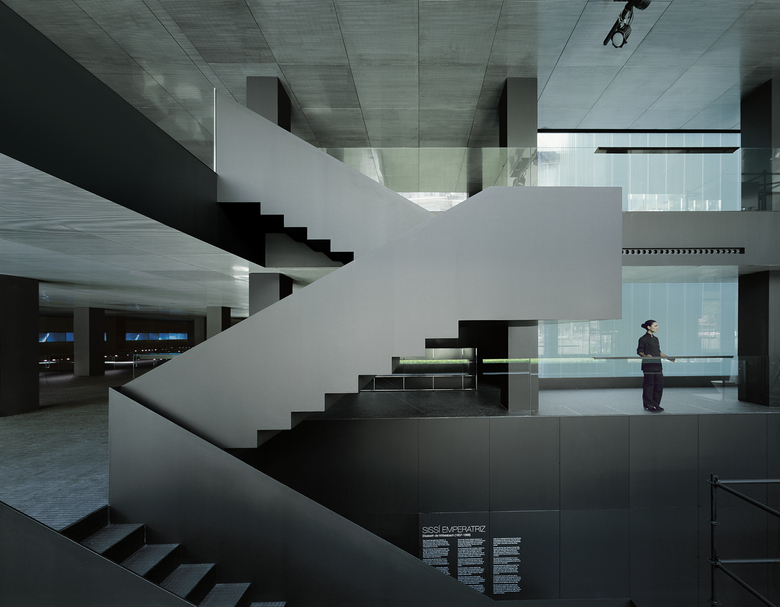
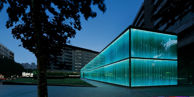
Typological study: since this type of building is based on its uniqueness or character, the exterior has a role of greater importance, especially since it is the first impression of the building. Even though the principal material of the façade is glass, the building does not function as a large window display. The glass works in different ways so that at some times it appears transparent and functions as a type of veil and reveals a bit of the inside but at other times it is simply perceived as transparent. In this way, the building becomes a unique piece, both day and night since in daylight it functions as a piece that attracts passers-by due to the seductive effect of the veil, and at night the building becomes a beacon. The logo/brand is presented on the façade in a discreet way, which is achieved by reducing its size in relation to the rest of the façade and utilizing transparencies or shades through which visibility is reduced, or completely blends the logo into the composition of the entire façade without being too evident. In all cases, the image of the architectural object predominates over the image of the product itself, allowing the building itself to incorporate the corporate image of the brand in the collective memory.
- Architects
- OAB Ferrater & Partners
- Location
- C/ Joan Güell 221, Barcelona, Spain
- Year
- 2009
