Two Stories Building
東京都, Japan
Exploring possibilities in commercial tenant buildings
Commissioned design of this commercial tenant building was inspired by considering two main themes.
First: how the design should relate to the neighborhood. We considered what aspects of the building should blend in and what statement it could make.
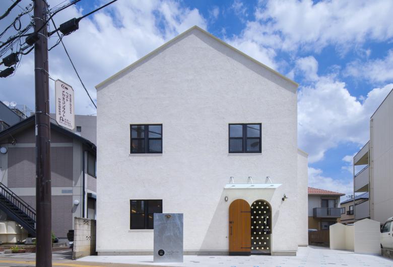
As for the existing cityscape, until around the 1990s many buildings in this suburb featured conventional low gable roofs, hip roofs, or pavilion roofs. Flat roofs appeared in the past 15 years or so as condominiums, apartment complexes, and commercial buildings popped up here and there. Now these flat-roofed office buildings and condos are becoming more common here. Without any bustling city streets, shopping districts, or built-up commercial areas by train stations, a multi-story, flat-roof building would have looked somewhat out of place.
The street in front is still fairly busy however, and people often pass by on their way to a nearby elementary school or park, or to a city office or public transportation at either end.
After pondering the building’s volume and shape, we decided that the volume should not stand out from the skyline on this block, and that the shape should consist of gable roofs on a low-rise building that would seem familiar to the mix of generations here, like how the neighborhood has looked for years. And because it is a commercial tenant building in a largely residential area, we sought elements less reminiscent of a business than of a detached home. In this way, the shapes mimic other shapes found in the neighborhood.
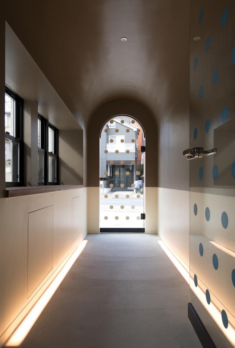
The second consideration in design was how to arrange a visitor’s approach to the businesses inside from the street. Specifically, we explored ways to act on psychological mechanisms as visitors pass from the door to the rooms inside. Before entering the rooms, visitors briefly pass through buffer zones (which we call “experience chambers”) that reset their mood.
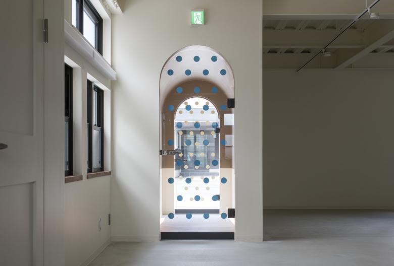
First, people’s latent desire for new experiences is roused even from the street in front as they notice a kind of dotted tunnel. Once they enter, the tunnel momentarily neutralizes the everyday world behind them, leading them onward. Similarly, a staircase leading to the second floor also serves as a mood-altering chamber, shifting their perspective the same way through a dotted, blue-colored static space before they enter the place of business.
It gives the impression of a moderated connection between the collective, social world outside and the spaces of individual businesses within, instead of a direct connection.
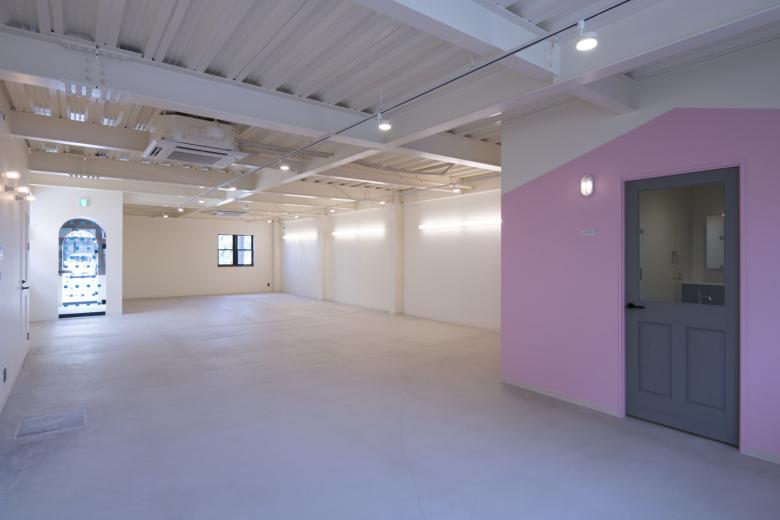
A homey exterior and skeletal interior
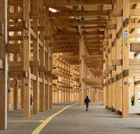
Although economical construction of commercial tenant buildings near suburban train stations often limits the choice of building material to steel-frame ALC, in this project we sought a more homelike appearance in line with a residential neighborhood. Inside as well, although the beams are exposed, the interior design supports our intentions for the building and may attract like-minded tenants.
At a time when cities are flooded with commercial buildings designed to emphasize economic efficiency and profitability, we sought an economical building that also introduces qualities that resonate with the community.
