DuPont SentryGlas at the University of Baltimore
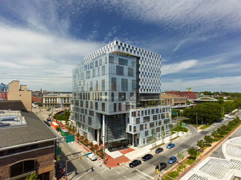
The first impression upon seeing Behnisch Architekten's John and Frances Angelos Law Center at the University of Baltimore is the way the boxy volumes are covered in different types of glass. There is a checkerboard frit that responds to the library and a rainscreen of structural glass and punched openings corresponding to classrooms and offices; zig-zagging in between is clear glass and horizontal louvers following the internal atrium. Of interest here is the rainscreen, which uses DuPontTM SentryGlas® in the outer frameless screen wall to achieve optimal transparency.
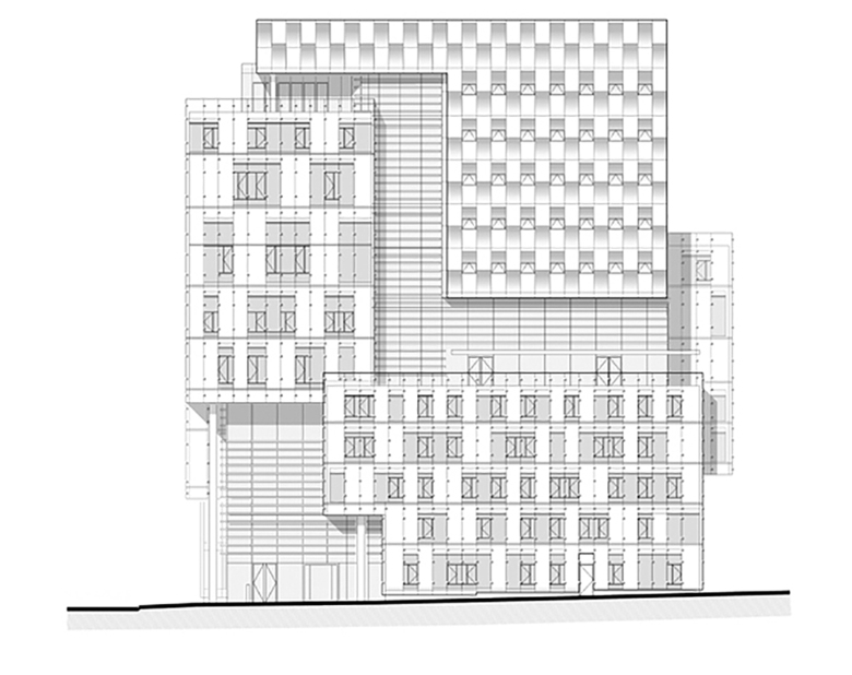
Of interest here is the rainscreen, which uses DuPontTM SentryGlas® in the outer frameless screen wall to achieve optimal transparency. The low-iron laminated glass panes are exposed on the edges and supported by outrigger brackets projecting from the glazed aluminum unitized wall behind it. Between the latter's aluminum panels are punched openings that provide natural ventilation through casement windows that open into the rooms. To aid in solar heat gain, each opening is provided with automated venetian blinds mounted on the exterior, in the space between the two layers of the façade. Since the openings correspond to the classroom and office spaces behind them, an apparently random, quilt-like pattern is created on these elevations.
The role of the DuPont SentryGlas in the Angelos Law Center is a balance of the functional and the aesthetic. The environmental benefits of rainscreens hardly need to be discussed here, but all too often double-layer curtain walls are primarily transparent, achieving shading through louvers and other means of fixed and movable elements. Behnisch Architekten, on the other hand, has opted for reducing the amount of clear glass impacting the interior spaces through smaller-scale openings, while still allowing the exterior to be a glazed expression.
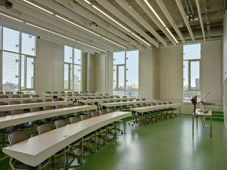
This view of a classroom conveys why small openings make sense: smaller and fewer openings near the front of the room mean less glare and more ease in projecting images; the blinds allow different openings and exposures to be controlled (note how they are down at the back of the room but not on the sides); and the primarily solid walls make it easier to incorporate perimeter storage, in this case at the floor. From this vantage we can clearly see how the building was designed from the inside out, with the classrooms and other spaces driving the glass volumes on the exterior.


