US Building of the Week
The Outpost
Beebe Skidmore Architects
21. febrero 2022
Photo: Lincoln Barbour Studio
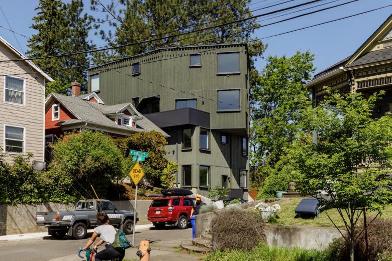
Interstate 5 cuts a north-south course through Portland, Oregon, severing many east-west streets and forming the occasional dead end. The Outpost, a co-living project that is a departure from most residential buildings in the city, is located at the end of one such dead end street. Beebe Skidmore Architects took advantage of the location in their "twisting" design of the building, answering a few questions about it.
Location: Portland, Oregon
Client: Owen Gabbert LLC on behalf of Minnesota-5 LLC
Architect: Beebe Skidmore Architects
- Design Principals: Doug Skidmore & Heidi Beebe
- Project Team: Pooja Dalal
Site Area: 0.06 acre
Building Area: 3,560 sf
See bottom for Important Manufacturers / Products.
Photo: Lincoln Barbour Studio
What were the circumstances of receiving the commission for this project?Beebe Skidmore Architects has collaborated on numerous projects with Owen Gabbert LLC, working in the capacity of development consultant and general contractor. The Outpost marks the first time Owen Gabbert and his business partners hired Beebe Skidmore to design their own development project.
Photo: Lincoln Barbour Studio
Please provide an overview of the project.The Outpost is an “up-down” duplex customized to operate in conjunction with the existing four-bedroom cottage next door as a single managed co-living setting for sixteen unrelated adults. The co-living arrangement increases density and brings an alternative, more communal housing option to the city.
Within the duplex units, individual dwelling spaces consist of similarly sized bedrooms with a mix of shared and en suite bathrooms. The third floor is given over to an open-plan communal living area and kitchen that serves both the existing house and new duplex. The communal level marks the point at which the two uppermost floors bend away from the street to align with the angled sound-wall adjacent property line. This twist establishes a cantilevered massing that projects out over the sidewalk and re-orients the interior views to look over the freeway toward the Cascade mountain range.
Photo: Lincoln Barbour Studio
What are the main ideas and inspirations influencing the design of the building?The Outpost is intended to demonstrate the viability of a progressive housing concept. The project provides an affordable option for people seeking community who don’t wish to rent an entire apartment or house by themselves. The co-living concept allows residents to decide for themselves what constitutes a “family.” The Outpost also threads the needle between existing definitions of group housing and household living within a residential structure, while preserving the ability to convert to a more conventional duplex arrangement if needed in the future. These aspirations for both intentional residential culture and for operational flexibility are expressed in its exterior form.
Photo: Lincoln Barbour Studio
How does the design respond to the unique qualities of the site?The Outpost is located in a designated transit-oriented neighborhood consisting of a mix of single-family and multi-family structures. The concept for the project is to preserve the existing four-bedroom cottage located on the same parcel by squeezing the new building into the trapezoidal remainder of the lot. This was made possible by recent zoning changes encouraging greater infill density.
The massing activates the narrow, dead-end street by “rising up” and twisting to “look over” the Interstate 5 freeway. The site is fortuitously bordered on two sides by open, tree-covered spaces that are owned by the Department of Transportation and will remain undeveloped.
Photo: Lincoln Barbour Studio
Visible from down the street, the projecting upper volume creates a sense of arrival to the building and makes room for a larger balcony at the entrance to the communal level. The shift breaks up the massing, associates the lower two floors with the neighboring structures, and references the top of the adjacent sound wall. The upper two floors benefit from dynamic views that are skewed relative to the surrounding street grid, looking out over the freeway on one side and to the city center and hills beyond on the other.
Photo: Lincoln Barbour Studio
How did the project change between the initial design stage and the completion of the building?In an effort to find the best solution to minimize construction expense while maximizing the rentable area, the design underwent many early design iterations, including explorations of different types of cantilevers over the street and the existing house. Earlier versions also compared the pros and cons of conventional stick framing versus stacked, prefabricated units.
Photo: Lincoln Barbour Studio
What products or materials have contributed to the success of the completed building?The exterior siding material is solid sawn cedar in a reverse board-and-batten pattern, stained in two shades of semi-transparent green. Large fiberglass windows reach all the way up to the ceilings of each room, adding visual porosity and extra daylight to the modestly sized bedrooms. Windows and cornices are enhanced by projecting casings and textural detailing to satisfy Portland’s Community Design Standards for this neighborhood. Exterior balconies and stair guardrails are surfaced with flush painted cement-board for a smooth, sculptural presence, offering a juxtaposition to the bas-relief quality of the rest of the building.
Email interview conducted by John Hill.
Drawing: Beebe Skidmore Architects
Drawing: Beebe Skidmore Architects
Important Manufacturers / Products:- Andersen 100 (fiberglass windows)
- Rodda Paint Rural Manor (semi transparent stain)
- Hardie Architectural Panel (exterior stair guardrails)
- Instafab (exterior custom steel canopy)
- Dansk (hardwood flooring) PacMat (vinyl plank flooring)


