US Building of the Week
Eastside Design Studio
Dick Clark + Associates
2. août 2021
Photo: Paul Bardagjy
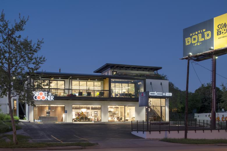
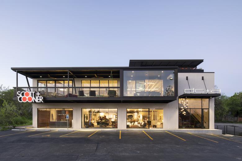
The new home of Dick Clark + Associates in Austin, Texas, occupies a portion of a building that formerly served as a pawn shop. The architects admit the tilt-up concrete building was pretty "drab," but in their hands it has been transformed into a light-filled building that illustrates how even the most diminutive, unexceptional buildings are ripe for adaptive reuse. DC+A answered a few questions about Eastside Design Studio.
Location: Austin, Texas, USA
Architect: Dick Clark + Associates
- Partners: Mark Vornberg, Kim Power, Kevin Gallaugher, Kristopher White
- Associates: James Legeai, Clara Paterson
- Project Architects: Patricio Rubio, Esteban Armenta
- Interior Designers: Brandy Balthazar, Marilee Kainer
MEP/FP Engineer: Bay & Associates
Interior Designer: DC+A
Contractor: IE2 Construction
Carpentry/Desks: Marc Hall
Poliform Kitchen Installer: Garvie McNab
Building Area: 10,300 sf
See bottom for Important Manufacturers / Products.
Photo: Paul Bardagjy
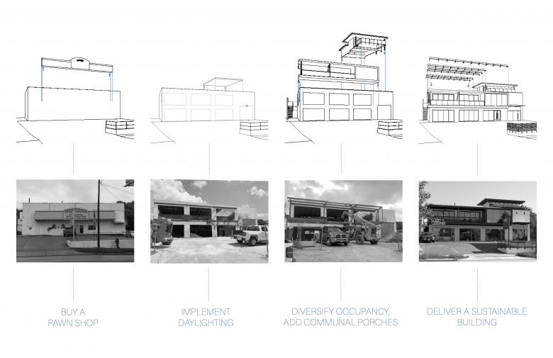
Please provide an overview of the project.Owning property in Austin is gold…so we bought a pawn shop. We took a drab, concrete tilt-wall building and revitalized it into a beautiful creative office and retail space, combining our established design identity with the existing neighborhood framework of East Austin.
This transformation accentuates architecture and celebrates structure as an extension of the neighborhood fabric with attention to material selection, interwoven programmatic elements, ample access to shared outdoor space and complementary spaces for design collaboration.
While the surrounding context is perpetually being torn down and rebuilt, this adaptive reuse building reduces the project’s carbon footprint, and not only preserves our 40-year-old design legacy but allows it to grow by planting a new seed, taken from the same tree.
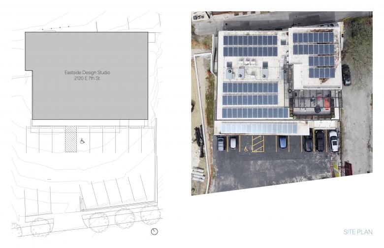
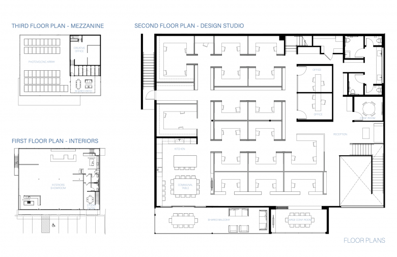
Drawing: DC+A
What are the main ideas and inspirations influencing the design of the project?A 40-year-old Austin design identity finds a new home on the Eastside. Integrated solar arrays, indoor-outdoor spaces and adaptive reuse promote a sustainable effort in not only the architecture, but also in preserving a legacy. A concrete tilt-up pawnshop provides a blank slate for the sustainable vision to take root. Simple but elegant design moves allow for the original form to be utilized to the fullest. Throughout the design, the studio is connected with the existing neighborhood through anchored viewpoints, providing an established design culture with fresh inspiration.
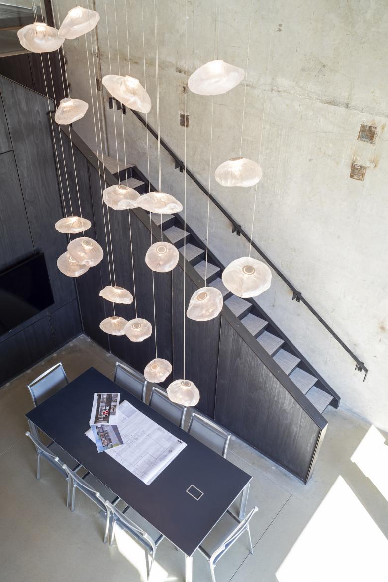
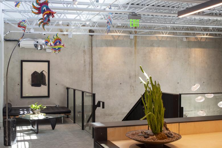
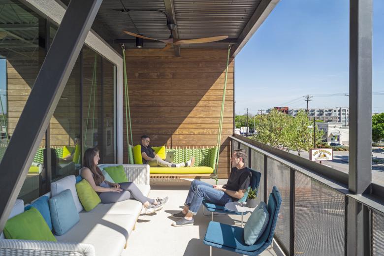
The tilt-wall panels gave us the structural flexibility to puncture the street-facing façade, add large glass openings on the lower level for a retail space and add a projected outdoor deck and conference room on the second level for a design studio. The new open facade and second floor deck create a dynamic indoor-outdoor connection, echoing our firm’s design aesthetic. Additionally, we took a portion of the roof off on the back of the building to add a mezzanine space above the second floor. Upon entry on the first floor, you can see up to the open mezzanine, which creates a powerful arrival experience.
Photo: Paul Bardagjy
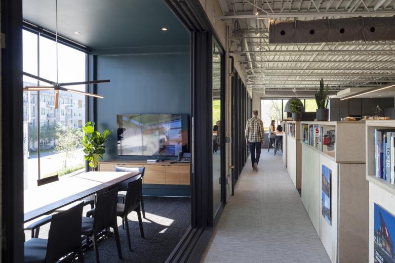
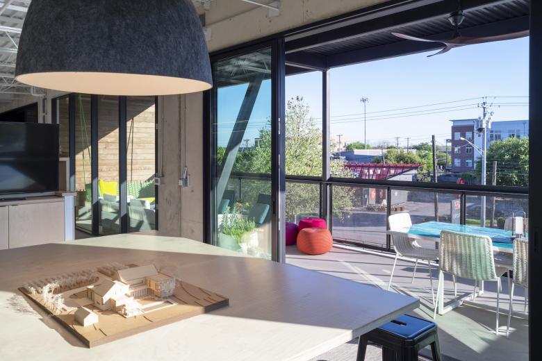
How does the design respond to the unique qualities of the existing building?The existing building was a pawnshop from the 1980s, built like a concrete bunker with no windows, insulation, or air conditioning for the majority of the space. We leveraged the strength of the original concrete shell to cut huge new windows, cantilever additional leasable area with a large balcony and a jewel box conference room, and added a new mezzanine and roof deck just under the current commercial compatibility standards to squeeze the most potential area and amenities out of this ugly existing building.
Photo: Paul Bardagjy
How did the project change between the initial design stage and its completion?In a building that had only one window before the redesign, having daylighting nearby every desk keeps all workers connected to the outdoors at their desks while a pair of shared outdoor spaces provide space for work or relaxation without leaving the building. In order to accomplish that, we had to cut large holes into the tilt-up panel shear wall. We had to scan the walls to determine the rebar size and location for structural capacity of the existing concrete wall and then determine how much could be removed from the overall structure. To build the roof mezzanine, we popped up a mezzanine area and relocated the displaced roof joists on the south side of the building and doubled them up with the existing joists on the front side of the building so we were able to structurally support the new roof deck.
Photo: Paul Bardagjy
In order to build the front outdoor balcony, we had to design a structural system to cantilever the balcony off of the front of the existing building, increasing the gross floor area without expanding the footprint. To support this cantilever, we added additional steel to the existing structural system at the front of the building.
While adapting a new design for this existing building did pose many constraints, the use of the original footprint allowed taking advantage of an existing parking deficiency and for a relatively quick permitting process via a site plan exemption. Much of the design and permitting happened during the previous tenants move out period so the entire process of demolition thru occupancy was completed in less than twelve months.
Photo: Paul Bardagjy
Was the project influenced by any trends in energy-conservation, construction, or design?As an adaptive reuse project, this design prioritizes utilizing the existing structure within a changing neighborhood to preserve energy and character. A multitude of cuts made in the existing tilt-up structure introduce extensive daylight where once there was none, while rooftop PVs provide the rest of the electricity; some of these openings provide access to new outdoor shared space for collaboration, socialization, and views. The goal of energy efficiency and sustainability was met, with electricity being provided 100% with renewables.
By redeveloping an existing building and minimally disturbing the rest of the site, this project reduces its impact on its immediate environment and ameliorates it to an extent with local floral plantings. The majority of the existing structure was incorporated into the project, drastically reducing the amount of new material used in the construction of the building. By adaptively reusing an existing building, this project required minimal virgin material for construction. New material sourced for the interior furnishing was highly prioritized to be local and/or recycled.
Email interview conducted by John Hill.
Photo: Paul Bardagjy
Important Manufacturers / Products:- Poliform Kitchen
- Paolo Verde - outdoor furniture
- Miele - kitchen appliances
- Light Streams MLS2 Linear lighting
- Delta Millworks - front entry/stair detail and wood on deck
- J Geiger Roller Shades
- Todo Plumbing
- Bolon flooring
- Daltile tile in bathrooms
- Ann Sacks in downstairs bath
- Scott + Cooner (decorative lighting)
- Marvin Doors
- Bocci 73 chandelier
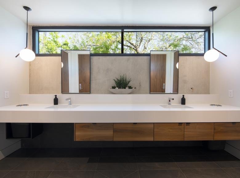
- Flos lights in bathroom
- Artemide Nur Acoustic light over center table in kitchen
