Oudens Ello Architecture
Scituate Town Library
Oudens Ello Architecture
28. mai 2018
Photo: Chuck Choi
One refreshing trend this century is libraries being recognized not just as repositories of books, but as important civic spaces. In turn, the design of libraries is improving in many ways: usability, flexibility, and quality of space, to name but a few. In some cases, such as with the Scituate Town Library southeast of Boston, existing libraries are being reconfigured to meet the needs of today's users. Oudens Ello Architecture's design respects Scituate's original library but makes surgical yet dramatic changes that make the contrast between old and new apparent. The architects answered a few questions about the project.
Project: Scituate Town Library, 2017
Location: Scituate, Massachusetts, USA
Client: Town of Scituate
Architect: Oudens Ello Architecture
Principal in Charge: Conrad Ello, AIA, LEED AP
Consulting Principal: Matthew Oudens, AIA, LEED AP
Project Architect: Noel Murphy, RA
Project Manager: Ashley Gonzalez
Project Team: Noel Murphy, RA; Ashley Gonzalez; Chelsea Brown; Joelle Szerdi
Structural Engineer: RSE Associates
MEP/FP Engineer: Cosentini Associates
Landscape Architect: CBA Landscape Architects
Lighting Designer: Horton Lees Brogden (HLB) Lighting Design
Interior Designer: Oudens Ello Architecture
Contractor: Castagna Construction
Constructin Manager: Daedalus Projects, Inc. (Owner’s Project Manager)
Civil Engineer: Nitsch Engineering
Site Area: 5.7 acres
Building Area: 32,000 sf
Photo: Chuck Choi
What were the circumstances of receiving the commission for this project?
We received the commission through a competitive RFP (request for proposals) process organized by the Town of Scituate. The project had gone through a preliminary design process with another design team as part of an application process for a construction grant offered by the Massachusetts Board of Library Commissioners (MBLC). After the MBLC’s construction grant was awarded (which provided about 50% of the funding for the project), the project was re-advertised and that’s when we were brought in.
Photo: Chuck Choi
Please provide an overview of the project.
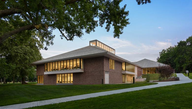
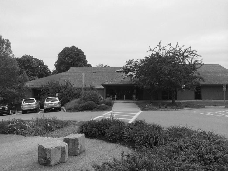
The Scituate Town Library is a public lending library serving a New England coastal community of 20,000 residents thirty miles southeast of Boston. The roughly 6-acre library site was originally part of a 350-acre country estate and today remains characterized by the stark contrast between dense woodland forest and cleared rolling fields. Completed on the site in 1978, the original two-story, 24,750-square-foot library building is composed of two interlocking hipped roof volumes supported on heavy brick piers. In keeping with the vernacular tradition of the region as well as the surviving structures of the original country estate (including Lawson Tower, an historic, early 20th century water tower in the form of a European castle turret), the hipped roofs were clad with naturally weathered cedar shingles and, due to their scale and material expression, served as the dominant architectural feature of the original building.
Beginning in 2013, the Town of Scituate embarked on a plan to modernize and expand the 35-year old building to meet the needs of a 21st-century library. Initial planning prioritized the construction of a large new addition with only minor physical and functional upgrades to the existing building. Following this planning stage, our firm was engaged as the design architect for the building and immediately focused on renovation-centered strategies for transforming the existing building. It was our belief that working within the original building footprint was the most responsible approach from many perspectives, including: maximizing material reuse, minimizing site impacts, the preservation and enhancement of familiar and beloved aspects of the original building (such as the original roof forms), and the opportunity to showcase the transformational capacity of architecture.
Photo: Chuck Choi
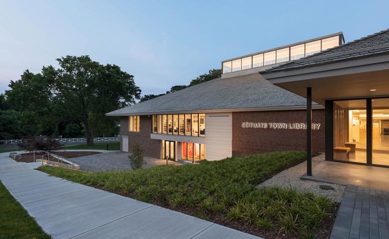
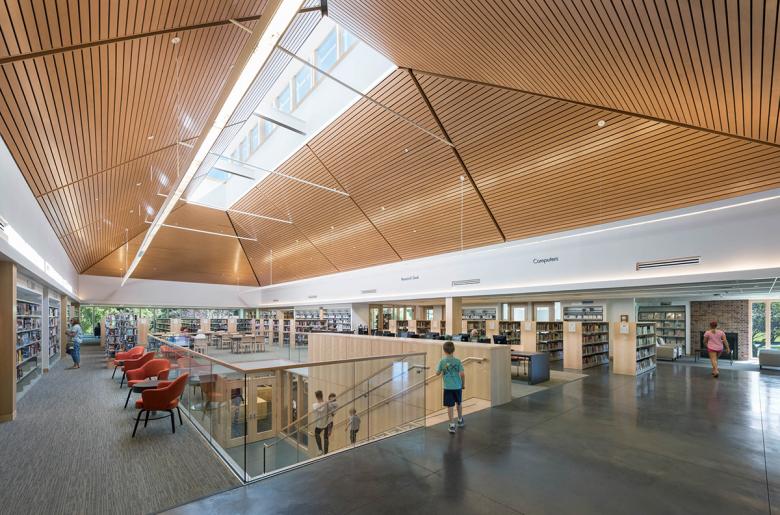
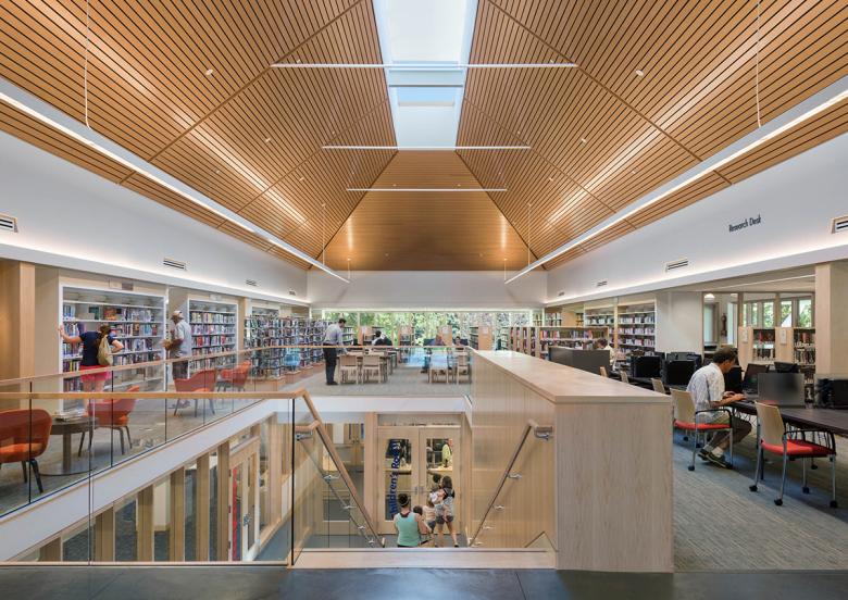
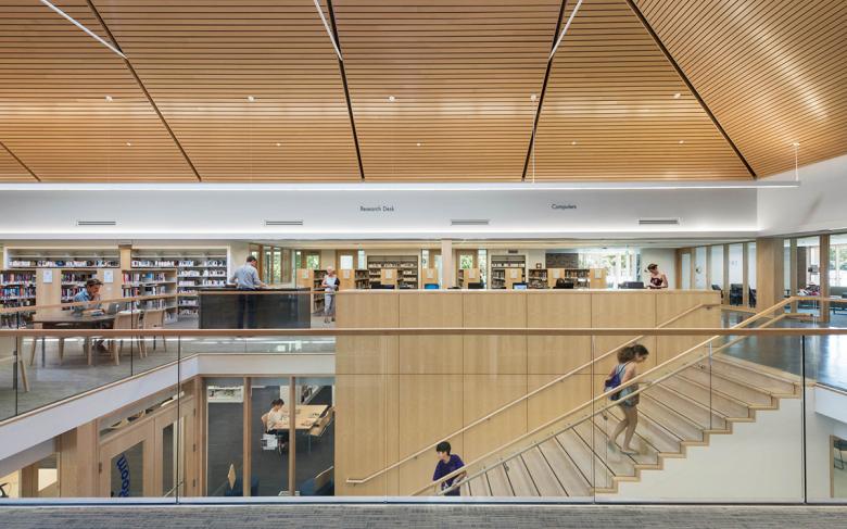
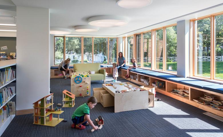
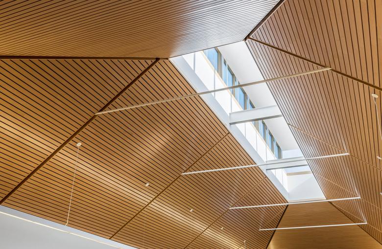
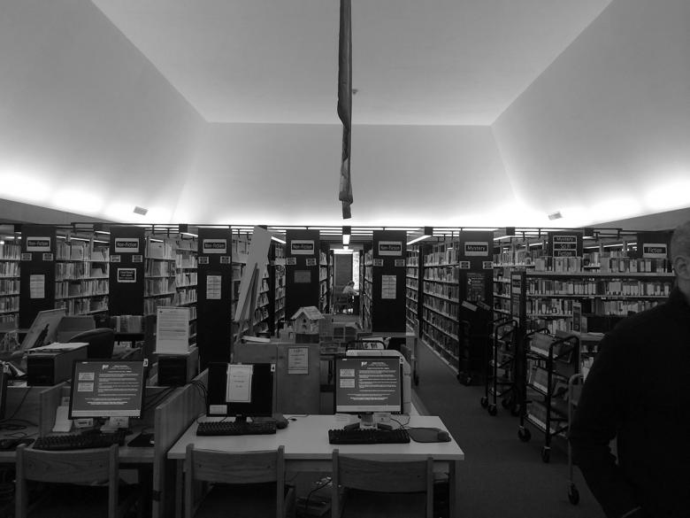
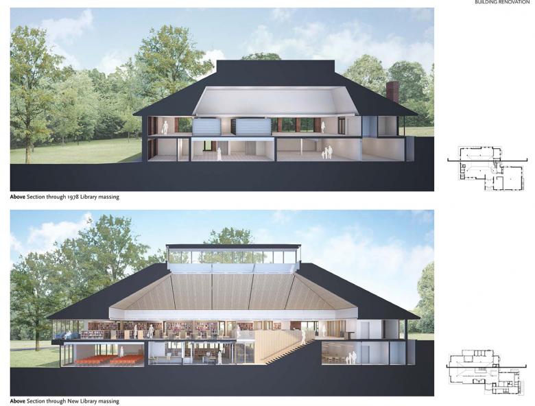
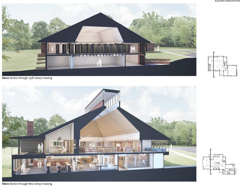
Building on the existing massing of the 1978 library building, the two-story, 32,000 addition-renovation project respects the major architectural forms of the original building with relatively modest expansions, while completely transforming the interior spaces to meet the demands of an active town library with an expanded program room, quiet study rooms, and after-hours suite of community reading rooms. The previously under utilized lower level is reinvigorated with a new open stair, creating a central double height space that connects the children's, teen's, and adult programmatic elements, improving both wayfinding for patrons and sightlines for staff. The main vaulted reading space pays homage to the original library with a new roof lantern above providing ample daylight to the library's previously dimly lit innermost spaces.
This technically challenging project includes a new automatic sprinkler system and full overhaul of the mechanical, electrical, plumbing, audio/visual and information technology systems, while also addressing the structural deficiencies of an aging and varied structural system comprised of precast concrete planks, masonry walls, and steel columns and beams. Reinforcement of the existing structure allows flexible long-term use by providing for the loading of book stacks throughout. Modifications to the exterior envelope, including all new glazing, enhance energy efficiency and lower maintenance, while also bringing additional daylight to the interior spaces of the library.
Photo: Chuck Choi
What are the main ideas and inspirations influencing the design of the building?
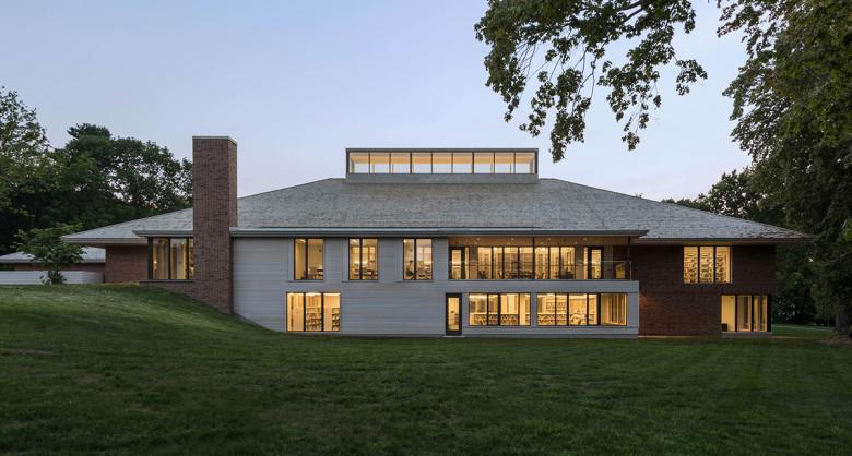
An overarching aspiration for the project was to maintain the integrity of the original library building, which was designed by a local architect and longstanding Scituate town resident, John Chesley, while, to the greatest extent possible, make it as inviting and fresh to patrons as possible. Without compromising the structure’s legibility, we went about transforming the visitor experience of the library by opening up its interior spaces; for example, removing walls and full-height books stacks that made the original library uninviting and even disorienting, cutting openings in the existing structural floor slab to improve visibility and connectivity between functional elements on different floor levels and adding a lot of interior glazing to establish a very light and airy feeling. We also substantially increased the amount of windows on the exterior walls and added a major light monitor at the roof to make the building feel less fortress-like and more welcoming as one approaches it. The opening up of the facades and roof had a dramatic effect both on the exterior reading of the building and on interior spaces that had been so starved of daylighting, especially in the middle of the building and at its lower floor level. As our design ideas developed, increased daylighting and improved visibility throughout the building became major themes.
Photo: Chuck Choi
How does the design respond to the unique qualities of the site?
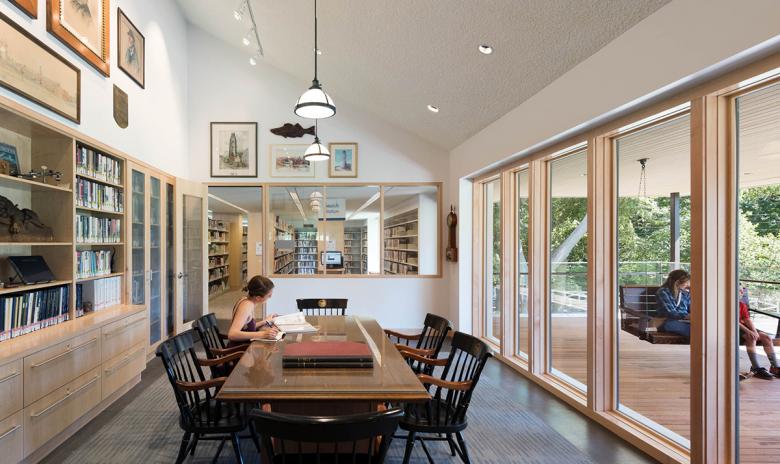
Design transformation of the existing library building centers on a concerted effort to improve physical and visual connectivity between the library’s interior environment and its exterior, park-like setting. Prior to the renovation-expansion, the original library suffered from having deep floor plates and large areas of the plan far removed from exterior windows, too few windows, tall book stacks and a heavy reliance on electric lighting. Our project dramatically increases the percentage of window to wall, opening up views of the natural surroundings and flooding interior spaces with daylight. Features of the new design include the adult reading room’s large central light monitor, which brings light into the deepest parts of the building from above, a new large opening in the existing floor slab and gracious public stair directly below the light monitor and a new outdoor covered reading porch on the building’s upper level, offering library patrons a peaceful and secure overlook to the surrounding grounds and mature existing trees.
Photo: Chuck Choi
How did the project change between the initial design stage and the completion of the building?
As previously mentioned, a separate design team had produced a preliminary design for the project prior to our involvement. After we became involved, the design completely changed, with design emphasis placed on transforming the existing building, in contrast to the previous design, which provided only light renovations the existing building and focused most of the attention and construction budget on a major addition to it.
Email interview conducted by John Hill.
Photo: Chuck Choi
Important Products/Manufacturers
Exterior windows and doors: Pella Windows
Interior wood ceilings: Armstrong Woodworks Linear Veneered Planks
Roof shingles, trim and wall cladding: Alaskan Yellow Cedar
