US Building of the Week
Timber House
MESH Architectures
16. octobre 2023
Photo: Frank Oudeman
Although the benefits of buildings structured by timber are well-known by architects and others involved in design and construction, the rollout of mass timber buildings in urban areas like New York City has been slow, at best. So it was just last year that the first mass-timber condominium in NYC was completed: a six-story, 14-unit building in Brooklyn appropriately called Timber House. MESH's Eric Liftin answered a few questions about the project.
Location: Brooklyn, NY, USA
Client: The Brooklyn Home Company & MESH Architectures (joint venture)
Architect: MESH Architectures
- Design Principal: Eric Liftin
- Project Manager: Mark Thomas
- Project Team: Zixiao Ji, Cameron Kucera, Lincoln Antonio
MEP/FP Engineer: Green Solutions
Landscape Designer: Outdoor Habitat
Contractor: Rise Development
Site Area: 6,668 sf
Building Area: 27,000 sf
See bottom for list of Important Manufacturers / Products.
Photo: Frank Oudeman
What were the circumstances of receiving the commission for this project?MESH and The Brooklyn Home Company (TBHC) had previously collaborated on the multifamily building at 84 Congress Street in Brooklyn. We learned that an owner was selling two adjacent houses. We agreed to buy them, and over the next several months we negotiated to buy two additional adjacent houses. Thus Eric Liftin, principal of MESH, was involved as both architect and developer of the property.
Photo: MESH
Please provide an overview of the project.Timber House is the first mass-timber condominium in New York City, and there are just a few other modern mass-timber buildings of any kind. The primary reason for their scarcity has been city agencies’ opposition. It was incredibly difficult to win DOB approval. That should change as the new building codes take effect this November. We are reminded that changing traditions and conventions is always difficult. But we must change in response to the climate crisis.
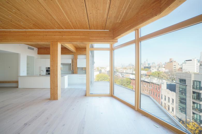
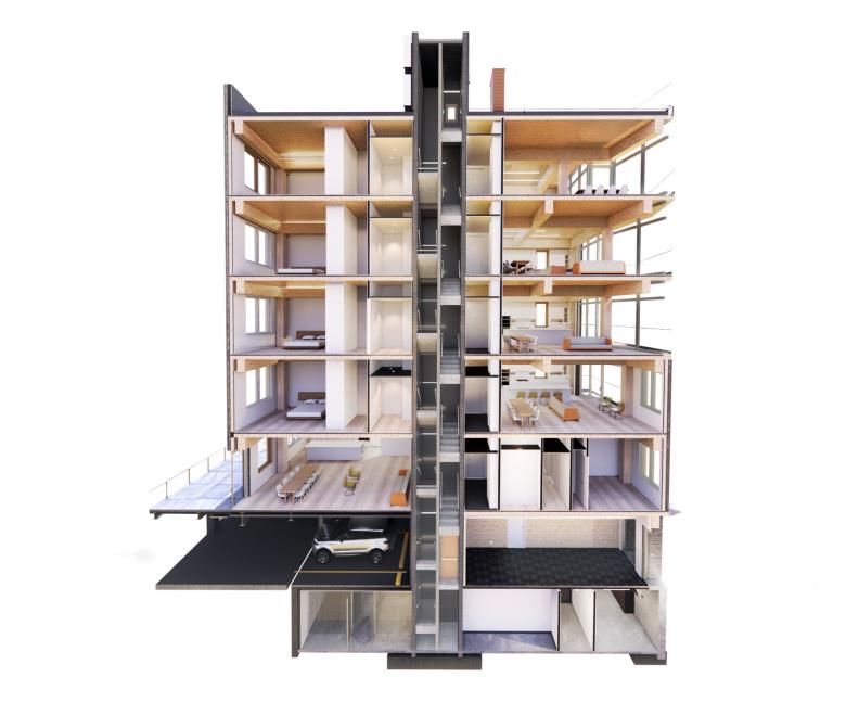
The six-story, fourteen-unit building comprises glue-laminated timber columns, beams, and floorplates. (Technically it’s a hybrid structure: the core and lot-line walls are concrete block, per fire department requirements.) Old-school heavy timber was hewn from old-growth hardwood trees. Today’s mass timber, by contrast, is fabricated from standard dimensional lumber, such as 2x8s, milled from fast-growing pine and fir trees. (You will hear mention of mass timber’s variants: CLT, GLT, DLT, and NLT. There are important differences between these, mainly in how the boards are fastened together, but they are all mass timber.)
Photo: MESH
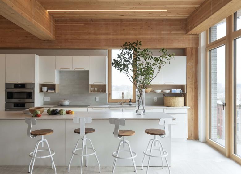
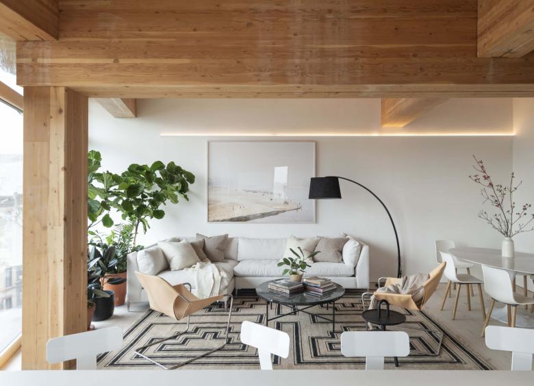
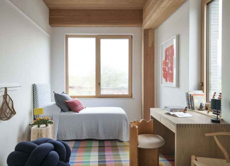
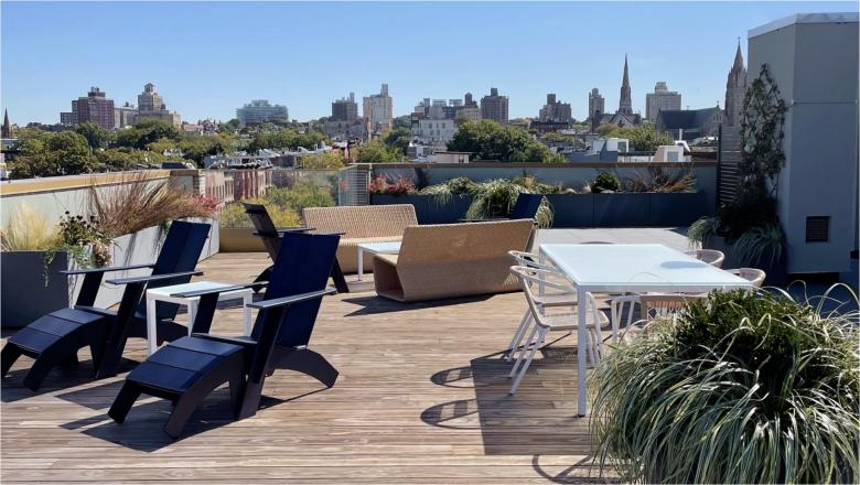
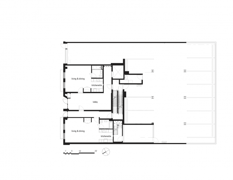
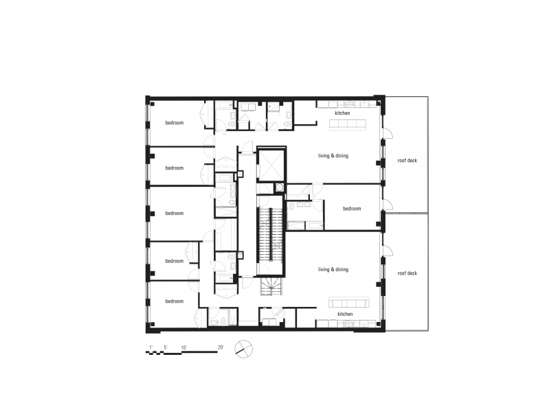
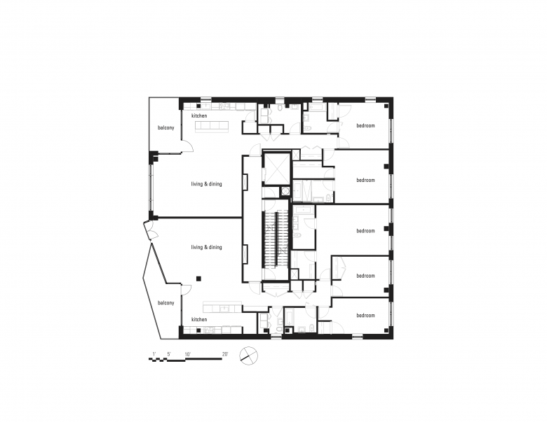
Natural light floods in through expansive glass windows, illuminating the beauty of 11-foot wood-beamed ceilings. Scandinavian kitchens are airy and bright, with patterns and materials artfully designed for the building. Fresh air is continually replenished, and half of the units enjoy private outdoor space. There are 14 homes: 2 studios, 2 one-bedrooms, 3 two-bedrooms, and 7 three-bedrooms.
Photo: Matthew Williams
What are the main ideas and inspirations influencing the design of the building?Design that is open and visually unfolding creates a sense of "life," which is to say it arouses in a viewer the kind of reaction one might have to taking in a landscape or other natural creation. We perceive patterns in multiple scales, complexity, and variation within a set of rules. Where most multifamily buildings feel lifeless, clad in thin wallboard and drab tiles, Union Street aims to evoke that sense of unfolding life.
Photo: Matthew Williams
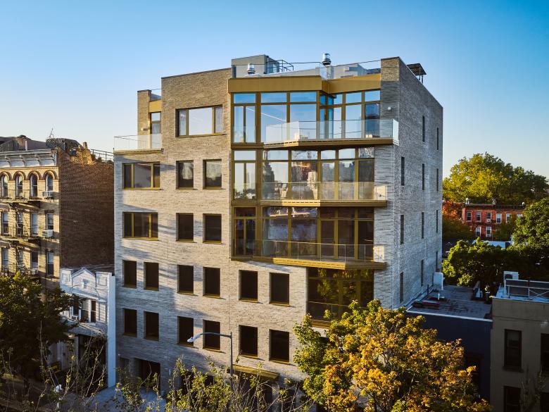
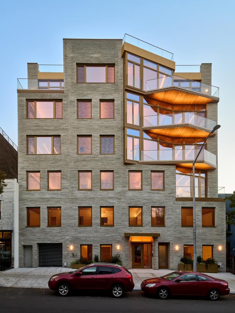
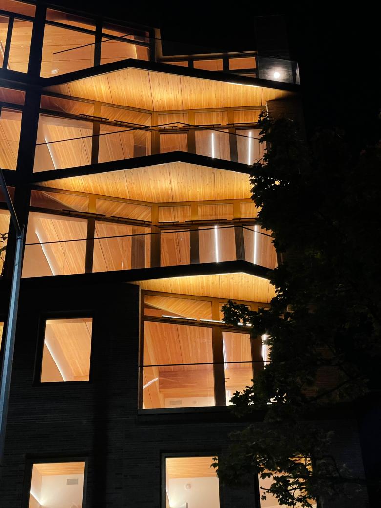
How does the design respond to the unique qualities of the site?In New York City, the form of the building is to a large extent determined by the allowable zoning envelope and site conditions. Within these constraints, the building takes advantages of views to the west of Manhattan in the distance (a view facilitated by the downward topographical slope) with angled large windows and terraces on the upper floors. On the lower floors, the punched-opening window pattern conforms to the module of other houses on the street. This module, in conjunction with the brick facade, helps the building to engage the existing built fabric of the block even though it is larger and ultimately quite different from these older houses.
Photo: Matthew Williams
How did the project change between the initial design stage and the completion of the building?The overall design stayed quite consistent over the course of design and construction. The main differences are that we had to change from CLT to GLT in response to the Department of Building’s (DOB) crackdown on CLT just before CLT was legalized. And we changed the brick color from dark to light, which is different from the other buildings on the block but gives the building a much lighter appearance on the block.
Photo: Matthew Williams
Was the project influenced by any trends in energy-conservation, construction, or design?The building is built to Passive House standards in order to use the minimal amount of energy. There is no combustion anywhere in the building. There is no gas line. We are looking to a near future when most of our electricity will be renewably generated. So we use electricity for everything, rather than burning fossil fuel (and needing to exhaust noxious gases).
The building structure, including columns, beams, and floorplates, is made from glue-laminated timber. This building material has been beloved for decades, but recent computer controlled fabrication processes have made large-scale timber buildings feasible.
Photo: MESH
Other sustainable features:
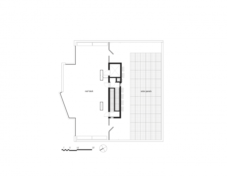
- Photovoltaic panels on the roof
- Electric charging stations at each parking spot
- Heating and air conditioning is provided by air-source heat pumps
- Generous mineral wool and polyisocyanurate insulation
- Air sealing with Intello+ smart air barrier and Tescon Vana tape
- European triple-glazed, Passive House-quality windows
- Energy-recovering ventilation by Zehnder (even when windows are closed there is a constant supply of fresh, filtered air)
Photo: MESH
What products or materials have contributed to the success of the completed building?The exposed wood structure is the obvious distinction that makes the building unusual, particularly in New York. The feeling inside each home is quite different from any other: it feels warm and deep, in contrast to the feeling of being in a wallboard box that is familiar from most new apartment buildings.
This structure is complemented by other material choices:
- The lighting is super-low-profile LED strips from Kelvix, fitted into discreet extrusions that illuminate the environment warmly, without glare.
- The floors are white-stained pine boards that resemble the wood structure, to maintain the warm, soft atmosphere.
- The kitchen cabinets are light wood boards wrapped with aluminum — minimal but tactile.
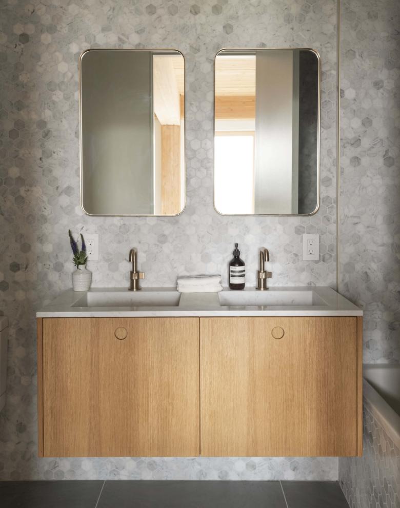
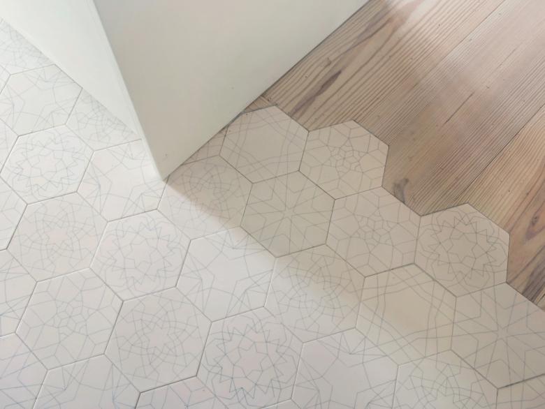
- MESH designed the hexagonal tile series: each set has various patterns on the tiles, so when installed randomly on the floor they create endless patterns. This effect supports the concept of evoking life in the building’s construction.
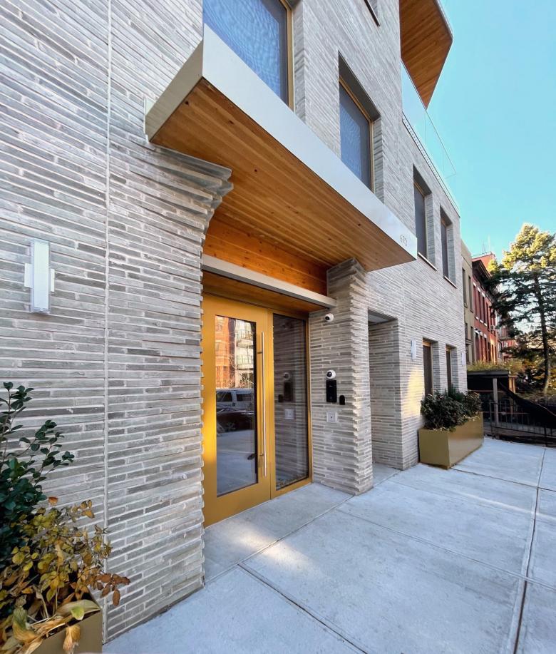
- On the envelope the beautiful handmade bricks from Petersen-Tegl give the building mass a soft, handcrafted appearance that contrasts with the glimpses of wood in the exposed terraces while complementing it.
Email interview conducted by John Hill.
