SND Chongqing WFC
Chongqing, China
01 | The spatial aesthetics of the same brand is expressed in a differentiated way.
Various Associates designed another new concept store for the pioneering multi-brand fashion supplier SND. As a promoter of new shopping concept, SND takes an independent road off the beaten track, rather than going with the flow. Its brick-and-mortar stores bring avant-garde design that is not defined by common standards, showcase clothes in an artistic manner, and inject fresh vitality into the retail sector.
SND concept stores previously designed by Various Associates
SND Chongqing - Milestone
SND Sanya - Huge wave
SND Aranya - Glacier
02 | Fashion show under a viaduct
The traffic above viaducts embodies the fast pace of the city, while the art of local life is reflected underneath.
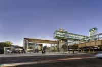
The new premise of SND is situated in the World Financial Center, the most prosperous commercial hub in Chongqing. As the city is built on mountains, it had been nicknamed a "mountain city". The complex transportation system and undulating topography endow this city with a unique charm. Viaduct plays an indispensible role in locals' lives, which not only drives economic development and facilitates connection across areas, but also enhances the efficient utilization of vertical space.
Various stories occur under viaducts, where Chongqing people enjoy drinking tea, fishing, strolling and other activities. The fusion of urban construction, lifestyle and rugged terrain formed the unique life in the mountain city. As approaching the project, Various Associates set the eyes on the site beneath the concrete viaduct.
The existing site is a long, narrow two-storey space. Taking into account the terrain features and interesting lifestyle of Chongqing, the design team took "the fashion under viaduct" as the design concept, and made use of the spatial relationships formed by suspension cable, order and overlapping layers to perform "a fashion show under viaduct" unique to Chongqing.
03 | Suspension
Viaduct-style suspending structural language is the core design expression of the overall space.
The original long and narrow space was not friendly to retail activities. To let passers-by capture a full view of the store in a glance, the design team chose to directly release the whole space, with a 20 meter-long, straight, unblocked circulation route running through it. The ways of commodity display reveal a sense of openness and order, creating an experience of strolling under a long viaduct and meanwhile offering people a panoramic view of the store.
The spatial layout is simple, but the suspended panel posed a practical problem, as it has a length of more than 20 meters, weighing nearly 10 tons. How to make the long, heavy display platform float in the air and achieve a subtle balance between strength and lightness was a key challenge yet a breakthrough of the core structural design.
The designers took cues from the cable-stayed structure of suspension bridge, which relies on one single structural column in the middle, with a long-span cable supported and obliquely pulled in a triangular way. This is another breakthrough, expressing a distinctive structural aesthetic.
The suspension cable is under tension force.
The suspension cable is pulled and fixed by anchors, and the stable triangle tells the beauty of angles and mechanics.
The thin suspension cable does not block sightlines from the outside to the interior, through which the service & reception desk and the rest area can be clearly seen. Thus, it ensures that wherever customers stay, they can quickly find shop assistants and ask for help.
The irregular-shaped seat placed at the rest area is like a natural stone on the road. The doors of fitting rooms are finished in the same color with walls around, keeping a relatively low profile. The space behind the doors strongly contrasts with the outside, making customers feel like they're walking into a hole under bridge. The dark-hued, smooth material textures soften the space, and the mirror reflection generates a sense of mystery. Complemented by lighting, the small, simplistic space fully expresses the freedom and artistry of the design.
The handrails of the staircase draw inspiration from railings on mountain roads. The combination of linear form and stainless steel shows a natural, free posture.
The original space inside the elevator is particularly cramped, only 1 meter wide. The designers utilized mirrored materials and the layering of light to visually enhance the spatial depth and add a fantastic touch to it.
04 | Order
The sense of order is created to suit functional needs, rather than for a repeated aesthetic. Product collections of about one hundred fashion brands are introduced into the store, which requires diversified ways of display.
Suspended panels combine aesthetics and functionality. Clothes are hung on stainless steel rails under the display panels at an equal distance. Illuminated by lighting, the garments slightly swing with airflow, showing a dynamic rhythm.
Suspended panels are arrayed in an orderly manner, each group of which is installed with nearly 200 vertical plates. The upper and lower edges of every plate emit light, bi-directionally brightening the space. Lighting outlines structures; structures support functions; and functions supplement light and structure in turn. They complement one another just like working mechanical gears.
The bespoke, dyed accessories display stand featuring wood grains naturally divides circulation routes. The suspended installation above it combines the functions of illumination and mirror.
Based on the brand's culture, the spatial attribute and local geographical characteristics, Various Associates extracted and combined different elements to create a brand new retail space. The point, line and plane of the space tell the core of the design concept, which runs through the overall space with a unified logic. Spatial languages, emotions and expressions are what Various Associates has been always focusing on in design practice. For this project, the team integrated the client's brand philosophy, functionality, structures and artistry into a whole, and eventually released the space through simplistic, pure design languages.
- Architectes
- Various Associates
- Lieu
- World Financial Center (WFC), Chongqing, China
- Année
- 2021
- Client
- SND
- Area
- 296 square meters
- Completion time
- September 2021
- Design firm
- Various Associates
- Project leaders
- Qianyi Lin, Dongzi Yang
- Design team
- Bo Huang, Junrui Zhang
- Photography
- URVIRSION CO. / Zheng Fang, Tang Cao


