WORK Architecture Company
Kew Gardens Hills Library
Nine years from commission to completion is not unheralded for a work of architecture, but it is an exceptionally long timeframe for a 3,000-square-foot expansion of a small branch library in Queens, New York. Design and construction of the Kew Gardens Hills Library were so far apart that WORK Architecture Company's Amale Andraos and Dan Wood consider the project in their new monograph, We'll Get There When We Cross That Bridge, "like a child we gave up for adoption and who has come back to us years later fully grown." Although WORKac, est. 2003, is now 14 years old, the library is as fresh as when it was unveiled so many years ago – and a welcome addition to its Queens neighborhood. The architects sent us some images and text on the project.
Project: Kew Gardens Hills Library
Location: Queens, New York
Client: Queens Library, NYC Department of Design and Construction
Architect: WORK Architecture Company
Design Principals: Dan Wood, FAIA, and Amale Andraos
Project Team: Sam Dufaux, Anne Menke, Jason Anderson, Erica Goetz, Jesung Park, Karl Landsteiner, Evgeniya Plotnikova
Structural Engineer: Leslie E. Robertson Associates
MEP Engineer: LILKER Associates
LEED Consultant: ADS Engineers
Code Consultant: CCBS Consulting
Lighting Designer: Tillotson Design Associates SIGNAGE: Epigraph Studios Inc.
General Contractor: S&N Builders, Inc.
What were the circumstances of receiving the commission for this project?
The building has been a long time in the making. Initially commissioned by Queens Library through NYC’s Department of Design and Construction in 2008, the library was among the first bevy of projects announced under DDC’s Design + Construction Excellence Program, which since 2005 has directed selected civic projects to leading design firms. The much-awaited library opened to the public on September 6.
The library was already a key institution in the diverse community of Kew Gardens Hills, and it boasts some of the best attendance and circulation gures of any library nationwide. Community members’ dedicated advocacy was pivotal in supporting a design that has provided the library with needed facilities and has given it a physical presence in keeping with institution’s importance.
Please provide an overview of the project.
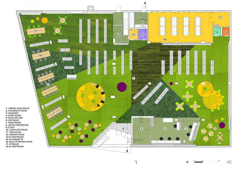
The project began as the renovation and 3,000-square-foot expansion of an existing Lindsey library from 1966. Its volume is still visible in the completed library. However, structural upgrades and new interior detailing have all but replaced the preexisting building with a new 10,000-square-foot space.
How does the design respond to the unique qualities of the site?
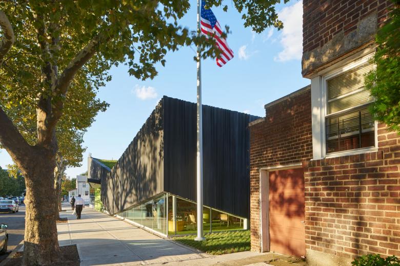
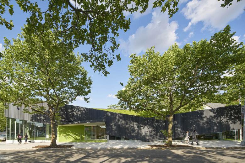
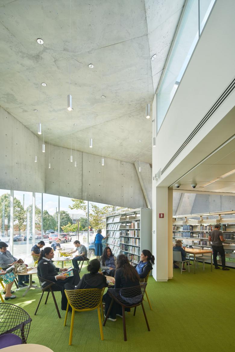
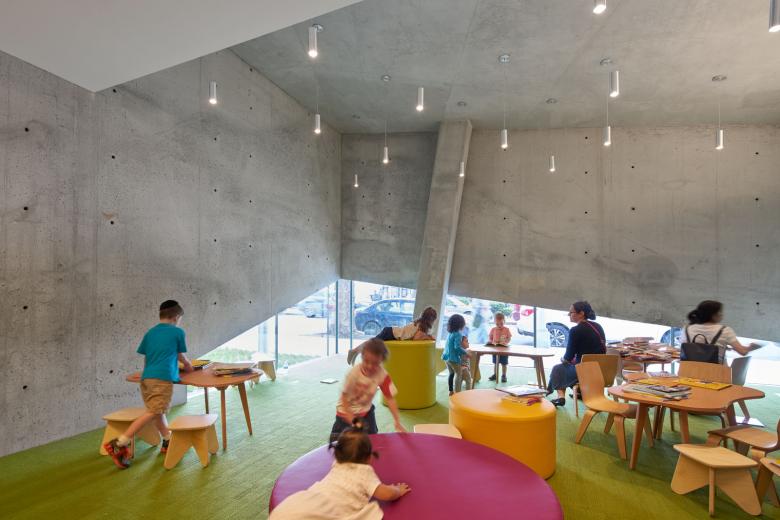
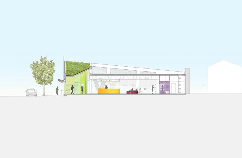
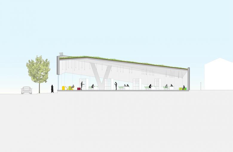
The focal point of the new design is the public space along the library’s perimeter, occupying the setback between the pre-existing building’s footprint and the sidewalk. Capped by a green roof, this perimeter zone joins existing gardens around the library’s back sides to form a continuous loop of green. Inside, the perimeter zone is conceived as a band of open rooms to be used by each of the library’s different user groups: adults, teens, children and staff.
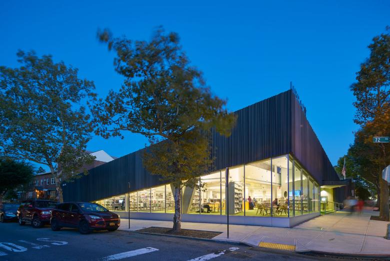
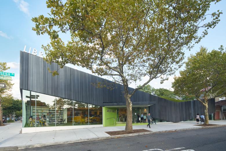
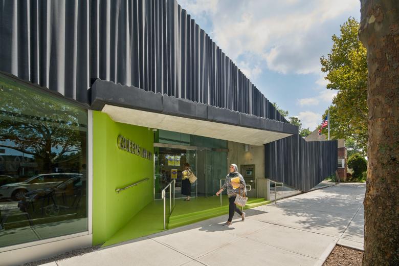
The new façade is a physical and metaphoric lifting up of the library’s exterior walls in order to broadcast the activities of the library to the outside. At the site’s most public corner, the roof reaches monumental scale. A second, smaller peak at the children’s corner provides child-sized views to the south. Between these two peaks, the façade dips down to provide privacy at the staff and book drop areas behind. The section of the façade at the entrance folds out over the street to make an awning— reminiscent of a folded page in a book. On the north side, the façade descends again, providing privacy for a teen study area while also bridging the difference in scale between the library and its residential surroundings.
What products or materials have contributed to the success of the completed building?
The façade is made from custom glass fiber–reinforced concrete panels. Their rippled, curtain-like pattern of vertical folds creates a play of light and shadow and softens the primarily glassy exterior. Beneath, large exterior windows provide direct natural light, while south- and east-facing clerestory windows provide indirect light that bounces off of the exposed concrete of the lifted facade. Not only expressive and functional but also structural, this concrete band acts as a 200-foot-long beam to support the green roof without interrupting the open interior. Two columns are the only supports for this beam.
Email interview conducted by John Hill.
