US Building of the Week
The Lawrenceville School Gruss Center for Art and Design
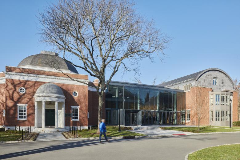
The Gruss Center for Art and Design is the renovation and expansion of the existing Gruss Center of Visual Arts on the campus of The Lawrenceville School in New Jersey, located about halfway between Princeton and Trenton. Sasaki answered some questions about the project, which adds a maker space convenient to the school's visual arts studios and galleries.
Location: Lawrenceville, New Jersey, USA
Client: The Lawrenceville School
Architect: Sasaki
- Principal in Charge: Vinicius Gorgati, AIA
- Project Architects: Lucila Rosso; Robert H. Genova, AIA; Grace Tsai Lehrbach
- Project Leader: Marta Guerra-Pastrián
- Landscape Architects: Andrew Gutterman, Radhika Mahan
MEP/FP Engineer: VanZelm Engineers
Lighting Designer: Horton Lees Brogden
Interior Designer: Sasaki
Contractor: V.J. Scozzari & Sons, Inc
Code Consultant: Howe Engineers
Civil Engineer: The Reynolds Group, Inc.
Acoustics, AV & Security: Acentech
Hardware: McCabe Consulting
Building Area: 17,000 square feet
Founded in 1810, The Lawrenceville School is a coeducational, independent college preparatory boarding school for students in grades 9 through 12. Located in the historic village of Lawrenceville, New Jersey, the school’s 200-year history includes its evolution from a one-building school house to its current 700-acre campus with historic Peabody and Stern buildings, and landscapes designed by Frederick Law Olmsted. Defining features of the school include its discussion-based, Socratic approach to learning — Harkness — and its residential house system.
Sasaki was working on the master plan for The Lawrenceville School in 2017 where one of the priorities was to create a maker space that would link the arts and science programs. The School asked Sasaki to bring forward some ideas for discussion and it became a commission. Underpinning all aspects of the plan is the desire to maintain a fine balance between its historic legacy and contemporary relevance. Within this vision, the Gruss Center for Art and Design is the first built implementation.
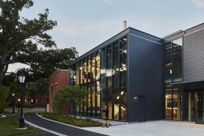
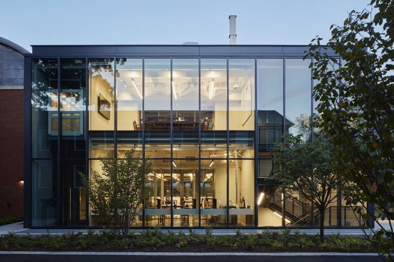
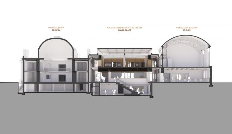
The Gruss Center for Art and Design (GCAD) is a new 21st century student learning center and maker space at The Lawrenceville School that bridges art gallery spaces and the school’s visual arts studios. The addition responds to this new campus typology with an enclosure of simple, neutral materials that allow for transparency and student engagement with the activities happening inside.
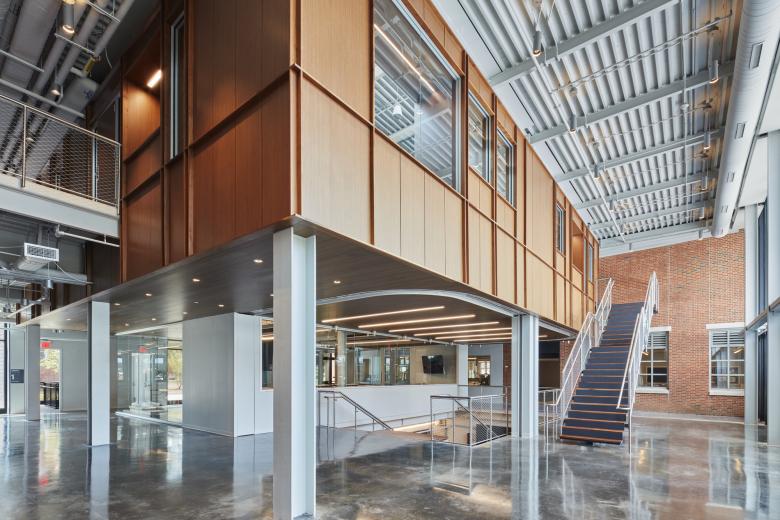
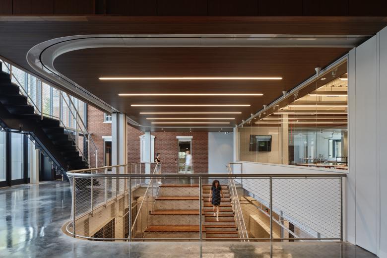
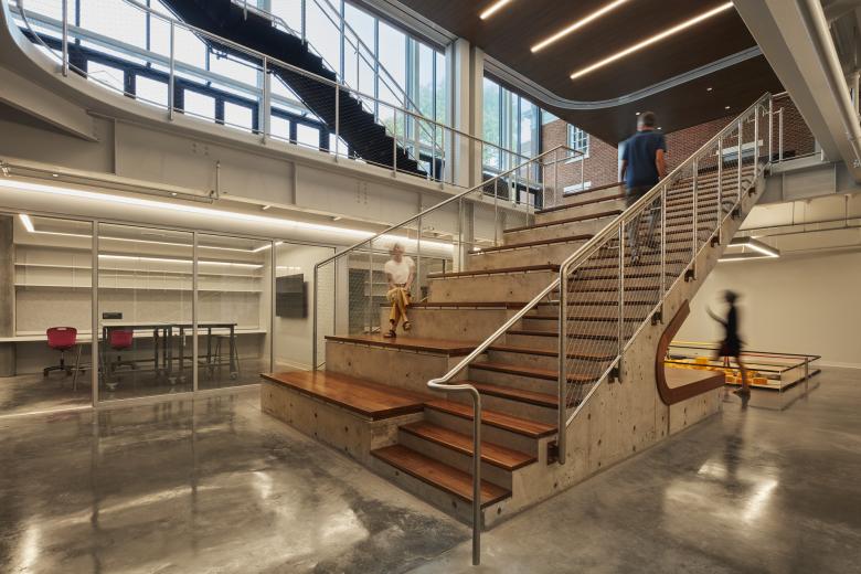
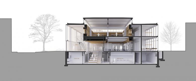
The open access of the building to all students and visitors is designed to foster creativity and collaboration, and to engage with the multidisciplinary activities that are happening inside of it. Both lobby and forum spaces connect a void space where one can see, be seen, work, and linger. They are designed to be places that allow for impromptu gatherings and spark conversation. The facade at the lobby opens fluidly into the plaza at the front, making of it another working room in the outdoors.
Today’s shift in educational paradigm centers on project-based learning to promote cross disciplinary teaching. Students realize their potential world impact by making things with their hands and fostering their creativity through group collaboration. The project nurtures this hands-on culture by providing work-focused spaces that foster student interaction.
The design addressed the importance of flexibility since the very early stages of the envisioning of the building program. All rooms were designed with the parameters of wanting to belong to a larger space, yet being able to create intimate spaces for more focused activities. Furthermore, the architectural approach of embracing uncertainty and flexibility as a design criterion has proven to be very useful during the pandemic, as the school has been able to adapt its spaces for gatherings that required larger spaces than in a typical classroom setting.
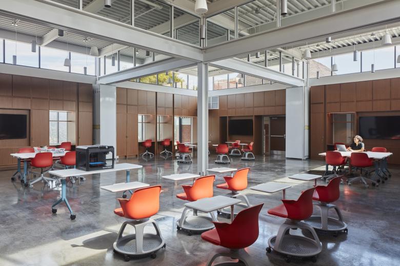
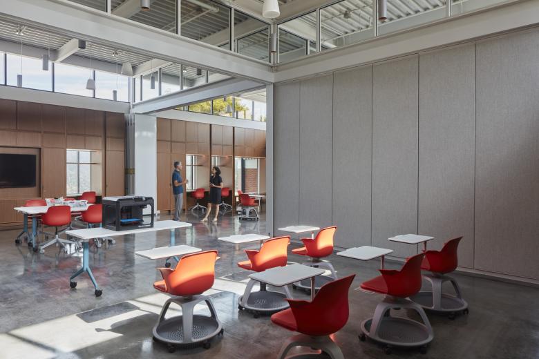
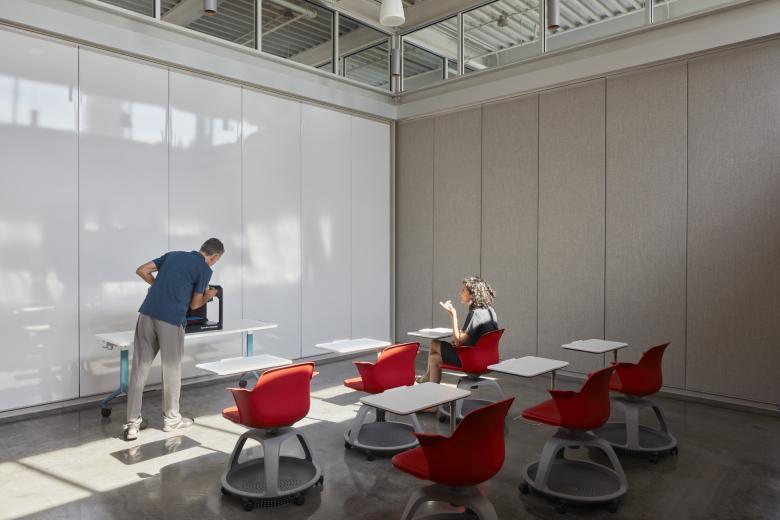
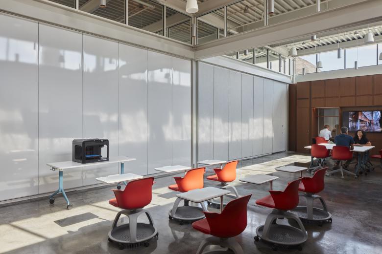
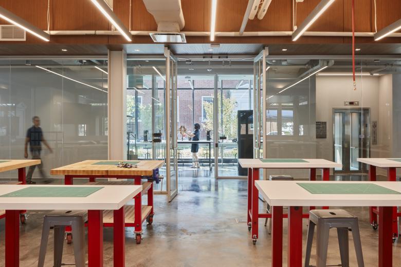
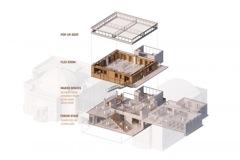
Organized across three levels, GCAD includes a forum of student engagement, wood and metal shops, clean labs, print and seminar rooms, and large storage areas. These spaces culminate at the top level with the “flex room.” This 2,000-square-foot space is intentionally free of a fixed program. Instead, it allows for multiple and simultaneous uses from different departments and students which help to transform it and suit a variety of needs. Folding panels with writable surfaces divide the flex room in halves or quarters, while the ceiling continues above the glass partition to make students feel engaged with the rest of the building. The design team conceived of the flex room as a living cabinet of curiosities. Through time, its shelves, furniture and storage will be filled with students’ work on constant display inspiring and informing future users.
This building represents a counterpoint to the traditional vernacular on campus. It deploys transparency throughout to emphasize visibility and connectivity, while creating intimate spaces where all students can feel a sense of belonging.
The decision to keep the building minimal in its expression of materiality helped balance the raw and the polished, exposing systems that speak the language of the making taking place inside the building all the while minimizing construction costs. Another driver for the design was the provision of abundant natural light throughout — through large expanses of curtain wall as well as a four-sided clerestory at the top level — as a way to compensate for the fact that the new addition is bookended by existing structures.
The large flex room on the second floor, set as the heart of the building, is inspired by the notion of a “Cabinet of Curiosities,” rooms created as containers for rudimentary collections that emerged in the sixteenth century and were precursors to museums. The collections were eclectic in nature, reflective of curiosity and demonstrated a sense of wonder. With that reference, the flex room was envisioned as a place for contemporary thinking, making and display.
The project evolved though several iterations of size and program mix. It started as a more ambitious proposition, considering a significant expansion of the gallery spaces and minor renovations to the art studios. Through iterative conversations with the major donors, faculty and administration, the design team optimized the program brief with a stronger focus on repurposing of the existing wings, leaving room for further expansion if desired.
The anchor programmatic drivers — learning, making and displaying — as well as the architectural qualities of light and interconnected spaces remained intact throughout design construction. The space that received the longest deliberation was the equipment room. Original conceived as a centrally located wood shop, it grew in scope and complexity to expand fabrication capabilities. The design concentrates the “machinery room” in a quadrant with proper ventilation and acoustic treatment, and releases an assembly area to take the central position in the plan.
Email interview conducted by John Hill.
- Cladding: Kawneer; Alcotex; Cupaclad; WR Meadows; Firestone; Tremco; Glen-Gery
- Storefront: Teknion
- Glazing: Viracon
- Hardware: Assa Abloy; Dorma
