US Building of the Week
LA Garage
SRG Partnership, Inc.
1. 3月 2021
Photo: Andrew Pogue
Like most corporate campuses, Nike's large world headquarters in Beaverton, Oregon, is served by numerous surface lots and parking structures. Two of the latter — the LA and NYC garages — were designed by SRG Partnership, who incorporated amenities not often found in parking structures. The architects answered a few questions about the LA Garage that took cues from the adjacent day care center.
Location: Beaverton, Oregon, USA
Client: Nike World Headquarters
Architect: SRG Partnership, Inc.
- Design Principal: Rick Zieve, FAIA
- Principal-in-Charge: Jeff Yrazabal, AIA
- Senior Project Manager: Dennis Forsyth, AIA
- Project Manager: Aaron Pleskac, AIA
- Project Architects: Eric Wilcox, AIA; Trevor Lavoie, AIA; Jason Karam
- Project Designer: Phil Lopez, AIA
- Designers: Marquesa Figueroa, Assoc. AIA; Rebecca Bompiani
MEP/FP Engineer: PAE Engineers
Landscape Architect: PLACE
Lighting Designer: Luma Lighting
Contractor: Hoffman Construction Company
Environmental Graphics: Ambrosini Design
Civil Engineer: WH Pacific
Building Area: 409,000 sf
Photo: Andrew Pogue
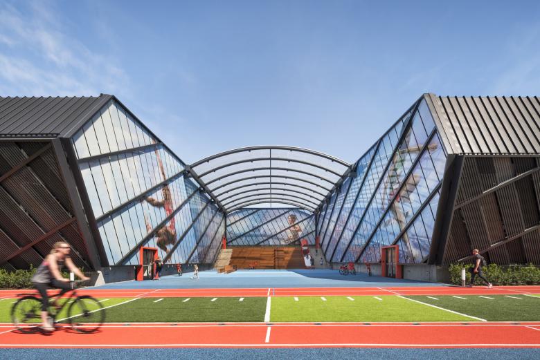
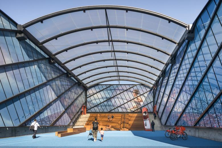
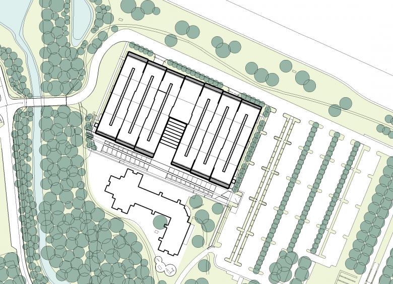
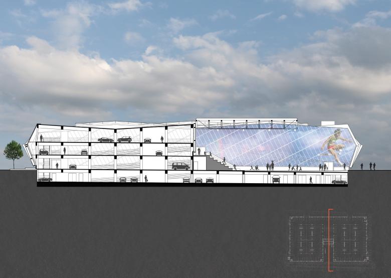
Please provide an overview of the project.Drawing upon themes of play, movement, and community, the LA Garage completely rethinks the role of the traditional parking structure. SRG interpreted Nike’s globally renowned culture of innovation to design not just a place to park, but an all-encompassing experience. Inserted into the middle of the massing is a unique, community-oriented, covered courtyard where employees can gather for events, where children from the adjacent day care center can play on and around soft sculptural forms and where runners on the campus track can stop for a breather. Upending the unremarkable routine of parking in a concrete structure, the LA Garage energizes and engages guests and employees arriving on campus, blending architecture inspired by athleticism and movement with super-graphics representing Los Angeles sports, including the 1984 Summer Olympics and professional L.A. teams. The transition from the garage to the courtyard can be accomplished by elevator, or by jumping on a playful slide or walking down a set of wide wooden risers that double as grandstands for events. The design integrates modulation, rhythm, and color with a multi-faceted program to create a new building type that does much more than simply housing cars.
Photo: Andrew Pogue
What are the main ideas and inspirations influencing the design of the building?Places for People
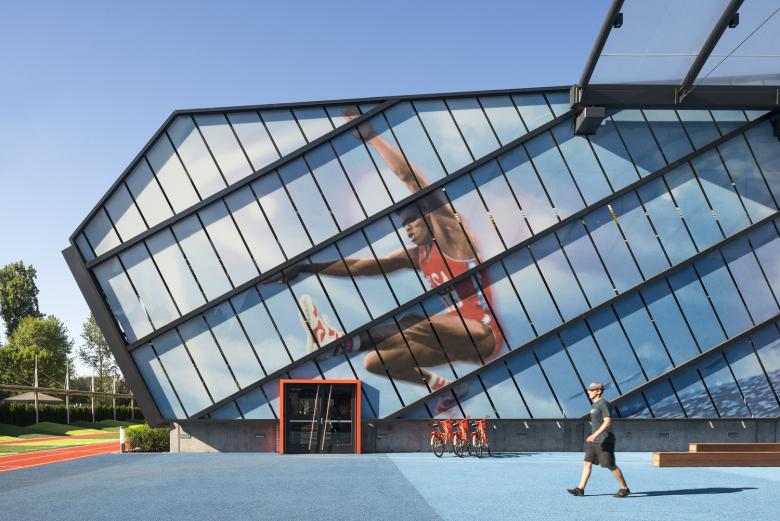
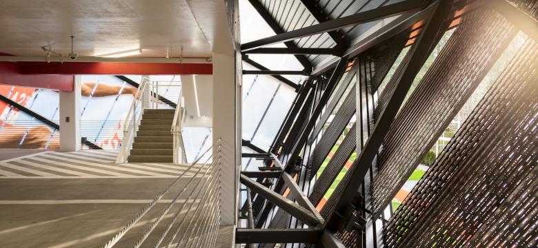
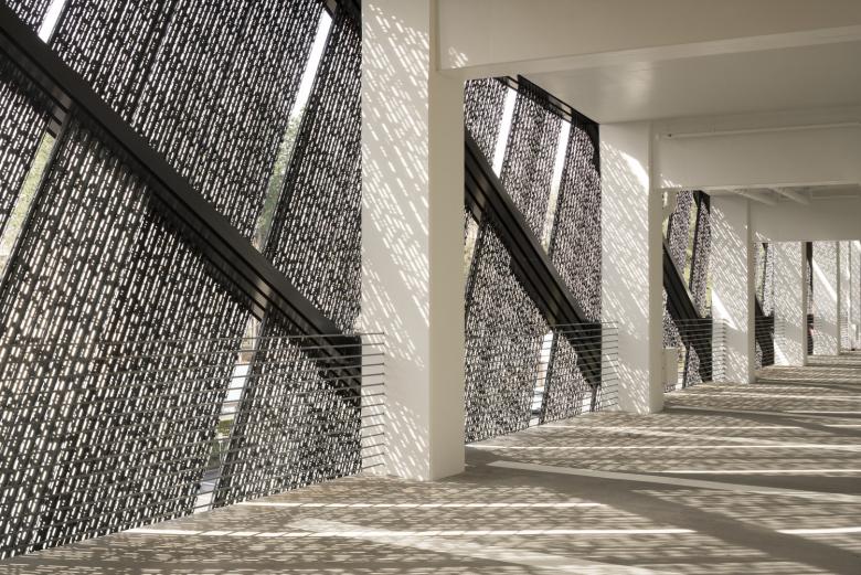
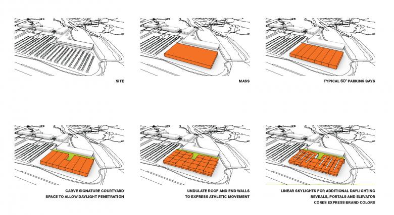
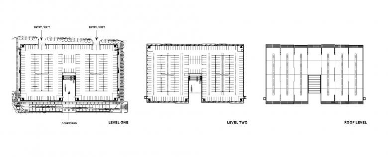
The LA Garage design breaks up the typical parking structure mass, providing opportunities for daylight to penetrate deep into the interior and a “wow” space in between with a public courtyard carved into the center of the building that encourages chance encounters, gatherings, and collaboration. A curved glass covering provides rain and wind protection, making the space useable throughout the year. Surrounded by three sides of backlit glass showing iconic Olympic athletes, the courtyard incorporates many activities and playful elements. This experience shifts the sequence of a branded workplace experience from one that typically begins at a front door to one that starts before a driver leaves their car. Both visitors and employees experience welcoming, amply daylit interior spaces enhanced with the dappled light filtered by the structures’ perforated skin, and a courtyard that, on any given day, may be filled with the energy of a pickup game or a pack of excited kids because this garage embodies much more than parking. It stands as a declaration that even the everyday parking structure can be elevated to great design.
Photo: Andrew Pogue
Movement and Dynamism
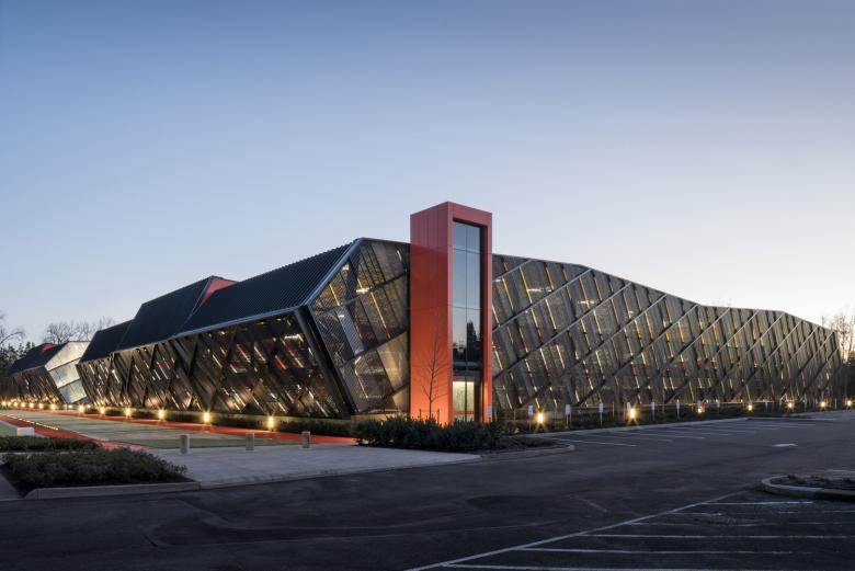
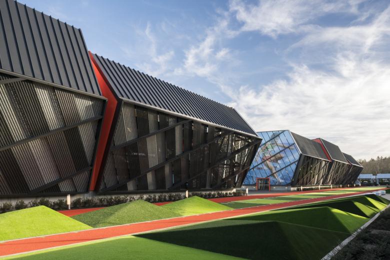
The LA Garage neither looks nor feels like a garage. As a hub of transportation and the place where people become pedestrians, the design embodies the idea of “movement,” a key theme for the client's products and design culture. Exterior walls tilt at an angle to give the elaborate building skin of perforated metal panel and glass a dynamic quality while concealing the cars within. Aligning the panels in a pattern along a diagonal grid creates a sense of leaning, making the building appear ready to spring forward. Layering of the facade elements provides both natural ventilation and adds to the garage’s dynamism.
Photo: Andrew Pogue
Wayfinding
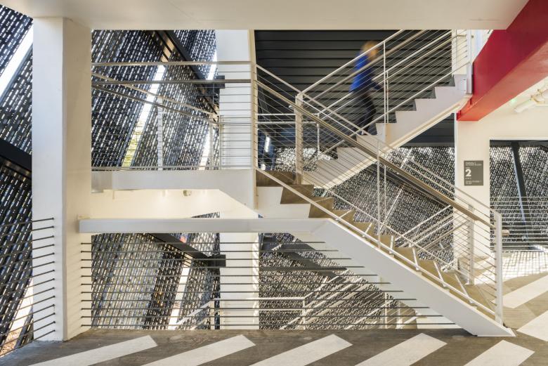
Wayfinding is expressed in orange circulation elements for cars and people, which reference the building's external orange-massing reveals. Pronounced entrances act like portals to create a holistic experience of entering, circulating, and exiting the garage. To maximize safety and efficiency, walkways separate pedestrians from drivers, guiding those on foot through the 1,094-car garage to the courtyard. Each level is themed with super-graphics and colors attributed to a different Los Angeles sports team, reinforcing the overall concept while creating an easier and more memorable wayfinding experience.
Photo: Andrew Pogue
How does the design respond to the unique qualities of the site?As the place where the transition from driver to pedestrian occurs, the LA Garage is a nexus of activity for people arriving on campus. Located adjacent to the campus child daycare center, the central covered courtyard break in the massing faces the daycare. This siting decision offers employees and their children a place to gather. The theme of movement also inspired the site design, which integrates sports and functional program elements to celebrate interaction, activity, fitness, and a healthy lifestyle. These playful and experiential elements include a slide into the courtyard, rubberized pyramids, a balance beam, and a running track. Furthermore, bikes are provided in the courtyard to easily connect people from the garage to the campus.
Photo: Andrew Pogue
Was the project influenced by any trends in energy-conservation, construction, or design?Through a design-build project delivery model, SRG worked closely with the contractor, Hoffman Construction Company, to maximize value for the client. This integrated approach allowed our team to improve efficiencies through early BIM and MEP coordination and a robust cost control process that resulted in high-quality design and construction solutions that uniquely reflect the client’s brand.
Photo: Andrew Pogue
What products or materials have contributed to the success of the completed building?The perforated metal panels by Morin and ETFE by Structureflex both greatly contributed to the success of the design. Hiding the cars within the structure was a goal for the client so designing a unique skin was key. The team used this opportunity to further express the movement theme by composing the exterior materials of metal panels into various depths and colors, perforated with the client’s motto, “Just Do it” in Morse code. Aligning the panels in a pattern along a diagonal grid brings a sense of undulation and movement to the exterior, making the building appear ready to spring forward, like a sprinter in the starting blocks. The three walls enclosing the courtyard are made of glass that showcase super graphics of athletes and includes an ETFE cover allowing year-round use and reinforcing the client’s brand and the project’s theme of movement.
Email interview conducted by John Hill.
Photo: Andrew Pogue
Drawing: SRG Partnership, Inc.
Drawing: SRG Partnership, Inc.
Drawing: SRG Partnership, Inc.
Drawing: SRG Partnership, Inc.
関連した記事
-
Hayward Field
on 2022/06/21
-
LA Garage
on 2021/03/01
-
Sydney Park Water Re-Use Project
on 2016/08/12
-
560 KM: A thousand logs on Sainte-Catherine Street
on 2016/05/11
