University of Hong Kong Medical School Lobby
When we were commissioned to renovate the main lobby of the University of Hong Kong Li Ka Shing Faculty of Medicine, we saw an opportunity to bring people together on campus and to encourage new ways of relating to the environment, inside and out.
Client: The University of Hong Kong
Architect: Atelier Nuno
Lighting Consultant: Tino Kwan Consultants
Surface Area: 3,000 sf
Our newly renovated lobby is the built expression of HKUMed’s core mission to enrich the total learning experience; it has been transformed into a much loved gathering spot for students to socialize and connect with one another outside of class, and will surely become a landmark of our campus for years to come.
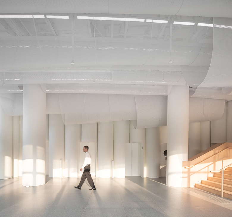
The medical building is located on a tree-lined hillside beyond the dense landscape of high-rises that defines much of Hong Kong, and its west-facing windows introduce abundant sunlight. We approached the project by conceiving of a space that is meant to be experienced simultaneously with its surroundings.
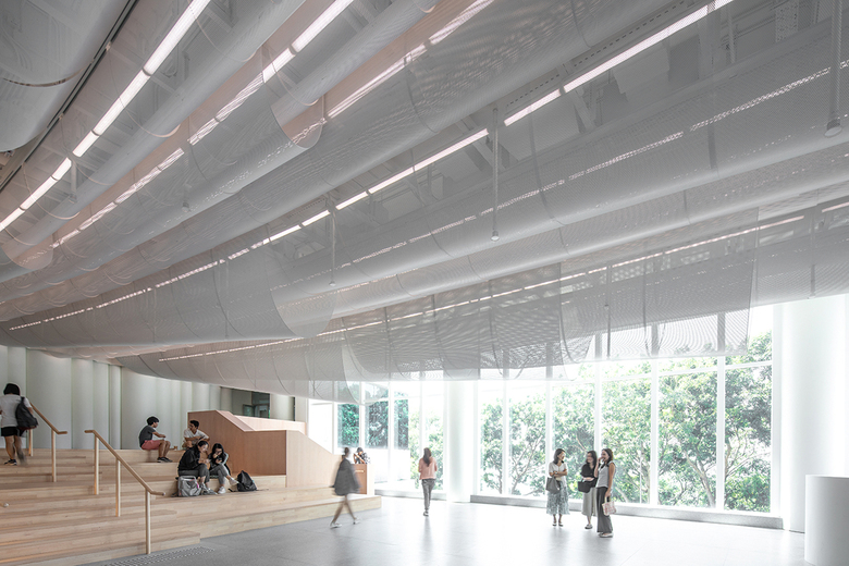
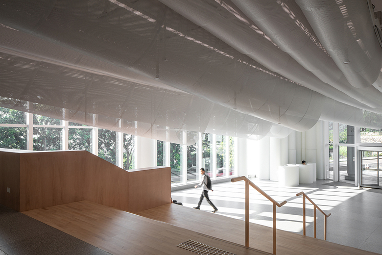
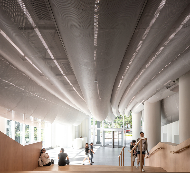
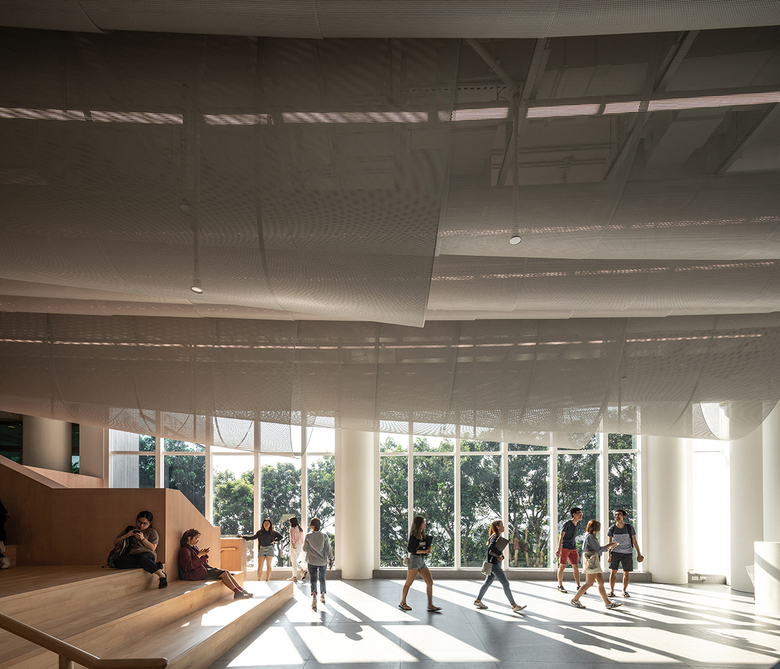
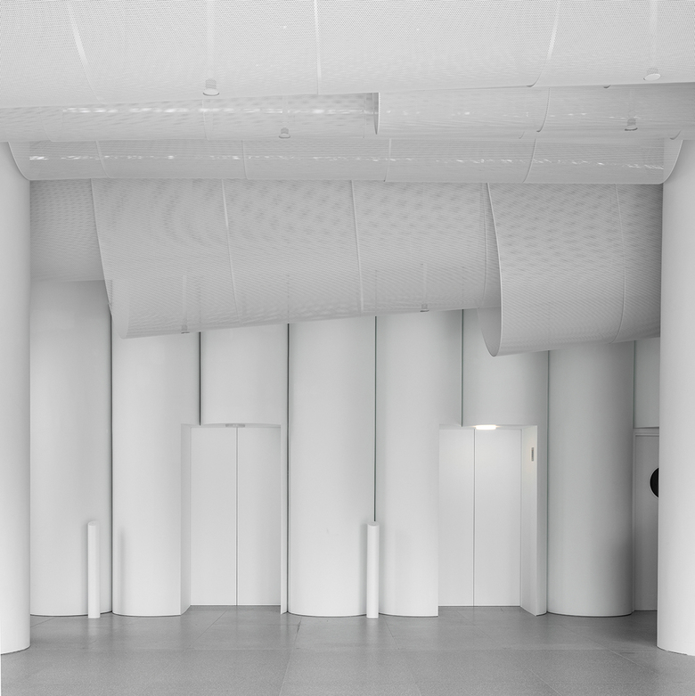
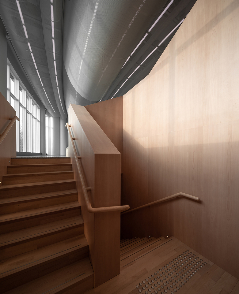
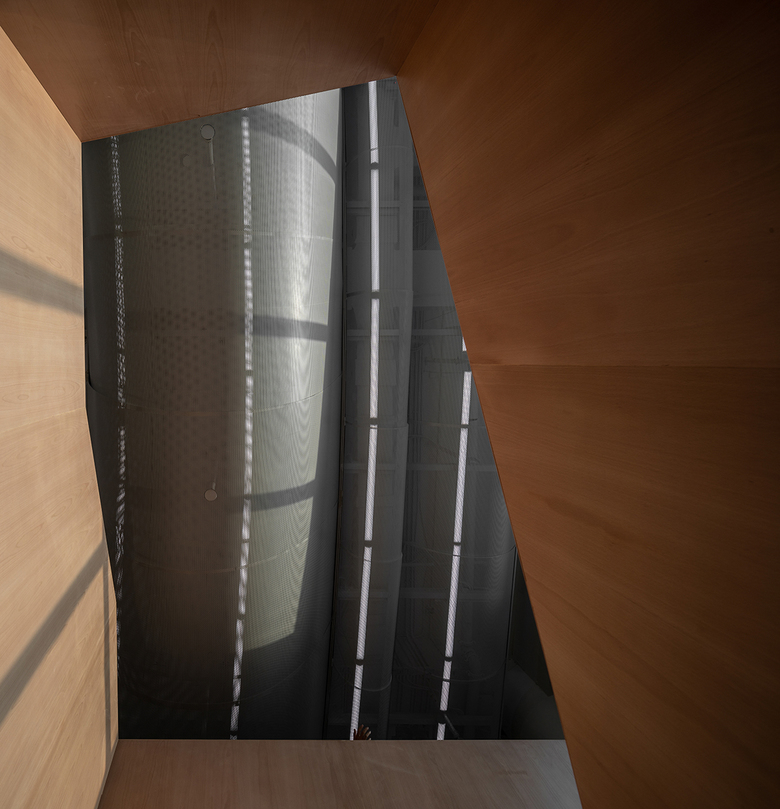
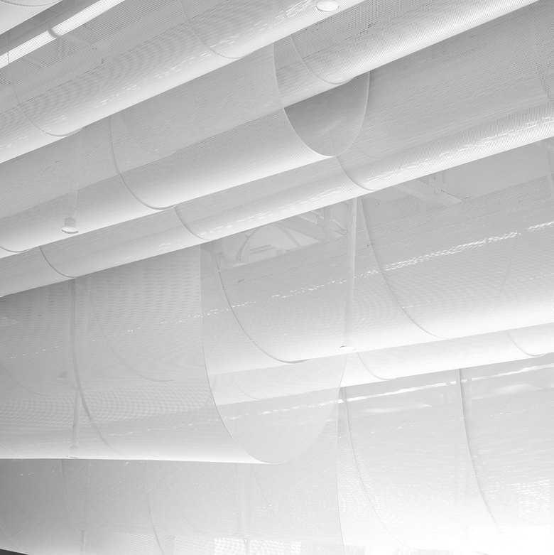
We were drawn to a white finish for the interior, both for white’s association with the medical profession and as a way to foreground the natural setting. We wanted to catch the light with a design that fills the space and that engages with the human scale. The walls are clad in white-painted curved plywood, and 0.8-millimeter-thick white powder-coated perforated aluminum panels are suspended from a structural frame on the ceiling. Light permeates the panels, drawing attention to changes over the course of the day. The metal volumes appear both white and solid, and both dark and transparent, filtering light together with the neighboring trees. The LED light tubes above the metal volumes negotiate with the natural light. As the sun sets, the lights glow more warmly, gradually intensifying and ultimately dominating the space.
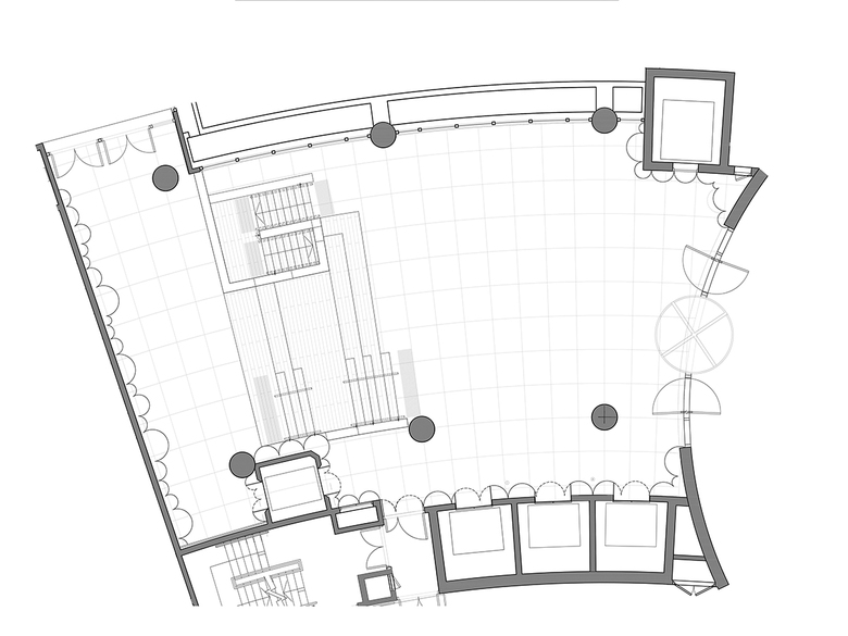
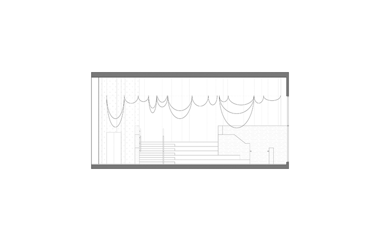
Rather than seeking to maximize height in the lobby, we created large, billowing forms that open downward. In the 6-meter-tall foyer, we dropped the ceiling height to 2.05 meters, offering a moment to engage closely with the contained light. To slow down this high-traffic space, we introduced a wooden stepped platform that also encourages social interaction.
Through the changing light and the shifting qualities in the materials that the light introduces, students can experience seasonal change intimately, in a space they interact with every day.
Choosing ordinary materials was our most important consideration. In Hong Kong, luxury materials are typically celebrated, while more modest alternatives often go overlooked. White-painted finishes and perforated aluminum panels can be found in familiar spaces such as bus stops and underground rail stations; the commercial white paint used for the walls of the lobby also predominates elsewhere on campus. The prominent position of these ordinary materials in the lobby is meant to emphasize the possibilities of the everyday and, in an academic context, to suggest that all students have the means to succeed.
