Qkids, a hugely successful online education platform, known for its high-quality online English courses to so far to more than 800,000 students, has over the past years spent lots of resources and efforts in developing a narrative game-based online curriculum to spur and stimulate the kids' curiosity in learning, consequently helping them to grow into small global citizens.
Its current venture is the expansion from online into off-line teaching, and the establishment of Qkids English Centers, aimed at 4-12 years old children who live in Chinese first-tier cities. These study centers are to reflect - just like the online platform - the Qkids educational philosophy of providing a long-lasting, immersive and fun learning experience. The first one to be opened is located in Xiamen, China.
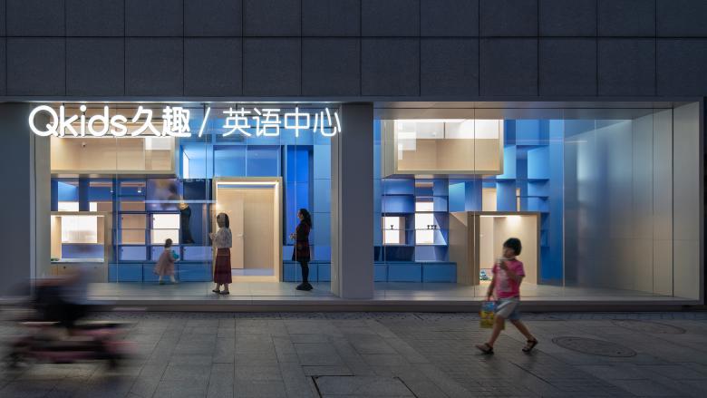
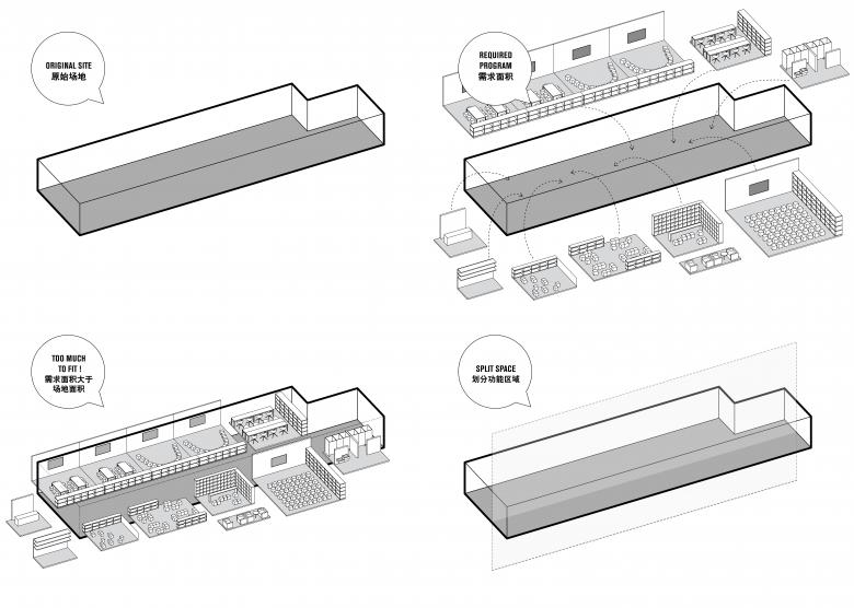
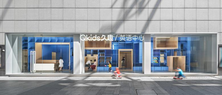
Crossboundaries developed and tailored the first English Center to an existing space, to fulfill a multitude of requirements and to match closely the Qkids brand image and vision. The project site is located in Xiamen's Siming District, next to Xianyue Road, with a surrounding area that is rich in cultural and educational resources, also guaranteeing a good passenger flow. The space is long and narrow, on the street level of an architecture complex, with a large glass front window and main entrance facing a library building, and a secondary entrance on its narrow end, around the corner.
Expanding from successful online to offline teaching, the client considered it very important to provide a comparable stimulating environment for its customers with the aim of delivering anything but just a traditional classroom experience.
Diverse functions had to be accommodated - for different audiences, at various times of the week - Qkids students attending classes mainly on weekends, siblings, their parents and caretakers, prospect students and passersby exploring the bookstore or getting information about the Qkids brand, its educational offers or just attending an event in the Qkids Center.
The total demand of functions required exceeded the actual store space. Flexibility was yet again one of the key principles applied in Crossboundaries’ space design concept, flexibility in time and space - so that the center can cater for various functions, whilst it becomes an enticing, flexible and fun educational space and expresses the overall Qkids brand philosophy.
"We had the challenge to create a unique space that expands Qkids' successful online teaching experience to a real-life scenario, by naturally integrating different age groups and parents’ demands", says Hao Dong, Founding Partner of Crossboundaries, "and at the same time, to provide a very flexible concept, a 'design master' that can be adapted to potential future Qkids English Center locations.”
Framing the Parameters. The Blue Spine as the main feature.
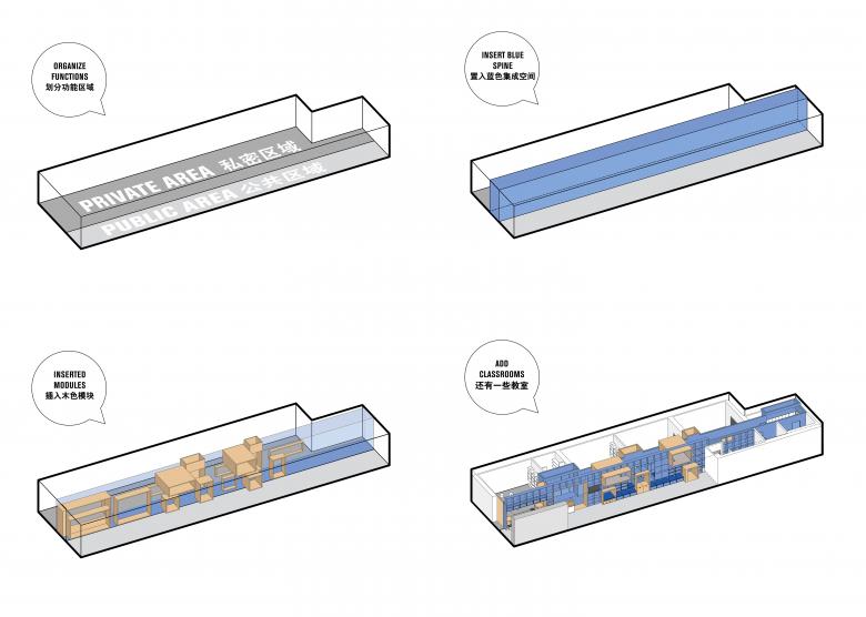
As a first step, Crossboundaries started to re-organize all necessary functions for the center based on the required degree of privacy and usage time. Integrated functions such as resting, play and display, were grouped as public areas (with less need of privacy) and re-arranged along the window front of the original shop. These public areas were given an improved visibility to engage and invite, representing the values and open-mindedness of the Qkids Brand. Private areas (less visible from the outside, in the back of the space) were assigned to teaching spaces, office and supporting areas.
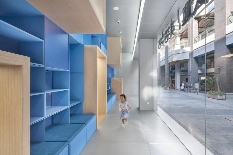
The main feature was developed, the blue spine, - a long sculptural body - running through the core of the narrow space, the blue interface holding everything together and allowing at the same time for connections and modular inserts.
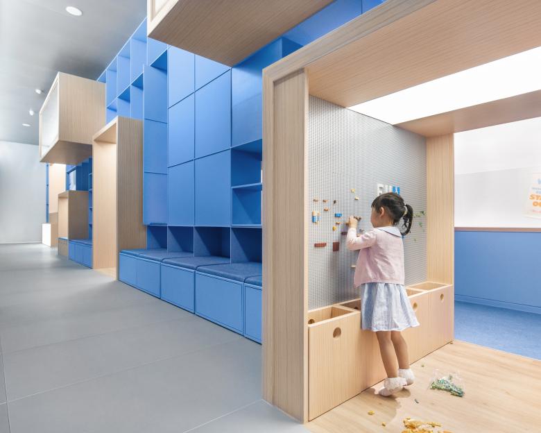
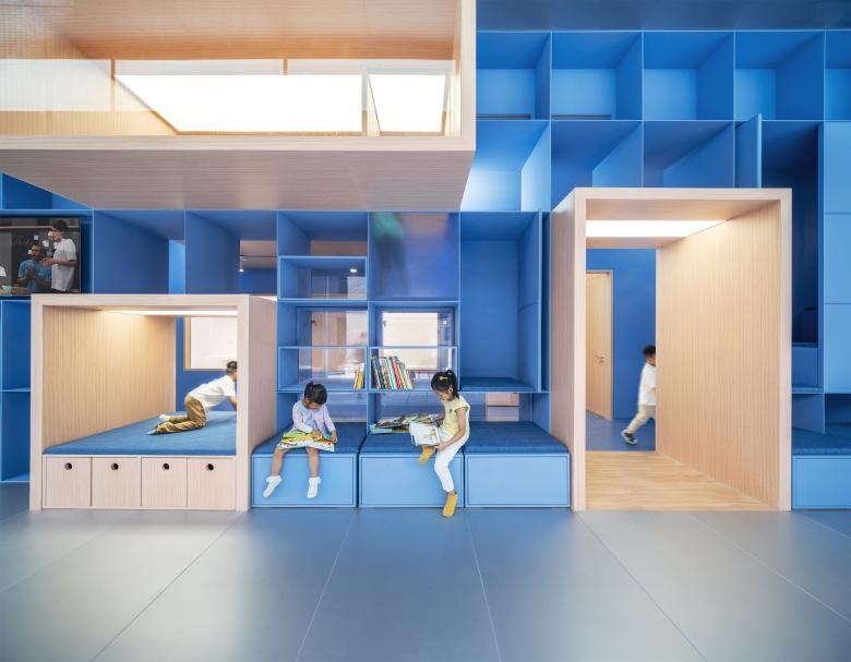
The front is composed as a large cubic wall grid, which is built as a steel structure, with public function areas inserted, in form of vertical and horizontally stacked wooden modules, containing the more open reception area and clearer defined break out modules that can be shared by parents and students alike.
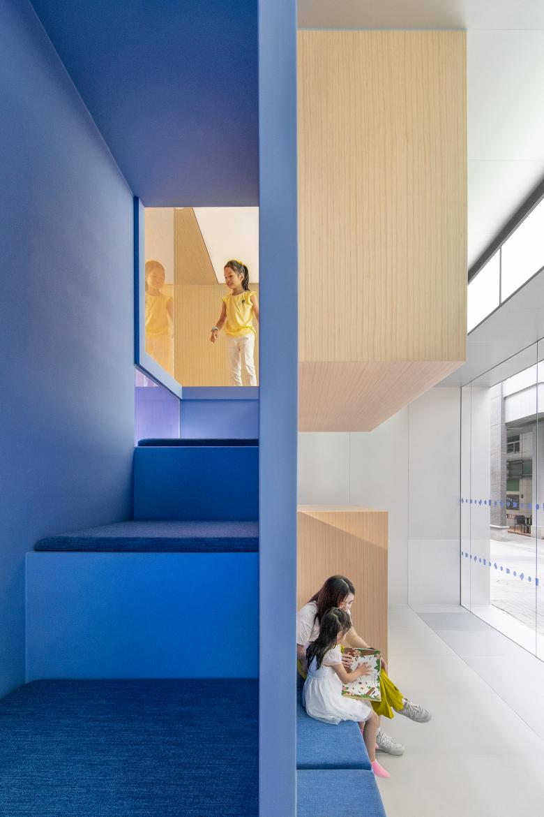
The upper modules became an exploration world designed solely for the little ones, within the cubic grid, in which children can climb up and engage in playful activities during breaks or whilst waiting together with parents for their siblings to finish class. Within the steel structure, there are partially visible, partially hidden cavities, that kids can crawl up and into, or from where they can catch a quick sight of what's going on in one of the classrooms.
The blue spine, with its cubic matrix and modular volumes towards the front, also attracts potential new Qkids members and students, getting them intrigued in what is happening behind, in the classrooms. The blue element becomes the most prevailing, absorbing feature, to be playfully discovered by children, as a climbing passage with hidden places they can take into possession and which attracts strongly from the outside.
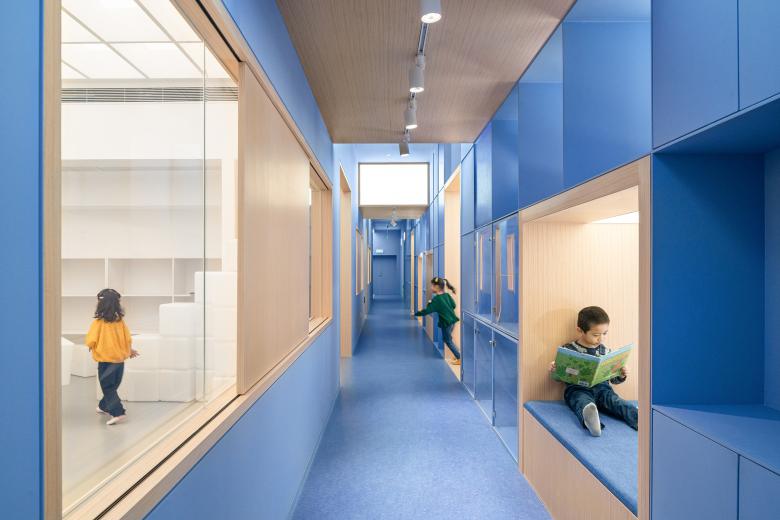
The overall space is arranged into areas of different levels of privacy, the blue spine facilitates a smooth transition from one layer to another - from a very public, very visible front to the semi-public corridor in the center and the private, non-public classrooms in the back.
"Presenting an accessible, open environment as well as sparking curiosity is part of the overall QKids Brand experience, we have continued this narrative from online to offline, and we layered the functional layout of the space accordingly, from very visible and public in the front to attract interest in what the center has to offer in more private areas in the back", explains Binke Lenhardt, Founding Partner of Crossboundaries.
The blue interface also makes room for modular furniture elements that can be placed and modified flexibly and stored away within, at any time according to the actual scenario and the number of users.
Inside. Outside. Fluid Relationships between separation and integration
Visual connections remain across the center's different functional areas and allow for a stimulating spatial experience. Throughout, the relationship between inside and outside, especially between public areas on the main glass front and its outside surroundings is kept fluid.
The storefront window was expanded in height, to give an opportunity to the public to get from the outside a glimpse straight into the contemporary, unusual English Center interior. The vast transparency of the store and the blue cubic spine are there to attract the community's curiosity whilst peeking in. It allows them to spot people inside, resting, chatting or browsing shelves, kids playing, in action, amidst a variety of open and closed areas and of different colors and materials. Hidden and not immediately visible from the main outside front, are the offices and a book display.
The fluid spatial dialogue continues, with light, materials and textures playing an integral role. Outdoor light falling into the glass front can reach also the inner corridor through openings in the blue steel structure, its color deriving from the Qkids Visual Identity's color system. The choice of materials in general is meant to reflect the offline and online teaching environment that Qkids is offering and mirrors both, the digital world through silver-blue-metal references, as well the offline, the more sensorial world, with more lively, warm, smooth wooden textures and materials, to stimulate the senses of the children and heighten their curiosity.
A dividable reading zone, that can be accessed either from the main front entrance via the reception, or by the secondary entrance, includes a small display. It can be used by both, Qkids students and their parents as a waiting area and is defined more as a "members only" zone. Whenever there is a requirement to separate the book store (e.g. due to different opening hours or special events), it can be closed off with an electric blind.
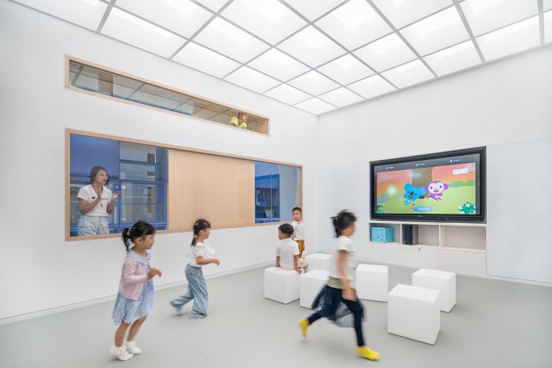
The Qkids English Center's teaching zone in the back consists of three regular classrooms and one multi-functional one. All of them are configured in the same way and provide a neutral, plain environment in contrast to the outside. They contain a back wall with a smaller cubicle shelf wall for general and furniture storage, allowing students to quickly stow away stools to have the whole room for games and playtime, opposite of that a wall used for multimedia teaching. The classroom walls on one side are covered with felt to absorb sound and the walls facing the corridor (behind the blue spine), have window openings with sliding wooden panels, giving the the teaching spaces transparency to its surroundings and allowing parents to look inside if they wish to do so. The rooms' ceiling structure is a continuation of the cubic grid from the blue spine, it also provides additional sound absorption and simulates a skylight effect through uniform light distribution.
Sliding doors between the reading space and the multifunctional classroom can divide or expand the public space, and turn it from a standard classroom into a meeting, event or Qkids brand exhibition space. As the center gains more popularity and at peak times, when it needs to run more classes in parallel, this solution offers maximum flexibility for different requirements.
When used as a standard classroom, and separated again from the more public areas, students can get access through a side door to the member-only areas via the inner corridor.
A smart and inspiring Masterplan for future Qkids Centers
The flexible usage of space within given limitations, facilitated by modular and movable elements, has become a central theme and a strength in several Crossboundaries' school design projects. It was yet again tailored to the requirements of the Qkids English Center, that is used differently at various times of the week, that needs space for activities with different privacy requirements and that becomes a manifestation for both, the Qkids Brand's offline and online teaching experiences.
The overall structure of the interior is made more intriguing, inspiring and children friendly through the limited use of colors and different material textures applied throughout the designs. Blue is an integral part of the Qkids Brand's visual language and became therefore the leading color, visible on the core feature, the blue spine, supported by a simple, geometric formal language and playfully integrated shapes of different sizes.
Another characteristic of Crossboundaries’ design is the flexibility of the elements used, for different functions, at different times of the week, but also to give children a ‘play and exploration' experience, and an offline platform for an enticing way to learn a foreign language, without being "childish".
Crossboundaries has also created essential master elements, defining the Qkids English Center look & feel for the future, a smart interior, yet an architectural solution, that can be adapted and leveraged in more 'off-line' English Centers to come.
Qkids English Center
プロジェクト一覧に戻る- 場所
- Lu Dao Tian Di, 361001 Xiamen, China
- 年
- 2020
- クライエント
- Xiamen Qianshi Technology Co. Ltd.
- チーム
- Binke Lenhardt, DONG Hao, GU Chang, HUANG Biao, HAO Hongyi, YU Hongyu
