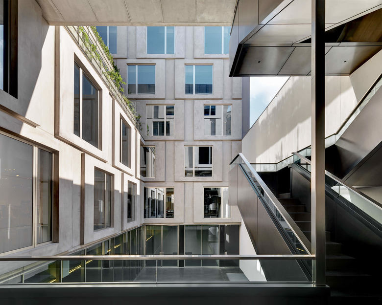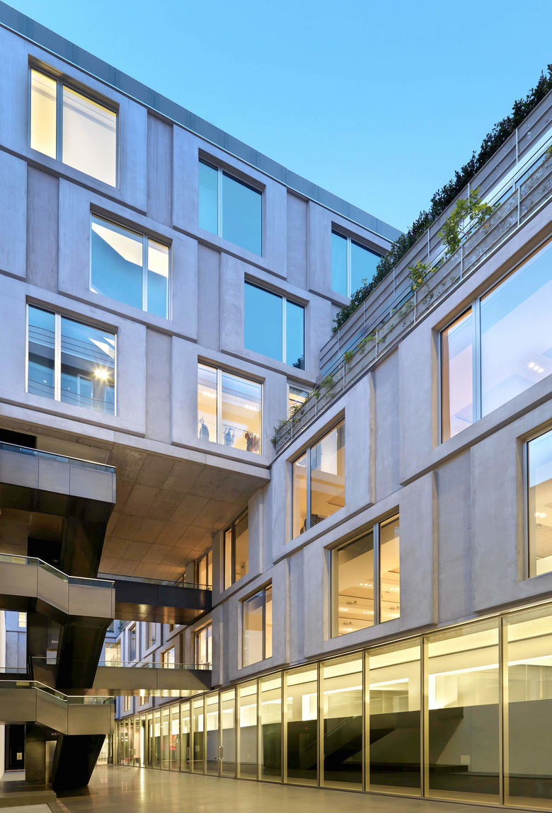
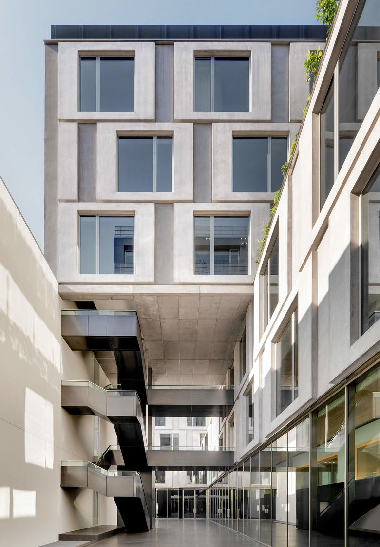
the new Dolce & Gabbana Headquarters results from the modernizing of a late 20th-century building. The building takes the form of three parallel constructions fitting in with the long and narrow building lot to create a large internal courtyard. The central one is suspended on a building, orthogonal with respect to the road, which connects the three constructions. In this way a large and deep inner courtyard is created, onto which all the buildings overlook.
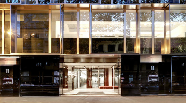
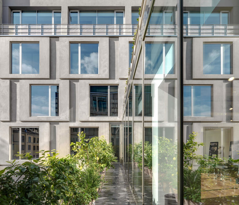
The elevation towards the street is characterized by sunscreens shutters made of steel. Set out in a displaced square pattern of 3,60 m x 3,60 m, the sunscreens create shafts of light and very precise, clear-cut forms making the façade look like an elegant garment stitched by a skilled tailor. The stylistic language used on the road front contasts with the more austere design of the elevations overlooking the courtyard, where the theme of squares is taken up again only this time through GRC (glass fibre reinforced concrete) panels.
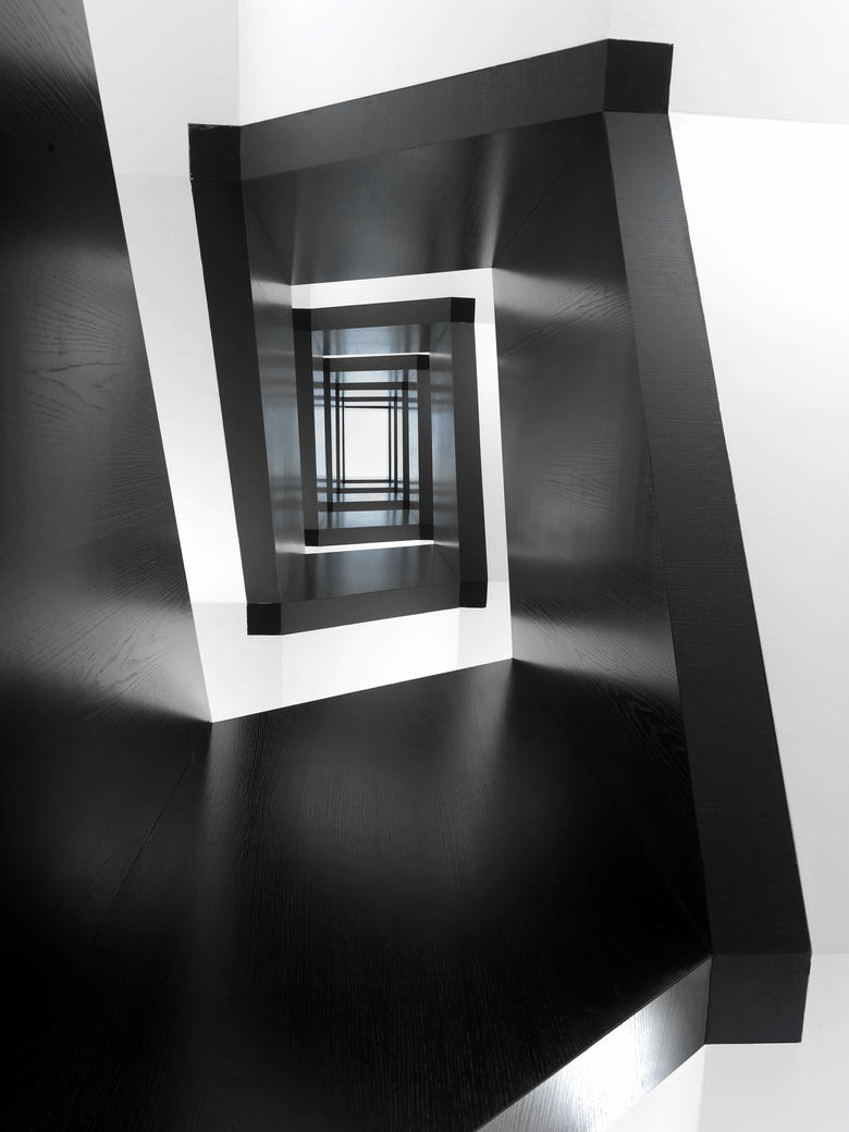
The most distinctive features of the interiors are the simplicity of the spatial layout, the decision to focus on the old architecture and the choice of elegant materials with the Mediterranean look of basalt stone that turns into a powerful leitmotif for the fashion house’s image.
Dolce&Gabbana Headquarters
プロジェクト一覧に戻る- 年
- 2013
- クライエント
- Dolce&Gabbana S.r.l.
- チーム
- Micaela Bonomessi, Silvia Calzetti, Laura Cassani, Cristina Castelli, Gabriele Coi, Marco Dragoni, Davide Fascione, Suewoo Kim, Luca Lazzerotti, Magali Roi Liverato, Michele Megna, Elena Migliorati, Gianni Mollo, Andrea Palaia, Salvatore Seggio
