HNO+ Kompetenzzentrum Höhr-Grenzhausen
Höhr-Grenzhausen, ドイツ
The challenge of this project was in need of renovation to transform three independent complexes of an office building from the 1980s into a competence center for ENT medicine with radiant power. For this purpose, the orphaned, drafty office foyer and the two staggered components were gutted and fire sections were moved. In addition, we developed an overarching design language that plays with the spatial geometries, reflects the corporate design and depicts the unusual composition of the patient groups.
As a center of excellence for ENT medicine, the practice is not only visited by people from the surroundings, but especially by hearing impaired people, especially children and adolescents and Bundeswehr soldiers from the nearby barracks in Koblenz. In addition, the center also offers aesthetic treatments. This, based on our analysis and interviews, led to a distinctive brand space color (british) concept in green-blue, against a background of neutral grey and fresh white, which stands for purity and order.
We further developed the idea of "camouflage" as an association with the Bundeswehr soldiers. In return, components and furniture were given the exact same color as the respective walls, which is both interesting and soothing.
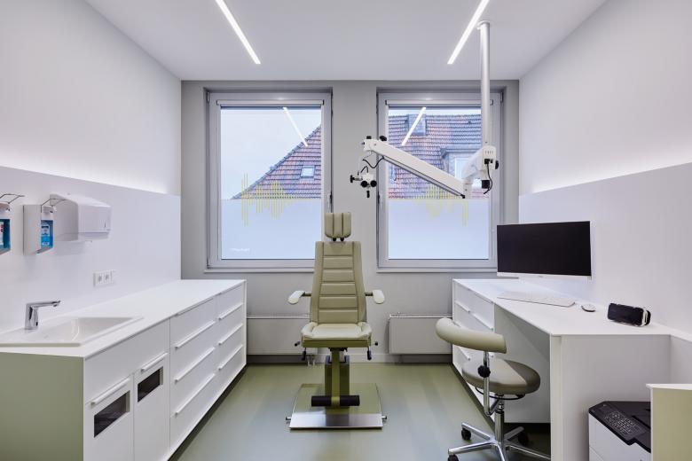
For example, all exterior walls, including radiators, were painted light grey, so that these and the existing windows are visually receding. The partition walls in the treatment rooms and the sideboards in front of them shine in hygienic white.
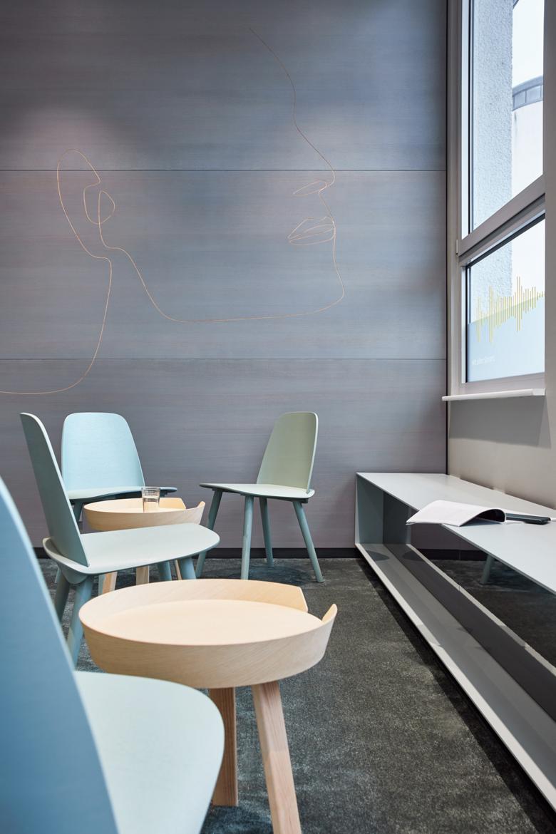
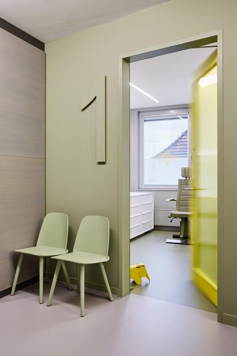
The shifted corridor walls, which are the result of the geometrical connection of the two complexes create generous spaces in front of the respective treatment rooms, which serve as intermediate waiting areas. This dynamic arrangement is reinforced by the wall colors, which are staggered in percentage terms per seat from green to blue and from blue to green in the two complexes. Waiting chairs, unusually large room markings and cloakrooms were precisely adapted matching the respective color code of the walls.
The existing floor in the foyer, a grey-white granite merges into a grey rubber in the corridors to connect these areas. The treatment rooms are visually and thematically contrasted with a rubber floor in a soft, calming green.
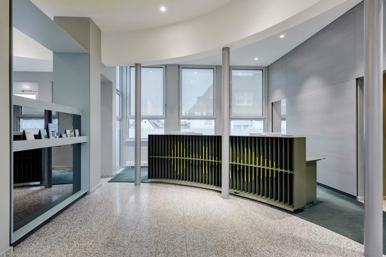
Strong yellow as an accent color emphasizes the “special”: Overheight doors of the treatment rooms illuminate and thus rhythmize the corridor areas. This is also excitingly enhanced by the linear ceiling lights. The yellow is also unusual in the form of the sonic graphic of the word “Welcome” on the concave reception counter facing the patient.
Here, the sonic graphic is shown laterally on its vertical slats, so that it appears to move with the movement of the viewer.
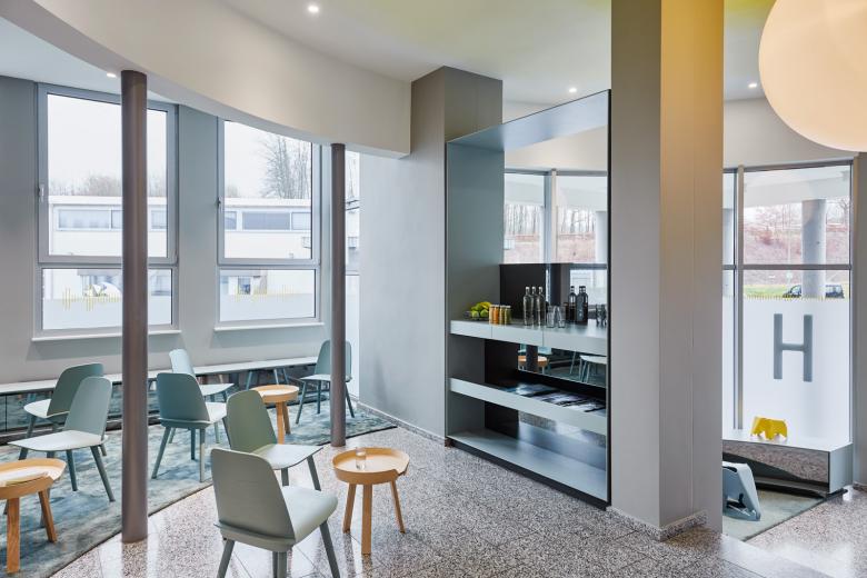
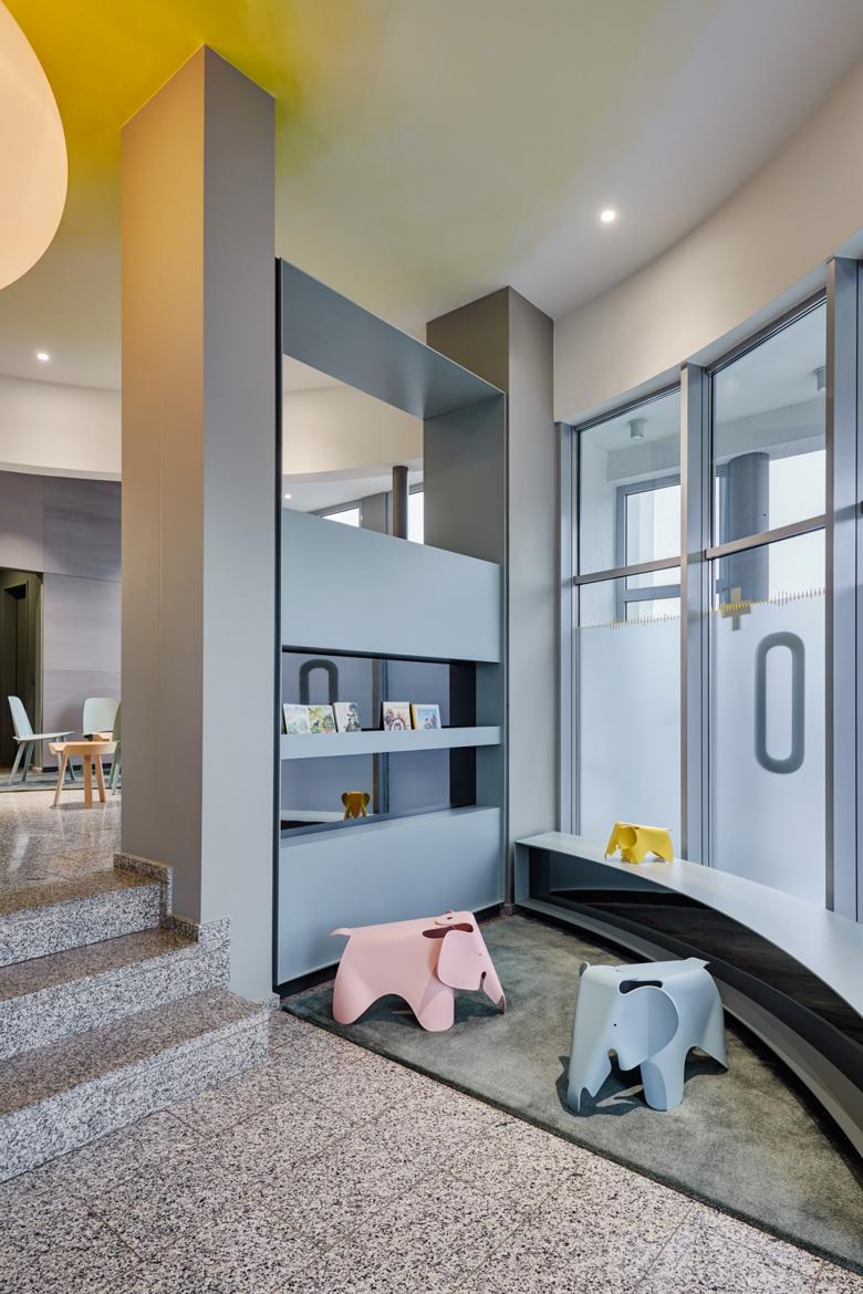
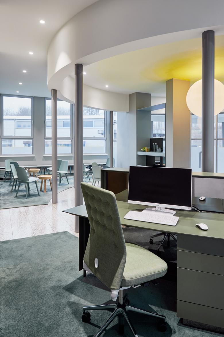
Yellow sonic graphics also determine the window and façade elements, which for reasons of discretion have been partially foiled translucently creating a “horizon” in the rooms. Each room was assigned a term of their brand values by the physicians, which was then converted into a sonic graphic and positioned on the horizon with the so-called “zero line”. In this way each room experiences its own topic and creates a subtle emotional connection to the patient. The yellow as a plus-sign in the practice's logo also emphasizes the additional services as a competence centre. The former circular office foyer is divided by two half-height dividing elements into a children's play corner and an open waiting area near the entrance and into the reception area and the back office. The elements were designed according to the respective requirements as a bookshelf, drinks counter with magazine display and as an information board close to the reception area. Light benches follow the facade and also integrate radiators.
All interior design elements blend harmoniously into their surroundings thanks to their blue-green color and slightly reflective rear walls.
Only the large ash wood wall deliberately visually stands out here, as it forms the background for the reception and waiting area and also emphasizes the beginning of the treatment tract and also the end of the practice at section two.
The elegant milling of a stylized face as a "one line" in a natural material such as wood creates a artistic reference to the ENT competence areas and aesthetic medicine and creates a memory value.
- インテリアデザイナー
- two_space + product
- 場所
- Bergstraße 63, 56203 Höhr-Grenzhausen, ドイツ
- 年
- 2019


