Fushan Primary School
China
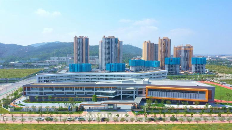
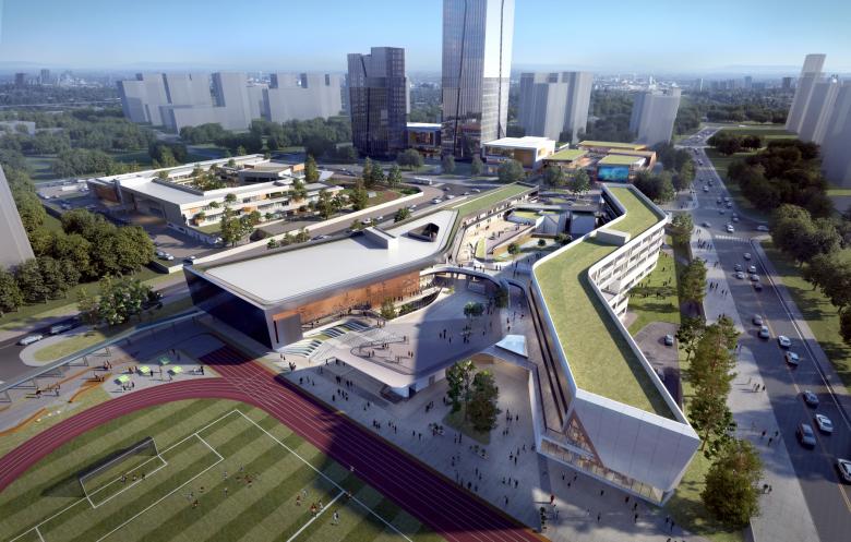
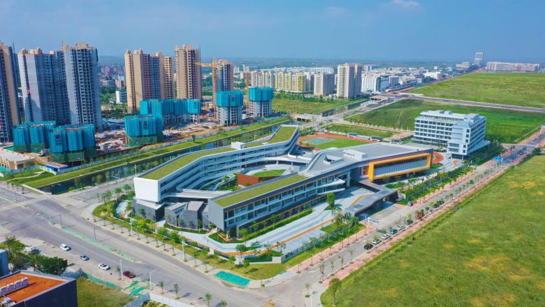
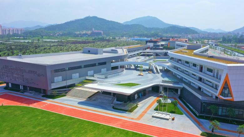
Led by Design Partner Ted Givens, 10 Design has just completed the new Fushan Primary School, which will serve as an educational and community hub for the local residents in Zhuhai, China.
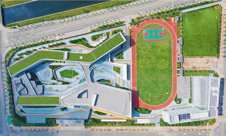
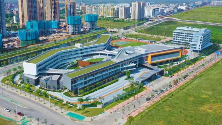
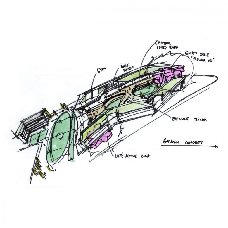
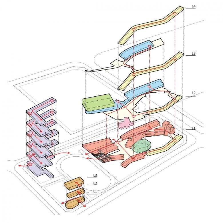
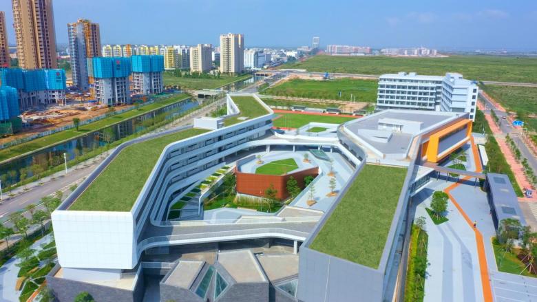
The qualities of Lingnan Garden design, namely: innovation, unique materiality, and abstracted natural forms, were the driving inspiration for the school’s courtyard master plan. The twin volumes of the school are arranged to create a large internal courtyard. This introverted planning diagram sets up a safe space for learning as all circulation is open air and visible from anywhere in the complex.
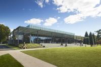
The art room and theater become follies that activate the courtyard. These sculptural forms are inspired by the abstracted natural geometries found in traditional Chinese gardens. The undulating form of the buildings is also reminiscent of the flow and orientation in ancient garden design.
Combined with traditional inspiration, we incorporated some mathematical concepts to help set the patterns of the garden spaces and the façade design. The Lorenz attractor is used to set the patterns for the courtyard geometry- pointing to trying to comprehending apparent chaos in natural systems. The facades for the gymnasium have a pixelated pattern based on the migration of a stain flowing across a surface and growth. The formulas provide a beautiful pattern, but also a learning opportunity as they are created from mathematical equations. The students will experience, and can find a deeper meaning in the world around them by studying the patterns upon which the school is based.
Student-housing buildings are also located adjacent to the school. The student-housing zone is far enough away to give the students a sense of separation from the school environment, balanced with connectivity. The master plan also includes a community centre and retail centre located to the east of the site on the opposite corner of the student-housing zone. This complex included retail shops, food and beverage areas, a farmers’ market, an art centre, and a post office to support the students and local residents. The same DNA that defines the school is also imbedded in these centres.
This entire complex sets up all the necessary components to create a sense of place for the students and local residents. These centres are the corner stone for the upcoming residential developments that are being developed.
Integrating high level mathematical ideas that hide just below the surface of the design will hopefully help foster creative thinking and curiosity in both the students and local residents.
Photo courtesy of Huafa Group
Visualisation by Frontop
For media enquiries, please drop a note to Catherine Chan, Partner - Marketing at cchan@10design.co.
