Photo: John Hill/World-Architects
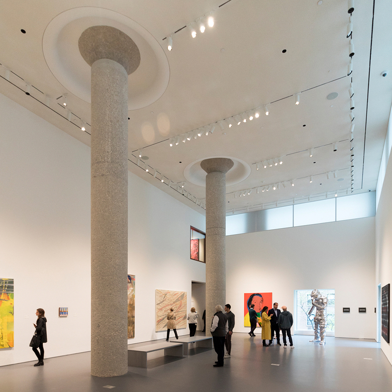
The world-famous auction house Sotheby's has completed the transformation of its headquarters on New York's Upper East Side. Some of the galleries designed by Shohei Shigematsu of OMA New York expose concrete columns that draw attention to the building's industrial origins.
Sotheby's held a press preview this morning ahead of its May auctions. With 90,000 square feet in 40 galleries (up from 67,000 sf), the OMA redesign provides plenty of flexible spaces for Sotheby's to display art to the public, as well as for private sales.
World-Architects attended today's preview, eventually honing in on the spaces punctuated by columns — standouts from the fairly straightforward, white-box gallery spaces. Below is a photo-tour of these spaces from our visit.
First a diagram from OMA, which reveals the extent of the redesign: floors 1 to 4 in the 10-story building. Before Sotheby's took over the 1925 industrial building at 1335 York Avenue in 1982, it served as a Kodak warehouse and before that a cigar factory. (Image: © OMA New York)
Partitions were removed behind the entrance desk, opening up the space and drawing people to the new double-height gallery beyond. (Photo: John Hill/World-Architects)
Visitors descend a few steps to an intermediate space beneath the mezzanine; two chubby columns and benches break up the space into three zones. (Photo: John Hill/World-Architects)
The double-height space on the first floor — one of three new double-height galleries in OMA's transformation — has two large columns. The diameter of the columns is greater here than out front: concrete was added around the columns to compensate for them being double-height and not having the lateral support of the floor that was cut out. (Photo: John Hill/World-Architects)
Doubling back toward the lobby but taking the escalators up a couple floors brings one to this gallery in the southwest corner of the third floor. (Photo: John Hill/World-Architects)
The soft light entering the gallery from two directions is particularly nice, though one's eyes are drawn to the ceiling and the way it's shaped to expose the column's mushroom cap. (Photo: John Hill/World-Architects)
Heading to the northwest corner gallery on the third floor brings us first to this smaller gallery next to it, where another mushroom-capped column (this time accompanied by an exposed ceiling) sits off-center in the space. (Photo: John Hill/World-Architects)
The two-story corner gallery (the space in the previous photo is through the opening in the center of this photo) is the most appealing space in OMA's redesign of Sotheby's. (Photo: John Hill/World-Architects)
The second of the three new double-height galleries (the third, not shown here because it doesn't have columns, is also on the third floor) has two tall columns that sit off-center and continuous clerestories that face north and west. (Photo: John Hill/World-Architects)
Looking up at the concrete column, its mushroom cap, and the ring-shaped cove recessed into the gallery's ceiling. (Photo: John Hill/World-Architects)
On the fourth floor is the eight-sided Octagon Gallery, where a column occupies its center. (Photo: John Hill/World-Architects)
Like the columns on the third floor, the ceiling in the Octagon Gallery is shaped to highlight the column capital, revealing that even though Sotheby's is all about the art it auctions off, it's also about the old building it calls home. (Photo: John Hill/World-Architects)


