Libeskind's Incubator
Leuphana University of Lüneburg is one of the best known universities in Germany and one where Daniel Libeskind has served as a visiting professor. The architect has now supplied the university with a new Central Building in his recognizable style.
Location: Lüneburg, Germany
Client: Foundation University of Leuphana
Design Architect: Studio Libeskind, New York
Architect of Record: rw+ Gesellschaft von Architekten mbH
Manufacturer: Selux AG
Product: M100 and M60 Modular LEDs
Lighting Design: Studio Dinnebier/ dinnebier blieske gbr
Electrical Engineer: emutec GmbH
Electrical Installation: R + S solutions GmbH
Facade Consultant: Arup
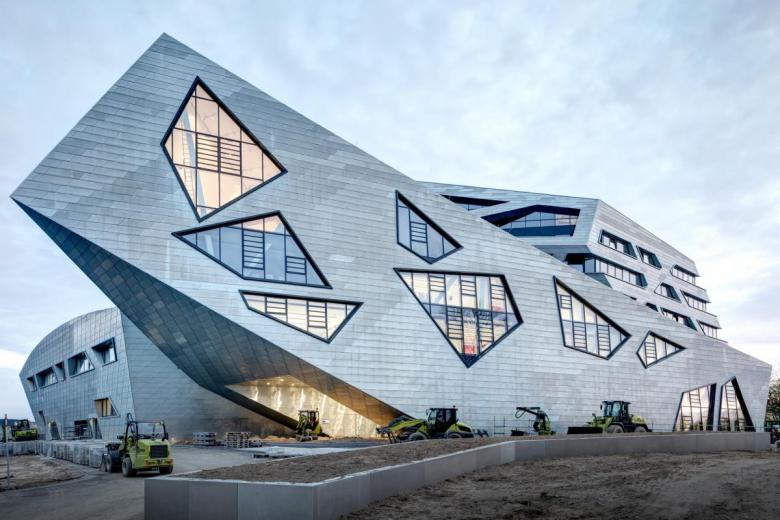
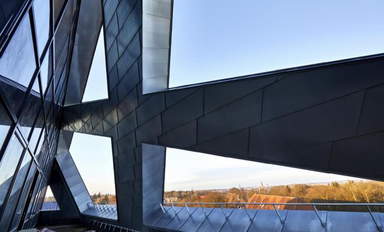
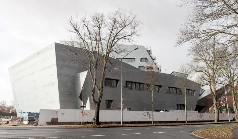
Architect Daniel Libeskind has been famous the world over ever since he won the competition to master plan the World Trade Center site in New York City in 2003. Well before that he had established Studio Libeskind with his wife and partner Nina Libeskind in 1989, the same year he won the competition to design the Jewish Museum Berlin, which (finally) opened to the public twelve years later. This museum is a common reference when discussing the work of Daniel Libeskind, since it established the formal language he has used since, until at least the Central Building of the Leuphana University of Lüneburg, which opened earlier this year. Libeskind has refined his architectural language over time, in many cases using the same materials, such as the gray zink-titanium panels covering the new Central Building. At Leuphanan University of Lüneburg, located on a former military site and appropriately graced with a collection of sober buildings, this material creates a contrast. Not surprisingly, Libeskind wanted to counter the campus's rigorous geometry with a strong gesture: "a landmark building that promotes the vision of innovation and excellence for the university," in the words of Studio Libeskind.
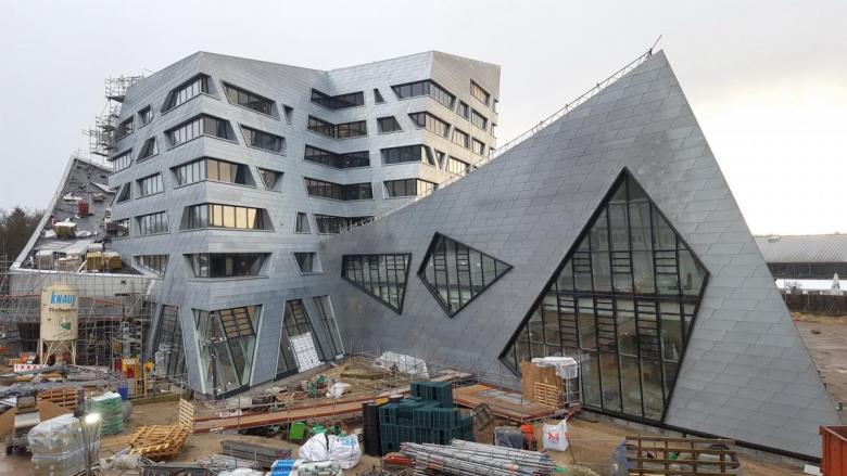
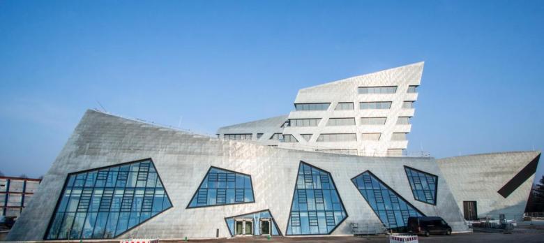
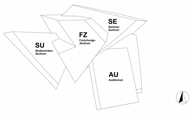
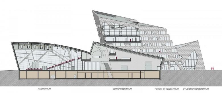
The new building consists of four blocks fused together, corresponding to the four main parts of the program. The centerpiece of the ensemble is the seven-story Research Center (FZ) with a multitude of small and large rooms for groups and individuals to work or teach, complete with a balcony overlooking the campus. The two-story Student Center (SU) and three-story Seminar Center (SE) bookend the FZ but stand apart from it through fenestration: their windows are like geometric cuts in the facade rather than the horizontal bands of the FZ tower. Standing out from the angular lines of these blocks is a curved roof that covers the last piece, the Auditorium (AU), which has been lovingly nicknamed the Libeskind Auditorium. Where the SE rises at one corner of the ensemble, visible in the photograph at top, is the main entrance.
Daniel Libeskind found inspiration in the conviction that architecture has an influence on science and our image of the world. The building is intended for the upheavals, approaches, variables and contingencies that are indispensable in modern science's quest to understand reality. The aim here, derived from the philosophy of Leuphana University, is to contribute to the resolution of pressing societal problems by focusing on new, socially relevant research topics and involving the relevant disciplines so they can methodically cope with the challenges. Libeskind described his approach: "For the new Central Building of Leuphana, I have been inspired by the ethos of this university. Leuphana is an incubator for new ideas, innovation, research and discovery. The new building is imbued with these principles."
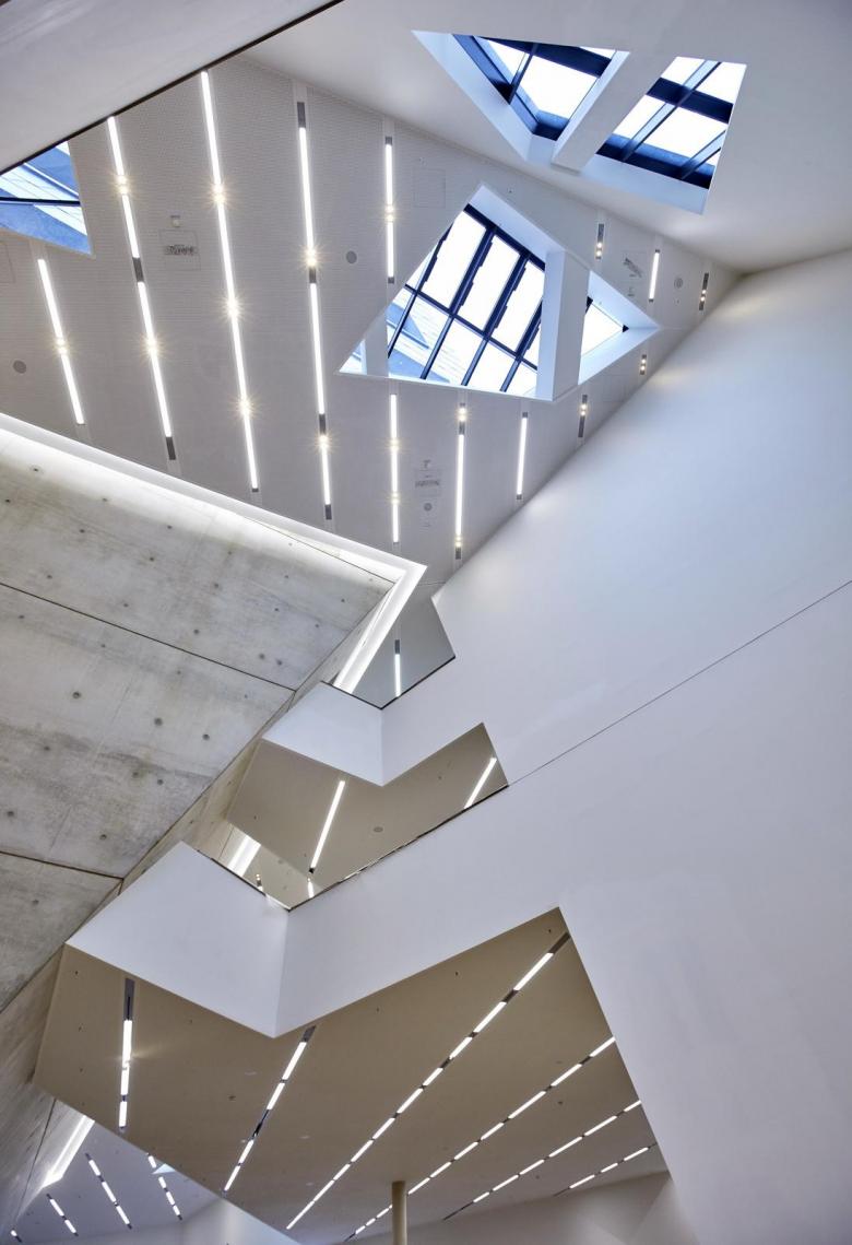
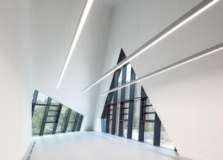
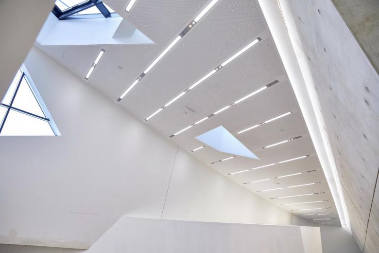
Inside the Libeskind building are correspondingly complex, somewhat disorienting spaces whose character is determined partly through illumination. Most prevalent are linear artificial lights that are set into the ceiling and emphasize the angular configuration of the spaces. The designers worked here with an old acquaintance from the time of the Jewish Museum Berlin: strip lights – ranging from 40 cm to 24 meters long – equipped with such extras as LED spotlights, tracks, and safety lighting. Made by the lighting manufacturer Selux, the lights are provided with oblique end brackets to connect seamlessly to the wall. In order to reduce direct and reflected glare, the lamps have a special lens optic system with microprisms hidden behind the acrylic diffuser. More than 2,500 meters of linear fixtures were installed throughout the Central Building, evenly illuminating its public spaces, corridors, and seminar rooms.
A version of this article appeared as "Libeskinds Brutkasten" on German-Architects.
