US Building of the Week
122 Community Arts Center
Deborah Berke Partners
8. maart 2021
Photo: Christopher Payne
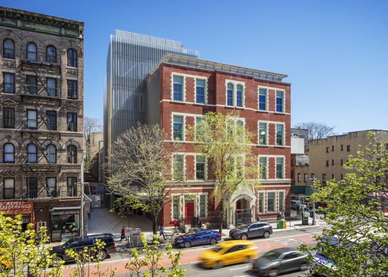
Not long after Public School 122 in New York's East Village closed in 1977, the late-19th-century building it was housed in found new life as space for artists. PS122 became Painting Space 122 and Performance Space 122. A few years ago the building underwent further transformation, into the 122 Community Arts Center, with renovation of the old building and an addition by Deborah Berke Partners, who answered a few questions about the LEED Gold-certified project.
Location: New York, NY, USA
Client: New York City Department of Cultural Affairs
Architect: Deborah Berke Partners
- Design Principal: Maitland Jones
- Project Architect: Ameet Hiremath
- Project Team: Brendan Lee, Deborah Berke
MEP/FP Engineer: Buro Happold
Façade Consultant: Front Inc.
Photo: Field Condition
What were the circumstances of receiving the commission for this project?Deborah Berke Partners was selected to be a part of a pre-approved list of architects by the New York City Department of Design and Construction. The Department of Cultural Affairs selected us from that list.
Photo: Field Condition
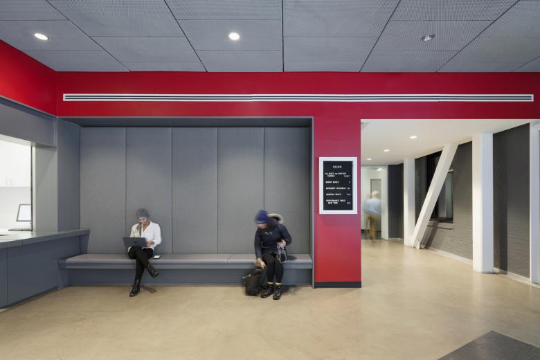
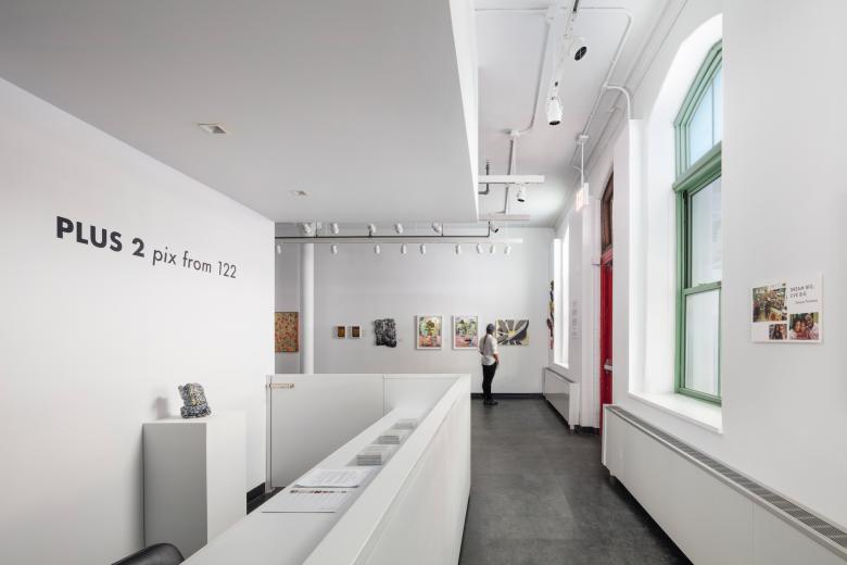
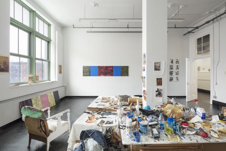
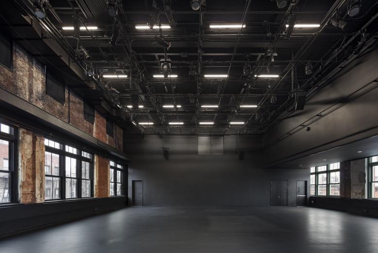
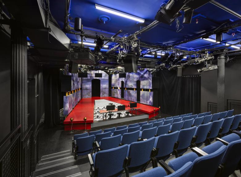
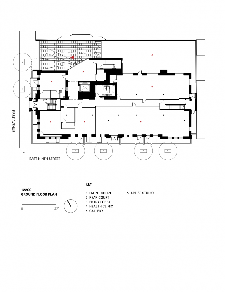
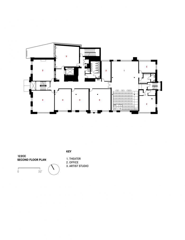
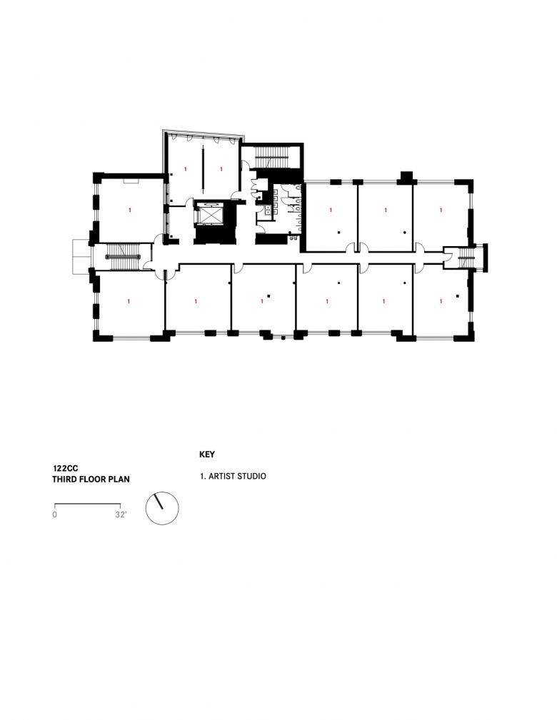
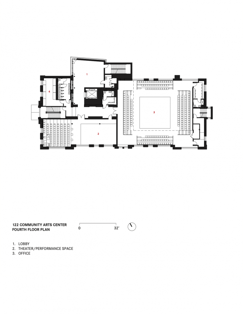
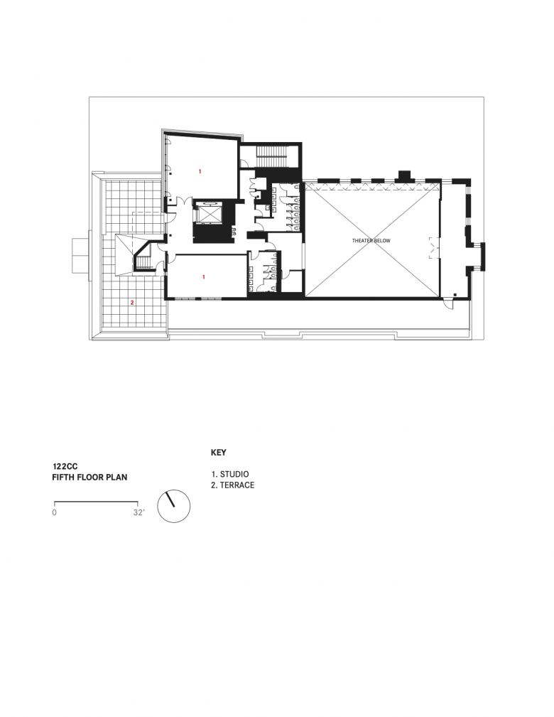
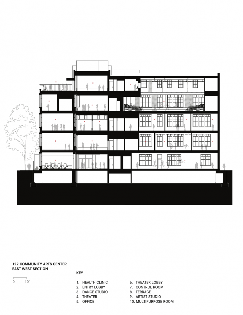
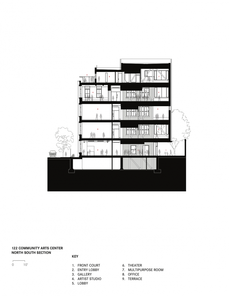
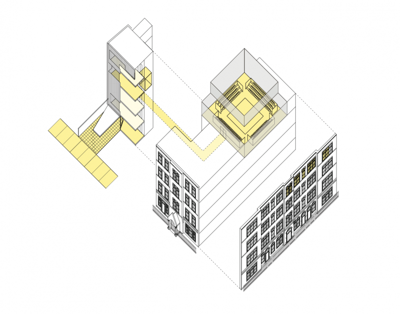
Please provide an overview of the project.This project, for New York City’s Department of Cultural Affairs, transforms a five-story historic former public school to better house four arts groups and one community-service organization. Our design proposed a new five-story addition to create additional public space and provide access to all parts of the building. The addition includes two new theatres within the building shell, a design studio, rehearsal rooms, shop space, painting studios, two gallery spaces, a lobby and pre-function gathering area, offices for the community center, and an outreach station for the community service group.
"Our driving question was how can we keep the excitement and grittiness of the early 122CC, while giving them the spaces needed today? In other words, the goal of the project was to create spaces for working artists — not too precious — and retain the character and patina of the building," said Ameet Hiremath, a partner at Deborah Berke Partners.
Photo: Field Condition
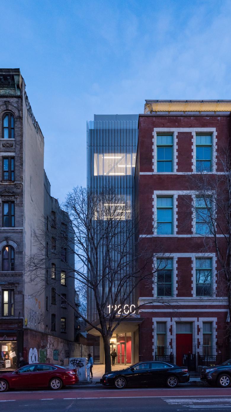
What are the main ideas and inspirations influencing the design of the project?The new circulation spine provides a welcoming lobby, safe and accessible circulation, and it creates opportunities for different artists and arts organizations to come together. The rooftop addition allows for a large, column free theater that is flexible and adaptable for a variety of performances and events.
"122CC is interdisciplinary, inclusive, public, and deeply engages artists so it is a place for making as well as presenting. The changing nature of many cultural institutions is that they are becoming less fortresses of culture, and more open and inclusive to a broader public — 122CC really embodies these qualities," Hiremath said.
Photo: Christopher Payne
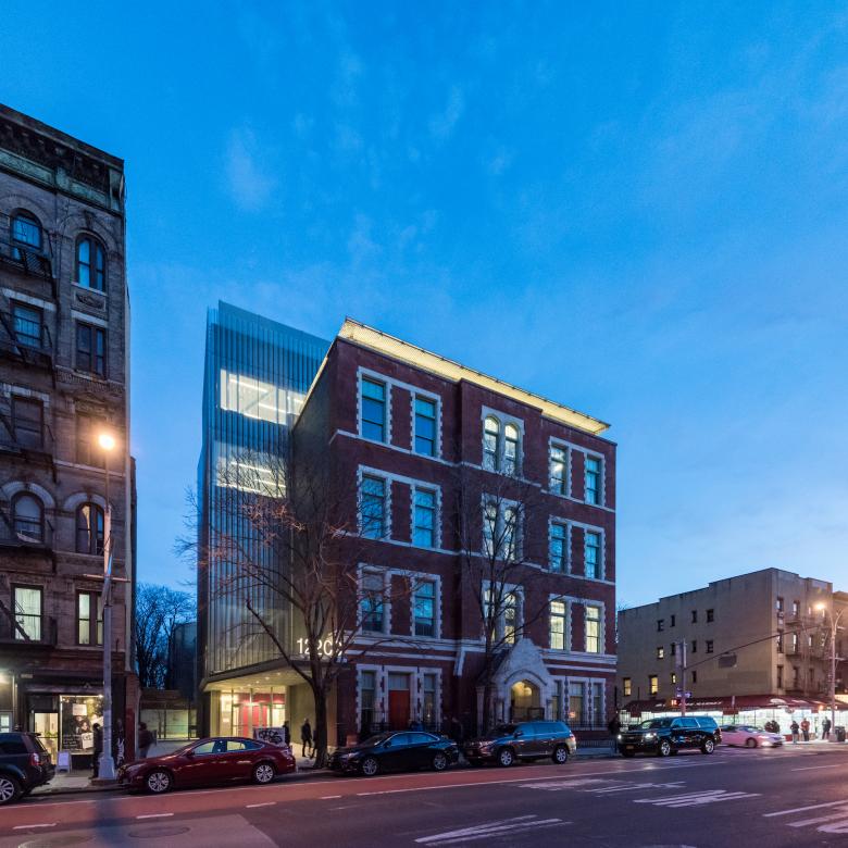
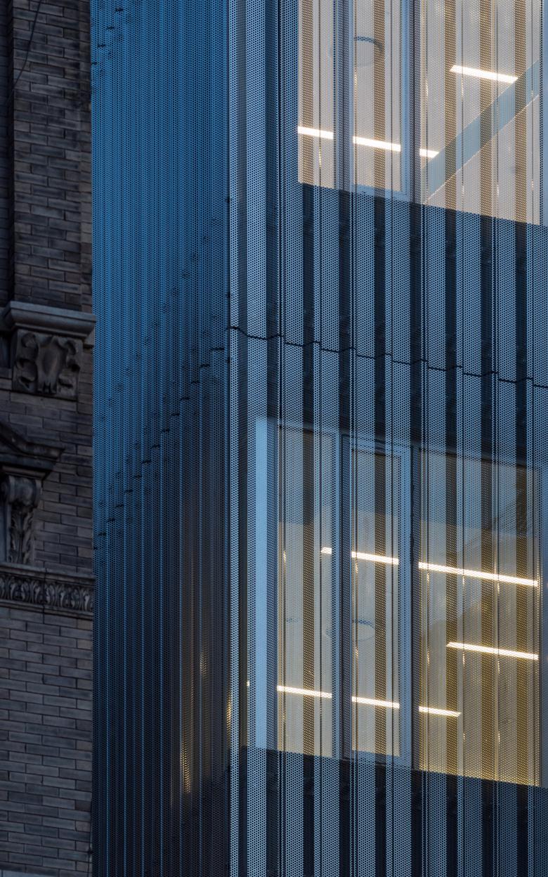
How does the design respond to the unique qualities of the existing building?The light, shimmering metal scrim that wraps the addition contrasts with the masonry of the old school building. A new metal cornice was constructed at the roof line with a pulsing light installation that "breathes," animating the building throughout the day.
Photo: Christopher Payne
How did the project change between the initial design stage and its completion?How and if to expand the building was not a foregone conclusion when we started: we looked at no expansion, versus expanding up or expanding underground. Doing only an interior renovation was initially preferred. But the idea of expanding up with the theater at the top and an addition to the side that gave the building a new entry and common spaces befitting a cultural institution really took hold.
The theater at the top was completely logical but also took a chance – no columns and great light/views, but you had to move a lot of people up there. The idea has a public dimension: theater-goers happen across the painters' gallery and workspaces, thus raising awareness of all the resident organizations.
The side yard addition was born of function and community: an accessible front door, the vertical movement, the threading of systems up-and-down which was very difficult given the old building’s structure, and perhaps most importantly the common spaces, social hallways, and lobbies that unify the building’s diverse groups – an idea that drove the project forward.
Photo: Christopher Payne
What products or materials have contributed to the success of the completed project?"We designed a custom metal screen over the addition. The stainless-steel panels have an exaggerated break-formed, corrugated profile and perforations. It is point-supported with minimal means, by designing the gauge and strength of the panels just-so. The overall effect is something diaphanous and light," Hiremath said.
Email interview conducted by John Hill.
