US Building of the Week
Serena Williams Building
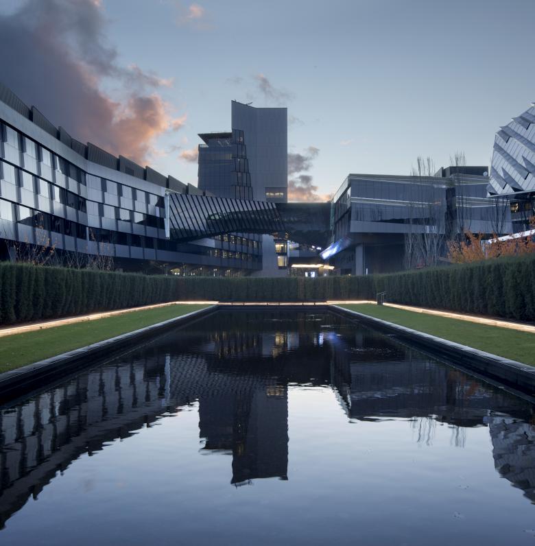
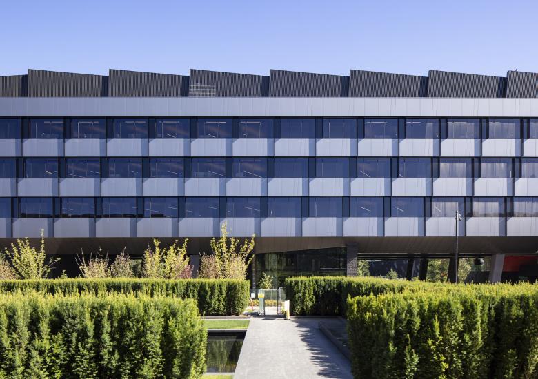
The most recent addition to the Nike campus near Portland, Oregon, is its largest: a 1 million square foot office building serving nearly 3,000 employees. Named for the newly retired tennis star Serena Williams, the building designed by Skylab Architecture strives to represent Nike and its namesake. The architects answered a few questions about the Serena Williams Building.
Location: Beaverton, Oregon, USA
Client: Nike, Inc.
Architect: Skylab Architecture
- Design Principal: Jeff Kovel
- Project Architect: Susan Barnes, Robin Wilcox
- Project Manager: Brent Grubb
- Project Team: Nita Posada (Interior Lead), Reiko Igarashi (Interior Designer), Louise Foster (Project Designer), Eddie Praza Garzon (Visualization Designer)
MEP Engineer: PAE (Scott Bevan, Chris Morgan, Dan Somlea, Grant Parthemer)
Landscape Architect: PLACE Landscape (Mauricio Villarreal, Dylan Morgan)
Lighting Designer: Luma (Zach Sachara, Brent Medsker, Alex Ridley)
Interior Designer: Skylab Architecture
Contractor: Hoffman Construction (Nathan Maroney, Rodney Myrick, Greg Boersma, Katy Church)
Civil Engineer: WHPacific Civil Engineering (Monte Higbee)
Sound: Listen Acoustics (Tobin Cooley)
Signage/Wayfinding: Ambrosini Design (Ken Ambrosini)
Sustainability Consultant: Brightworks (Josh Hatch, Elena Goldstein Lake)
Code Consultant: Code Unlimited (Samir Mokashi, Tom Jaleski)
Kitchen Consultant: HDA (Gary Hammer)
Specifications Consultant: M.Thrailkill (Michael Thrailkill)
Building Enclosure: Facade Group
Site Area: 325,000 sf
Building Area: 1,023,000 sf
See bottom for Important Manufacturers / Products.
In 2014 Nike hired Skylab Architecture to design the newest addition to their Beaverton Campus. The Serena Williams Building (SW) — a workplace for 2,750 occupants at more than 1 million square feet — is the largest structure at Nike World Headquarters. We led the design of all aspects of this complex building and program, including core and shell, interior design and furniture selection, and branding integration.
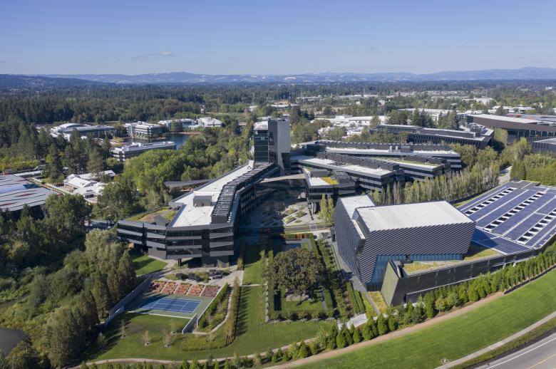
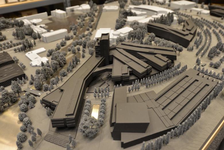
- Largest office building at Nike World Headquarters (WHQ) at 1 million sf; the footprint is equivalent to three Portland city blocks and 140 full-sized tennis courts.
- SW includes 200,000 sf of lab space – larger than a Costco Warehouse (145,000 sf) – designed to allow Nike teams to test new ideas in developing, presenting and merchandising product.
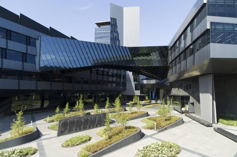
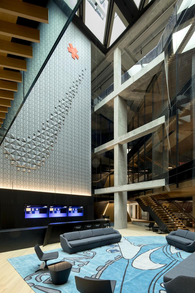
- SW is divided in three wings and connected by a main tower. The three wings are named: Phenom, Warrior and Muse. In the words of the architect, “Our concept [for the Serena building] is a branch form that abstracts the wing of the Nike Goddess.”
- SW is a LEED Platinum-certified building and was designed to be energy and resource efficient, with a focus on water efficiency, material usage, indoor environmental quality and wetland improvements.
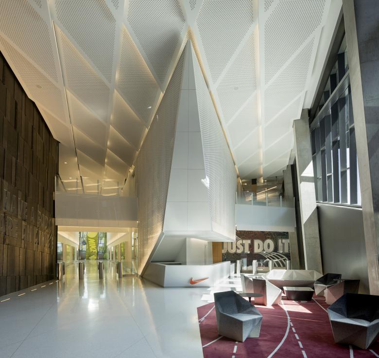
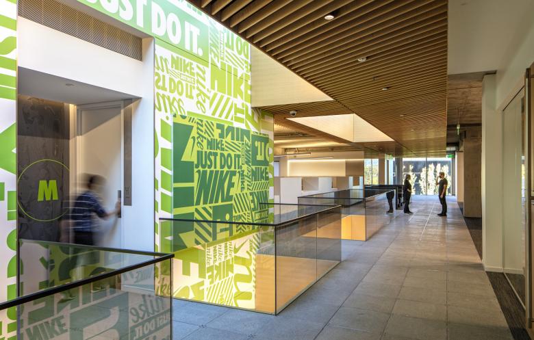
- SW provides an experience aligned with the Nike brand, heritage and team culture, while also representing the building’s namesake. Brand nods to the world-class athlete exist throughout the space.
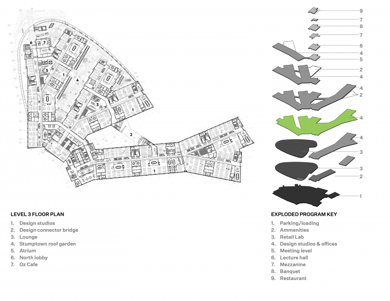
- Food service locations within the building are named for the four Grand Slams: the US Open Café, the French Open Café, Wimbledon Restaurant, and Oz Café.
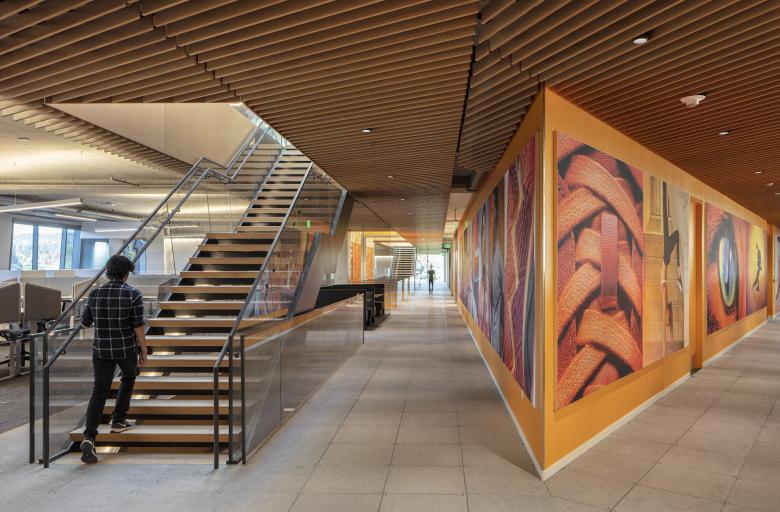
- Building residents include Nike’s Consumer Creation teams – Design teams; Consumer Insights teams; Women’s, Men’s and Kids teams; Apparel and Footwear Product Merchandising teams. The team workspaces are curated to each working group and filled with stories about athletes, sport, innovation and Nike culture.
- Skylab Architecture, a Portland architecture firm, designed the building in collaboration with Mark Parker, former long-time CEO and current Executive Chairman of Nike, Inc.
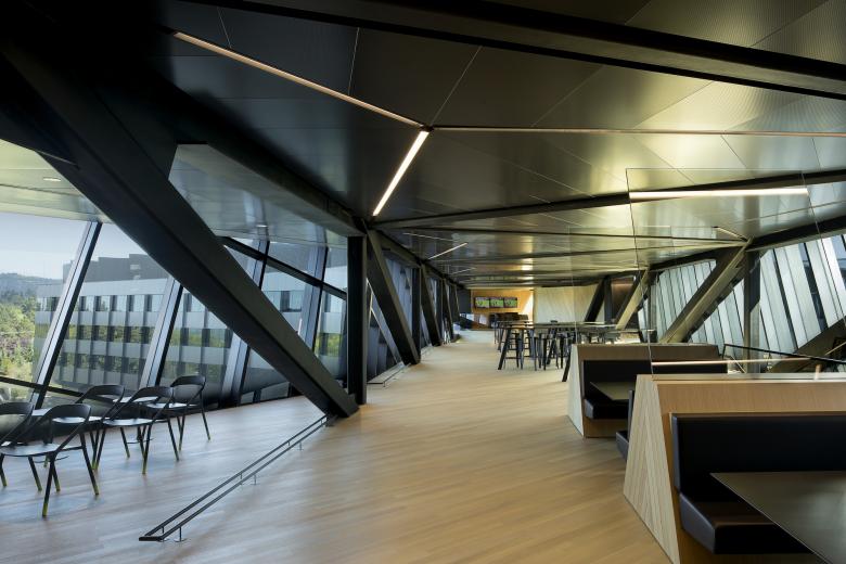
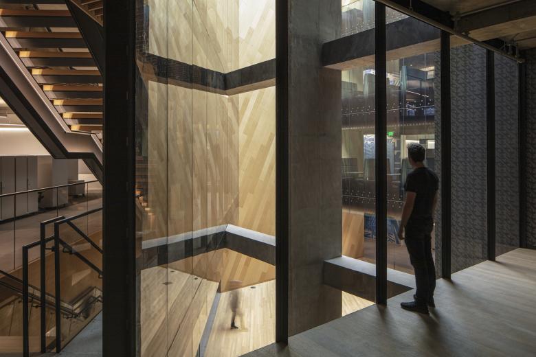
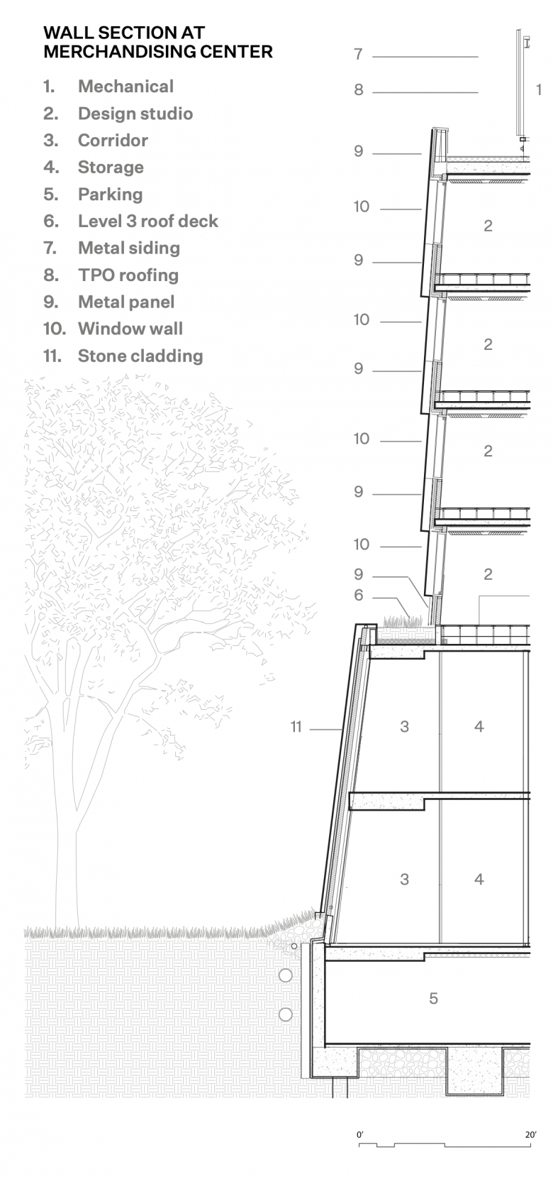
Integral to the design is the concept of flow — a fluid-state design strategy that is both efficient and enlightened. Flow facilitates unexpected connections and possibilities, both among designers and between disparate parts of the business. The building consists of four parts: an underground parking garage and loading dock; a merchandising center for prototype retail spaces; integrated design studios for multiple product categories; and a 12-story tower with shared amenities for all of campus. We created a variety of scales of gathering spaces to foster identity and connectivity, both indoor and outdoor. The building is organized around a principle that all designers for each brand within the business occupy a single level, while the services stack vertically between levels. In a first for Nike, products can move from sketch to prototype to final design to retail fixture all under one roof.
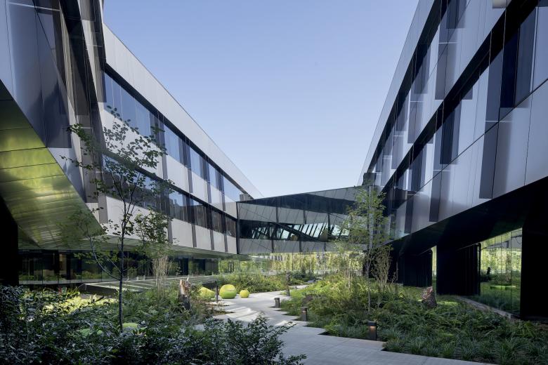
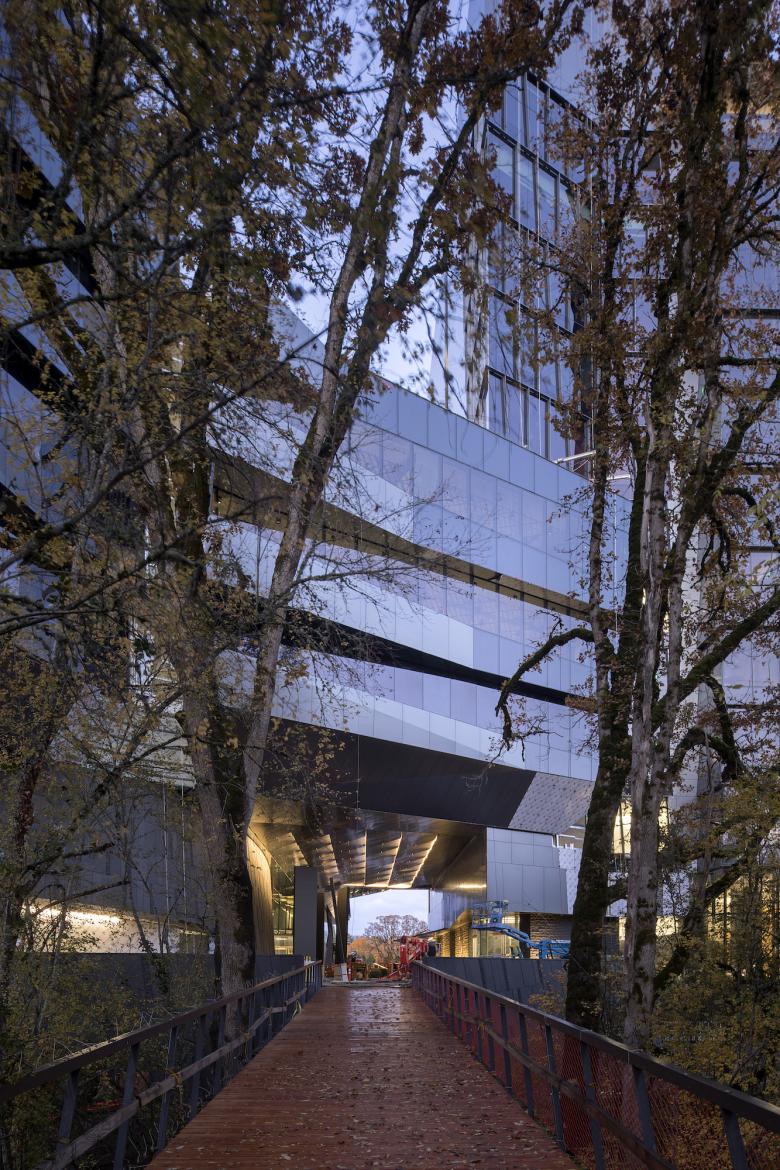
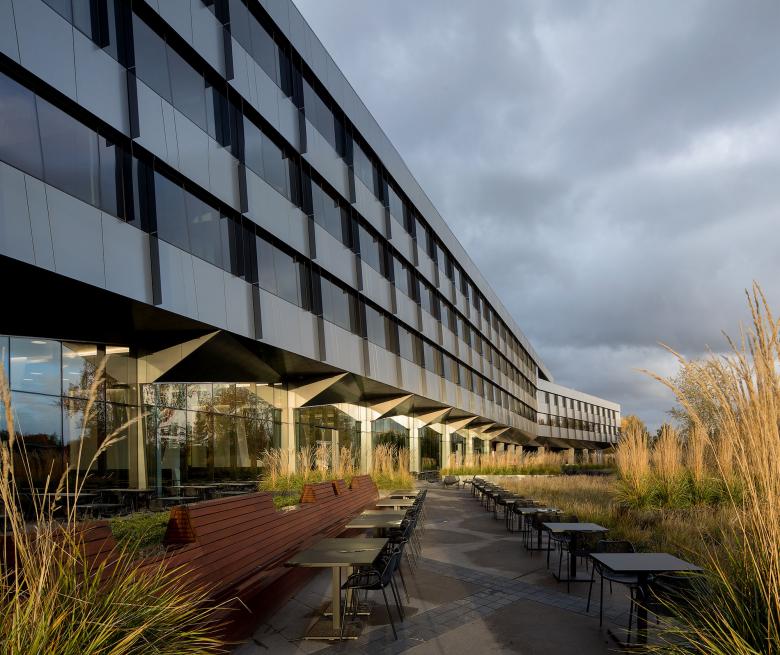
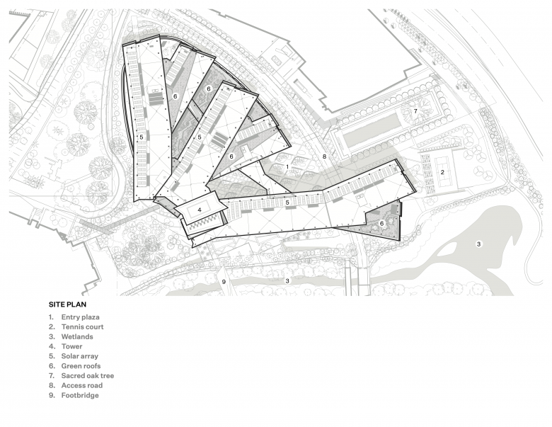
In its former life, the building site contained a parking lot and an access road to an adjacent building, all next to a beautiful wetland that the campus had turned away from. The negative spaces created by the branching bars are treated with the same sensitivity as the interior spaces themselves. Courtyards, gardens, plazas, and a sunken tennis court break down the scale of the building and provide informal outdoor spaces for work, recreation and relaxation. To better connect to the natural landscape, we buried the existing access road along with all parking and loading to minimize the visual presence of cars and trucks. In terms of massing, each of the building’s distinct bars, or wings, cascade to the south and feature inhabitable, interlacing green roof terraces that overlook the wetland.
For us, regenerative design involves working with nature as an active partner towards both respectful site design and intelligent construction with responsible systems and materials. Sustainable design features include energy efficient mechanical systems, incorporation of photovoltaic panels on the building’s roofs, reuse of rainwater for toilet flushing, the use of regional and recycled materials, and providing users with the ability to individually control their environments. A 260 kW photovoltaic array screens rooftop mechanical units from view. Stormwater is collected and returned to the wetland. Energy efficient mechanical systems include displacement ventilation and radiant sails. When building design reaches the scale of urban design, sustainability is non-negotiable.
Site & Landscape:
- The building is part of Nike’s “salmon-safe” campus, meaning stormwater run-off and source pollution have been reduced to protect Pacific Northwest salmon watersheds.
- The federally protected wetland running through the Nike campus and along the building is supplemented with thousands of native plant species.
Building Environment:
- The building provides supplemental fresh air indoors, which has been linked to increased productivity.
- Rainwater is captured and stored, then used for the building’s toilets.
Materials:
- The building has been created using recycled materials – more than 20% of materials are made up of recycled content and harvested and manufactured regionally.
- All the adhesives, sealants, paints, coatings, flooring, and composite wood installed in SW are low-emitting to improve indoor air quality and reduce chemical and particulate contaminants.
- More than 50% of the wood installed in the building is Forest Stewardship Council (FSC) certified and derived from sustainably managed forests.
Energy Efficiency:
- The building is anticipated to achieve an energy cost savings of over 41% compared to a baseline building.
- The building is outfitted with 648 solar panels.
- Principal Materials: Aluminum panel rainscreen system and glass curtain wall, Stone cladding, Exposed concrete and steel structure, Concrete tile raised access floor system
- Principal Structure: Post-tensioned concrete slab and column system, Steel structures
- Raised Access Floor: Haworth
- Wood Ceilings: Linea Ceiling and Wall Systems
- Acoustical Sheetrock: GypSorb
- Acoustical Ceilings: Armstrong, Barrisol
- Carpet: Bentley
- Custom Rugs: Delos
- Solid Surface + Tile: Dekton, Corian, CaesarStone, Lapitec, Pental, Mosa, Daltile, Trend
- Glass + Partitions: Skyline, Forms + Surfaces Vivid, Vitrum
- High Density Storage: SpaceSaver
- Modular Partition Walls: DIRTT
- Custom Markerboards: Egan
- Custom Upholstery + Wall Panels: Carnegie, Maharam, Febrik, FilzFelt
- Furniture: Andreu World, Arper, B&B Italia, Bensen, Bernhardt, Coalesse, Davis, E15, EcoPDX, Established & Sons, Flexform, Geiger, Hay, Herman Miler, Hightower, Kielhauer, Knoll, Kristalia, Ligne Roset, Magis, Mallet, Martin Bratrud, Matt Gagnon, Moroso, Paola Lenti, Viccarbe, Vitra, Vondom, Walter Knoll, Watson
- Site Furnishings: Paola Lenti, Popp, Escofet, Extremis, Fatboy, Tuuci
- Decorative Lighting: Foscarini, Ligne Roset, Lindsey Adelman, Luceplan, Rich Brilliant Willing, Vibia
- Exposed Access Floor: Haworth
- Wood Ceiling: Linea Ceiling and Wall Systems
- Acoustical Sheetrock: GypSorb
- Lecture Hall Seating: Poltrona Frau Group
Email interview conducted by John Hill.
