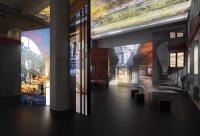
8. prize, Wien Museum
Wien, Oostenrijk
Renovation and Extension for the Wien Museum in Karlsplatz
Urban Planning – The protagonists of the public flow on Karlsplatz
The expansion of the Wien Museum on Karlsplatz should respond urbanistically to the situation on Karlsplatz and enhance architectonically the existing museum to being more innovative and up-to-date.
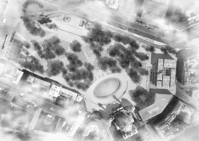
The starting point is the plan of Karlsplatz of 1912, in which the symmetry of the Karlskirche is being integrated in the layout of the square. Following this traditional, urban morphology, we expand the Wien Museum as a massive solitaire. The existing connection to the Axa Building is eliminated. In the extended perimeter, we see an expansion of the Karlsplatz and an integration of the Kunsthalle Wien in the Karlsplatz ensemble by the removal of the car traffic from the Karlsplatz between the Wiednerstrasse and the Kärtnerstrasse. The various institutions, such as the Kunsthalle Wien, the University, the Karlskirche and the Wien Museum Neu (WMN) spread a cultural field of relations on the Karlsplatz, originating from the metro station below the Otto Wagner Pavilions.
1912 Masterplan
We apply the 1912 master plan, which appears to be correlating the institutions the best way. The symmetries and diagonals give a sense of the intention of the history of Wien a hundred years ago. This masterplan is being superimposed on the current Karlsplatz and keeps it informative as a preserved trace of history.
All existing trees are being preserved and superimposed with the masterplan of 1912.
Karlspark – Karlsplatz – Public
The western side of the Karlsplatz, between the Otto Wagner Pavilion (metro), the educational institute Technische Universität and the evangelical School will be designed as a Campus similar to a park. All island surfaces of the 1912 masterplan are green areas. This park area can be used as a recreation zone for students, pupils and the population of Wien. The development of the city park between the institutions and the public flow take place along the axes of the 1912 masterplan.
The eastern, cultural side of the Karlsplatz between the WMN, the Karlskirche and the Otto Wagner Pavilion, we see it as a city square with the appropriate public space for the accumulated institutions on the square. On the city square all the existing trees are also being preserved. The floor covering is designed continuously with stone. The masterplan of 1912 is legible as an imprint of history due to the different treatment of the stone. The circulation over the square is no longer taking place along the axes of the masterplan, but freely, only filtered by the existing trees.
Through the conversion of this part of Karlsplatz to a city square with pre-existing trees, adequate space for the institutes is created, without big interventions in today´s microclimate.
Along the periphery of the square, seating surfaces are planned congruent to the geometry of the masterplan, as well as individual trees, similar to the ones framed with circular seating surfaces at the evangelical School today.
WMN – Karlsplatz
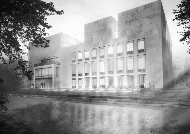
The WMN stands at the eastern end of the Karlsplatz. The main entrance is on the new city square and is being accessed through the square and between the trees. At the north towards Lothringerstrasse, we plant some trees, so that the WMN forms again a visible and distinctive destination in the city. The groups of visitors arrive at Maderstrasse, where the bus parking lots are located. From there, they reach the museum through Symphonikerstasse. The staff entrance and the supply of the museum also take place on Maderstrasse.
The new terrace of the WMN with the café forms a semi-public space between the Karsplatz and the WMN. The terrace is the roof of the new temporary exhibition spaces, which manifests them gently in the context of the square. As a reference to the existing Haerdtl Building, glass blocks are incorporated in the terrace floor, as a reflection of the existing façade. These skylights bring daylight in the exhibition spaces when desired and in the evening they illuminate atmospherically the terrace in front of the WMN. The dialogue between the Haerdtl, WMN and Karlsplatz enriches the new location.
Contextualization
Central to our task for the extension of the historical Museum of the city of Wien, is the question of how “old” and “new” can be brought into a relationship, without a separating distribution in old and new, but one in which the elements are combined and respond to each other. The qualities of the existing are being recognized and emphasized. We want to adopt relationships to the work of Oscar Haerdtl and the significant prehistory of Otto Wagner, which have been arisen alongside to the development of our project.
The project consists of three extensions, upwards, downwards and on the surface.
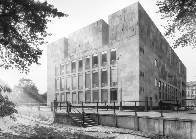
The extension upwards deploys a striking presence, without ignoring the scale of the surroundings. The Karlskirche defines the new building height and remains the protagonist, but with a strong partner at its side.
The extension downwards is externally manifested as the terrace surface; the cover of the space defines the terrace area.
The extension on the surface serves the illumination downwards and as a terrace. It refers to the underlying volume and the tiling corresponds to the façade: “roof”, “floor”, “wall” emerge together.
Existing and extension incorporate each other. An archaic structure contrasts the delicate formulation of the existing façade, with its sophistication against the compact volume of the extension.
The result is no hierarchy, but integration.
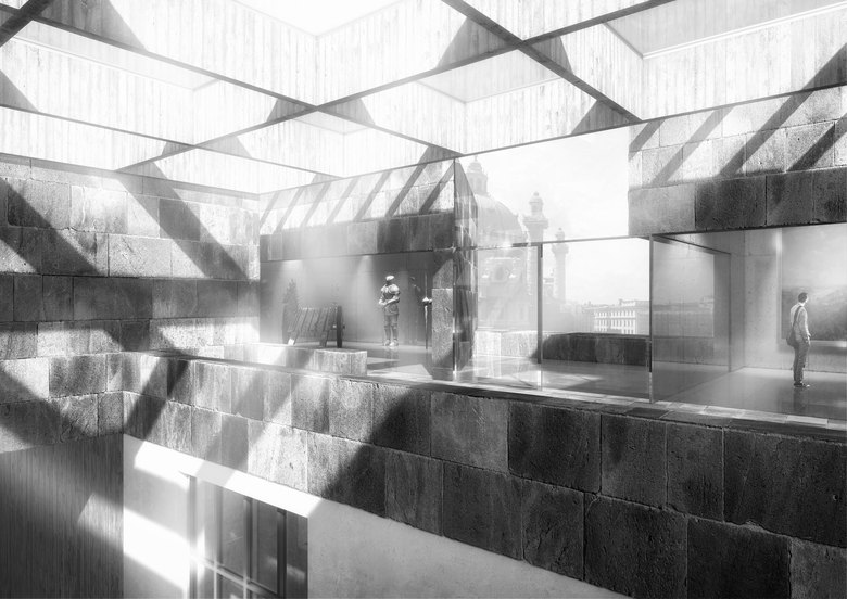
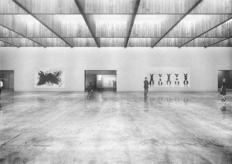
For the extension, “in context” stone is being used, the surface being kept contrastingly raw. The tiling produces a fine mesh of joints. The idea of the „Kern“, liberated from the „Stilhülse“, is being continued inwards: the outer material appearance is confirmed inside as the truth of material.
Typology– Program
The museum is organized so that only program with natural daylight is assigned to the existing Haerdtl Building with the many windows. On the ground floor the foyer with the entrance and the café, on the 1st floor the meeting rooms with offices and almost “in situ” the director’s office as part of the permanent exhibition. On the 2nd floor there is a part of the permanent exhibition.
The new part at the attic and at the basement is morphologically a space expansion of the existing mass without architectural reference or connotation, hence without windows but with incisions. If necessary, daylight can be conducted through the incisions at the stone mass to the exhibition spaces.
Organization of the Museum
Entrance / Foyer
The existing entrance is also the new entrance of the WMN. The museum cafe with the terrace connects and expands as a new semi-public meeting place of the Karlspltaz. The ground floor is connected to the basement by a large, massive staircase-landscape and generates a foyer two floors above. The ticket counter, the cloakrooms, the museum shop and the cafeteria are located on the ground floor.
Circulation and Museum
The access to the museum is taking place via the existing Haerdtl staircase from the ground floor foyer to the upper floors. From the 2nd floor, a new massive staircase is introduced, to the permanent exhibition in the attic.
Two landscape-staircases lead from the ground floor foyer, over the atrium to the foyer of the temporary exhibition in the basement. The two staircases allow a round walk between the two foyers. The visitor never has to go back the same way. The incorporation of the Haerdtl staircase in the main access to the museum reveals an appreciation of the historic staircase.
New lifts lead directly from the foyer to all exhibition spaces.
- Architecten
- gus wüstemann architects AG
- Jaar
- 2015
- Competition
- 2015, 8th place
