US Building of the Week
Arts & Letters Creative Co. World Headquarters
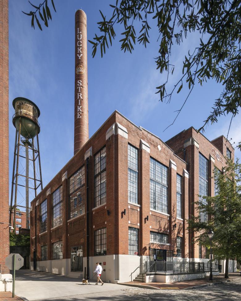
A former power plant in Richmond, Virginia, just steps from the James River, is now the headquarters of the branding and marketing company Arts & Letters Creative Co. Richmond- and Brooklyn-based ARCHITECTUREFIRM transformed the brick and steel building into a brightly lit contemporary office space that still reveals its industrial roots. The architects answered a few questions about the adaptive-reuse project.
Location: Richmond, Virginia, USA
Client: Arts & Letters Creative Co.
Architect: ARCHITECTUREFIRM
- Design Principal: Danny MacNelly
- Project Architect: Matt Pinyan
- Project Team: Adam Ruffin (Partner), Rick Fischl, Haley Maguire
MEP/FP Engineer: AKF Group LLC
Interior Designer: ARCHITECTUREFIRM
Contractor: DPR Construction
Building Area: 20,000 sf
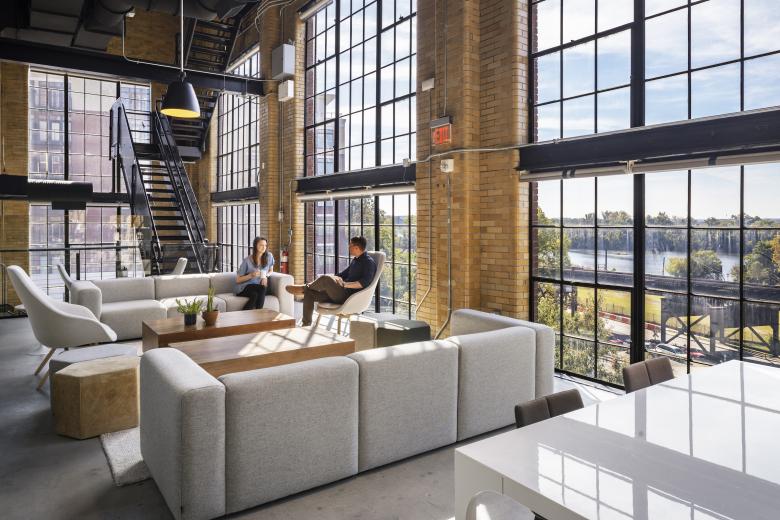
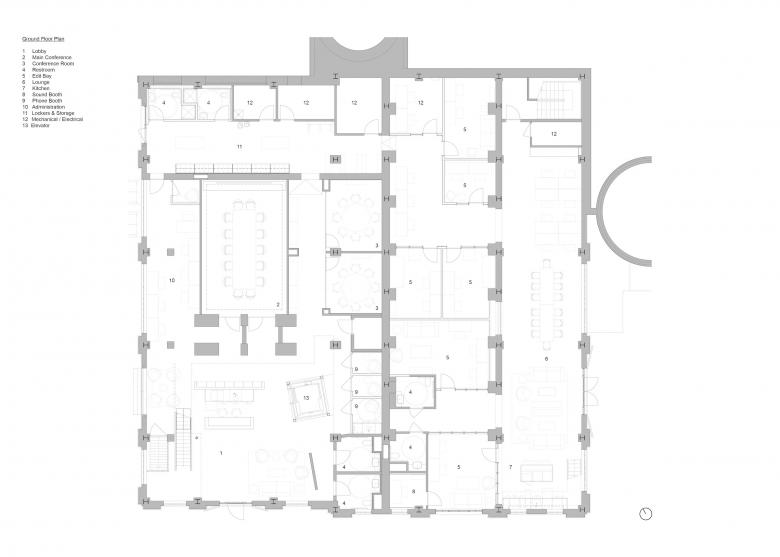
We were asked to provide an inspiring, open, and flexible headquarters for this rapidly expanding creative company. The primary component of the program is desk, conferencing, and flexible work space for employees, with options for additional growth in the future, and an expansive community space where the entire team can gather. The second significant program element involves on-site production of video, graphic, and digital content for the creation of branding and marketing campaigns; this includes filming rooms and editing bays, sound recording booths, and conference and white board spaces. The space also needed to be filled with flexible and comfortable lounge and amenity spaces for the company teams, clients, and visitors.
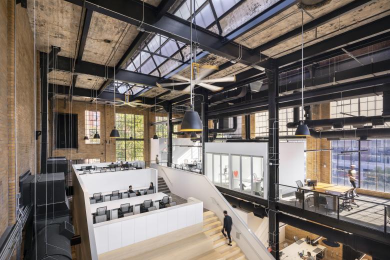
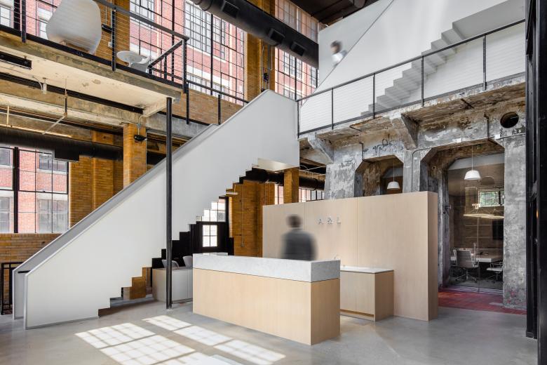
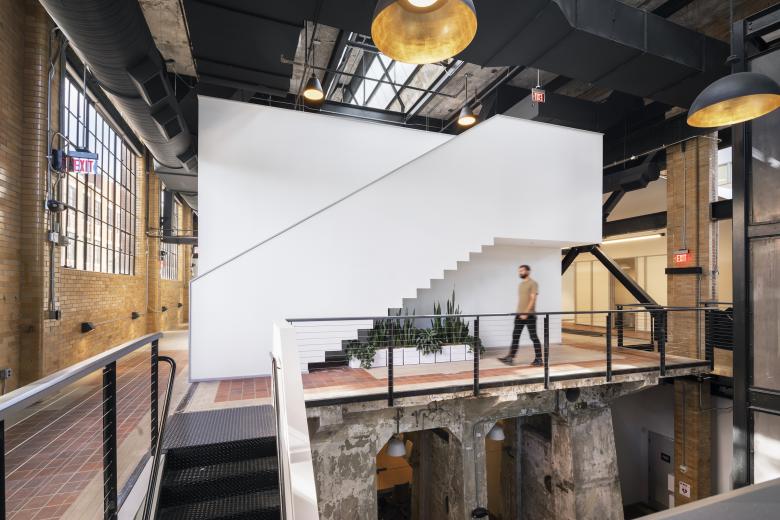
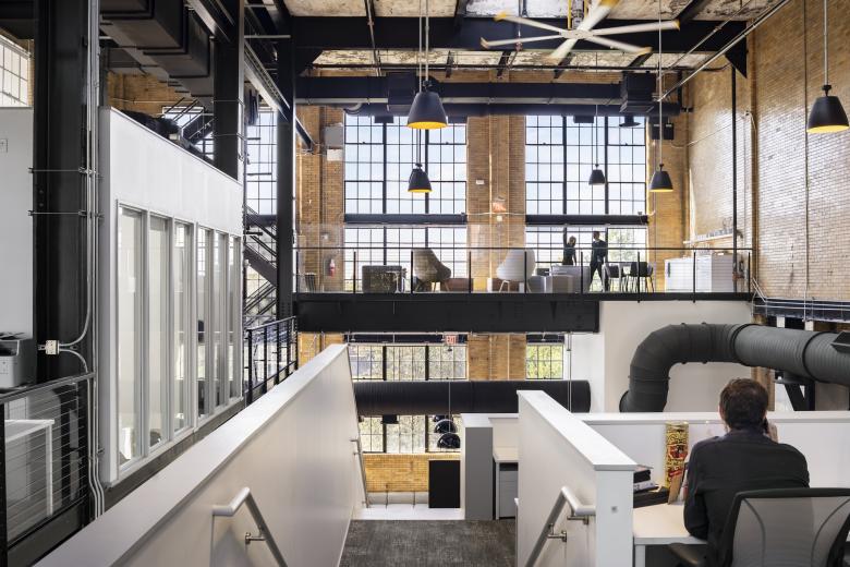
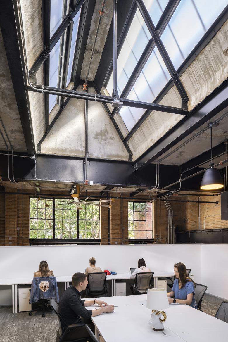
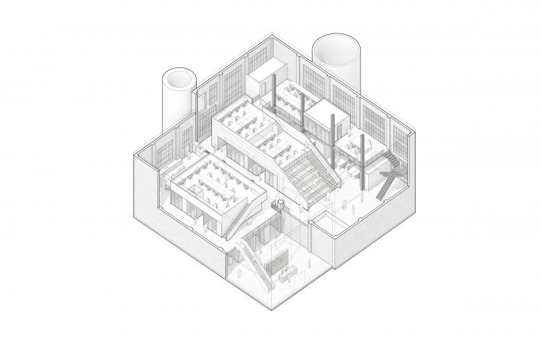
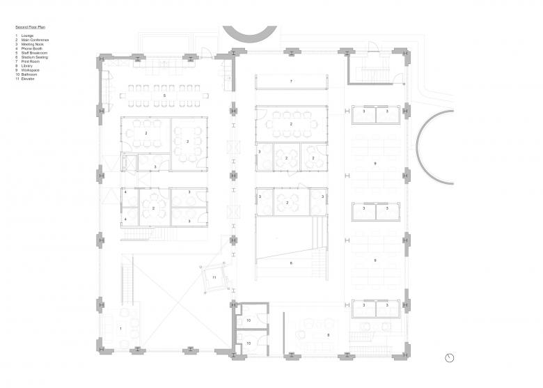
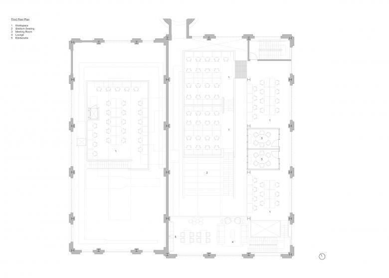
The large volumetric expanses of daylit space created some obvious space planning opportunities to go up, but it was undesirable to simply create more floors and mask the previous uses of the building. The architectural approach to plugging in a very contemporary program to this impressive historic building was to make a clear distinction between new and existing construction. The scheme uses the former undercroft spaces as the production and editing spaces, utilizing the heavy construction and low light levels for increased sound and light control. In the upper floors, the new meeting volumes are disconnected from the envelope, creating lofted work spaces with conference rooms below. All new construction is further distinguished by crisp geometries in matte white materials set against the rough existing walls, floors, structure, and ceilings of brick, steel, and concrete.
The building was large and drafty and due to the desired program, the mechanical requirements were significant. While holding the envelope and the existing light as the inspirational starting point, significant mechanical, ventilation, and shading was required to make the building useful to this company and their people. It was also important to remain conscious of the cost to this young office so the architectural interventions are extremely simple to construct, use only readily available construction products, and the detailing required no special contractors or experts. The decision to never cover or put a lid on the creative and open work environments led to an extremely open environment that is bathed in shifting daylight, providing comfort and inspiration to the entire team.
The intentional decision to not build a new campus but to infill an existing and well-loved building in this city is a key communicator of the value of what this community has as building infrastructure and what can be maintained at its core. The belief in reuse and in the protection of the existing urban environment of Richmond, in addition to anchoring this company very visibly in their hometown, imbued the design process with a respect for the existing condition and a strong desire to keep the intervention simple and discrete.
The design approach to maximize usable interior space by introducing two new volumes within the footprint was a scalable solution intended to respond to Arts & Letter’s continued growth. From the outset of design to construction completion, the projected employee population doubled from 80 to 160 occupants. The design team responded at each new benchmark by right-sizing the meeting spaces and configurations of workspaces to accommodate this growth.
The simple stud-and-drywall system of the new volumes allowed for flexibility in expanding or reducing the sizes of spaces both during construction and in the future. In addition to flexibility within the new volumes, the design team also took this opportunity to remove all non-original elements that had been added to the existing building during previous occupancies. The deliberate choice to construct the new volumes inboard and detached from any existing walls creates flexibility in the future should a new occupant take over the space and have different needs.
Email interview conducted by John Hill.
