SPACECUTTER
Cut Triplex
SPACECUTTER
25. julho 2017
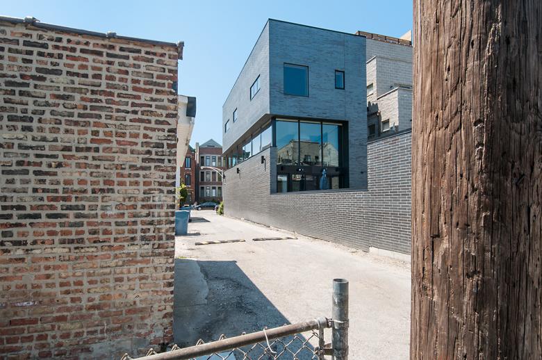
Rear elevation (Photo: Michael Vahrenwald)
Narrow residential lots are par for the course in such Chicago neighborhoods as East Village, where SPACECUTTER's Cut Triplex is located. The site of this particular house is special, though, since it abuts an east-west alley. Architect Alex Gil of SPACECUTTER took advantage of this "extra" south-facing elevation with a generous ribbon window related to the interior spaces. Gil answered a few questions about the project.
Project: Cut Triplex, 2016
Location: Chicago, Illinois
Architect: SPACECUTTER, Brooklyn
Project Architect: Alex Gil
Structural Engineer: SP Engineers, Ltd.
MEP/FP Engineer: Building Engineering Systems, LLC
Contractor: Allianz Construction, Inc
Brick: Endicott
Exterior & Interior Richlite Fin: Intectural
Windows: Marvin
Kitchen: Ernestomeda
Site Area: 3,210 sf
Building Area: 5,300 sf interior plus 2, 100 sf terraces, deck, and garage
Award: Iconic Awards 2018: Innovative Architecture
Front elevation (Photo: Michael Vahrenwald)
What were the circumstances of receiving the commission for this project?
The client made an extensive search through their personal & professional network. After interviewing SPACECUTTER it was the natural choice based on skill and rapport, even though the office is based in New York, 800 miles away.
Side elevation (Photo: Michael Vahrenwald)
Please provide an overview of the project.
The Cut Triplex townhouse balances privacy and openness, maximizing the narrow but deep Chicago property to carve out a light-filled 5,300-square-foot residence. Behind the monolithic black-brick facade lies an inviting and light interior. On the second floor, wrapped along the south facade that overlooks the adjacent alleyway, a long ribbon of continuous windows lets light stream into the kitchen and dining areas, where artificial light is rarely needed during the day.
In addition, light wells that reach from the first to the second floor bring natural illumination to each end of the residence. On the third floor, which holds the family’s four bedrooms, window sizes and their positioning vary, giving each room a unique quality of light.
Dining room at front of house (Photo: Michael Vahrenwald)
What are the main ideas and inspirations influencing the design of the building?
Phenomenology, fortification, privacy, light, and exceeding client’s expectations.
How does the design respond to the unique qualities of the site?
The long continuous wrapping ribbon window captures sun from the east, south, and west for maximum sunlight in the public common spaces. The entire design unfolds from this 750-square-foot cut in the building envelope.
Kitchen alongside ribbon window (Photo: Michael Vahrenwald)
How did the project change between the initial design stage and the completion of the building?
The project did not change in a significant way from the original vision. From an early stage, the project sought to reconcile and satisfy all of the family’s specific wishes and living idiosyncrasies. Additionally, every design detail was discussed through extensive meetings to avoid potentially costly construction change orders.
Casual dining area at rear of house (Photo: Michael Vahrenwald)
Was the project influenced by any trends in energy-conservation, construction, or design?
The project was specifically not interested in trends that come and go. However, the design does focus on sound, robust construction with an enduring timelessness. The house has a thick concrete mat foundation, is extremely well insulated, and takes advantage of daylighting.
Email interview conducted by John Hill.


