US Building of the Week
‘r kids Family Center
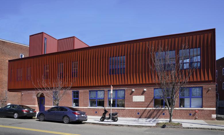
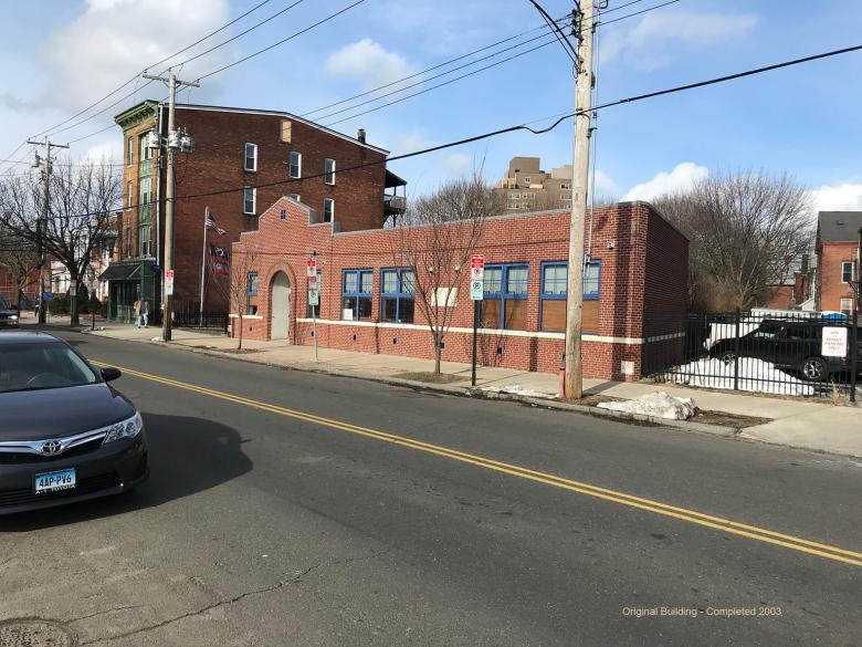
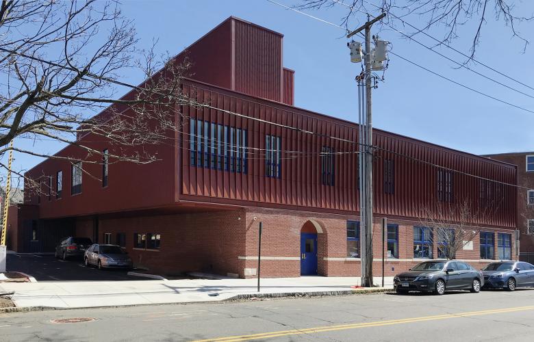
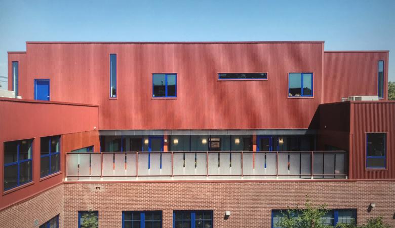
Since 1996 the ‘r kids Family Center has worked with vulnerable foster children and their families toward re-unification in New Haven, Connecticut. Located just west of the Yale University campus, the new home of ‘r kids literally builds upon a nearly 20-year-old one-story brick building. The terracotta-colored addition, covered in aluminum fins, gives the non-profit an identity on Dixwell Avenue. Craig Newick answered some questions about the project.
Location: New Haven, Connecticut, USA
Client: ‘r kids Inc.
Architect: Newick Architects
- Design Principal: Craig Newick
- Project Manager: Aaron Pine
MEP/FP Engineer: Landmark Facilities Group
Landscape Architect: Newick Architects
Contractor: A. Secondino & Son
Site Area: 12,731 sf (1182 m2)
Building Area: 15,093 sf (1402 m2)
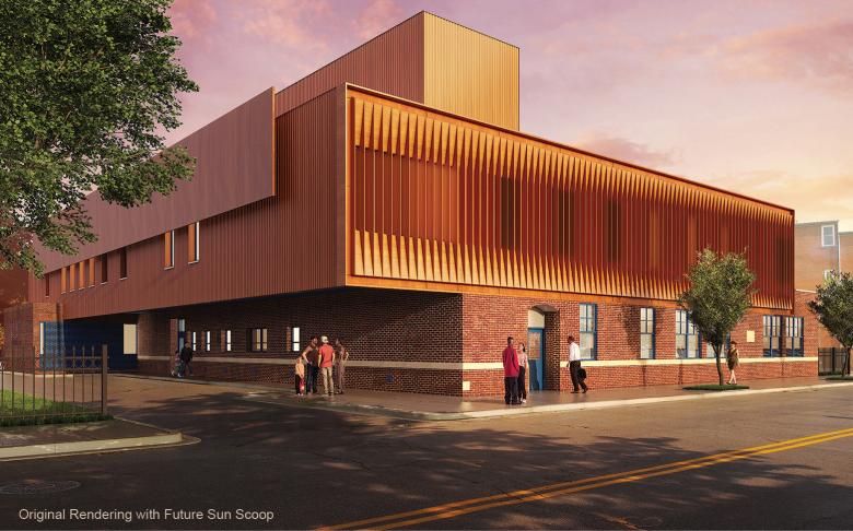
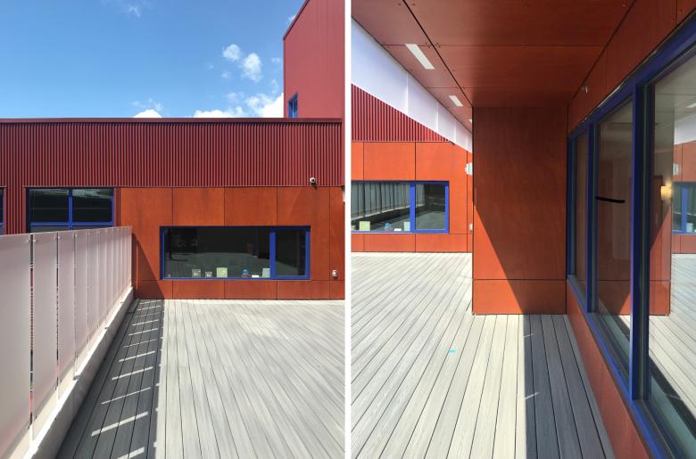
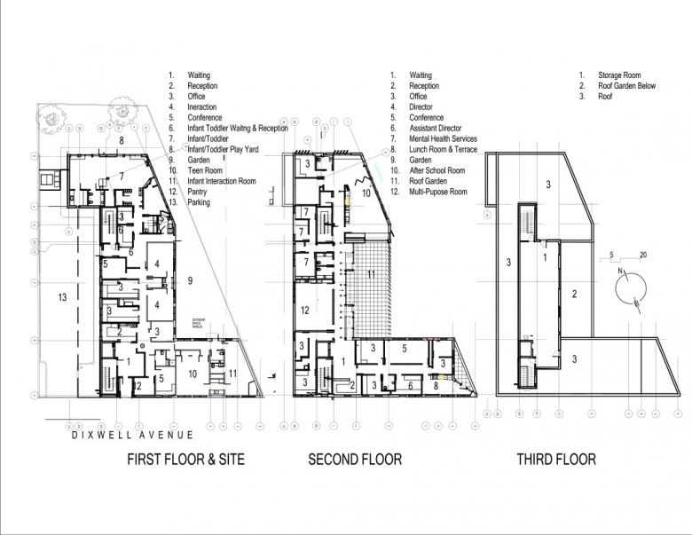
We started with an existing one-story brick building bult for the client in 2003. Our project tripled the available space. The principle architectural move was the cantilever of the second floor, which provided a 90-m2 outside roof garden — increasing the amount of available outdoor space considerably.
We were very much focused on the quietness, the way in which this sensitive use is incorporated into the city. Even though the new facade is elaborate and catches light in animated ways, it is possible to walk right by the building without noticing it.
The façade consists of 82 aluminum fins alternating with faceted wood veneer panels. We had just six inches of horizontal space between the face of the existing brick and the existing concrete roof slab in which to build our new facade. The result has little topographic depth but catches light and shadow in a surprising way.
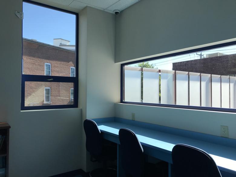
The site was already tight — too small, really. Our design vastly increased the outdoor space, and all of the principle rooms of the second floor look into it, increasing the ways in which users can interact. Because it was impossible to excavate below the building for storage we relocated that area to the third floor as an open loft.
The budget was very tight from the beginning. As the construction documents came together some details and elaborations were left behind: connections between the first and second floor for example. At one point the design team considered the cantilever, which was there from the very beginning; even though it was difficult to do and consumed a lot of resources, we all understood that it was central the scheme and we fought for it.
The exterior envelope is significantly more efficient that the US energy codes mandate. We understood that money spent now would benefit the non-profit owner going forward.
We used corrugated aluminum wall panel which is one of the cheapest commercial materials available but we coated in with a matte finish with a barely rough finish. It absorbs and reflects light in extraordinary ways. Sometimes it is bright, terracotta red and sometimes, when there is little light on it, it appears to be chocolate brown.
Email interview conducted by John Hill.
