Casamirador Savassi
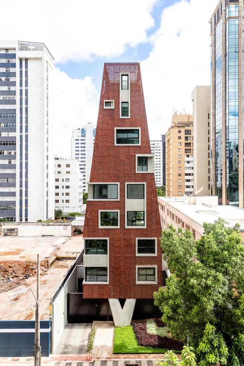
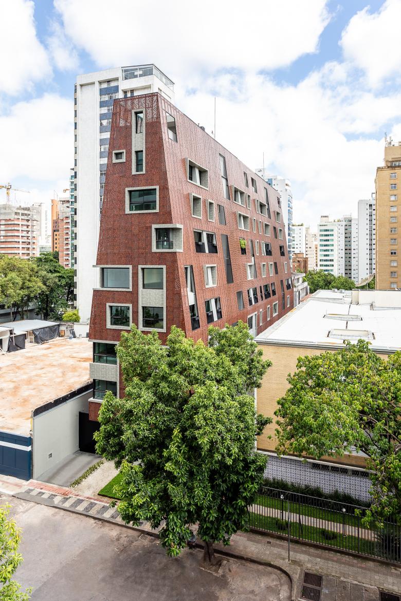
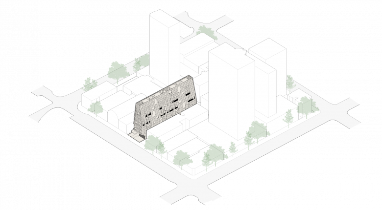
The Casamirador Savassi residential building, completed in 2021, is located in Belo Horizonte, Minas Gerais, Brazil, and features boldly designed architecture that stands out in the local landscape.
Location: Belo Horizonte, Brazil
Client: Casamirador Incorporações
Architect: Gisele Borges
- Project Manager: Ulisses Mikhail Itokawa
- Collaborators: Helena Hostalácio, Iara Pimenta, Mariana Correa, Manuela Fratezzi, Luiza Menicucci, Gabriela Jacobina, Victor Lamounier
HVAC: Protherm
Structure: Bedê Consultoria e Projetos
Glazing and Metal Facade: Aludesign
Contentions: Geomec Engenheiros Consultores
Installations: Projelet Projetos e Sistemas Prediais Ltda
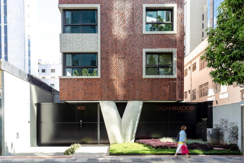
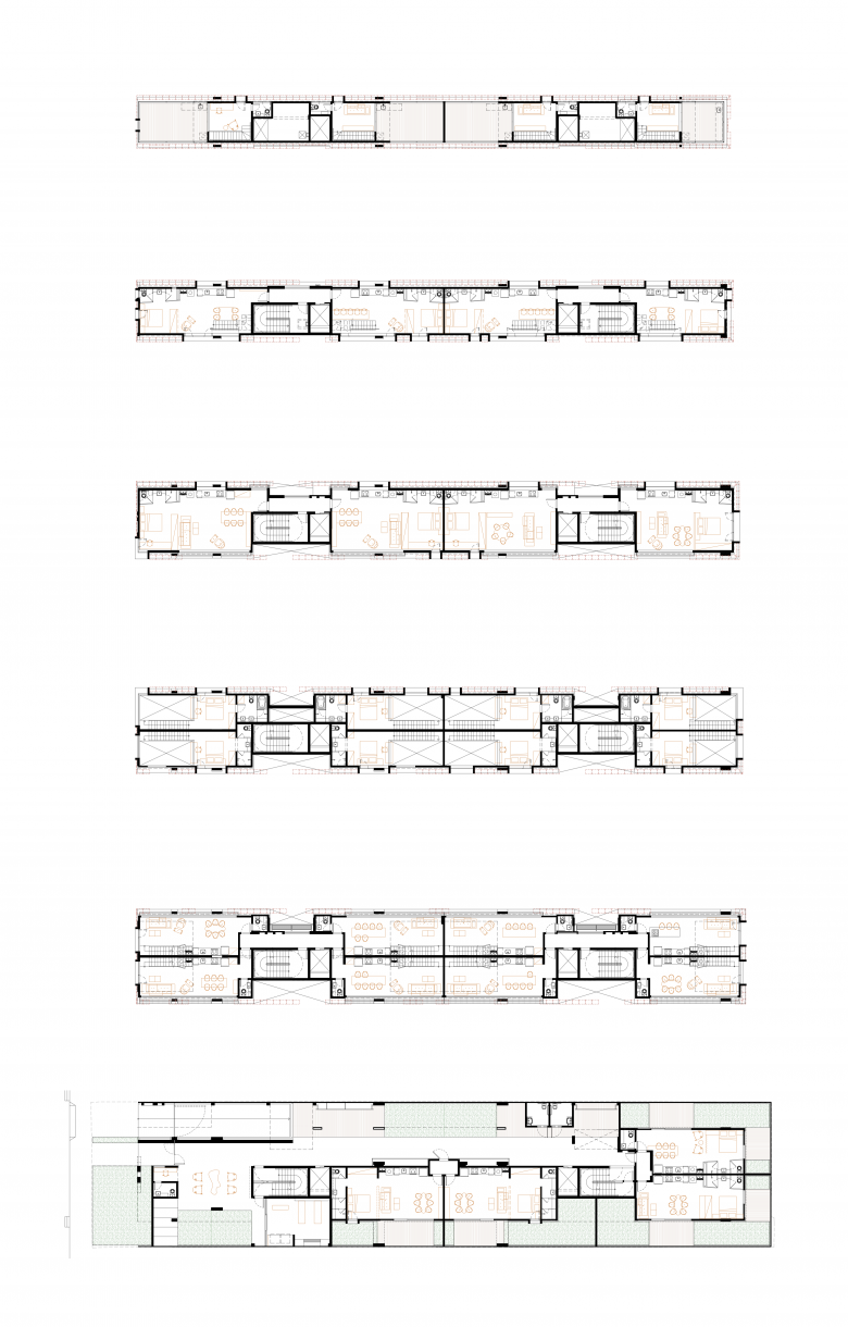
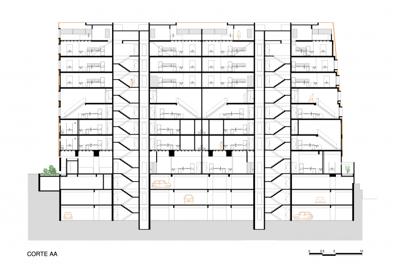
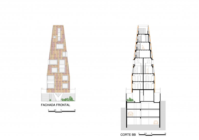
The building has 14 lofts and 24 studios, and is spread over nine floors in a construction located on a narrow lot, with a width of 12.7 meters. The challenge of its volumetric mathematics, to respect distances, was one of the factors that influenced non-obvious decisions resulting in architecture created with its own identity.
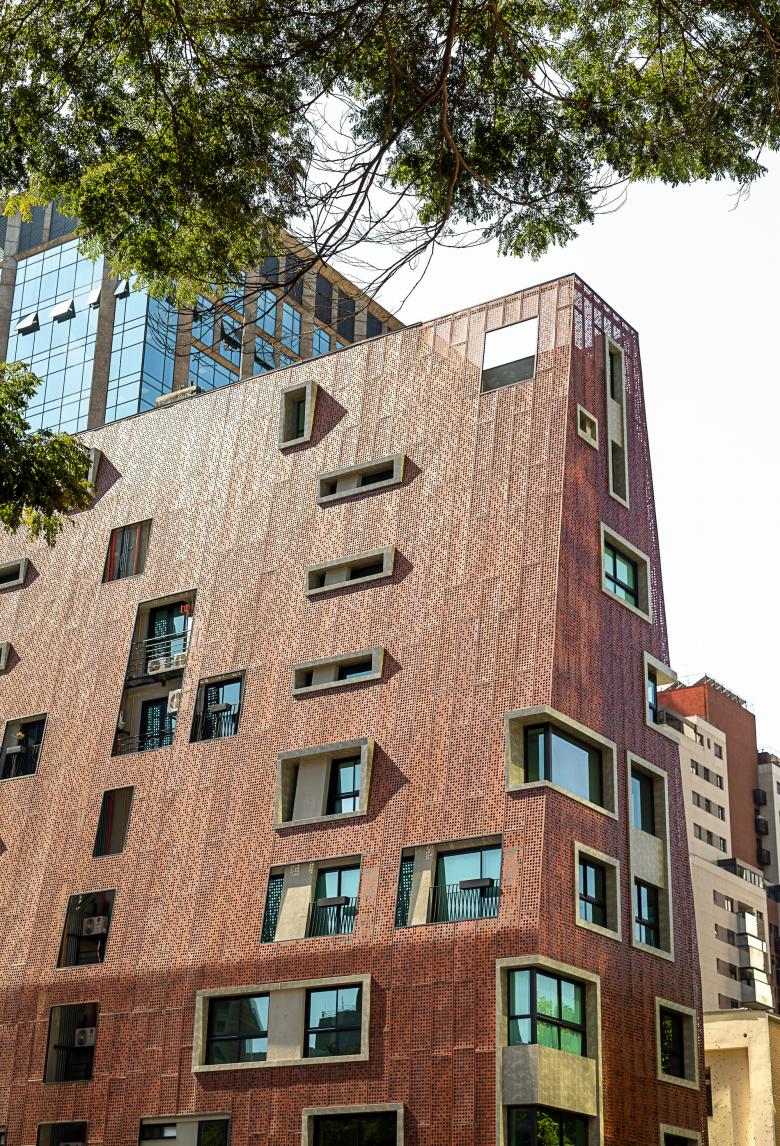
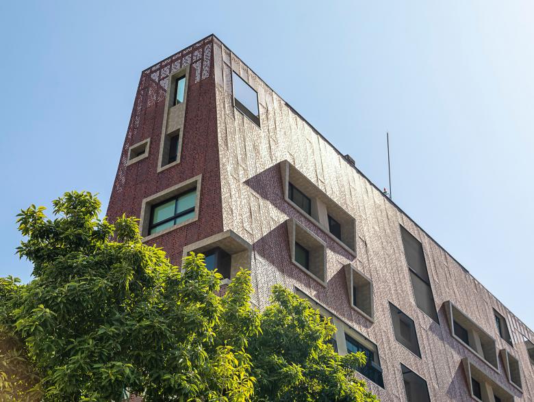
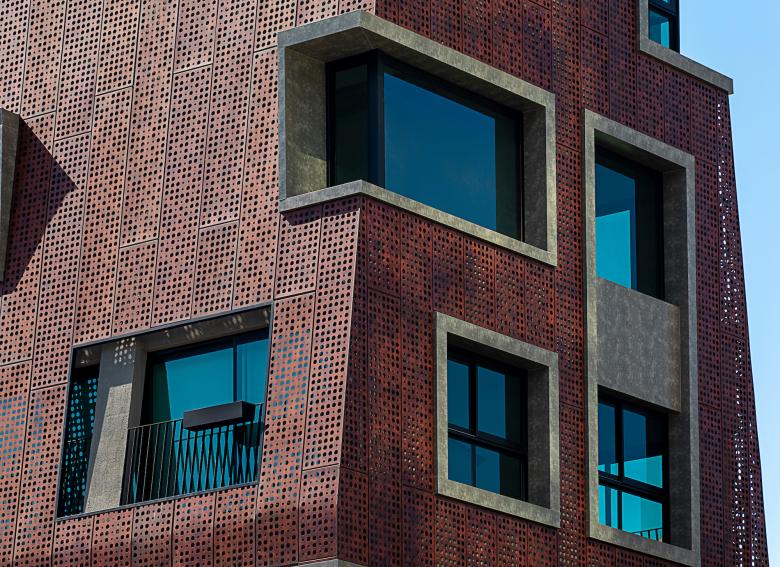
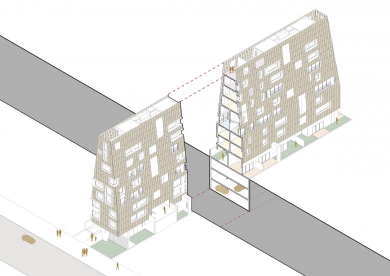
The interdependence between the building’s structure and the architectural project enabled great creative freedom, culminating in the most prominent element: a second skin that “wears” the building like a garment, giving it unique characteristics. The material used was aluminum, painted in an earthy reddish sepia tone that alludes to the abundance of raw ore in Minas Gerais.
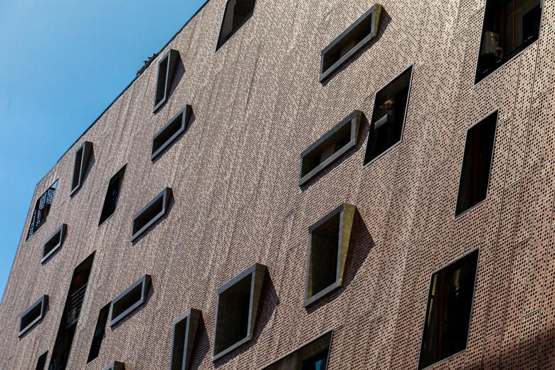
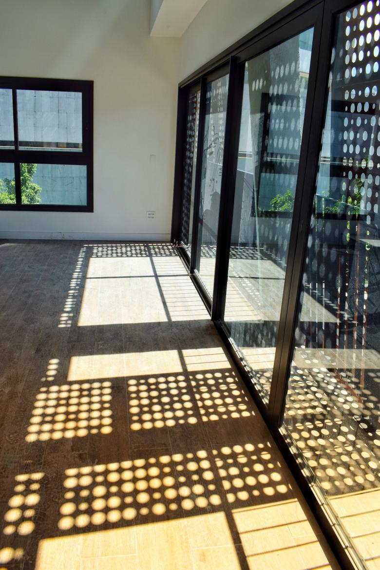
In order to obtain lightness and transparency, the aluminum sheets received perforations in different sizes, and were made in an asymmetrical, yet harmonic way. That process makes it possible to see through them from the inside out, where city views are exposed through the skin. However, from the outside looking in, it isn't possible to see the interior, guaranteeing privacy to the resident. This element also made it possible to explore a rich range of effects, from hiding smaller, functional windows, to tearing the skin to expose the large spans. Conceived as generous openings, these windows allow the city to become an extension of the house, with abundant light and ventilation. The concrete frames of the openings contrast with the predominant oxidized color.
The skin covering the building also provides thermal comfort to the units. Away from the masonry, it provides shading of the fences and good ventilation through a mattress of renewable air. From that perspective, sustainability guided a large part of the project’s choices. Due to the reduced dimensions of the land, and minimal rooftop space for installing equipment or photovoltaic panels, it was necessary to find a solution that would avoid the entry of heat, to the detriment of an air conditioning project.
The building’s pyramidal shape, which is the result of staggering, also made it possible to allocate technical areas on the external face of the masonry, as well as on the internal face of the skin, ensuring a clean and unadorned plastic.
Another highlight of the project concerns the challenge of placing the pyramid on the ground, touching the land lightly at a single point. Under the influence of Brazilian architect, Oscar Niemeyer, a “V”-shaped pillar was created, which is widely used in his works.
Finally, to ensure flatness on the facades, the sheets were bent on all four sides, thus increasing their rigidity. Although the sheets were randomly perforated, the joints were aligned and the volume was harmonious, several studies were carried out until the final fixing model produced an alignment of the slabs and the midpoint of each floor. The study ensured optimization in the secondary structure for fixing the plates: there are only three horizontal profiles per floor, and the upper and lower profiles were also combined to fix the plates of the adjacent floors.
Artigos relacionados
-
Cocoon Pre-primary Extension at Bloomingdale International School
andblack design studio | 19.08.2024 -
-
-
-
