US Building of the Week
Interactive Learning Pavilion, UC Santa Barbara
The Interactive Learning Pavilion opened at the University of California, Santa Barbara earlier this year as the campus's first new building dedicated to classroom space in more than fifty years. Partner Stephen Van Dyck and the team of architects at LMN Architects answered a few questions about the project.
Location: Santa Barbara, California, USA
Client: University of California, Santa Barbara
Architect: LMN Architects
- LMN Project Team: John Aldredge; Pascual Corona; Albert Cua, AIA; Rob Curran; Michael Day; Tiffani Erdmanczyk, Associate AIA; Jeff Floor, AIA; Howard Howlett, Associate AIA; Kris Jugueta; Susan Lowance, AIA; Chris Martin, AIA; Jennifer Milliron, Associate AIA; Charlotte Phillips; Shima Sahebnassagh, AIA; George Shaw, FAIA; Stephen Van Dyck, AIA; Kevin Zhang
Structural Engineer: Saiful Bouquet, Inc.
MEP, Lighting and Sustainability: Integral Group
Landscape Architect: Arcadia Studio, Inc.
Acoustic, AV and IT: Arup North America Ltd.
Environmental Graphics: Entro
Wind Consultant: RWDI
Civil Engineer: Stantec Consulting Services, Inc.
Project Contractor: C.W. Driver
Site Area: 159,000 sf
Building Area: 90,000 sf
There was a public solicitation for architectural design services and we submitted an RFQ (Request for Qualifications). The university selection committee shortlisted LMN Architects and a few others firms to interview and submit proposals. We interviewed and shared our thinking about the project, site and campus opportunities.
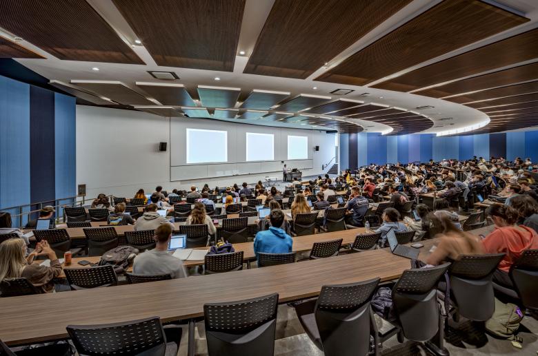
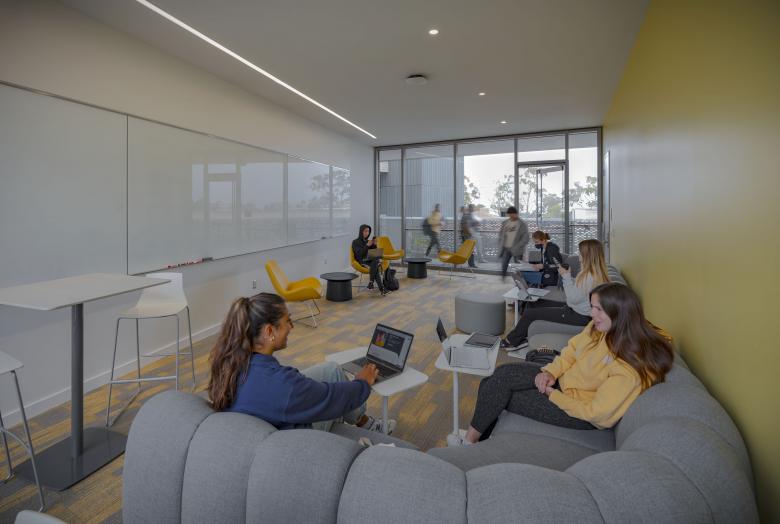
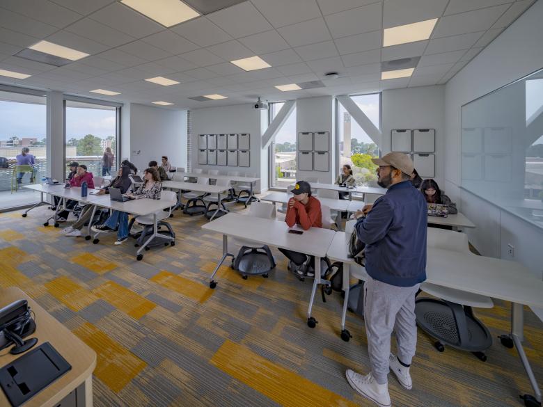
The building provides new spaces for teaching and learning to meet growing demand at the University of California, Santa Barbara. It is the first new building dedicated to classroom space to be built on the campus in over 50 years. The program includes spaces for active learning across five lecture halls, three large flat flexible rooms, and twenty seminar-sized classrooms. The site is in the heart of the campus, which is known for its unique, coastal site.
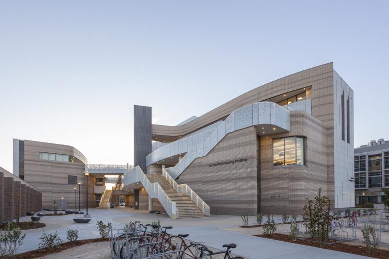
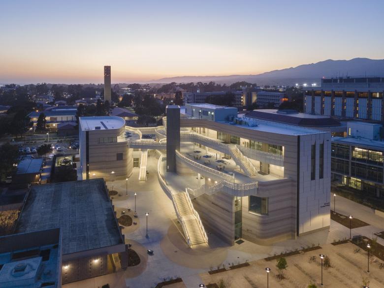
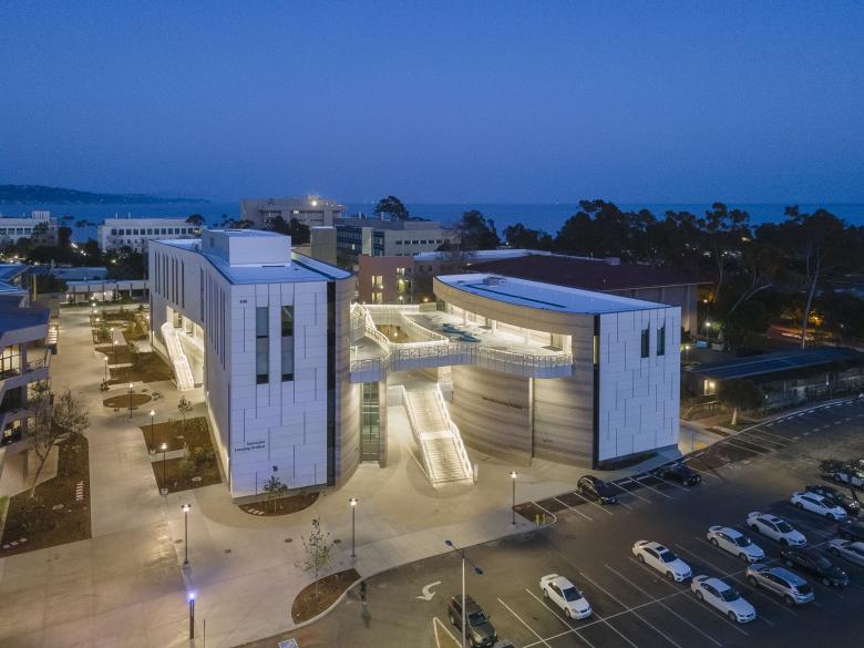
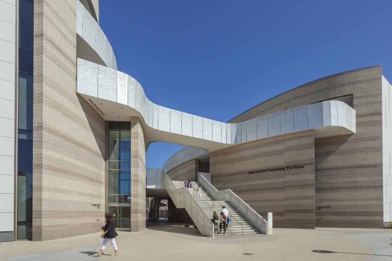
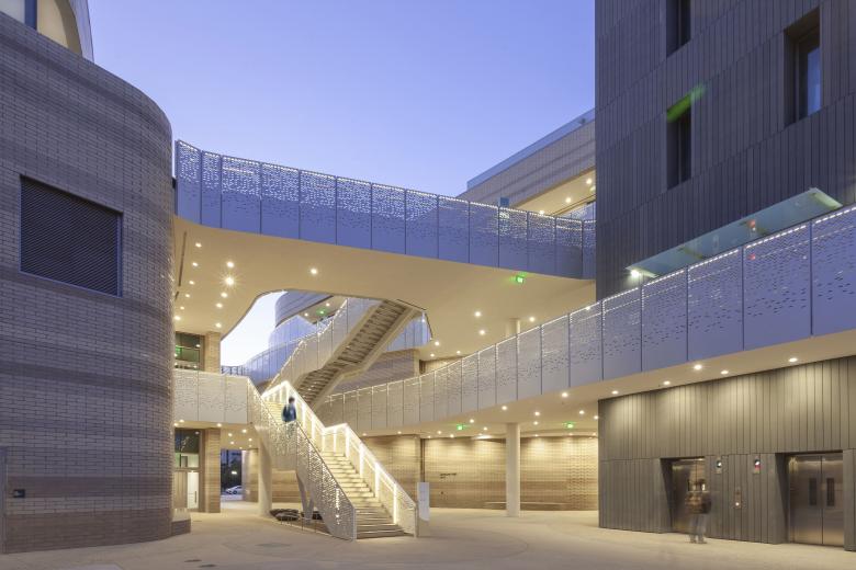
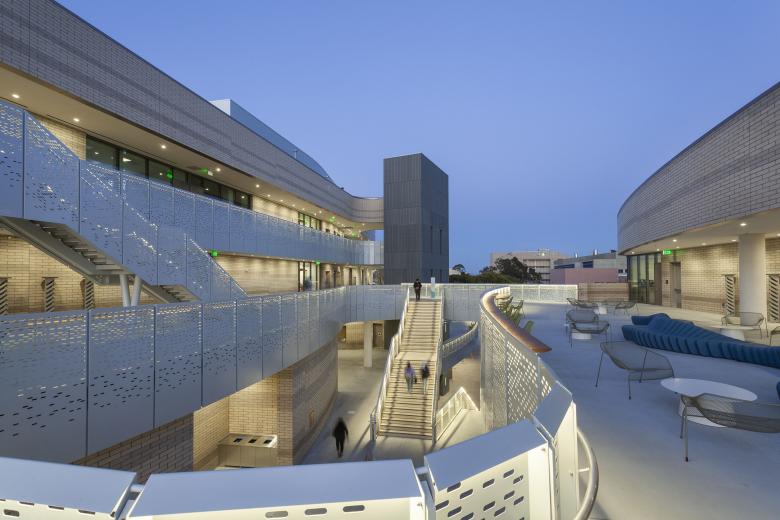
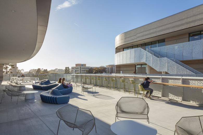
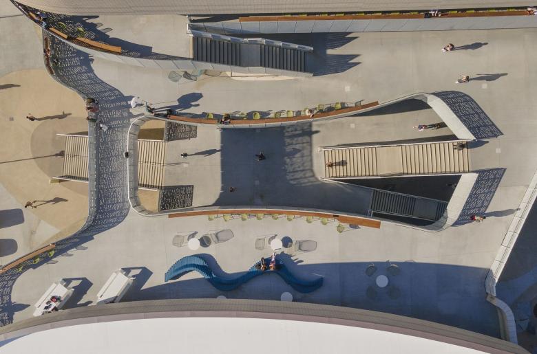
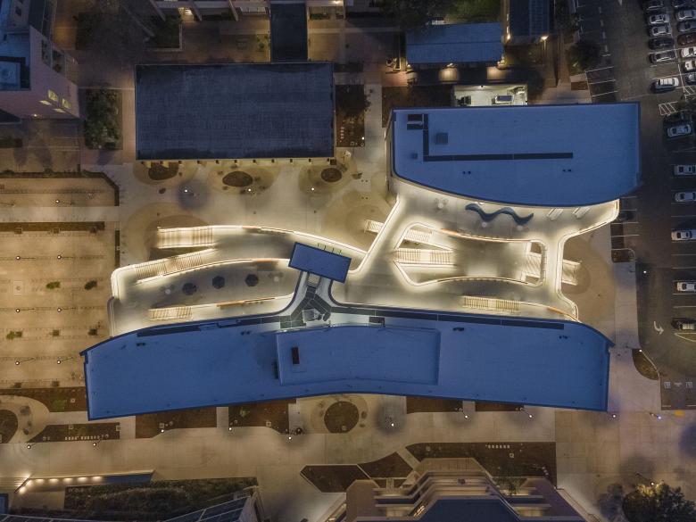
The building design anticipates the extension of Library Mall and is configured to be approachable and welcoming from all edges. It is composed of two main volumes with a central circulation corridor open to the exterior with terraces, stairs, and collaboration spaces. This open-air “street” interconnects the functions of the two volumes and encourages serendipitous interactions among students and faculty.
The building is inspired by both the campus and environmental context. The architecture and the material palette take advantage of the climate and echo the colors and textures of the nearby seaside cliffs and neighboring campus buildings.
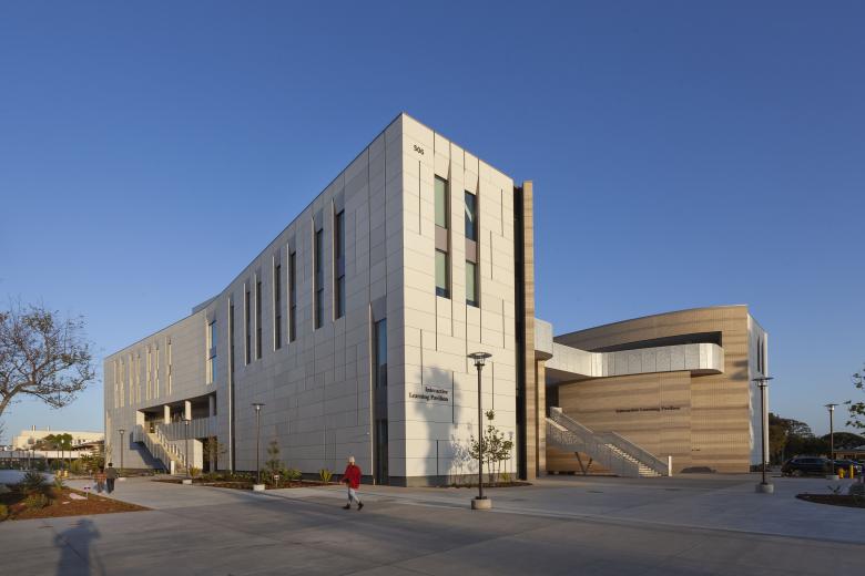
The building's exterior presents two distinct characters of expression. A taut, vertical facade system comprised of high-performance concrete panels (UHPC) and vertical windows clads the outward-facing elevations, establishing the building massing as clear framing elements along the adjacent campus spaces of Library Mall and Pardall Mall. Facing the internal public spaces, the building takes a soft form by sculpting the shared exterior terraces with a curving formal language, driven by the efficient planning of the lecture halls within. The interiors of the building feature a material and color palette that is inspired by the region’s coastal caves.
Of note, the geometry of the building’s internal paseos and terraces evolved in the design process. Originally conceived as rectilinear forms and spaces, their language developed into a soft, curvilinear sequence of spaces as a response to both the efficient planning of the classrooms as well as the flow and movement of people through the building and site.
The building configuration is designed to passively reduce energy consumption and features highly efficient mechanical and electrical systems throughout.
UHPC panels were chosen for their ability to convey multiple scales — particularly large scale — in a way that would complement some of the surrounding buildings. Additionally, the material is very durable and relatively lightweight, which helps us minimize structural and embedded carbon.
Polished concrete block was chosen for its formal characteristics, economy, and maintenance. The honed or polished surface serves to elevate the material and is much more tactile, very well suited for spaces where people will be circulating in close proximity to it. It also gave us lots of formal freedom to shape the internal walls of the building.
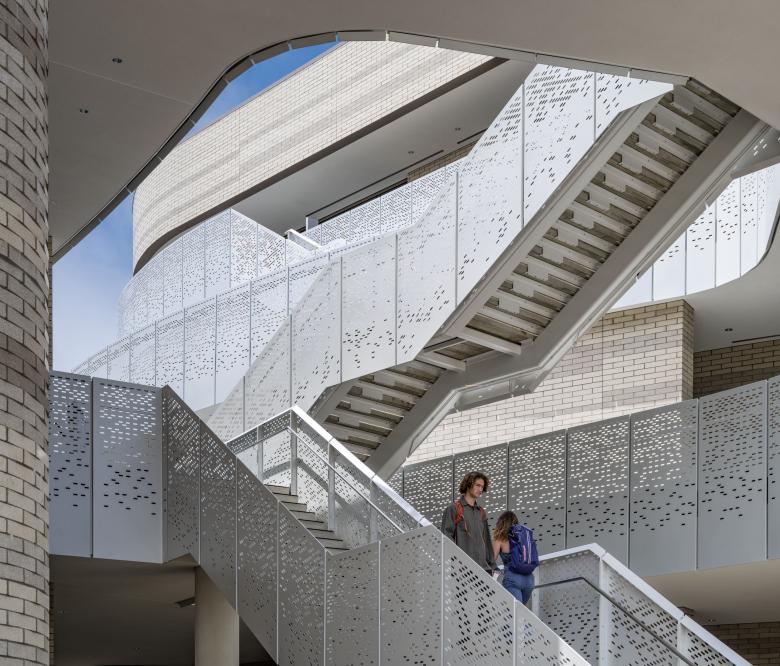
We’ve been designing perforated aluminum guardrail systems for quite some time — in this application they are well suited since they allow for some transparency but are generally very low maintenance. In this building we really wanted people to engage with the edge, so a sense of security is important; but being able to see the building come to life through the perforations is exciting. The panels are lightweight and easy to handle from an installation point of view. They also respond to light in some interesting ways, so they become an important part of the feel of the place both day and night.
Email interview conducted by John Hill.
