A Mirrored McDonald's in Moscow
Photo: Anton Voronkov
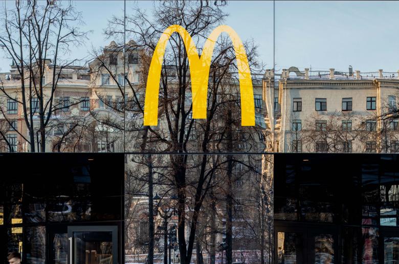
A new McDonald's restaurant in Moscow is covered in mirrored glass panels that reflect its Pushkin Square locale. Designed by Landini Associates, the project sits on the site of the first ever Russian McDonald's, which opened on Pushkin Square on January 31, 1990.
Landini Associates is no stranger to the Golden Arches. The Australian design and brand consultancy is responsible for a slew of McDonald's restaurants around the world, including a three-story location in New York's Times Square, a flagship store on Oxford Street in London, and the sustainably minded flagship in Chicago, where the firm handled the interior design. The latest iteration for Pushkin Square is part of "Project Ray," which launched in Hong Kong in 2015 and is described by the firm as a "complete reinvention of the world’s largest restaurant chain, including master-planning, architecture and interior design, brand positioning, graphics, packaging, uniforms and global design standards and guidelines" toward "re-attracting millennials to the brand by challenging their expectations."
Below is a photo tour through the new "Project Ray" McDonald's in Moscow's Pushkin Square.


Mark Landini, creative director of Landini Associates, says the mirrored facade "is designed as a visual giving-back; an optical celebration of the local community within which McDonald’s serves." It is also meant to be a quiet foil to "a world where everyone is shouting louder and louder." (Photo: Anton Voronkov)
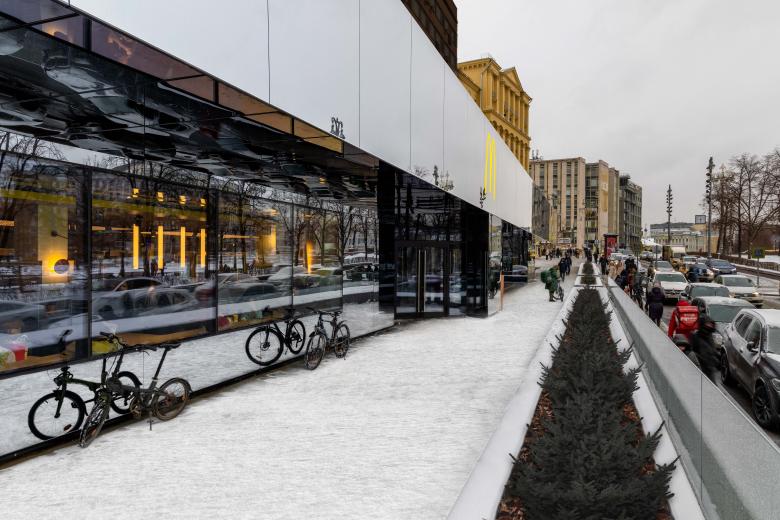
The site for the Pushkin Square McDonald's is a long rectangle that parallels the square, resulting in a long mirrored facade that, in this view, reflects the snow and Moscow's gray winter sky. (Photo: Anton Voronkov)
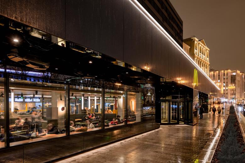
But at night (this busy location is open until midnight), the artificial lights opens up views to the interior, which was designed to be "warmer and more inviting to customers." (Photo: Anton Voronkov)
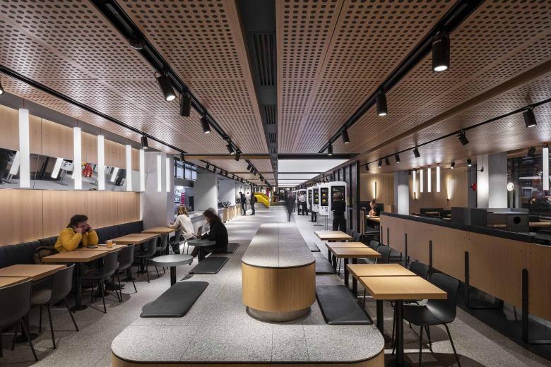
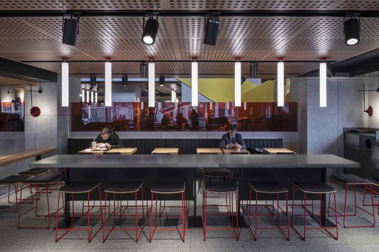
As in many newer McDonald's locations, customers order from self-service kiosks, which are located beneath an illuminated ceiling and are visible here past the timber surfaces of the seating area. (Photo: Andrew Meredith)
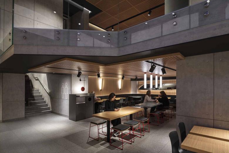
The three-story location incorporates multiple mezzanines and therefore a variety of seating areas. (Photo: Andrew Meredith)
The interior palette of concrete, stainless steel, oak, and glass aims to serve as a backdrop of "recognizable neutrality," in the words of the designers. (Photo: Andrew Meredith)
