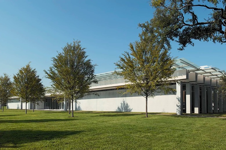
Between Earth and Sky: The Piano Pavilion
Italian architect Renzo Piano may be considered the go-to architect for museum commissions, but two recent projects show he is also the choice when it comes to adding to icons of 20th-century architecture: A gatehouse and monastery next to Le Corbusier's chapel at Ronchamp was completed in 2011, and the long-awaited expansion of Louis I. Kahn's 1972 Kimbell Art Museum opens on November 27 in Fort Worth, Texas. Writer Fred Bernstein got a sneak peek of Piano's new building at the Kimbell, filing this report for World-Architects.
Sailing the Mediterranean, his favorite weekend past-time, Renzo Piano must wear cowboy boots and play country & western music. How else to explain the affinity of this Genoese seafarer for Texas, the location of three of his best museums?
First came the Menil Collection (1987), a low-slung gray wood building, in which he arrayed galleries along a 320-foot (100-meter) promenade while still reflecting the domestic scale of Houston’s Montrose neighborhood. Next was the Nasher Sculpture Center (2003), in Dallas, a jewel box with a roof that harvests and directs sunlight. And now comes the Piano Pavilion, in Fort Worth, his addition to the Kimbell Museum, Louis I. Kahn’s 1972 masterpiece, to which his new structure defers but doesn’t genuflect.
So 20 years after it dropped the Giurgola plan, the Kimbell tried again, this time with Piano. The first major decision was to locate the addition due west of the Kahn Building, on a lawn that had served for years as the Kimbell’s front yard and a buffer between it and the Amon Carter Museum (designed by Philip Johnson and itself an underappreciated gem). The Carter might have been worried about the Kimbell encroaching on its views. In fact, Piano kept his building low and covered much of it in grass; it is practically invisible from the Carter’s front steps. And yet it shifts the center of gravity of the city’s museum district (which also contains Tadao Ando’s Modern Art Museum of Fort Worth) westward, forging valuable connections to the Carter.
The Kimbell’s second big decision was not to let the new building touch Kahn’s. Instead, the so-called Piano Pavilion faces the Kahn building across what’s left of its front lawn (still an imposing two acres or so of grass). Visitors now enter through a parking lot below the lawn, and ascend (by elevator or stairs) to the portico of the new building. From there, they walk across that lawn and then through a grove of yaupon holly trees to Kahn’s original lobby. Like a cathedral’s steps (but ADA-compliant), the walk delays gratification.
The new building, which cost $135 million, is about the size of Kahn’s, and its galleries are similarly long and narrow. But where Kahn placed walls of travertine, Piano uses a creamy white concrete, achieved – at great expense, Kimbell director Eric M. Lee says – by the consultant who created the concrete walls of Tadao Ando’s Punta della Dogano museum in Venice. Precious, but slightly less precious-looking than Kahn’s marble, the concrete provides a neutral backdrop for the museum’s collection of Old Master paintings.
The gallery roofs, supported on slender steel columns and thick wood beams, are less dramatic than Kahn’s – reflecting, in part, Piano’s deference to the master (for whom Piano once worked, and who would have designed the Menil had he not died unexpectedly in 1974) – but they are hardly afterthoughts. Fabric scrims, glass panels and metal louvers create a sophisticated system for regulating light.
But in this museum, what’s underfoot is almost as impressive as what’s overhead. To avoid the need for grillwork, which can be visually distracting (a significant problem at David Chipperfield's recent addition to the Saint Louis Art Museum), chilled air is sent through narrow gaps between the floorboards. The expensive, nearly imperceptible system reflects years of experimentation by Piano’s colleagues, including the partner in charge of the Kimbell project, Mark G. Carroll.
So what is it about Texas that so inspires Piano? It can’t be the state itself, given the success of Piano’s Beyeler Foundation building (1997), outside Basel. (True, Ernest Beyeler chose Piano for the commission after visiting the Menil.) But what does unite Piano’s best museums – the Beyeler included – is that they are all low-to-the-ground. The chance to build horizontally, with galleries forming long, narrow rectangles, appears to spur Piano to greatness. And Texas has repeatedly offered him that opportunity.
Piano’s more vertical museums – the Morgan Library and Museum in New York, the Broad pavilion of the Los Angeles County Museum of Art, and the Whitney Museum of American Art on Manhattan’s west side – are all, by comparison, awkward and unwieldy. (Though it’s too early to pronounce judgment on the Whitney, expected to open in 2015, it’s not too early to say it lacks the clarity of the Menil, Nasher and Kimbell.)
The reason reflects Piano’s relation to the sky. Perhaps as much as any architect (and even as much as the artist James Turrell), Piano’s best work is about sunlight, in its many permutations. A single-story building allows him to give every space access to natural illumination. And once that happens, for Piano, the other elements seem to fall into place. He can achieve the pagoda-like perfection of roofs overhanging glass pavilions, the meeting of classical inspiration and technical innovation.
Then, too, there’s the issue of circulation. In Piano’s single-story museums, circulation spaces parallel the galleries, reinforcing their essentially linear orientations. By contrast, the stairs and elevators of his vertical museums seem like disruptions.
It’s not that Piano doesn’t work effectively in section. (His New York and London skyscrapers are proof.) But as he demonstrates again at the Kimbell, it’s when all his galleries touch both the ground and the sky that his museum buildings soar. Wisely, the Kimbell let Piano do what he does best.


