Nestlé Headquarters
Assago, Milano, Italy
In the month of April, Nestlè Italy inaugurated its new headquarters in the building called U27, completed two years from construction start in the Milanofiori Nord area, Assago (MI) . The architectural project was committed by society Milanofiori 2000 to Park Associati while executive project and management work have been taken in charge by the engineering firm General.
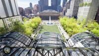
The architectural design by Park Associati is based on an analytical approach to the articulated system of access to the Milanofiori Nord area, the pedestrian walkways and roads, climatic factors relating to the context and the goal of properly integrating the building into the overall masterplan. Its position as a link to an area of forest towards the north led to the development of a complex that while being based on a closed courtyard layout, enables a visual permeability to be maintained in terms of the routes that surround the building. The building has been designed in such a way as to create a visual continuity between the natural landscape of the wood at the north and the designed landscape of the site itself. The courtyard, reserved for users of the building, relates to the external landscape and is conceived as a kind of “secret garden”.
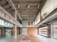
The entrance, that faces onto a semi-urban piazza, has been conceived as a continuation of the main pedestrian access from the south-west of the site (directly connected to the metro station) while service vehicles are directed to the opposite end of the complex to an area that is completely hidden by ground. The main entrance hall is in direct visual contact with the internal courtyard and is flooded with natural light by a large, north-facing rooflight. The canteen area is a place for relaxing and an important area for social interaction that adds to the quality of the environment.
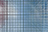
While the building appears compact and rational in plan, the elevations are articulated in a series of blocks allowing for a lighter and more fragmented composition. This is achieved by dividing the whole building into a number of segments, ‘suspended boxes’ that vary in size and height and each with a slightly inclined facade. The elevations establish a link with the context through the nature of the surfaces, perceived from different angles, they are sometimes made neutral allowing light to filter through, other times compact and reflective giving continuity to the natural surroundings. At certain points the composition is enriched with the addition of vertical blades in coloured glass that further articulate the volumes without affecting the level of transparency.
The raised part of the building is embedded into the ground in a natural way to create a secluded internal space on top of which sit volumes at different levels that house the building’s main facilities. The articulation of the building envelope and the rhythm of the structure relate to the open-planned interior spaces and act as a grid for generating different configurations for the internal circulation, enabling a high degree of flexibility.
Considerable importance has been given to energy issues and levels of energy consumption. The building is certified LEED (Leadership in Energy and Environmental Design) “Core and Shell” in Gold class.


